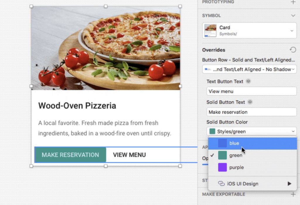
What is Symbols?
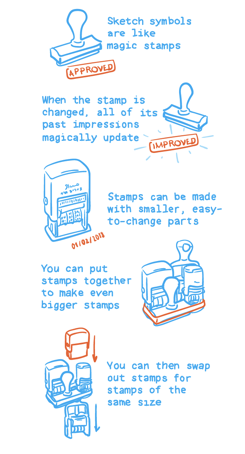
Symbols in Sketch is useful tools which you could imagine as magic stamps. You don’t need to build all the words in English. Instead, you could create all words by building the 26 letters, and use those words to create different sentence.
Why to use Symbol?
Then, why to use it become easier to understand. To be honest, I had never used it before my summer internship this June. However, when I worked in design team, and needed to collaborate with the Dev team, there are so many back and forth work. Believe me, you would never want to redo everything again and again. From my perspective, here are three benefits I got after I using Symbols.
- Speed up my Design Flow: for website, I usually decide color scheme at first, and design basic components like modals, drop-down menu, search bar, etc. It just saves my so much time! When I start to design, most of time I am dragging those symbols to make everything make sense and looks good. This process also make me focus more on the structure of website instead of how every part looks.
- No worry of changing anymore: I changed my design one by one for several times at first. Then I gave up and hug Symbols, because changing design is one of the most horrible and exhausting things, especially change color scheme, text style or the padding of one component, which is the work without thinking. Working in a team, there are so many reason to change design, sometimes technology constriction, sometimes problems just shows after the design process. When I saw all my cards change together by only changing the Symbols, that is the time when I decided to use it and let others know how effective it is.
- Easier to keep Design Consistency: last but not least, every designer has his/her own style, which is good for divergency, but definitely not good for Hi-Fi prototype. When the design team decided their style guide, designers should take some of the design work and put them together afterward. Trust me, having Symbols page is the most wonderful thing you want to hear. In this way, same modals, profile, or even padding for heading will make you and other designers’ prototype looks much more harmonious.
How to use Symbols?
- Create Symbols

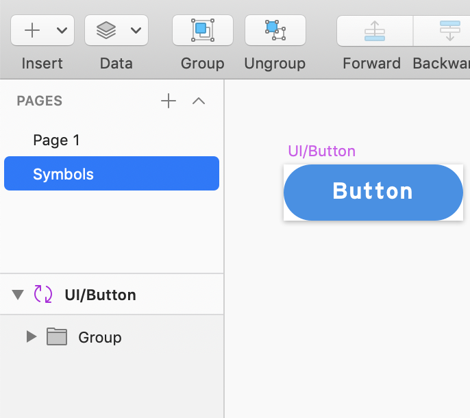
The first and key demo I want to show is creating a symbol. Click all the thing you want to create and then click “Create Symbol” button on the left corner of the navigation bar(as image 2.) Then give it a name. Here is a tip, pay attention on how to give them different hierarchy, the only way I know is using “/” .
After clicking “OK” button, there will be a “Symbols” page for your first symbol on the “Page” area(image 3,) and everything in this page are with purple color name.
- Use and change design by changing Symbols
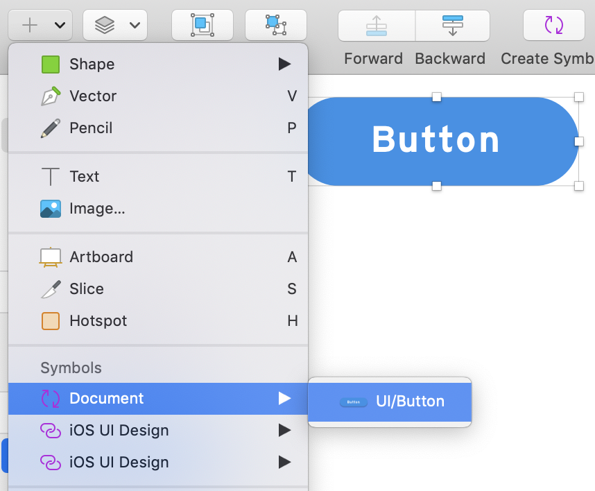
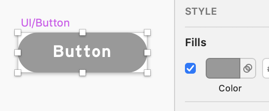
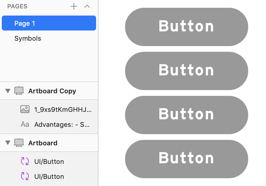
If you want to use the symbols you have already created, click “insert” button and then “Document” in “Symbols,” and choose what you want(as image 4.) By changing the style of the symbols in “Symbols” page, everything symbols you have in your artboard will be changed together as image 5 & 6.
- Nested Symbols

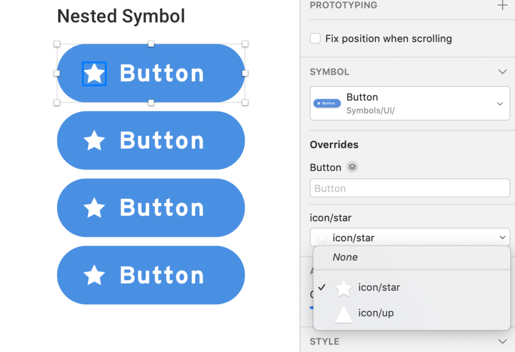
Nested Symbols(symbols inside symbols) is the most important step to make your systematic and useful symbol collection. In this way, you could have one button with different icons to change as many as you want. Here is the way to do it: add the icon on the button on “Symbol” page, and click “create symbol” to create nested symbol(image 7.) Then you could different icons on that button. The key here to let computer recognize that these icons are used on the same place is that you need to let them in same hierarchy and same artboard size. Then click this button on the regular page(as image 8,) you will find this “icon” drop down menu to change icon.
- Systematic Symbols
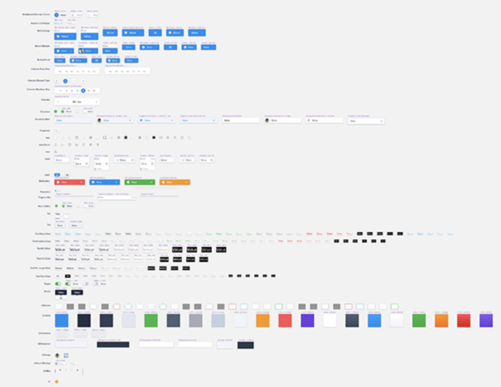
By using your own rationale to give symbols name and put them together, you will gain a systematic symbol system. Image 9 is a good example I found online. You could focus on your design by only drag and drop this way.
These are all I have this time, and hope it would be handy for you.
