“During my summer internship, I realized aside from everything I was responsible for as a designer, there is one thing I have no clue what to do, which is when I was asked to send assets to the developer after we finished our design. I didn’t know what is needed to be exported nor how to export assets properly. That’s when I realized as a designer, we oftentimes only focus on doing better at our design jobs but not so much on how to collaborate with the developers, moreover how to handoff the design. “
Ran
The Design Handoff
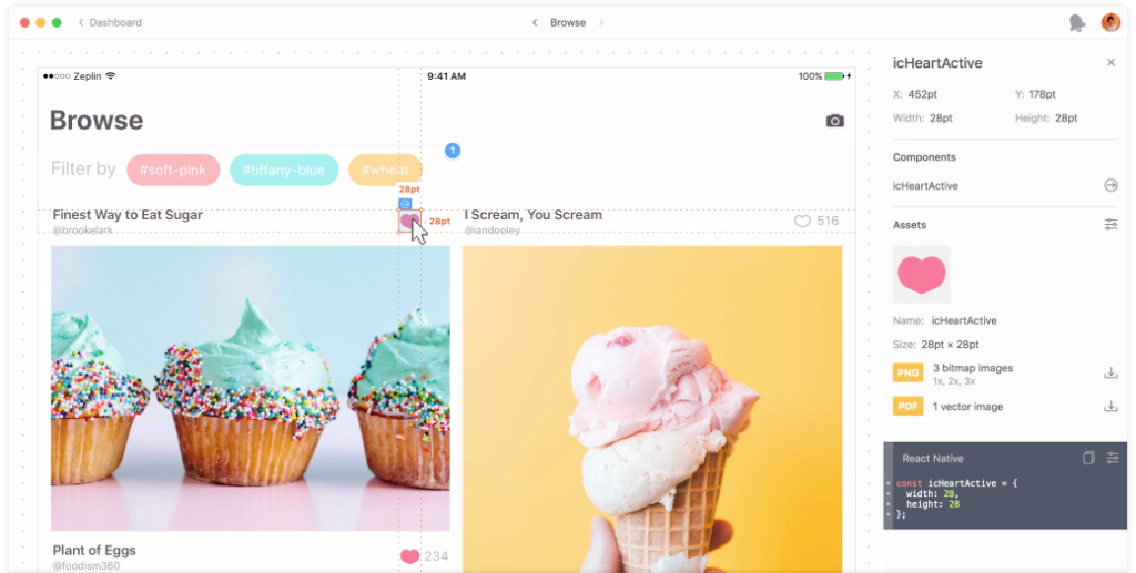
The design handoff usually happens after the design team has a finished product, the design team sends the prototypes to a design handoff tool. The developer then inspects the finished design, layer-by-layer. Design handoff tools also translate each layer into code, so the developer can use those codes as the basis for developing the app or website. Along this process, if the designers need to fix any issues or make any changes, they can simply update the design to a new version in the handoff tool so the developer can get their hands on it simultaneously.
Zeplin
This process used to be very meticulous back in the early days of web design. Luckily, with tools like Zeplin, the hand-off process is much less painful between design and development. Zeplin is a collaboration tool for UI designers and front end developers. It allows designers to upload their wireframes or visual designs straight from Sketch and add them to project folders in Zeplin. So developers can take it over with all the information they need at a glimpse.
However, as a designer, with the use of these handoff tools, there are still things we can pay attention to make the handoff process even smoother, saving time for everyone.
Style Guide
Starting with the basics – style guide. Hopefully, by now, everyone is aware of how important style guides are to ensure the consistency of your design. They not only will improve the designer-developer collaboration but will also make your product more consistent, especially as you scale. Zeplin generates style guides automatically after you upload the design so designers don’t have to spend time making a visual deliverable for a style guide. Here I will only mention things worth keeping an eye on while designing to make the handoff in Zeplin more organized.
Color Palette
Pay attention to the colors you are using. First of all, set a color palette or use the existing brand core color palette and keep it consistent throughout the whole design. Second, make sure you specify the shades of grey using for different purposes. Grey can be a tricky color, you can easily slip and use a different shade of grey without noticing, hence, pay attention so your developers don’t end up with a style guide with ten different shades of grey.
Iconography
In terms of iconography, make sure all icons of a type are the same size. One thing you can do with this is to make all the icons in squares of the same size with no extra space around. Position-wise, the edges of your icons should always end up on full pixels. Pay attention especially when you are using the Center-aligned button, if your design tool is not set to fit full pixel, it’s very likely you will end up with half-pixel, which will make coding the exact design difficult for developers. In Sketch, the simplest way to avoid this is to turn on the pixel fitting option.
Prepare the Design Files
Time to pass your design on to developers to start building it. Really all you need to do here with Zeplin is to upload your sketch or xd file to Zeplin and share the link with your developer. To better prepare the design files and make the whole handoff smoother, here are some of the things you can do. First, name everything clearly with hierarchy, so instead of rectangle 1-2-3, make them button start-stop-end. Second, organize things into groups as well as get rid of unnecessary layers/groups. By doing so the developers are not confused. Last but not least, make sure you make exportable in sketch so your developer can directly download the asset however they want within Zeplin.
Here is how to use Zeplin.
Based on our theoretical section we identified what the greatest weaknesses on a handoff from designer to developer lie in the time used to translate for the developer. So here is how you can shorten the time of handoff by paying attention to these details.
6 biggest mistakes for developer handoff:
- Naming of layers
- Half Pixels
- Icon
- Colors
- Box size of text
- Exportable
Naming of Layers
When creating a new design it is important to have a good hierarchy in layers and name everything accordingly. Not only is this important for the designer themselves but also for everybody else who will be working with the designed document.
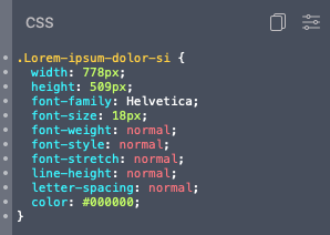
Currently the text box is named after the text within the box. This will show in the developer view as the title of the css element. 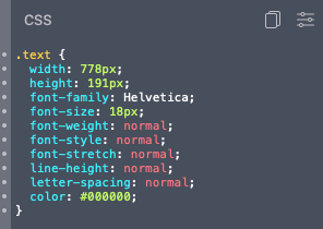
Instead we can name the layer to what this element represents (in this case text) and change the developers view to make more sense.
Half Pixels
Since Sketch is a vector drawing application, edges appear crisp—but that’s not how a raster asset would export. It is important to make sure that Sketch works with a pixel grid so that later on we can create pixel perfect exports.
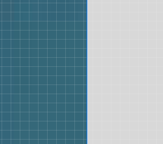
This element is vector based on does not snap to the pixel grid. 
This element snaps to the pixel grid.

Icons
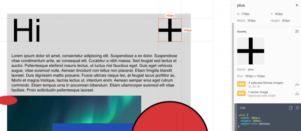
Icons can be quickly created by adding a few basic elements together. Take a plus sign for example: you can create it with two lines. When exporting for the developer this icon will appear as two separate elements. In order for the symbol to appear as one single element we need to create an icon.

Colors
When adding colors to the design document and try out new and different things you might end up with multiple colors that differ ever so slightly. It is important to create a design document with a set color palette.
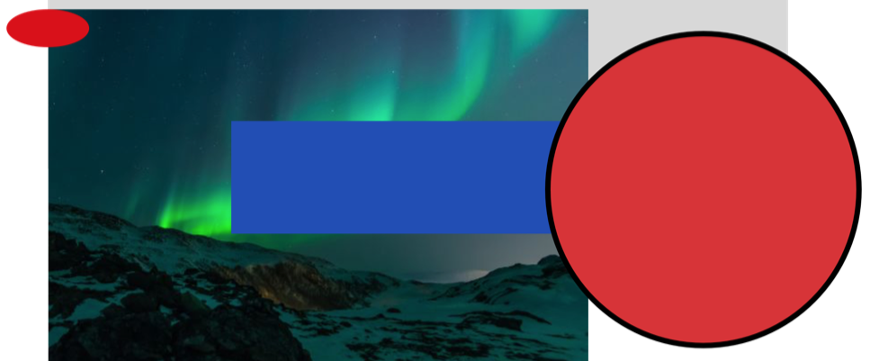
The two red elements look like they have the same red color. 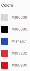
The developer can see two different reds colors.
Box Size of Text
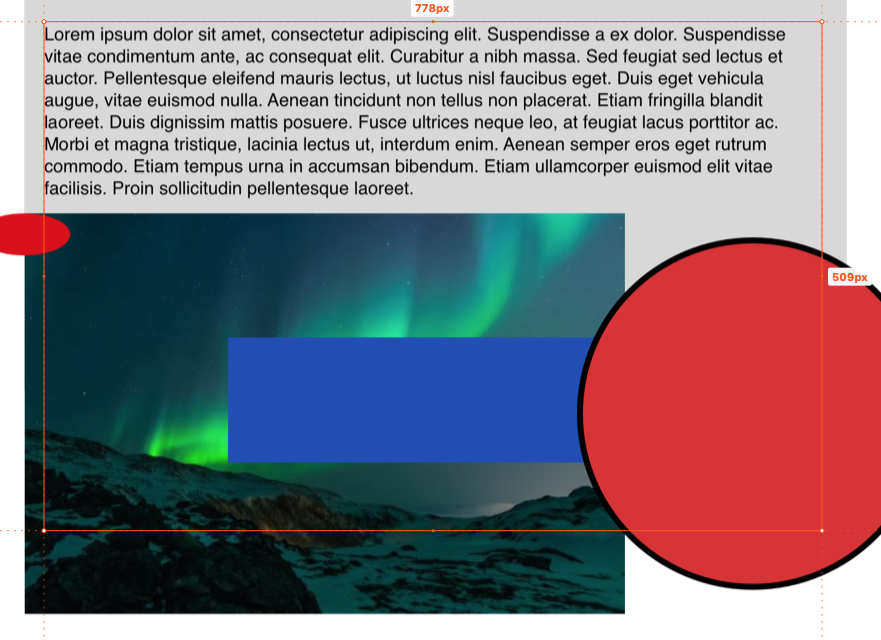
Text boxes can become much bigger than the text within them. This does not concert the visuals but once exported the text box will appear much bigger than needed for the developer.

Exportable
In order to make sure the developer can have access to the assets used in the design we simply need to make sure that the assets are made exportable in Sketch and Zeplin will recognize those elements as being exportable for the developer.
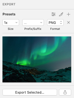
By making the asset exportable in Sketch, Zeplin will recognize that the asset can be downloaded. 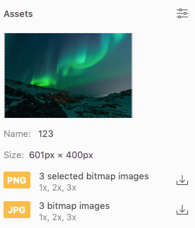
The developer will be able to view and download the asset.
Handoff Across Programs
Lastly, we want to mention that Zeplin also works on Sketch, Photoshop, XD and Figma. InVision, Figma, and Adobe XD, despite being focused on screen design and interactive prototyping, also have design handoff features.
Designs synced from any of these tools can be translated into CSS, Android, Swift, Objective-C or React Native code, which includes the styles of each layer and any assets that have been marked as exportable.
Conclusion
Zeplin allows the designer to create a much faster and more efficient developer handoff. Essentially, by creating a well organized design document it is possible to easily create a document for developers to work with. Our job as designers is not only to design the product but to also create work that can be easily implemented by anybody later.
