This usability test evaluated the Pratt Library website to assess the design overhaul that occurred last semester. Our client was Nicholas Dease, a librarian at Pratt Library, as well as the head of technology and website design and implementation. Particular emphasis was put on attributes that were requested by the client (attributes described below). These were areas that earlier analysis and user comments had drawn scrutiny and further research and understanding was needed. This was explicitly expressed by the client, as he wanted to assess these features to see if changes, and if so, what changes were required to increase the website usability. In a group of three, we worked alongside Nick to get a better sense of design alterations for the next iteration of the website. Most aspects of the project were completed by the team together, however, my particular focus was last three recommendations and findings, as well as proposed mockups for all recommendations. I also designed and compiled the report layout.
During the process, our group designed user tasks to address the four major concerns of the website. These sections included search bar architecture, “Ask a Librarian” widget interaction, user account icon visibility, and in library book mapping feature. I helped to design these questions, requesting users find particular areas within the site that accessed features listed before. The least straight forward was designing the widget question, as we did not want to explicitly use the same phrasing as the widget title, however, did want to the user to be put in a situation they needed assistance finding a particular material. This was accomplished by putting the user into a hypothetical situations were they could not discover particular information, and then ask, “what would be your next move?” This allowed us to indirectly move the user towards the “Ask a Librarian” widget, however, not directly use that language.
I interviewed multiple participants during the user test. Our group consisted of six participants, all undergraduate Pratt students. They were recruited from the Pratt Listserv, however, one was found by approaching them in-person in the library on the day of testing. There was a wide array of experience on the site, which was not exactly as designed, but we had some difficulty with users showing up to their test times. We wanted to have only novice users, however, ended up with four of the six as novices. The biggest learning moment in this regard for me was the difficulty during the in-person interview not to lead the user or bias the test in anyway. Phrasing interview commentary in an objective manner is difficult and further examination of this will occur when completing my next usability test. Staying as close to the written script is particularly important during these moments, so not to instill this form of bias between various users.
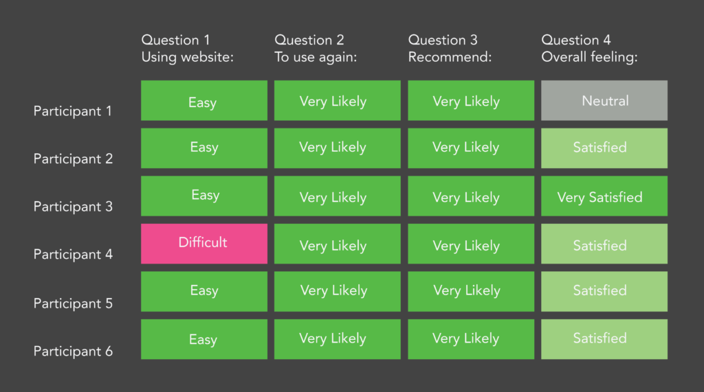
For the findings and recommendations, we proposed four design alterations to the current website. Overall, the responses (see Figure 1) were extremely positive, and we believe our recommendations will only aid in this great established user experience. Four of the six participants, the users that had experience with the old website, all agreed the new version was greatly superior to the former.
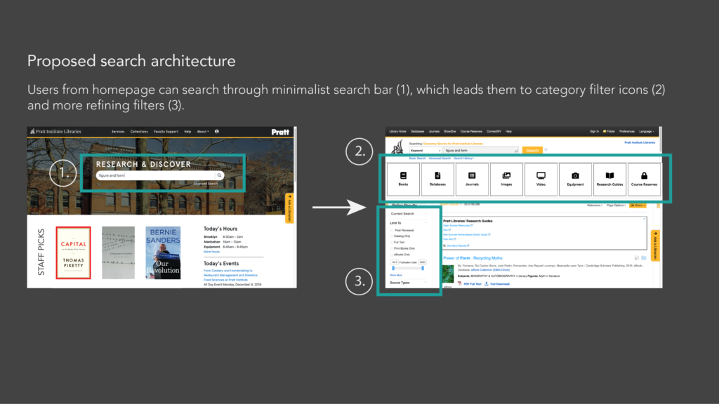
We had four major findings and recommendations, all within the purview of our client’s needs and interests. The major design change (see Figure 2) dealt with search bar architecture, and more specifically, how the filter system works. We changed the order in which these filters are used and applied, and also made the primary search bar work in a similar fashion to typical search functions like Google, etc.
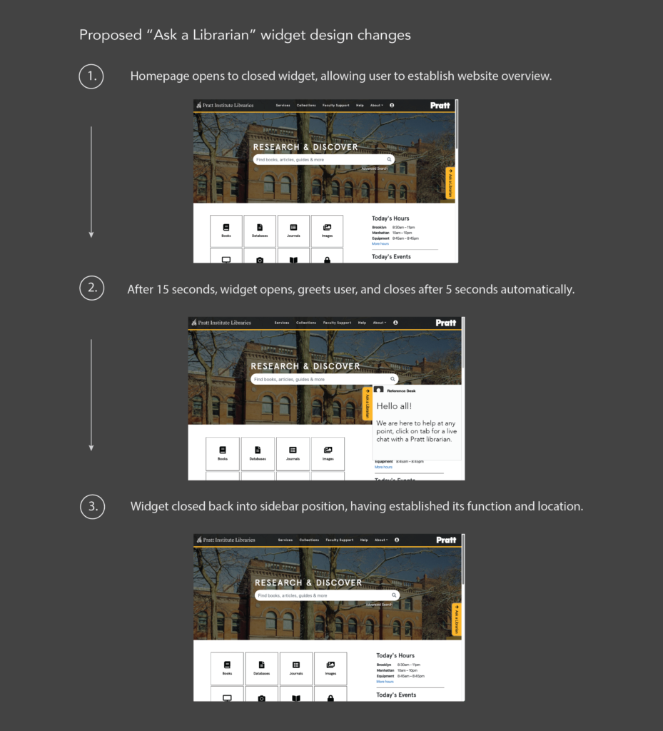
The following three recommendations were more subtle, and also within the control of the Library web development team itself. These included the “Ask a Librarian” widget (see Figure 3), in which the interaction animation was altered. This allows users to see and process the existence of this resource, but address concerns that it cluttered the homepage and was a bit annoying for users to consistently require closing.
The account icon was moved (see Figure 4) to increase visibility and to rely on understood conventions of sign-in page link location. Using cultural standards and increasing the size, the experience is designed to be easier for users to use and find.
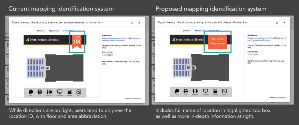
The final recommendation deals with the identification system notation within the “Map it” feature when finding the physical location of a book in the library. While there was concern about user’s understanding of plan floor diagrams, this turned out to not be a concern, as all participant’s expressed understanding of these diagrams. However, what did confuse users, was the numerical and number identification system of library areas (see Figure 5). This was addressed by using the full word to describe the section in the library, instead of the identification system.
More information regarding these changes can be found in our full report, as well as our presentation slides. Greater detail regarding observing the finding, and the design recommendation can be found in these documents.
During the course of our study, it became quite apparent how satisfied users were with the website overhaul that took place this year. The users’ positive comments and study question responses are to the credit of the design choices and changes that have already occurred. Our proposed design alterations will only aid in this. Tweaking the addressed issues above will continue to streamline this website experience. The client was very happy with our findings and recommendations, and will implement many of these in the coming months. Changes that he has full control over will immediately be taken care of, and changes that require more bureaucratic consensus will use this report for reference in those discussions.
The area that requires continued research is the search bar architecture. Not only is this a particularly design intensive area with users having varied responses, it overlaps the control of website between the library and the various database venders it deals with. Changes are not as simple because they are not fully internal, and require other organizations to make alterations that can then be embedded within the Pratt Library website. This complex web of servers and designs is a major takeaway of this project, recognizing the intricacies of website usability testing especially with websites that do not have one institution in charge.
We believe our findings and recommendations will continue to improve the Pratt Library website. It is an incredibly important portal for students, staff, and faculty of the Pratt community. Our group wants to especially thank Nicholas Drease, not only for his dedicated and continued work creating and designing the website, but for all his help and direction through this testing process.