
About AdBlock
AdBlock is an open source browser extension for blocking intrusive or distracting ads on websites. It is inconspicuous in the browsing experience but has a powerful impact, with the ability to block banner ads, pop-ups, and video ads.
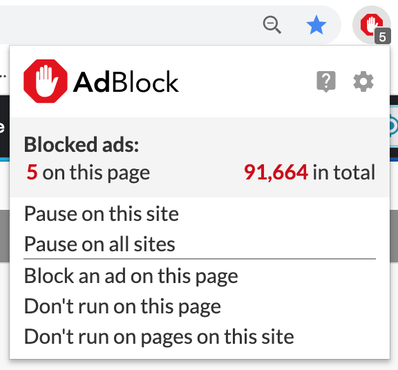
This extension has been my ad blocker of choice for close to a decade because of its simple and effective interface. Given my experience with AdBlock, I thought it would make an excellent subject of critique using Don Norman’s principles of strong design from The Design of Everyday Things.
Your Web-Browsing Companion
AdBlock’s algorithms block most intrusive ads by default one browses the web, but occasionally, users may encounter unfiltered ads they wish to block.
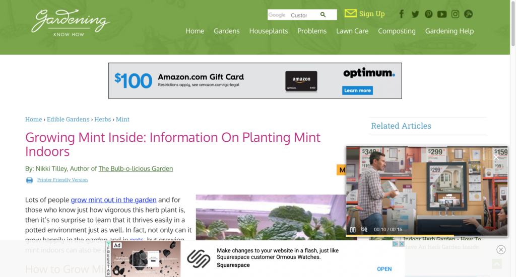
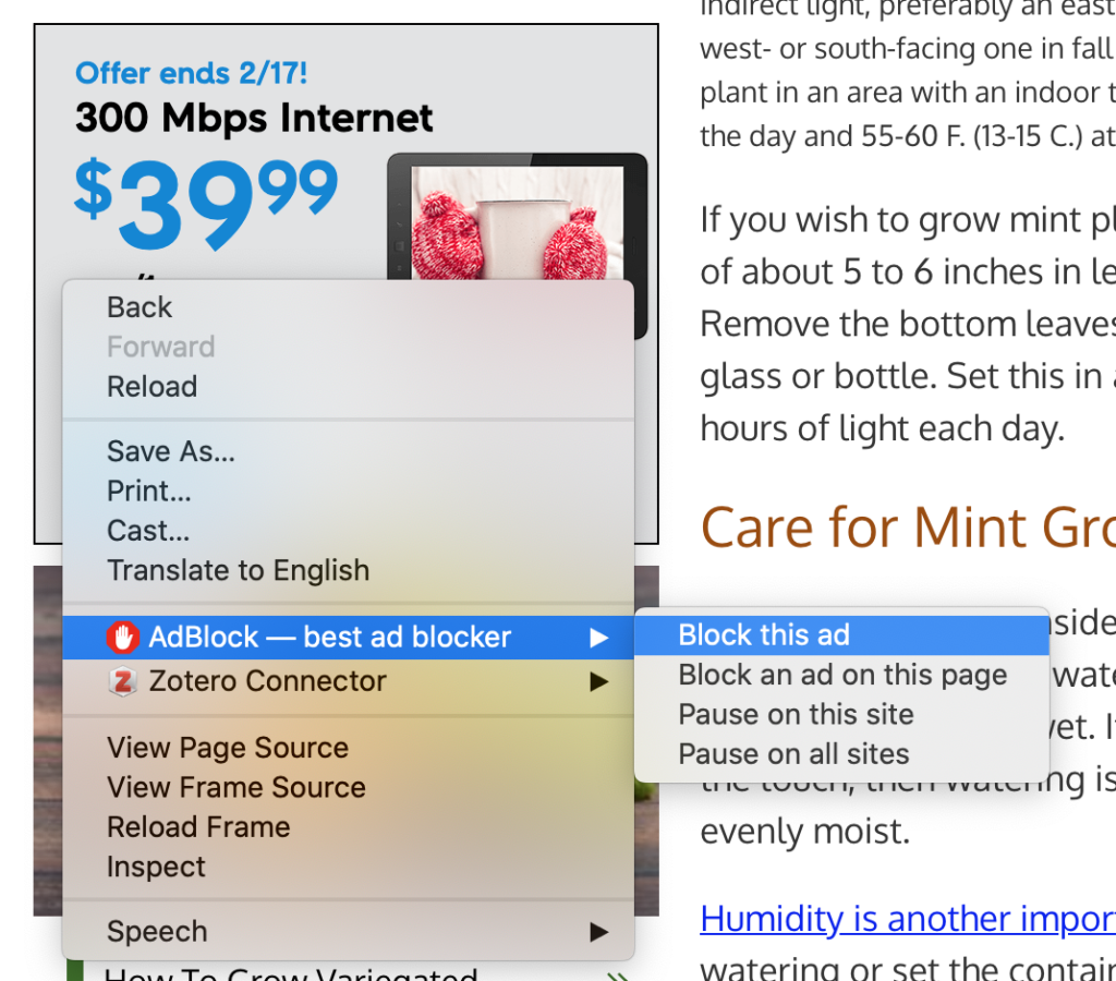
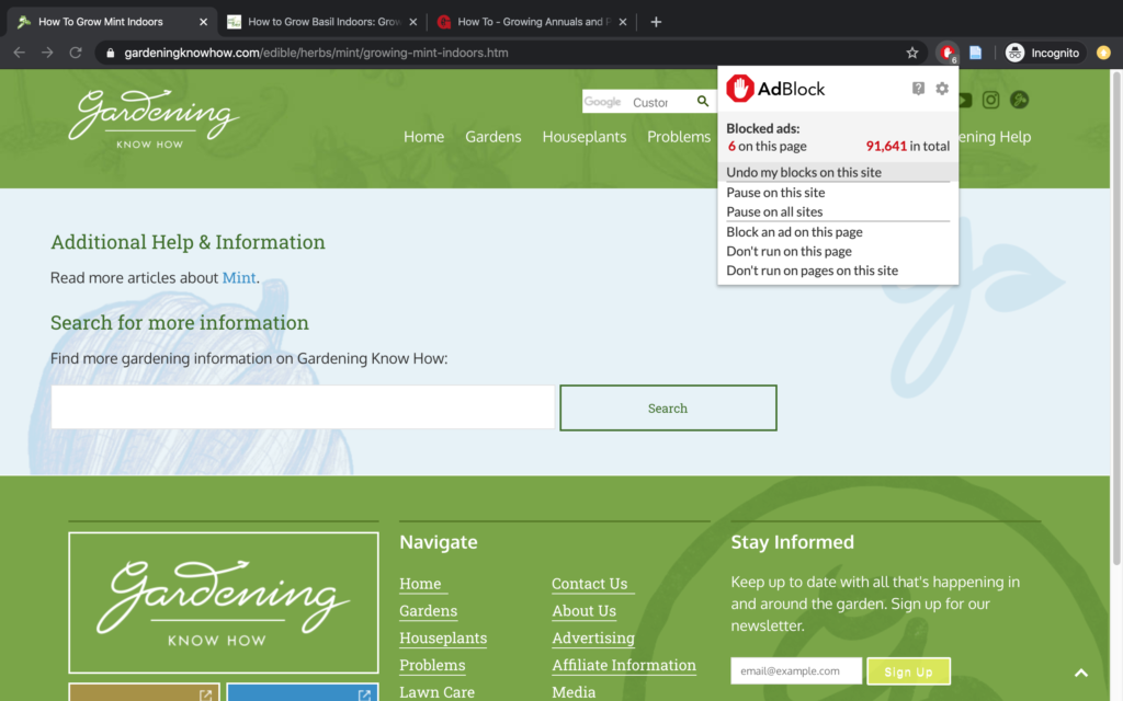
I’d like to block the banner ad on this page, so I will right click on the page, or on the ad itself, and click “Block this ad” or “Block an ad on this page.”
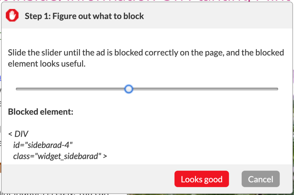
Then, I am prompted to move a slider from left to right until ads on the page are blocked to my satisfaction. Simple and effective!
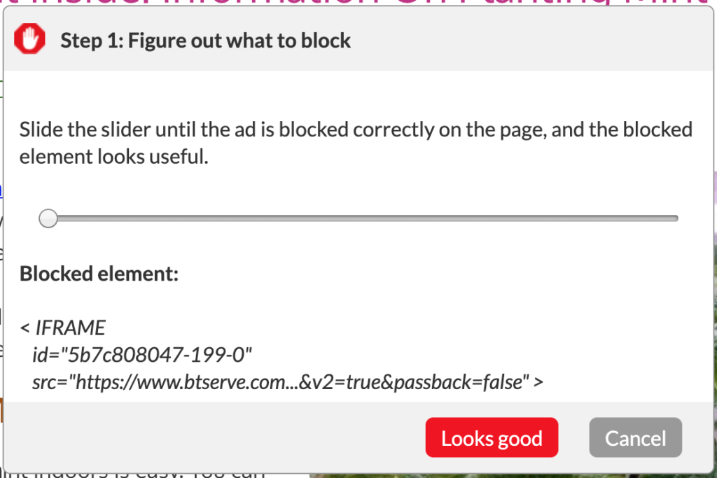
This tool’s effectiveness is due to its simplicity and its use of a strong conceptual model, which guides the user’s input. Those familiar with web design will notice that as we move the slider from left to right, the filter we are about to apply is made more and more general so as to encompass greater and greater nested elements on the webpage.
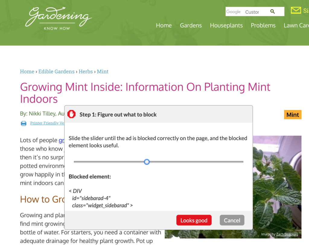
The idea is that a user will stop the slider as soon as the unwanted ad is hidden. A more advanced user’s curiosity might encourage her to push the filter further in order to select particular page elements or containers, such as “widget_sidebarad,” which the developers of this page have created to house advertisements.
Designed with Helpful Constraints
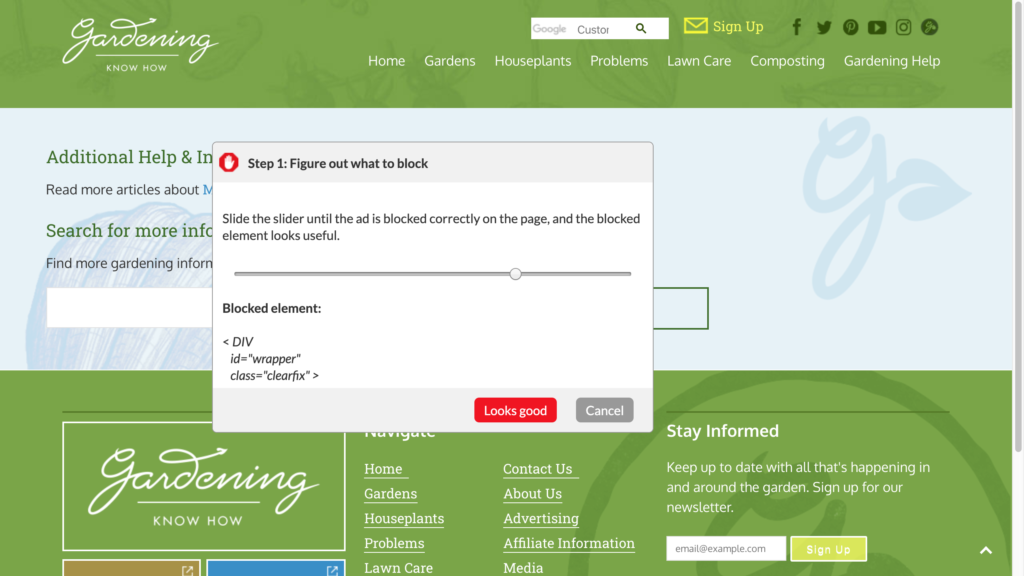
AdBlock’s generosity with its ad filters may lead some users to push it a little too far. Here’s what happens when I apply a filter that is too broad for the page I am viewing. By accident, I have blocked some containers with the content that I came to this page to view!
This mistake is purely for the sake of demonstration, as it would actually be fairly hard to achieve in a natural user environment. AdBlock makes use of constraints and feedback to prevent users from making errors. In my example, in which I pushed the slider too far to the right and blocked more web content than I intended, my mistake was flagged to me early on. AdBlock’s filter window shows a live view of the ad filters at work. By employing the conceptual model of the filter, AdBlock’s designers prevent what Norman would call a knowledge-based mistake, in which a user’s insufficient knowledge leads them to fail a task.
If I decide to move past this stage and save my overactive ad filter, I am met with a message that confirms that this is the degree of filtering that I want.
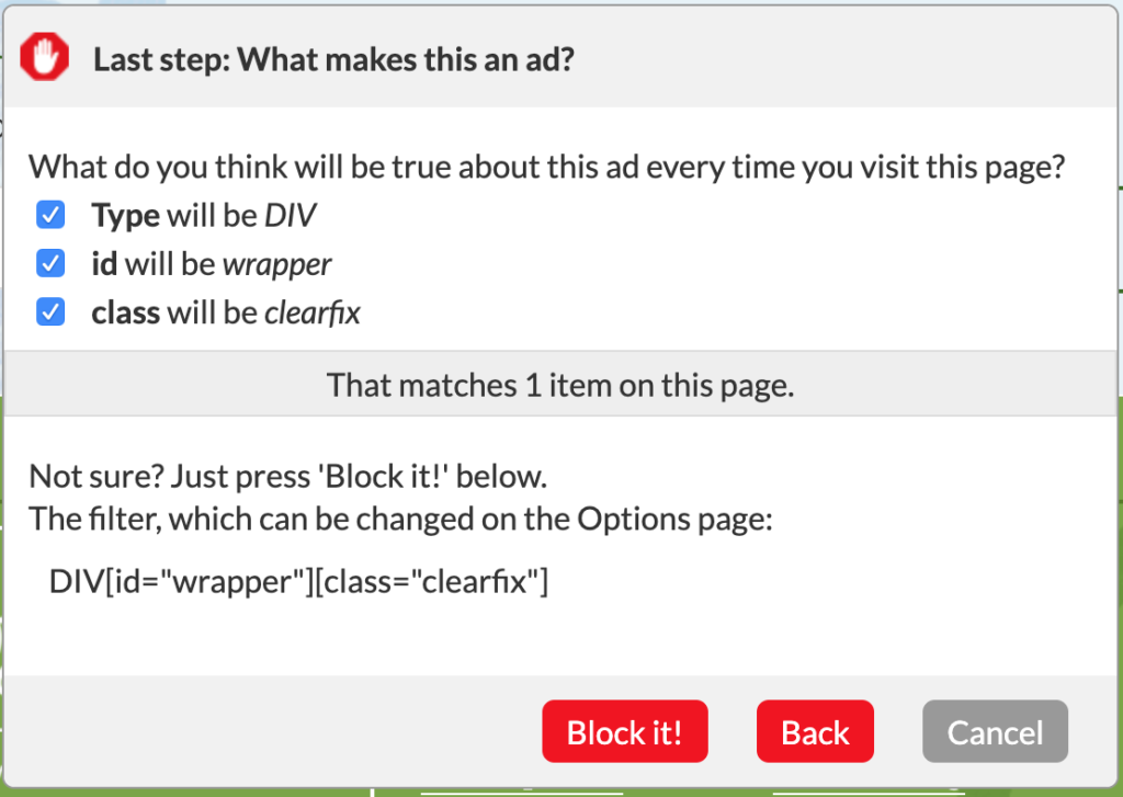
Notice that both the “Block It!” and “Back” buttons are given prominence here. These buttons, with their bold red color, are in strong contrast to the “Cancel” button. They are lock-in and lock-out constraints, respectively. These constraints are meant to lock a user into confirming a particular choice or prevent them from making a potentially destructive choice. Recall Norman’s “Save/Don’t Save” Microsoft Word example from The Design of Everyday Things, in which a lock-in constraint prevents an inattentive user from losing their work.
While considerate, having both options is overkill. To improve this aspect, I suggest choosing one option or the other to highlight, rather than two out of three. This raises an opportunity for user research on scenarios that AdBlock users frequently encounter. Is there a greater need for locking users into blocking page elements, or is it more important to present a signifier for modifying the current choice?
Conclusion
AdBlock remains a top-ranking ad blocking browser extension for good reason. It simply and effectively communicates a good conceptual model to the user. Through the use of constraints and feedback, it guides user behavior and facilitates recognizing and undoing errors. Not only is it effective at delivering on the promise of its namesake, but it provides a pleasurable user experience according to the principles outlined in Don Norman’s Design of Everyday Things.