Apple Music is a subscription-based music streaming service that provides user with access to an endless amounts of albums, artist, playlist, etc. It includes a great amount of features such as following friends to see what they’re listening to, lyrics, and off-line streaming.
Search Page
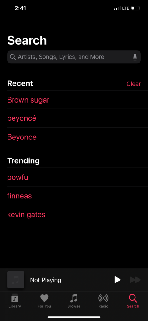
Upon opening of the Apple Music app, the navigation bar is placed at the bottom. The visibility of the navigation bar provides users with the main five features that are available. Along with an icon, labeling is also provided to clearly distinguish each feature and its capabilities. To discover new music, due to knowledge in the world, the user would more than likely look for a magnifying glass in order to execute their goal. To the very right of the navigation bar, there is magnifying glass icon accompanied by the word “Search”, which is a clear signifier that this is the route to be taken to discover new music. Once pressing on the “Search” icon, the user is taken to the search page and the icon turns red, which is great feedback to notify the user of what action has been done. The search bar being located at the top of page is another example of good visibility because it provides reassurance to the user, letting them know they are in the right direction of accomplishing their goal.
Discovering Music
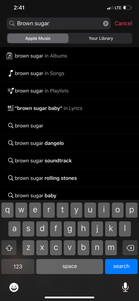
The conceptual model can be applied to the action of adding songs to the user’s library. Consisting of affordances, constraints, and mappings, the conceptual model is the mental stimulation of how users operate the application. As previously stated, once on the search page the search bar is at the top of the page, making it visible to the user. The word “Search” in bold white font against the black background, above the search bar, along with the magnifying glass inside of it, signifies to the user this is where you search. Once pressing on the search bar, the bar shifts to the top of the screen revealing the keyboard, the background fades out, and a red blinking cursor appears in the bar. All these signifiers provide the user with an affordance that this is where they are able to type in the artist/song/genre they are searching for. Also, when all these signifiers occur, a filter option is available between Apple Music & Your Library. This a constraint that only allows users to search between the overall Apple Music database or their own personal library of songs that they have previously added. Because of the action of adding songs, the user will filter it to Apple Music. They will know they have decide that filter because it will turn grey, while Your Library will remain black. Once that is done, are able to type in for what they are looking for and press the search button on the keyboard, which will turn blue while the user is typing the necessary information into the search bar.
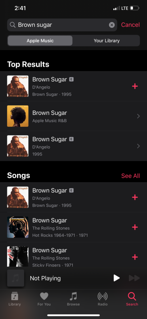
Once searching music has been done, feedback will be provided to the user by a list of results loading, organized within categories that they apply to. Mapping can now be seen as users navigate through all the results, either by scrolling up and down or pressing on the icon available to the far right of each results, which lead to further results.
Playing Music/Adding to Library
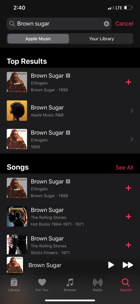
Artist/Music discoverability does not seem to be an issue within Apple Music. Once results are loaded from searching and user had decided on which result they want to further interact with, the next steps are pretty discoverable. If user decides to pick on a specific song directly, rather than the album or artist option, they can press directly on the song for it play. Another bar will appear above the navigation bar, which gives users the option to play/pause or skip to the next song as sound is produced through the speaker, providing feedback that the song is playing. A set of 4 dots will also appear on the image provide with the song in results that signifies that the music is playing. Users have the option of adding the song directly from the loaded results with the visible red plus sign located to the right of the result. If users want more options, they are able to click on the signifying bar which will maximize the bar into a page.
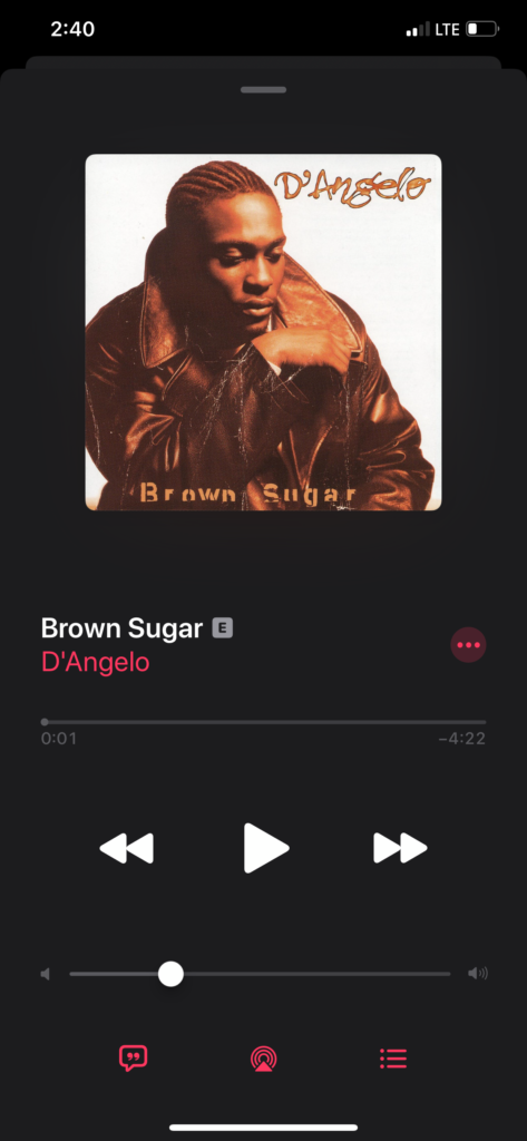
On the maximized page, users are provided with an option of affordances such as play/pause, rewind/forward, volume up/down, and much. There are a set of 3 dots to the right of the song title and 3 icons at the bottom that signify that there are more affordances. These features, either being red or white, against the black background provide visibility. The small gray line at the top of the maximized page signifies to user that it provides an action. Once pressed, the page is back minimized, once again a bar above the navigation bar.
Conclusion
Apple Music is a great example of an extremely understandable application. It applies Norman’s design principles appropriately, mastering user-centered design, providing users with a more than pleasant user experience.
