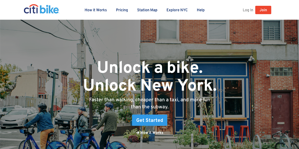
Citi Bike is a New York City public bike sharing program that serves the boroughs of Queens, Manhattan, and Brooklyn along with Jersey City in New Jersey. According to its website, it is the largest bike share program in the nation and is a “fun, efficient, and affordable” transportation alternative. Through its app, available on both iPhone and Android, users can purchase passes, get directions, and view a map of stations.
Home Page
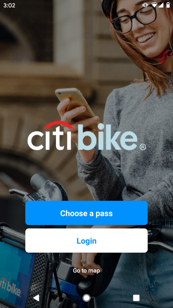
When users first install the Citi Bike app, they are greeted with an image and only three options: ‘Choose a pass,’ ‘Login,’ and ‘Go to map.’ Presenting only three options is a constraint on users, but this constraint simplifies the process as users select only from the most necessary functions: purchase a pass, access account, or view map.
Despite the simplified process, the home page still presents a lack of discoverability in informing users that they must already have an account or create an account, as one is necessary to purchase a pass. When users tap on either the ‘Choose a pass’ or ‘Log in’ option, it prompts them to enter their login information, assuming they already have accounts.
Solution:
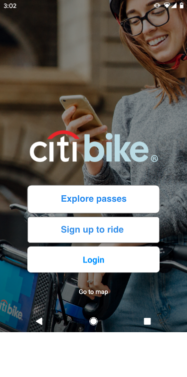
A solution to this lack of discoverability is to provide signifiers for users to create a new account in order to utilize the app, such as a button labeled ‘Sign up to ride.’ In addition, modifying the current ‘Choose a pass’ signifier to ‘Explore passes’ can still afford users to learn more about what kinds of passes are available for purchase.
Purchasing Passes
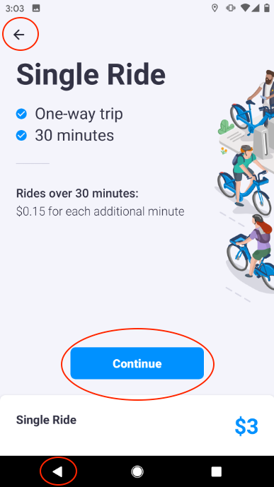
When users select a pass, the ‘Continue’ button is immediately discoverable as it is enclosed in a blue rectangular box, signifying where users should tap when ready to continue.
Mapping is also evident as the back arrow takes users to the previous page and aligns with Android’s current back arrow display configuration. In addition, knowledge in the world also guides users where to tap to go back.
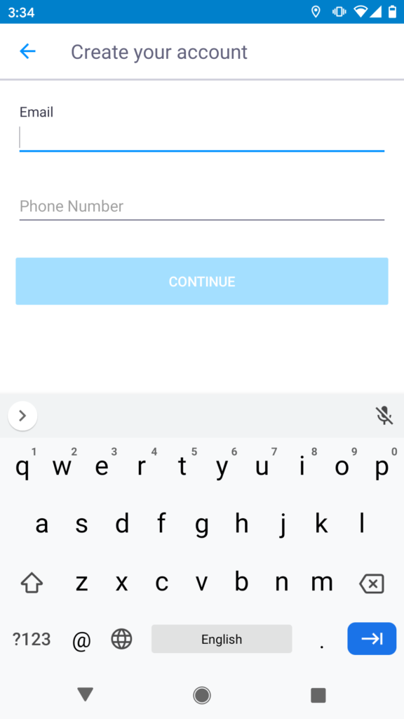
However, when users continue on to purchase, the next screen prompts you to create an account. There is no option to skip and a menu is also not available. Users are expecting to finalize their pass purchases but are met with an account creation page instead. This creates a constraint on users as they must have an account or create an account in order to purchase a pass, as the only other option is to go back to the previous page.
Solution:
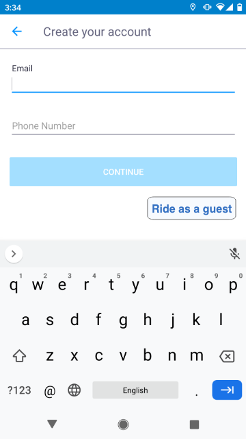
A solution to the constraint in purchasing passes is to create signifiers, such as ‘Skip’ or ‘Ride as a guest,’ to afford users other options. This will allow for a more seamless pass purchase experience and bridge the gulf of execution.
Map
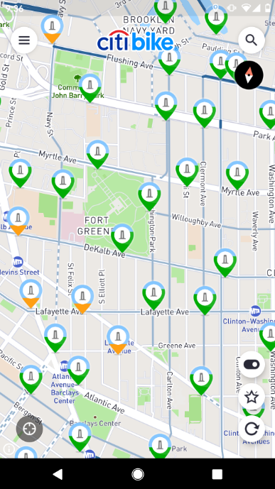
When users tap on the ‘Go to map’ option, they are immediately taken to a map displaying their current location and nearby stations.

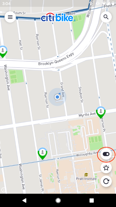
The toggle switch provides immediate feedback when users go from dock mode to bike mode, as the switch changes from dark to light and users can see the station icons changing from bike to dock.


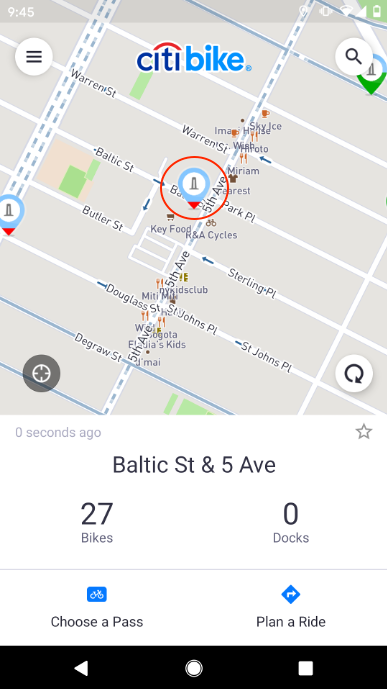
While the toggle switch successfully informed users of which mode they were in, the colors provided for each bike/docking station had a lack of signifiers to help determine what each color represented. It is only when users tap on a specific station that they see the data available, such as the number of bikes or empty docks. Although cultural conventions can help users associate red with no availability and green with availability, the color orange presents a constraint as it is a color that is not as conventionally used and can have different meanings according to the user.
Solution:
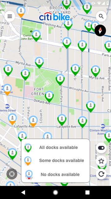
A solution to the lack of signifiers in the map would be to provide signifiers in the form of a key, clearly defining what each color means.