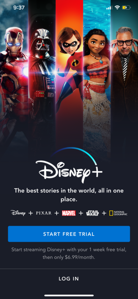
DisneyPlus is a new streaming service that’s only 2-3 months old and their target audience are users who love all things Disney. Giving Disney users a platform where they can indulge themselves in a world where users can watch anything that Disney’s touch ever created. But not only do Disney viewers get to enjoy this app. You also have Star Wars, National Geographic, Marvel, Pixar, and The Simpsons franchise all on one app. The layout of this app is simple and minimal and easy of users to use to explore content.
Login
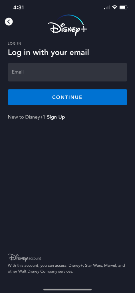
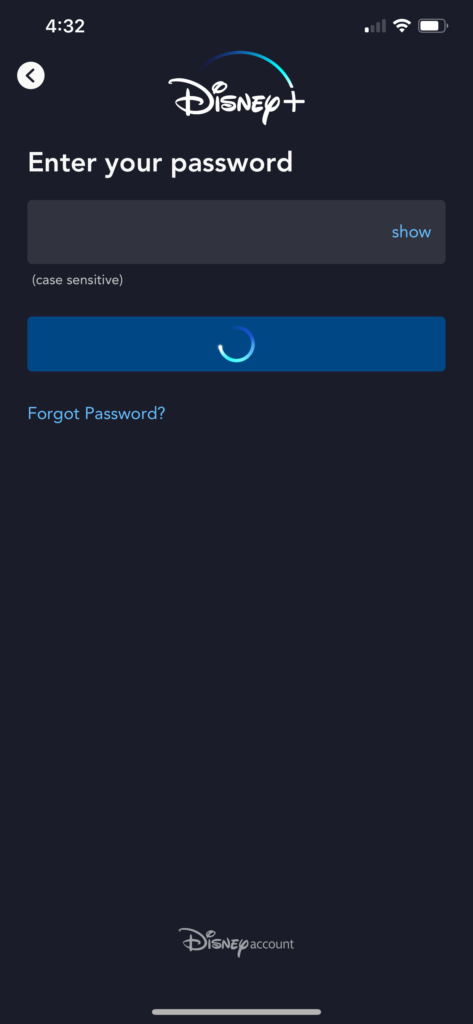
When opening the DisneyPlus application the application login in page has a standard format. The login page represents good communication indicating what actions are possible, what is happening, and what is about to happen. The login is process is graceful and smooth, and the feedback from the interaction of the login button communicates the result of an action (figure 3) light blue circle rotates.
Discovering videos
Once you’ve logged in successfully in the app users can go through several categories of videos that were picked for users. Such as Originals, Hit Movies, Trending, Disney Channel Favorites, etc. on the home page the bottom navigation bar has 4 main signifiers for users to interact with. Allowing the user to easily navigate through the app.
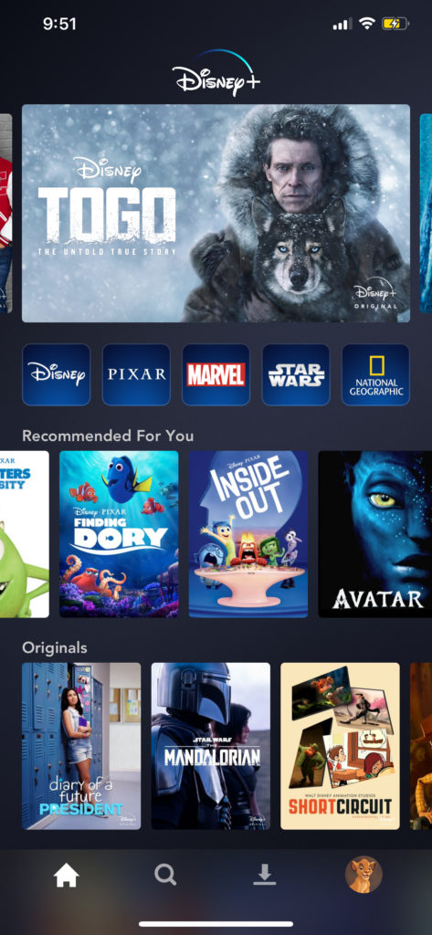
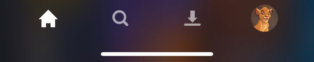
The navigation bar located at the bottom of the screen signifies the 4 major mappings you can use throughout the app. The icons (figure 5) give the users a clear understanding what each icon would bring you to and it reflects knowledge in the world. By looking at the icons users can use the knowledge of that in their heads to already know what each one signifies. Memory is knowledge in the head.
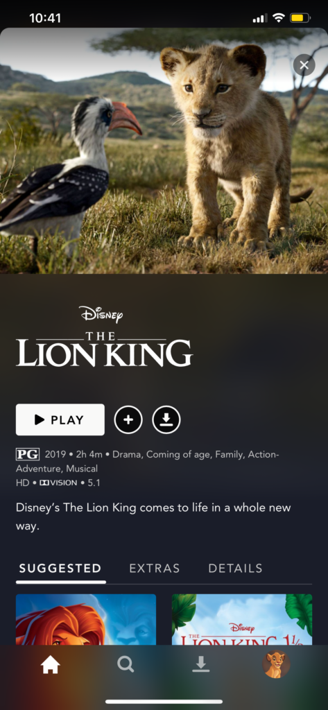
When selecting a movie, you have the choices of either play, add to watch list, or download. The icons below the image are signifiers that tells the user where they need to tap. Users don’t have any other choices to tap from, if trying to watch the movie. Signifiers are only located at the bottom of the image so users know exactly where to go to watch the movie.
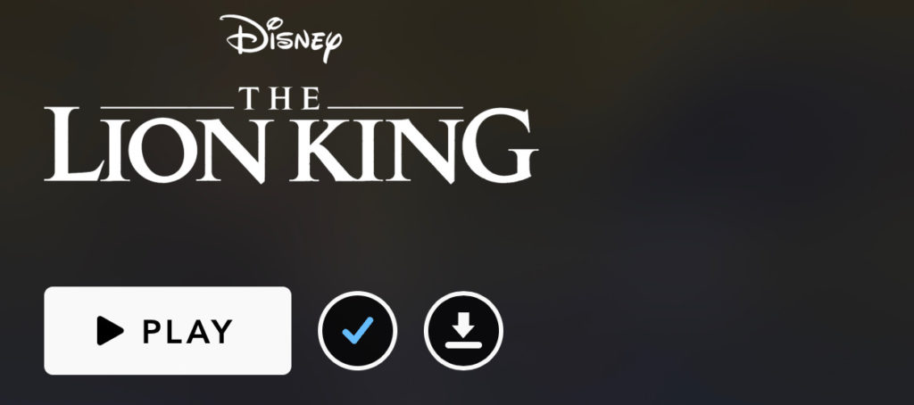
When users would like to add a movie to their watch list they’ll tap the plus icon and the icon would rapidly switch over to a check icon (√) allow changing color for verification signifying to the user that the movie has been added to their watch list. This action is good feedback to the user because it signifies that the action of adding amovie to your watchlist was complete.
Viewing a Movie
While watching a film if the user would like to play or pause the film, users can simply just tap the screen and the pause/play/rewind/fast-forward will all appear. This indicates great discoverability because it’s possible to see what actions re possible during the state of watching a movie.
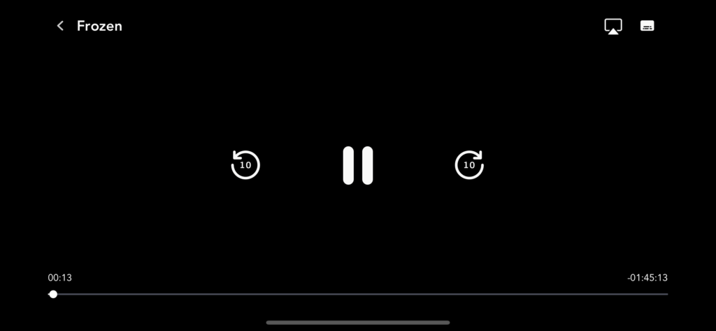
When tapping play and pause you don’t get a sound signifier but you do feel a signifier of vibration that indicates to the user that you’ve paused or resumed the movie.
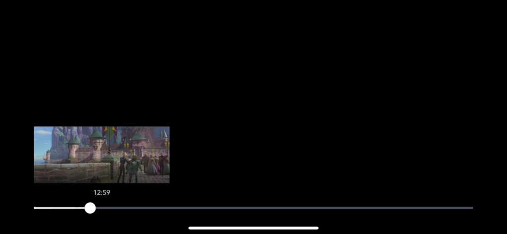
If the user would like to jump to a certain part of the movie they can do so through the duration timeline that offers affordance. The option of jump to a specific scene is given to the user, and while trying to find that scene the user is given a small box with an image for accuracy. In a way, I feel that this feature is both a signifier and affordance. Signifiers communicate where certain actions take place and affordance determines whether the actions are possible.
Conclusion
The DisneyPlus app, in my opinion is a well design video streaming app for users. Simply because the user experience is simple and easy to use. The app doesn’t make it hard for users to use and I think that its simply because DisneyPlus UX designers catered to the majority of children.