Background
I use hopper from time to time because it can predict prices to help me book flights and hotels at the right time. The core function of the product is price prediction and it is helpful indeed. The target users are the ones sensitive to prices and it’s likely that their departure and return dates are flexible. (I did some related user research before.) However, as hopper provides price prediction service, it does not support imprecise date searching, which is not so convenient.
Homepage
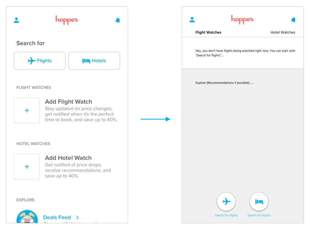
The good point of the homepage is concise without ads. I can tell that the designers at hopper try to follow Norman’s minimalist design principle. However, at first glance I can’t tell what’s the focus point of the homepage: whether hopper tends to highlight search function or adding more hotel/flight watches? In addition, the relationship between “Search for” and “Add Flight/Hotel Watch” is also unclear which does not meet the basic design principle pf discoverbility. (What’s the difference between taping “search for flights” and the plus button besides “Add Flight Watch”? What will happen when tapping the plus button? Users can be confused.)
As for the layout of the homepage, I believe it’s unsustainable. What if there are too many flights being watched in the future? Then users can’t see the hotels being watched when they open the App. They need to swipe up and down to get the whole information. In Norman’s words, the structure is not flexible and efficient of use.
Thus, I suggest changing “search for flights” and “search for hotels” buttons which are fixed now to two floating buttons on the bottom. Change the structure of the homepage as below. “Flight Watches” and “Hotel Watches” are put as a top bar to make it clearer for users to know what to expect in this page.
Search for flights
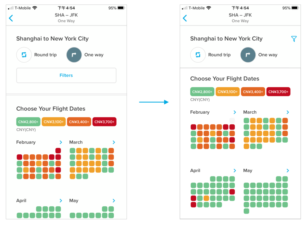
After inputting the start and end places, users can get the price range for the flight date, which is the biggest selling point of the product. The data virtualization here is also clear and straightforward: red represents highest price and green represents lowest, which match users’ mental model. However, the filter button is too large, and the place should be reconsidered. Most “filter” function in other Apps is represented by a small filter icon, which “matches the real world”.
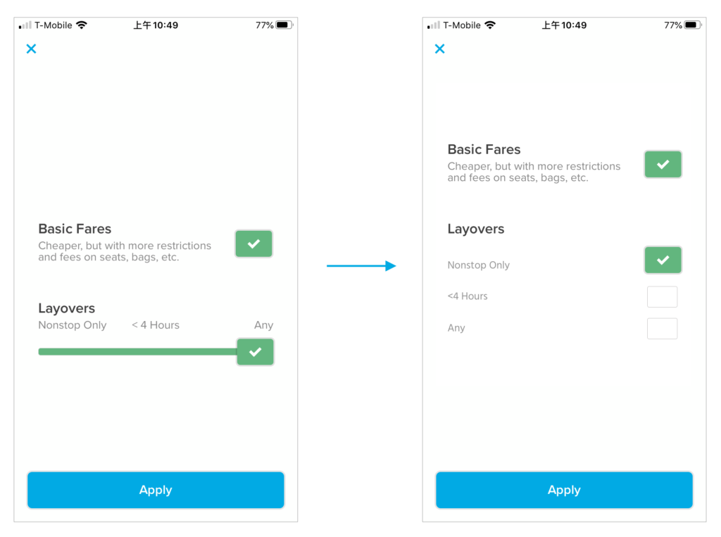
As for the detailed filter page, there are some questions:
- If there are only two items to select, why users need to get into a second layer? More layers will do harm to users’ psychological burden.
- Are there any other items users care about but not in this filter page? As an expert user of travel-related products, I can think about the number of transfers, class, transfer AirPort, etc.
- The selection control for “Layovers” does not match users’ conceptional model. When you see a progress bar like this, you will believe it’s feasible to stop at anyplace on the bar. However, you can only stop at three points: “Nonstop Only”, “< 4 Hours” and “Any”. Thus, I suggest changing the control like this:
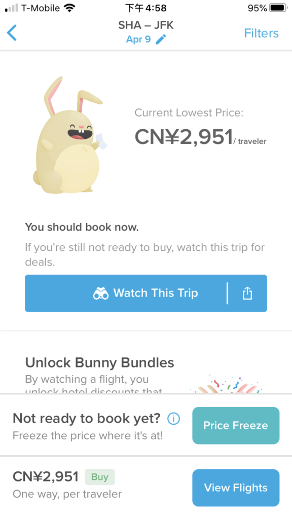
After users pick a date (why not support choosing a period of dates to watch?), the product will show directly what users need to do: whether book it now or wait for a better price, which is perfect. However, there are three buttons in this page, the picked green and blue are odd since they don’t meet the basic UI principle of “contrast”. Besides, the structure of the page and the words picked are challenges to users’ learnability. I believe most new users don’t understand the relationships between the three. Thus, I think it’s necessary to reconsider the priority of the three choices and based on the result, place them appropriately.
Search for hotels
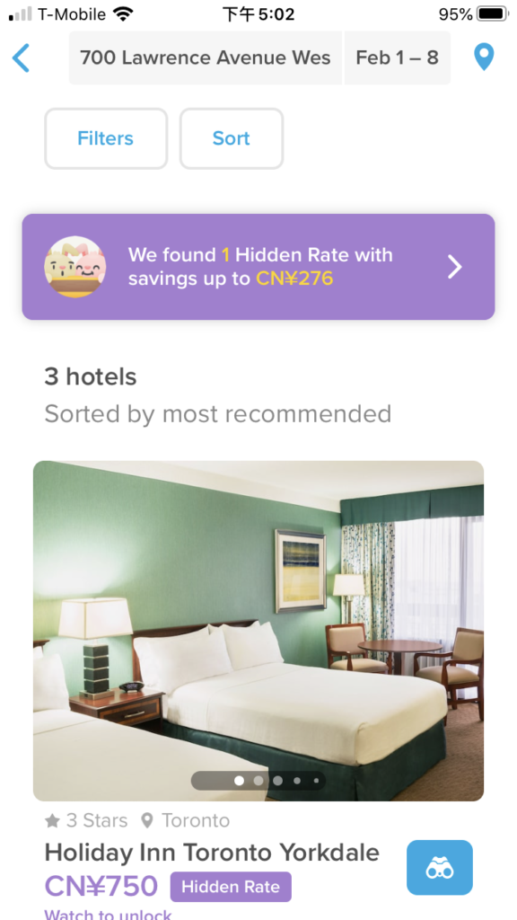
After inputting the hotel area and dates (still don’t support fuzzy search), hopper will show three most recommended results. I think it’s considerable for some users with choice difficulties. But as a whole, presenting only three items will do harm to “users control and freedom”. What if they want to see more? This limitation seems to lack enough data support considering no other Apps are doing the same thing.
Overall feeling of UI
I think the visual design of the product meets the basic design principle of consistency. The icons it uses, the fonts and sizes are in consistent. What’s interesting is that when users are waiting for the result, the small rabbit is jumping, which perfectly embodies the brand identity and is recognizable indeed.
As a whole, I think the product is successful in guaranteeing the usability of key features. At the functional level, I think it’s a little bit too minimalistic. Other frequently appeared features in other travel-related Apps should be considered here to meet users’ expectations. At the UI design level, I think the overall user flow makes sense though there is still some space to improve user experience.