Introduction
UX designers play an essential role in a team. We confront a situation that developers control the universe. How can we transition their developer-centered approach design to a user-centered approach? How can UX designers better communicate and express UX concepts? Games can teach us UX concepts that improve productivity, taking the UX concept – chunking as an example.
Starcraft Brood War

There is a player called BoxeR, who was the most celebrated player at Starcraft Brood War days. What makes BoxeR so great?
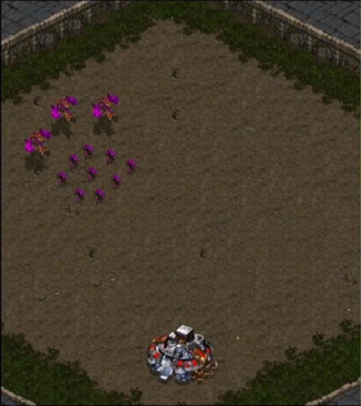
When a certain number of opponents was sent to his base, BoxeR knows what to press on his key bords to build just the exact number of units to defend that force within a couple of seconds, not even in a glance. That is important because if you built too many units, you could not put that amount of money into your economy, and if the economy can not grow fast and then, you would lose. So you have to build just the right number of units to defend. But you have to know those units and how many. BoxeR is very good at doing this. He can look at the number of units and know precisely how many units should be built to defend.
How could he do that?
To understand, Chabris & Simons did an experiment called the invisible gorilla, which helps explain what we see and what we don’t see. And it got us thinking that many other intuitive beliefs that we have about our own minds might be just as wrong.
There is a replication study- Memory for chess positions (featuring grandmaster Patrick Wolff) In this study, they give cards showing different chess positions on the card. They give them 30 seconds to understand chess positions, and they took the card back. Testers can not look at the card anymore. They have to resemble the board based on their memory. They have to remember where are those chess positions were. It might not surprise that Patrick Wolff, the grandmaster, can rapidly assess and recall the position in certain cases. However, there are conditions that Patrick Wolff’s performance is just as good as those novice users. How would that possible?
The reason why the grandmaster is better than those new players is that those cards are screenshots of real chess games, which stops at specific points in the real game and takes a snapshot.
In Equal performance conditions, there seems to be a lot more going on, and they contain much novelty. A random position makes no sense, has no patterns, so amateurs and GMs score the same. For example, you cannot use the same vicious at the same color. Or you cannot have two kings that are side by side. These are scenes that a player through all his games would never see in real games.
What makes Patrick Wolff so good at memorizing those cards is that he did not see them as individual pieces. He sees them as chunks. He does not see this configuration as specific pieces at the board. He has seen these pieces so many times, so his brain is memorizing it as one piece. He chunks those pieces as one unit. So when he is assembling those cards, he is not reassembling individual pieces but different chunks. He has been exposed to these familiar patterns and themes he has analyzed so many times.
The secret is chunking
This is the same case for BoxeR’s. When boxers see this configuration, units come to his base he has seen it so many times before, so he chunks the figures as a unit. He knows how many units to build against it. That’s the example of chunking and how we can understand it by video games.
However, if you sent enemies that not as a chunk of the game. For example, these are two different species, which took BoxeR much time to deal with this because he has never seen this before. He has to stop, and his brain has to work instead of just memorizing the pattern and reacting right away.
How does chunking apply to our tools when we redesign tools?
UX-Definition: In the field of user-experience design, ‘chunking’ usually refers to breaking up content into small, distinct units of information (or ‘chunks’), as opposed to presenting an undifferentiated mess of atomic information items.
We can apply it to the use of color -RED YELLOW AND BLUE

In the adobe suite, you can see two things in photoshop and illustrator. When you see the hex decimal represent colors.

00ff00, which means no red 100 percent green and no blue. However, Microsoft blend represents color as #FF00FF00, which have different length and order. So Adobe users cannot apply those chunks that they learned by adobe suit. So, in that case, Adobe users cannot apply my knowledge faster.
Insight:
Present data in a consistent order so that they can chunk them and do things faster. Imagine if people are saying the same data, but in different configurations, it is tough for them to chunk that. When working as a team, try always to present them in the same way so that they can build up the chunks that allowed them to be more productive because they react much faster.
Reference
Memory for chess positions (featuring grandmaster Patrick Wolff) from chess
https://www.gdcvault.com/play/1023953/Getting-Productivity-from-Play-How