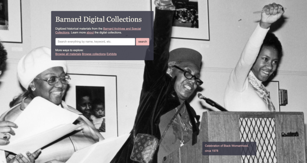
The goal for this project was to run an evaluation of the Barnard Digital Collections portal and analyze its potential usability issues. The Barnard Digital Collections portal was created in 2014 to serve as the online home for Barnard’s archival materials and special collections spanning the 19th, 20th, and 21st centuries. Our team was composed of Hiral Parekh, a Communications Design student, and Mayank Gupta, Mohammed Hosen, and myself, who are all Information Experience Design students at Pratt Institute.
At first blush, the Digital Collections portal didn’t appear to have any glaring usability issues. In our pre-test interview with the client, we learned that the Digital Collections team has been planning a major update to their site and was interested in incorporating recommendations from usability experts at this crucial juncture.

It was determined that typical users of the Barnard Digital Collections website include current Barnard College students, staff (typically in the areas of public relations and fundraising), and independent researchers. From our discussion, we gathered that the Barnard team was particularly interested in enhancing the user experience in these three areas: metadata and filters, ensuring that users have a sense of where they are and what materials they are viewing, and enhancing discoverability. With this in mind, the team took a close look at the interface and searching experience of the desktop browsing experience.
Designing the Test
We designed our user tasks to make use of the simple and advanced search features of the portal, given that a typical visitor’s objective is to search for and locate materials. We wanted at least one task to require a user to execute a broad search for materials (such as a document about a place or historical figure), and a narrower, more rigorous search to locate a specific document in the archives. In addition to text documents such as scrapbooks, letters, and yearbooks, we wanted our users to experience browsing through photographs and their details.
Below are the tasks we settled on for our user test.
- Find the digital exhibit on Student Publishing.
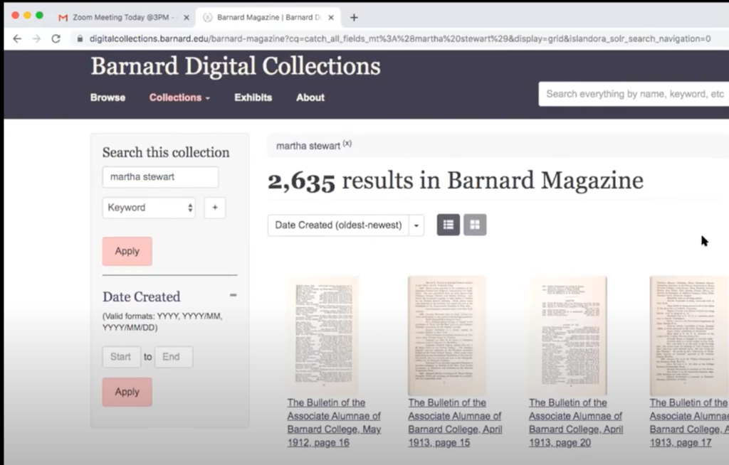
- Martha Stewart is a notable alumni from the class of 1964. Locate an article in the Barnard Alumnae magazine about her.
- Your research involves second-wave feminists’ concerns for women in higher education. Search for proposals on this subject matter in the digital collection.
- You are a historical researcher looking for images of greek games held at Barnard in 1966. Try finding the photos using Barnard’s digital collection.
To help set the scene for our test users, we came up with a scenario that might plausibly lead someone to the Barnard Digital Collections site and motivate them to search through the archives.
Imagine that you are an independent researcher looking for information on student life at Barnard College in the 1960s and ’70s. You have come to the Barnard Digital Collections portal to source materials from their archive.
Test User Recruitment
Our next step was to recruit 8-10 test users for this assessment. Given that this our test involved browsing through archival materials, we thought it would be best to screen for users that might already have experience in this field, either informally or professionally. With our client’s help, we compiled a mailing list of students and staff in the Barnard community as well as independent researchers and sent them a screener survey to gauge their interest and expertise in archival research.
Screener Questions:
Are you, or have you ever been a Barnard College student/faculty/staff?
    Yes
    No
What are some reasons you have used archival material? (check all that apply)
    Academic research (student)
    Academic research (facult)
    Family/genealogy research
    To create public relations or marketing materials
    Exhibits or artistic purposes
    I have not used archival materials
    Other (Fill-in)
Indicate the highest level of education achieved/pursuing.
    High school
    Bachelor’s degree
    Master’s degree
    Doctoral degree
    Other (Fill-in)
Do you have experience researching materials in a digital archive?
    Yes
    No
When the responses came in, we paid particular attention to those who had attained at least some higher education and had experience with database research. We hoped to find participants that were at least somewhat familiar with Barnard College and would have a knowledge of search procedures beyond how one might use a search engine such as Google. In total, we recruited 8 users, 1 of whom was an independent researcher and 7 of whom were part of the Barnard College community. Of the Barnard-affiliated test users, one was a staff member who worked in fundraising.
Once we secured our test users, our team scheduled Zoom video calls with each of them. Each test was attended by two researchers: a facilitator who would introduce the test and guide the test user through the tasks, and a recorder who would take notes and record the session for later review.
We held a team debrief as soon as all 8 tests were complete, reviewing our compiled interview notes. We identified patterns in direct user responses to our tasks as well as analyses of particular behaviors that we observed. We drafted a usability report outlining the following problems and our respective recommendations as well as a client presentation when our analysis was complete.
Observations and Recommendations
Some observed behaviors were related to specific tasks. For example, when trying to find materials related to Martha Stewart, virtually all users started their search by entering her name into the search bar, without quotes, which yielded tens of thousands of results. Through trial and error, some users eventually discovered that using quotes aided their search considerably.

To aid users in the future, we recommended adding a tooltip to the global search bar with tips for users to enhance their search. The mockup below shows buttons that instruct users to make use of boolean operators such as “AND,” “NOT,” and “OR,” as well as quotation marks for searching for phrases.
Another task-specific problem we observed involved navigation through the Digital Exhibits. While users had no problem locating the exhibit we asked them to find in the first task, we received strong feedback that perusing the Student Publishing exhibit was rather cumbersome. One user said they “felt forced to go through the linear experience” of the exhibit by relying on the “Previous” and “Next” buttons to explore, with no option to jump right to an entry of interest.
As a solution, we recommended adding a progress bar to the interface. This progress bar displays a row of buttons with titles pertaining to each slide in the exhibit. It echoes the style of the existing navigation bar, subtle changes in format and font size indicate that the entries in this bar fall below the sections above in the exhibit hierarchy.
As users navigate through the exhibit, the highlighted titles serve the purpose of showing where in the exhibit users are and also provide an escape from the “linear experience” described in user feedback. By clicking on the buttons, users have a way of jumping to entries of interest outside of relying on the Previous/Next buttons to flip through each page in sequence.
Some of our users noted the display of photographs as another area of improvement. They did not appreciate that by default, photos are displayed slightly zoomed in, which cuts off potentially important areas. This requires the extra step of zooming out to view the entire image.
We suggested the the Digital Collections team remedy this by setting the default zoom to fit the entire image. During our client presentation, they confirmed that this was within their abilities.
Other behaviors were more general. All team members noted that in their tests, users seemed to struggle with the date filter function. When trying to narrow their search results by date, it wasn’t immediately clear that they needed to populate both the “From” and “To” fields. The error message wasn’t very helpful in telling them how to correct their entry.
We suggested adding a tooltip to more clearly inform users that both date fields are required. After consulting with our client, we learned that they have the ability to make either field optional from the back-end of the site. Given that this is a simpler solution than adding another element to the page, we supported this solution moving forward.
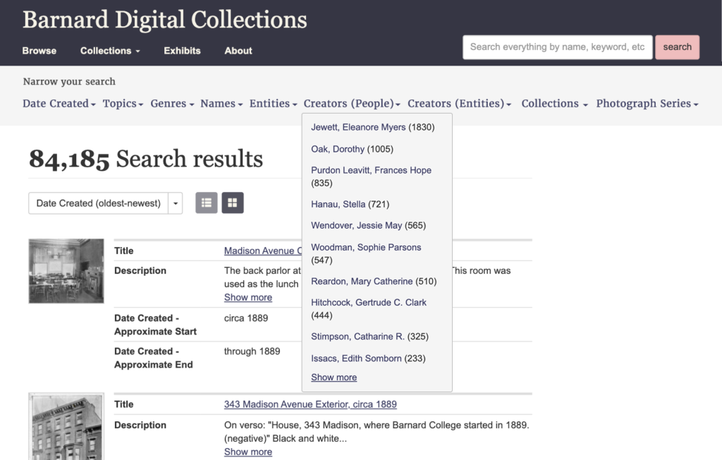
We also noticed that for many tasks that would have been helped by narrowing search results using filters, users preferred to refine their keyword search instead. To promote the use of filters, we recommended either increasing the contrast of the sidebar that houses the filter to better draw the eye towards it.
At the request of our client, we proposed an alternate layout for the filter bar, orienting it horizontally instead.

Our last observation about the use of filters was that very few users filtered by Genre. They preferred to narrow their searches by date or topic instead, neglecting a filter that would present only the types of documents or images that they wanted to see. We heavily considered adding this to our report with the recommendation of changing the title to “Document Type,” a more common term that users might recognize. However, we had insufficient evidence to support the need to change the terminology and so this recommendation was dropped from our report.
Conclusion
Our recommendations were received well by the client on the whole. Their feedback was a supportive, but also realistic voice in terms of implementing our proposed solutions on their redesigned website. They appreciated solutions that made a large impact without a lot of development needed on their end, such as our recommendation regarding the date filter. However, even where more intervention was needed to implement a solution, our client supported a solution if it was demonstrated that it would have a noticeable impact on the search experience.