About
This project was for The Archivists Round Table of Metropolitan New York, Inc. via the Center of Digital Experiences at Pratt Institute. The NYC Archivists Round Table was founded in 1979 and is known as a nonprofit organization. Serving a diverse group of more than 400 archivists , librarians, and record managers in the NYC area. Also one of the largest local organizations of its kind in the United States. The mission of ART is to educate the public on the legal, historical, and cultural value of public and private archives and manuscript collections. Known for their vast amount of events, forums, with the ability to publish journals on archive science, on their website.
Problem
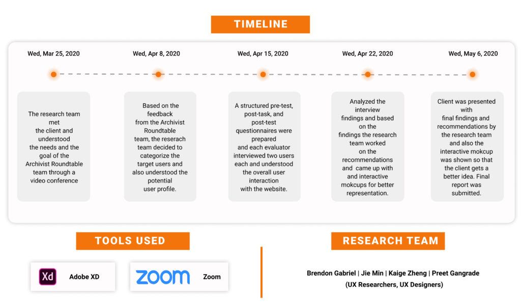
The research team understood the needs and the goal of the Archivist Round Table team through a video conference. The Archivist Round Table team wanted to optimize the website structure to not only visually attract users but also make it easy to navigate.
This project is focused on the following two objectives:
1. To introduce Archivist Round Table the frustration of users’ frustration and their needs towards the website.
2. To make users satisfied with the navigation and visual element of the website.
Methodology
We researchers used traditional user test methods via the internet. To control the environment remotely, participants were asked to finish all the tests on their computer desks within 45 minutes. All the tests were accomplished with the same online meeting tool. Participants were asked to open their cameras throughout the tests and to share their screens with the researchers at the same time. In this way, we could still observe how users interact with the product and wouldn’t lose certain nuances such as body language and facial expression of the users.
Research Process
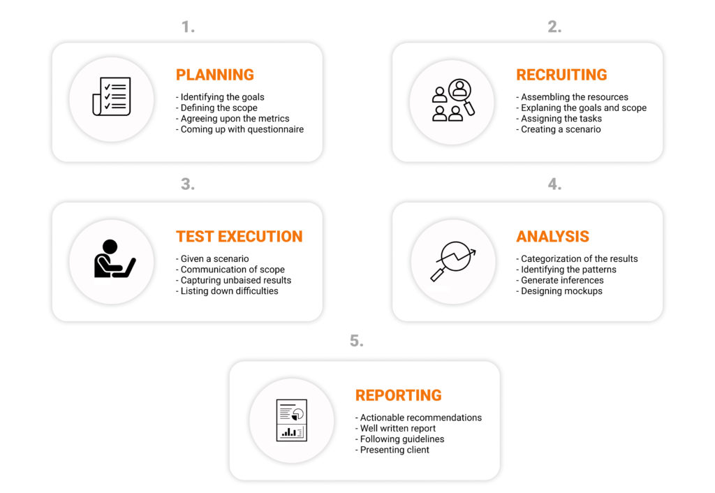
Participants
The A.R.T website sees its potential users as archive ehnthusiastics. For this reason, this study includes 8 researchers who use archives regularly and have expressed their interest in archives. All of them have never used The A.R.T website before. In another word, all of the participants could be seen as novice users.
Pre- and Post-Test Interviews
In order to find out how target users would expect from an event searching experience and what their overall impression on The A.R.T website are, participants were asked several questions before and after the test. Questions were as follows:
[Before-Task]:
What would you do when trying to seek events on a specific website.
[After-Task]:
Can you please write down two descriptive words for your overall impression about the website?
The selection and acquisition of participants whose background and abilities are representative of the product’s intended user is a crucial element of the testing process.
User Test Scenario & Tasks
To best visualize how the target user groups would interact with the event searching flow on The A.R.T website, each participant was given a scenario and was asked to accomplish several sets of tasks under this scenario.
Scenario – You are an archive enthusiast who heard about Archivist Roundtable from your friend. You want to know more about it.
TASK LIST
Timeline-Related
1. A friend sent you a link to the A.R.T Awards ceremony because you told her that you are interested in this event. Can you please check it out and see when this event happened?
2. You want to know more about A.R.T events.Can you find out what event took place on November 01, 2019?
3. Can you describe your overall experience during the process of finding out the event? Is there anything unclear in the website? Did you meet any difficulties?
4. Did the overall experience meet your expectations?
Location-Related
1. Go back to “A.R.T. Awards Ceremony” Page. Can you tell on which location this event is taking place?
2. Are you able to find 3 events that took place in Manhattan?
3. Can you describe your overall experience during the process of finding out the event? Is there anything unclear in the website? Did you meet any difficulties?
4. Did the overall experience meet your expectations?
Registration-Related
1. Can you try to register for the event “Fashion: Now & Then” and describe your experience, how did it make you feel?
2. Can you try to register for the event “2019 New York Archives Week Awards Ceremony” and describe your experience navigating to it?
3. Can you try to register the event “An evening at Poster House” and describe your feelings?
4. Could you please compare the two register processes, do you have any preference or what do you think?
measurement criteria
The user test for The A.R.T website was designed to discover how users interact with the website in search of certain events. The research team sought to find answers for the following questions:
What drives users to search for a certain event? What information on the homepage gets the most attention throughout users’ event searching experience ? What information are users looking for when they are using the current event list page? What are users’ reactions to the current event list page? What are users’ expectations for an event searching experience?
Design Recommendations
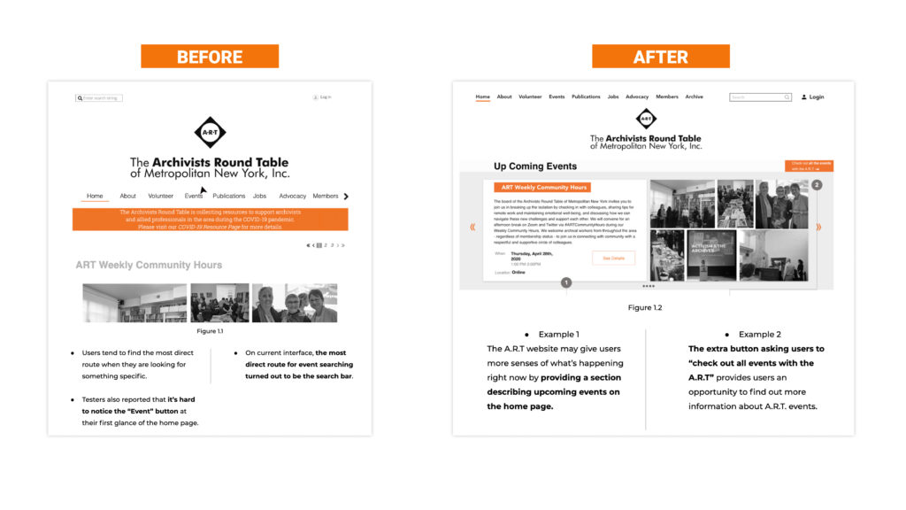
Insight #1 –
Usability test participants found it hard to read the ART website home page. Most of them have difficulty finding out the event page. 60% of our testers went directly to the search bar to search for event information.
Recommendation #1
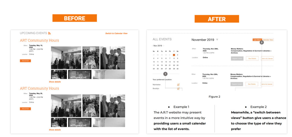
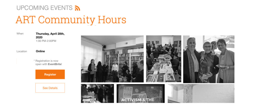
Upcoming events should be highlighted on the homepage. While building a high-usability search system could be time consuming and technically challenging, the website may lead users to the right route by restructuring its home page hierarchy. Figure 1 has given an example of how the A.R.T website may change its home page by putting emphasis on upcoming events.
Insight #2 –
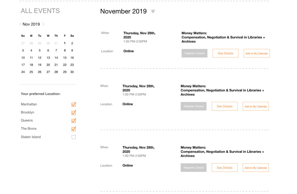
90% of test participants had difficulty finding the “switch to calendar view” button. 60% of them prefer list view while 40 % of them prefer calendar view. This phenomenon could be explained by various reading habits of the users. Those who prefer list view tend to be sophisticated text readers and find it easy to follow an event list organized chronically. On the other hand, those who prefer calendar view have high priority on schedule management. They find calendar view an intuitive way to find out if a certain event fits in their personal agendas
Recommendation #2 –
Apply a small calendar with event lists and make the “switch to calendar view” button easier to notice. Two examples are provided below.
Insight #3
All the usability test participants found time and location information important when searching for an event. Most of them require the website to highlight time and location information on the event lists pages, otherwise with “too many words on the single page”, it’s hard for users to find out what they “need”.
Recommendation #3
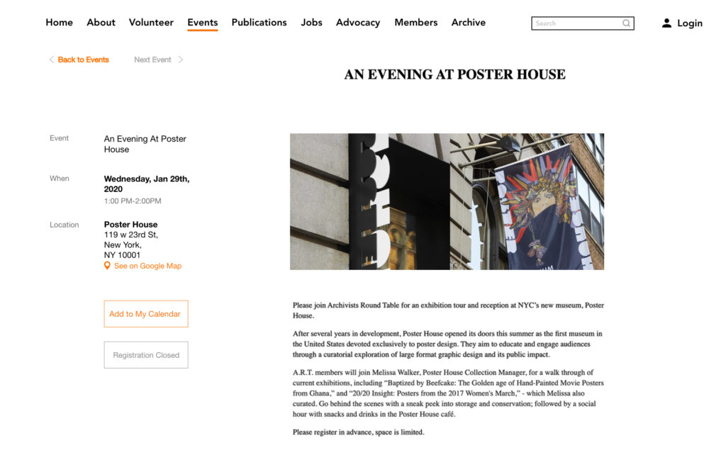
Make time and location information more apparent/significant to users when signing up for an event. See example 3.1, 3.2, 3.3.
Example – 3.1 : For upcoming events, the A.R.T website may provide time and location information on the side for users before they click in to an event detail page.
Example – 3.2 : Time and location information could be organized in a unified way so that users could find it easily.
Example – 3.3 : Time and location information should also be highlighted on each event detail page. The A.R.T website could provide more detailed information on time and location. As shown above, location information could be presented with a link to Google Map.
Insight #4
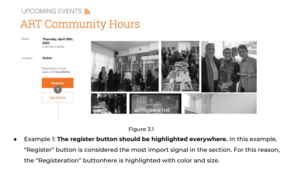
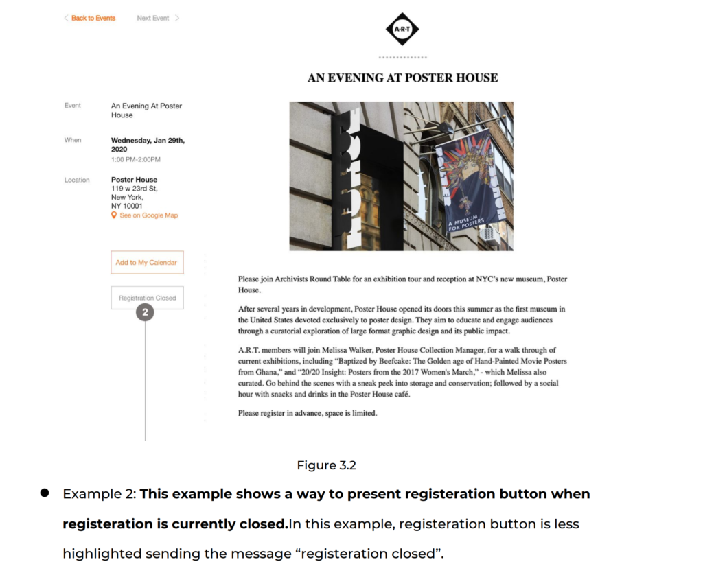
Usability test participants were”asking where should I click on for registration” repeatedly during the usability test, which indicates that users have high priority on finding out how to register when they are led to event detail pages. In addition, while some participants reported that they really liked to be led to a third-party registration platform, others were uneased by it.
Recommendation #4
Since users have put high priority on registration, the “register” buttons should be in bigger sizes and look more eye-catching.Moreover,
since users have various preferences on third-party registration platforms, there should be a notification sign before users are led to another platform to register.
Conclusion
We presented all the findings and recommendations to our client with a formal presentation. We were confident with the recommendations that were made to make the users experience more satisfying and smooth, if considered. Making these changes will definitely strengthen the ARTs interface allowing it to be prepossessing than what it is now. The client appreciated and were satisfied with the recommendations provided and also they mentioned to us how they are going to work on it as soon as possible.
Overall, the ART interface has a lot of features that can help users seek the information they need on archives such as join events, find jobs, help volunteers and much more. The site successfully provides everything the user needs to be a part of the NYC archive group. Thus, in my opinion; a revamp of the complete website would not only confuse the users but make it difficult for them to surf on the website. These recommendations above provided would help users with a better flow.