Loading can be understood as progress indicators for data presentation in the Internet environment. And it is also a state of visible feedback triggered when user interacts with media. Good loading design can reduce user’s uncertainty and perception of time.
The Logic of Loading
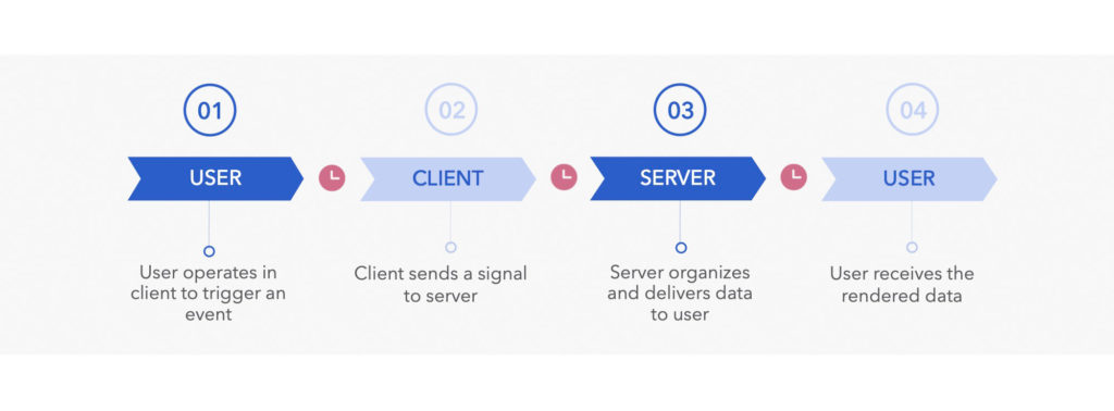
Data is presented to users through a series of complex flows. First, user operates in client to trigger an event, and then the client sends a signal to the server. At this time, the server receives the signal, starts to find the data and organize the data packages, and finally delivers the rendered result to user.
In fact, the user is waiting for the completion of loading during data transmission process, as the interaction between the client and the server needs a period of time to complete. The sending and receiving of data depends on the quality of network, and the searching and integration of data depends on the performance and capacity of the servers. The final rendering result depends on the performance of client, and the information content of high-end phones has better quality and speed compared with low-end phones.
Therefore, UX designer hope to reduce the waiting time of users, optimize each step, and adopt different loading methods according to data types to meet user’s psychological expectation and create better experience.
Main Types of Loading and Use Cases
1. Modal Loading
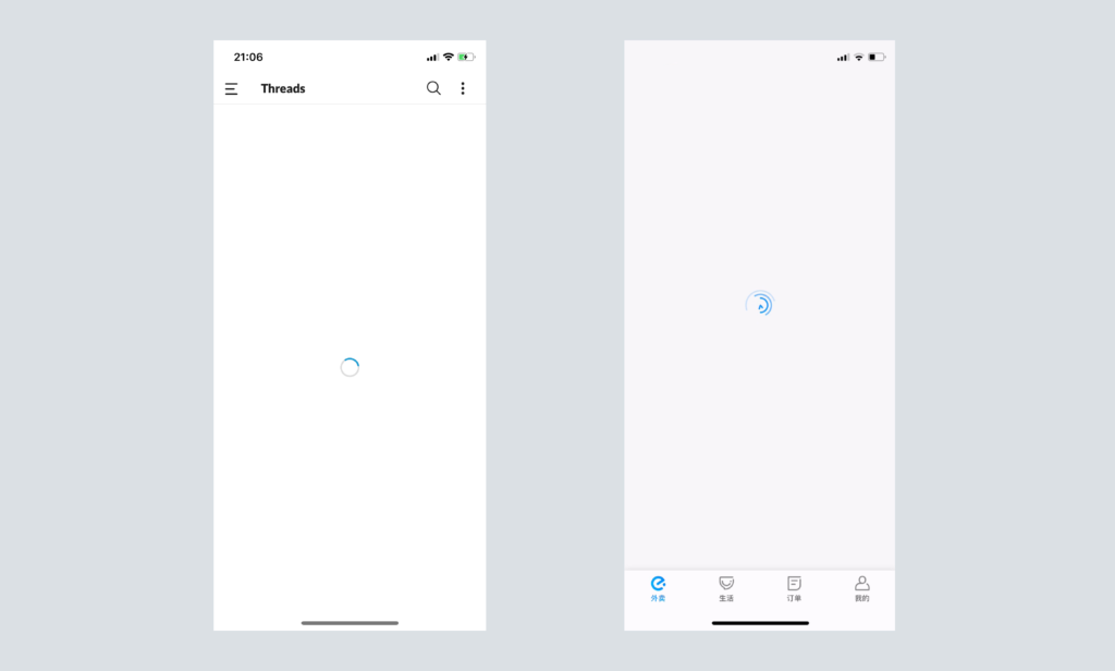
Modal loading is exclusive on client when user triggers an event, which forces the user to wait for a page to load. For example, looped animation or progress bar. But this experience is not very good. If the amount of data is large, most users will lose patience, which can increase bounce rates. Therefore, try not to use modal loading unless incomplete loading leads to errors.
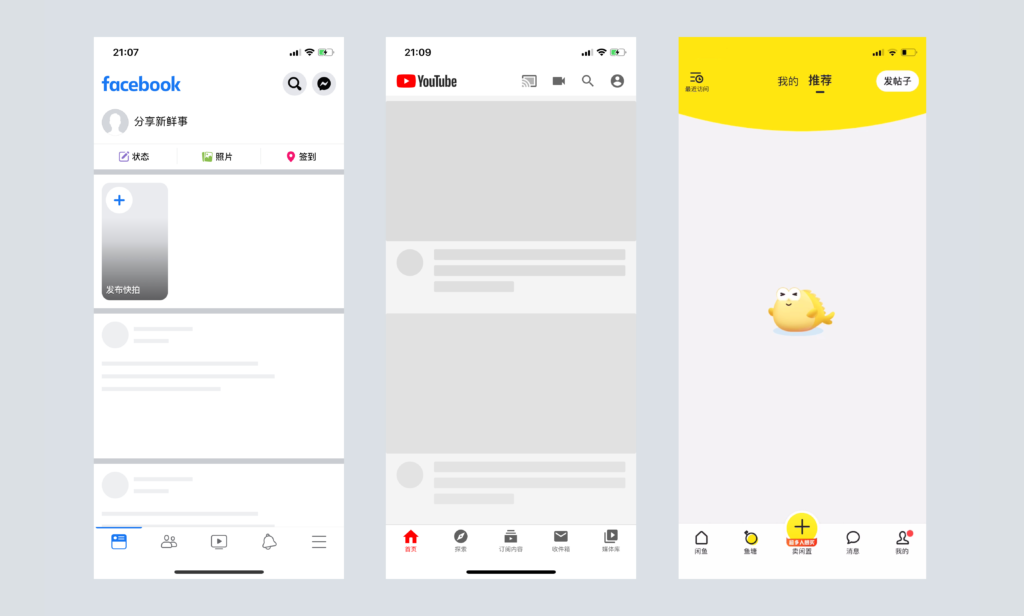
Other modal loading types include skeleton screens, fine animations and illustrations. All these design can be used to make the wait more pleasant. Facebook uses this design, showing a wireframe as a placeholder, while the actual content loads. It tells users a general layout of the information, making users focus on content being loaded instead of loading fact.
2. modeless Loading
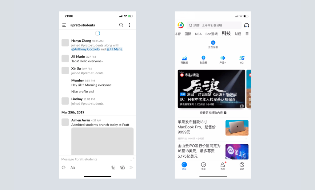
Modeless loading is more user friendly than modal loading. It allows user to operate on other content of the current page while waiting for data.
Step by Step Loading
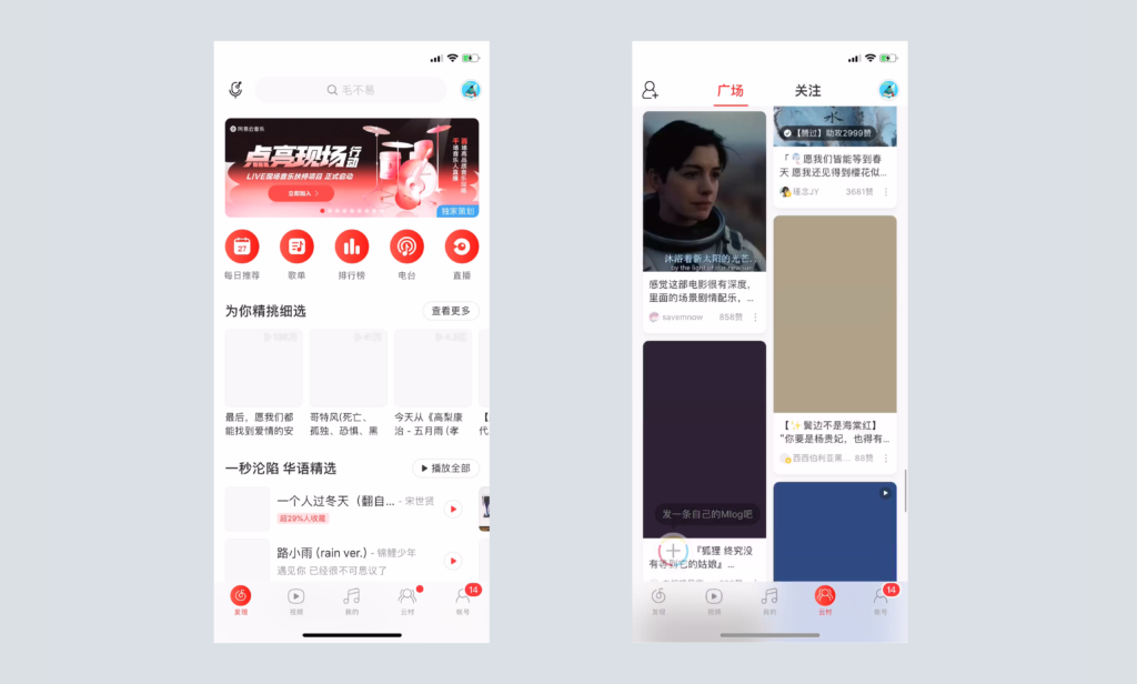
Step by step loading is also called lazy loading. It can be understood as providing information to users step by step, thus users don’t need to wait too long to have negative feelings. Usually, this loading method includes several solutions. First, load small resources like text before large resources such as pictures and videos. Second, load content gradually according to user’s browsing behavior. For example, while the user browses to a certain part of the page, load the content of this part. Third, load when user’s behavior meets some certain conditions.
Preloading
We can notice that with step by step loading, users still have to wait when browsing new content. There is a better loading method called preload. It can be understood as prejudging user’s next behavior and requesting this part of content in advance. This method can’t solve the problem of slow internet, but only implement network request in advance to alleviate the problem. For instance, some news app usually measures the proportion of page when loading current page content, and triggers following content when users scroll to half of the page.
Intelligent Loading
In different network environment, some client may loads different resource or rendering efficacy for visual appearance. For example, when users watch videos on 4G network, the lowest quality video resources will be provided by default. However, the client will automatically load following content on WiFi.
Summary
There are multiple loading methods can be used in product design. We need to consider user’s specific scenario when making design decisions. Each loading method has its advantages and disadvantages. Only by selecting suitable loading method, user experience can be improved.
