In 2020, most of the products we use today have some type of dark mode integrated into the user interface. Dark mode is a color scheme which utilizes light-colored text, icons, and graphical user interface elements on a dark background. Dark mode is often associated with accessibility with its user-friendliness to those who have poor vision. It even helps offset the damage you’re doing to your circadian rhythms by helping your eyes adapt to the dark while surfing on your phone before sleep.
What is the difference between light and dark mode?
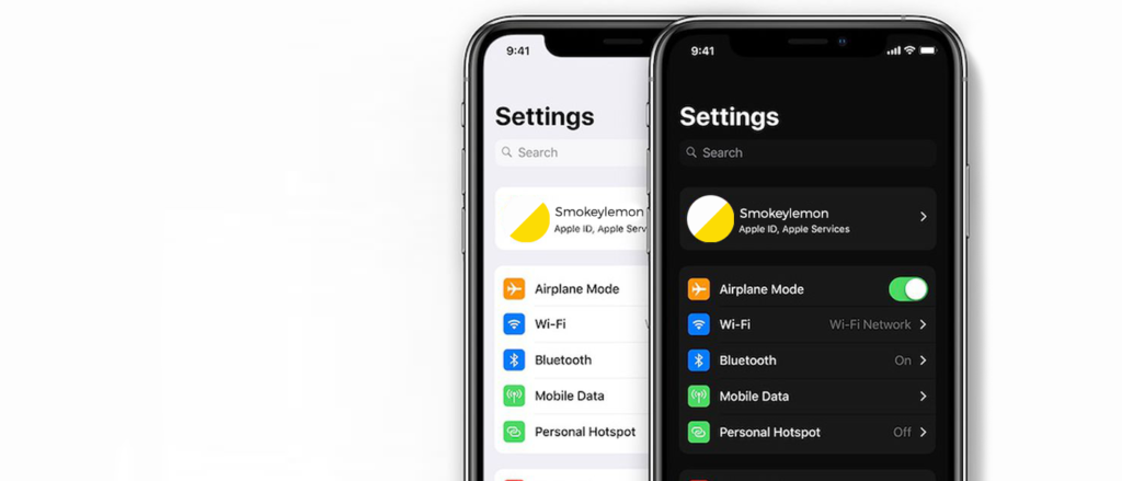
- Light mode, positive contrast polarity, refers to dark-font text on light background.
- Dark mode, with negative contrast polarity, denotes the combination of light (e.g., white) text on dark (e.g., black) background.
Why use dark mode?
Dark mode is good for your eyes
It is commonly believed that dark mode is good for users’s eyes by cutting harmful blue light. Blue light is a high-energy visible light spectrum with the shortest wavelength. The biggest natural source of blue light for human beings is the Sun, but our phones also emit trace amounts of blue light. Excessive exposure to blue light suppress the secretion of melatonin which is a must-have for sleep. Some companies even claim that dark mode can improve visibility and reduce eye strains.
Dark mode saves battery life
Dark mode apps can prolong the battery life of your smartphone. Google confirmed that dark mode on OLED screens may help save battery life.
users with impaired vision read better on dark mode
As early as 1977, a study reported that some people with low vision prefer dark mode. It is Legge’s studies that formed the basis of recommending the possibility of switching to dark mode for user interfaces.
In Legge’s study, each of the 7 participants with cloudy ocular media had better reading rates with dark modes, whereas the rest of the participants, who had impaired central vision, were not affected by contrast polarity.
However, does dark mode actually increase accessibility?

People with normal vision (or corrected-to-normal vision), visual performance are usually better with light mode. However, those with cataract and other visual disorders tend to perform better with dark mode. However, users with Astigmatism have a more difficult time reading in dark mode. Astigmatism causes blurred vision due to the irregular shape of one or both eyes.
A 2014 Gizmodo article cites the Sensory Perception and Interaction Research Group at the University of British Columbia:
People with astigmatism (approximately 50% of the population) find it harder to read white text on black than black text on white. Part of this has to do with light levels: with a bright display (white background) the iris closes a bit more, decreasing the effect of the “deformed” lens; with a dark display (black background) the iris opens to receive more light and the deformation of the lens creates a much fuzzier focus at the eye.
Although dark mode may present some advantages for some low-vision users such as those with cataract, users with normal vision may perform better in light mode. Users should have the freedom to choose between light and dark mode depending on their own situation and preference, which is a good thing that currently most designers create new products with both options.