DailyArt is a free educational app that publishes one-piece work of fine art info everyday for its users. Besides getting inspired by reading the art masterpieces’ stories every day, as for its users, they could also explore the digital collection of more than 2500 masterpieces in DailyArt. With its informative contents, DailyArt is widely favored by many art lovers.
This Design critique will mainly focus on DailyArt’s App usability for iOS devices.
After downloading
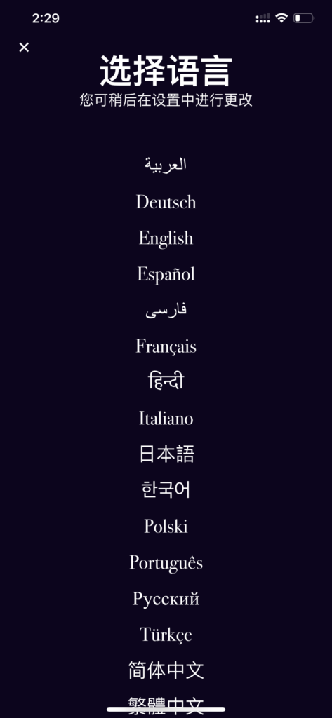
The initial interface after launching the DailyArt app is the language selection. DailyArt serves up to sixteen different languages (FIG.1). When selecting the language, the original form of each language acts as a user-friendly signifier that even affords people from non-English speaking areas to better access the App at the very start.
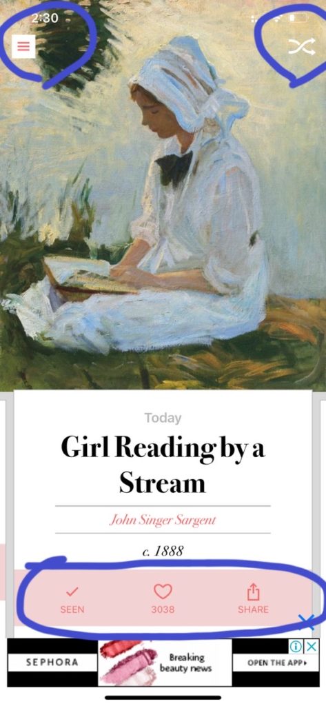
Once selected the language, users will be directed to the main interface— Today’s Art (FIG.2-1), and by scrolling left, the users will be able to see the artwork that posted in the past.
This page has two main signifiers at the top; by clicking the menu button (on the left), it will navigate the user to the menu page (FIG.2-2). The mapping of this menu page is pretty clear: every section has a straightforward signifier to represent its function. In this menu page, users could log in or register, or explore more about the digital archive.

In addition to the top-right Shuffle button, it allows the users to “wander through” the digital collection. However, the purpose of shuffling is relatively unclear—it seems to be just for making users see more random artworks. Moreover, since it is a signifier, the Shuffle button does not specify its action; there is another button “GET LUCKY” on the menu page, which functions the same way as shuffling but they are not successfully integrated either.
In order to avoid the potential confusion that this shuffling option might bring to new users, either of the buttons should be removed, and the Shuffle icon could also be replaced as “GET LUCKY” for the purpose of directing more clearly.
Today’s Masterpiece
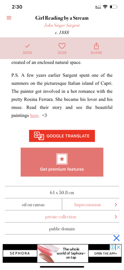
This interface focuses on promoting artworks for users every day. On this page, it not only contains an intro to the work but also provides bottoms for users to click for additional information. Every masterpiece affords Seen, Liking, and Sharing. The icons below every artwork act as signifiers indicating users to tap. In addition, the Google translate section adds more flexibility to the content.
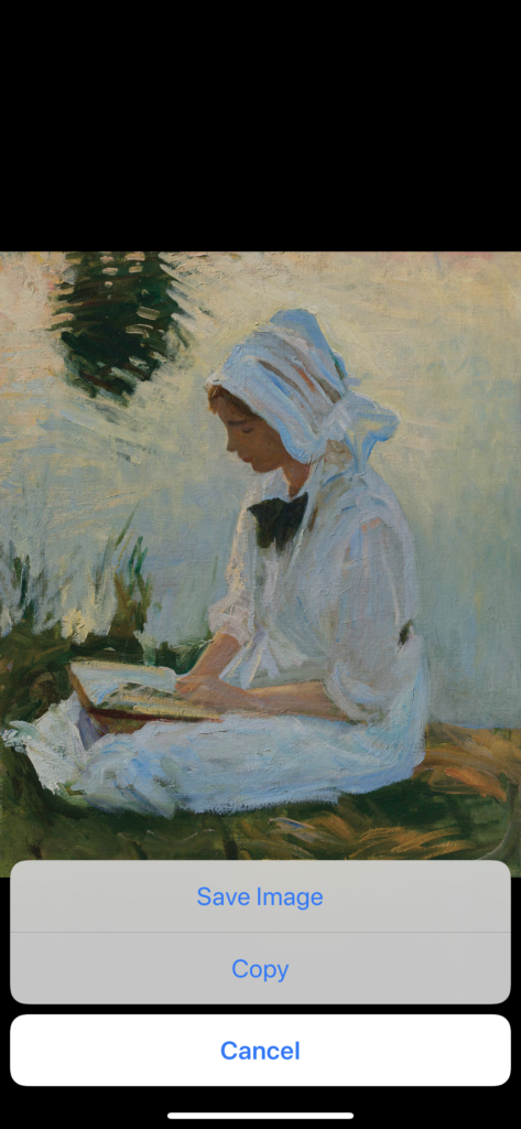
FIG. 3-2 (Right)
By long-pressing the painting (FIG. 3-2), users are able to save the picture on their own devices. However, there is no signifier to tell this function (an invisible feature). Therefore, it is better to add a button/icon for signifying this feature along with the Seen, Liking, and Sharing bar.
Searching for Artist or Artwork
The searching bar is easy to locate; it is right next to TODAY’S MASTERPIECE button on the menu page (FIG.2-1). Below the searching bar, there are three main sorts for users to narrow down their searching range: they could search through artwork, artist, or museum.
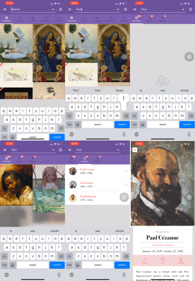
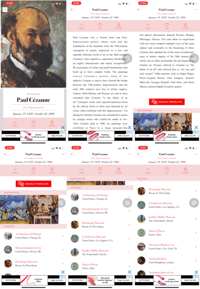
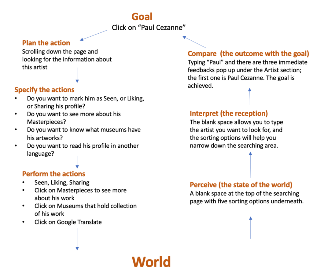
Seven stages of action that Don Norman proposed are presented by the searching function. Let us try searching “Paul Cezanne” as an example to examine each stage of action (FIG.4-1, 4-2).
What’s bothering
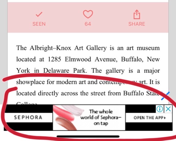
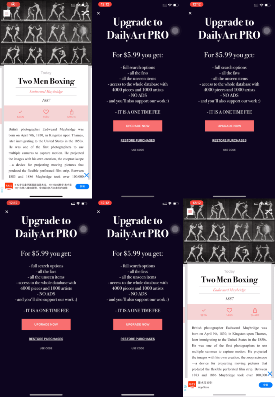
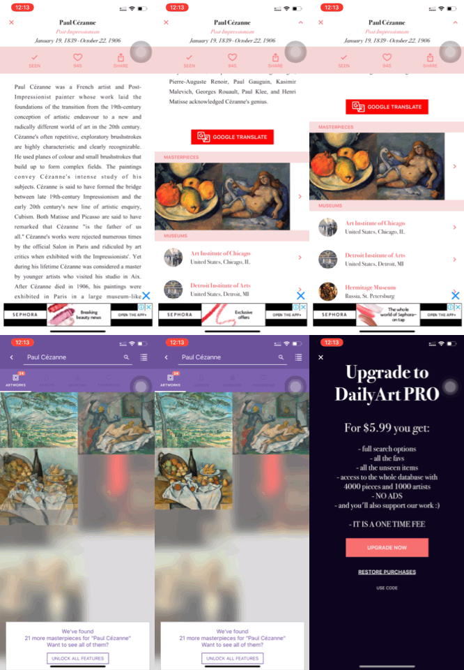
DailyArt can be downloaded for free but there is always an advertisement bar at the very bottom of the page (FIG. 5-1) and it is unable to click off (FIG.5-2); every time when trying to click it off, the “Upgrade to DailyArt PRO” notification will instantly pop out. This feature bothers the entire user experience because it is very intense. It is understandable that the App wants its users to pay a little extra fee for unlocking more content, but the ads are somewhat annoying in DailyArt; it is literally “brainwashing” the users to get upgraded.
Solution
There is unnecessary to put ads everywhere. Let us take a look at the Cezanne’s masterpieces (FIG. 5-3); the app could remove the ads bar at the bottom and simply remain the “Unlock all feature” for notifying the users: you can get full access to Cezanne’s work if you upgraded to DailyArt Pro. In this way, users could make their own decision on whether to upgrade or not instead of being overwhelmed by the ads.
Conclusion
DailyArt is fundamentally well-designed as an educational App in general. It has sufficient art information for its users and relatively clear navigation of every section. Although there is room for improvement, DailyArt still presents a user-friendly platform for its users and achieves its educational goal.
