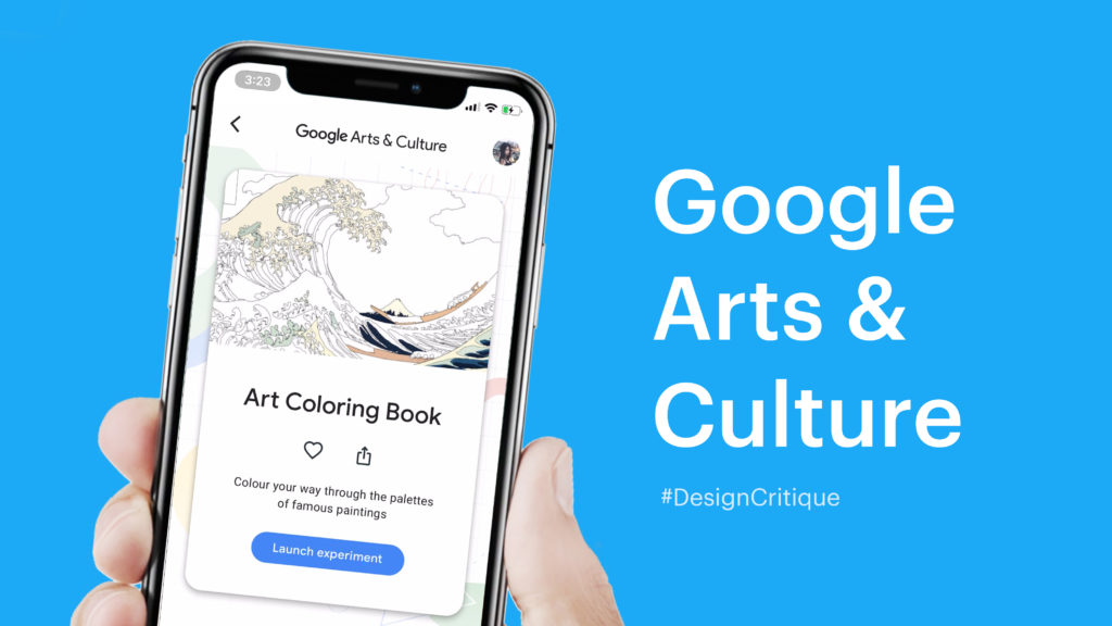
The Google Arts & Culture App provides an online platform in which users can view high-resolution artworks and learn the worldwide culture of art from their smartphone anywhere and at any time. This article mainly introduces the user experiences related to augmented reality(AR) features and interactive games.
Note: This design critique is focused on the iOS version 7.0.14 updated on September 9, 2020.
Home Page
Before talking about the new features, let’s look through the brief of the home page. After the launch page(Figure 1-1), users enter the app, swipe left/right to pick up today’s topic(Figure 1-2). Scroll down the screen. The first page categorizes each section with the consistency of title and interactive posture(Figure 1-3).

Fig. 1-1 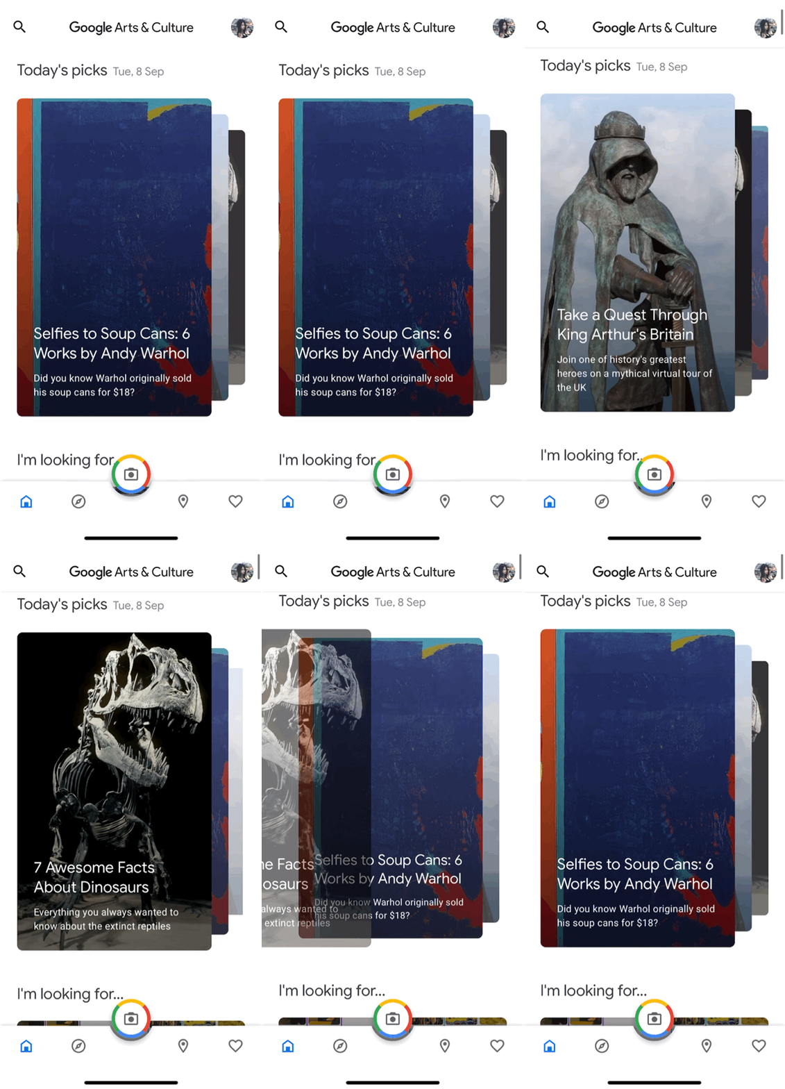
Fig. 1-2 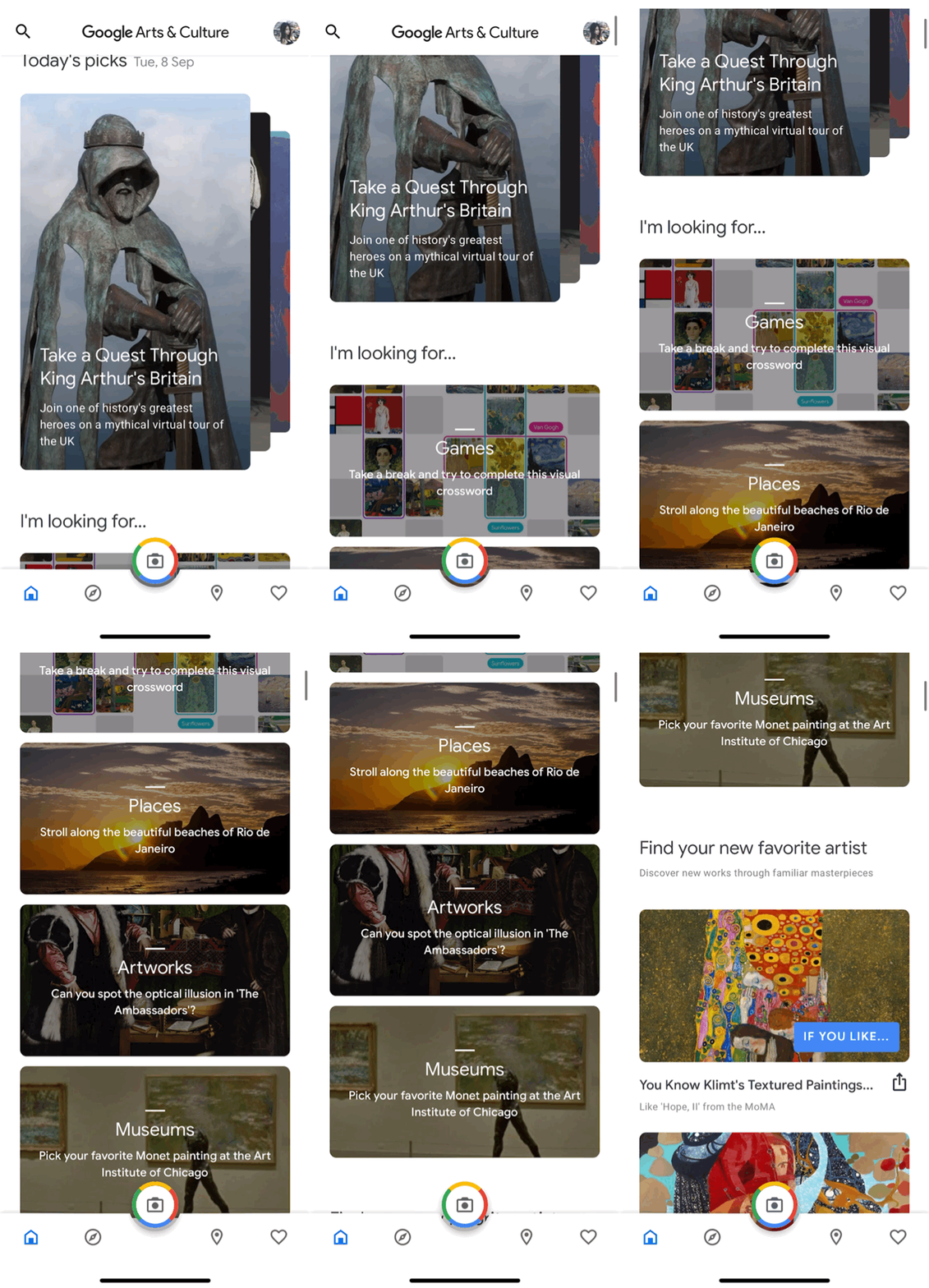
Fig. 1-3
AR Museum
Through the Google Art & Culture app, users can visit the art museum with AR on their smartphones. Here is the default selected museum is The Art Institute of Chicago(Fig. 2-1). Users “enter” the online gallery and pick up a painting from the thumbnails of the navigation to take a closer look(Fig. 2-2). Use the zoom-in gesture to enlarge the picture. If you want to take a walk from the museum, manipulate your direction like you take a street view on the Google Map. Click on the arrow on the screen to control your direction, long-press to keep “walking” through the gallery(Fig. 2-3).
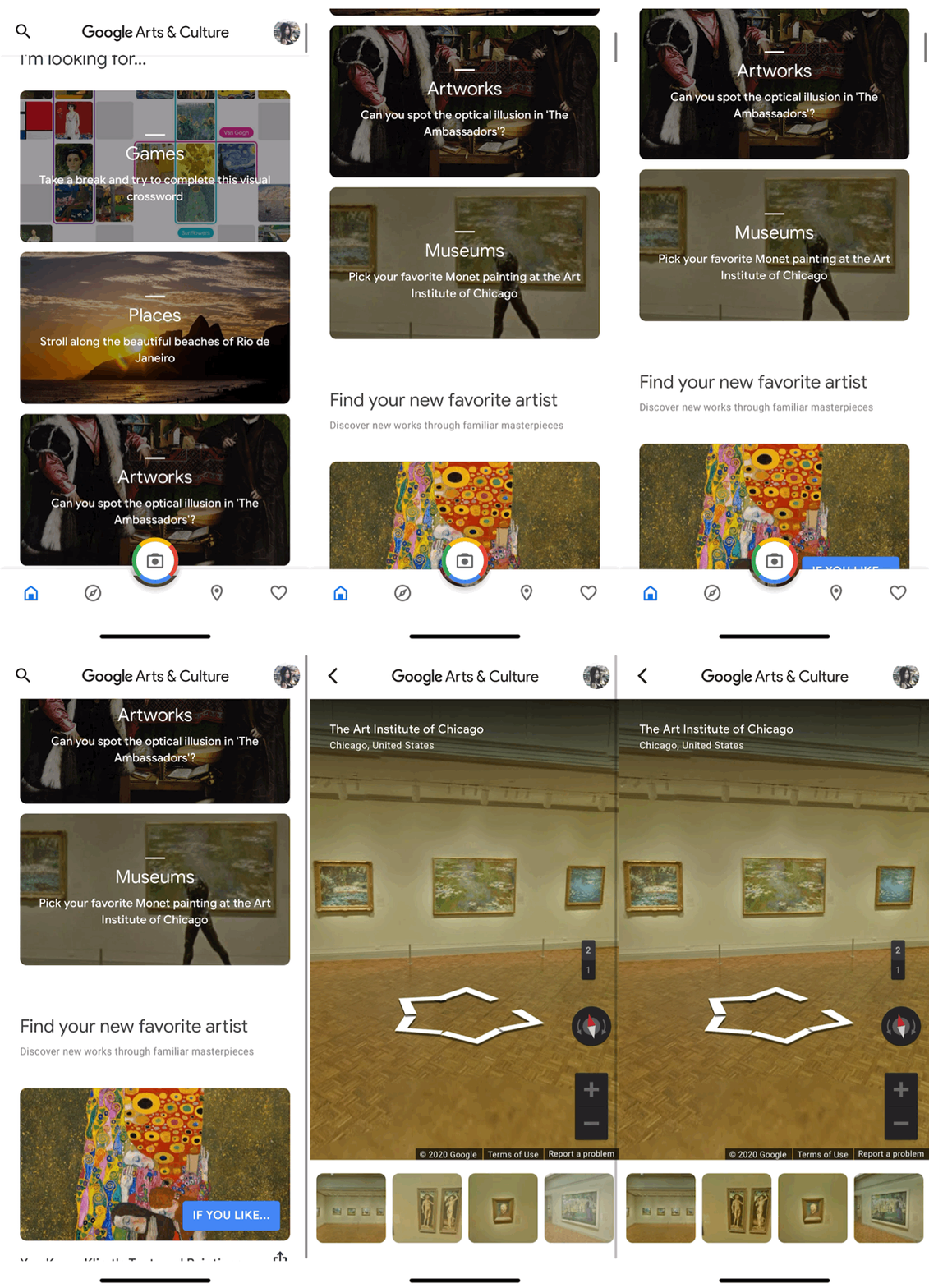
Fig. 2-1 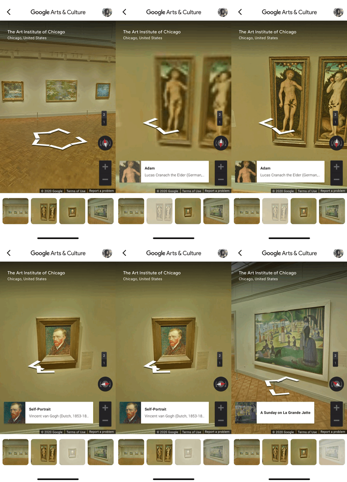
Fig. 2-2 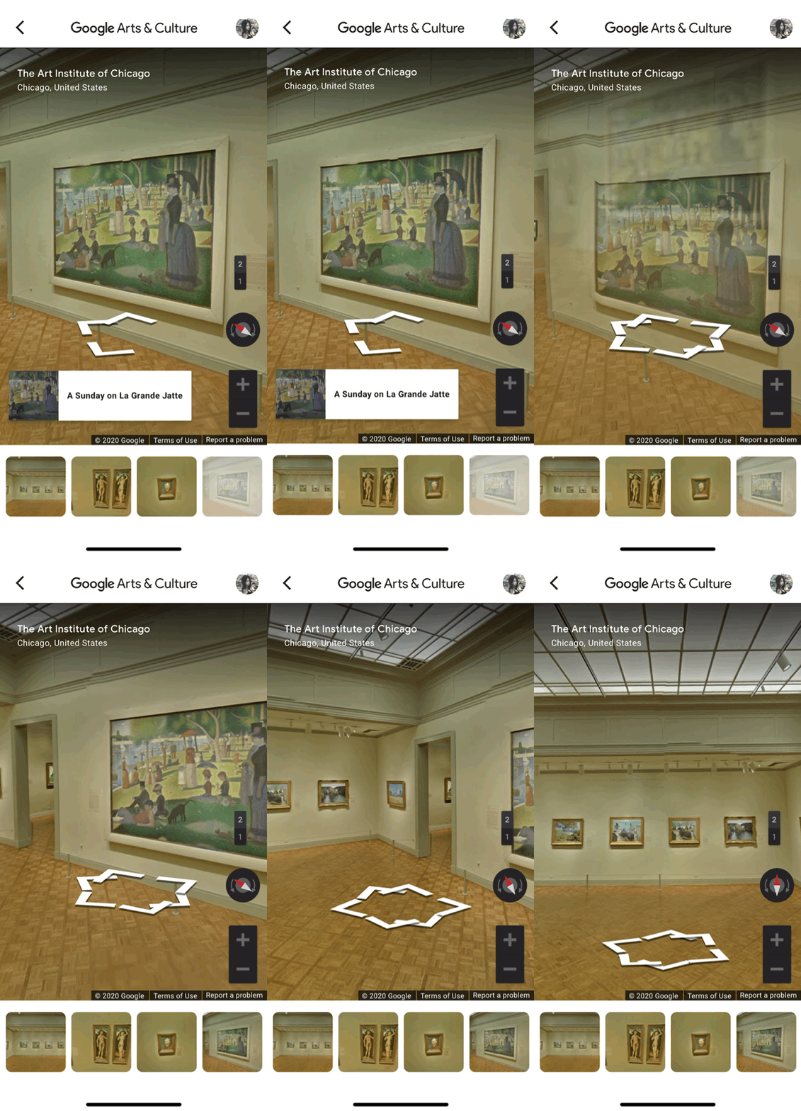
Fig. 2-3
ART Transfer
The feature imitates the style of the artwork with artificial intelligence(AI), which applies the technique to the uploaded picture. Users enter the system and select a painting style they want to apply to the image. Then, take a photo in reality (Fig. 3-1), and the computer makes an artwork within a few seconds. In the loading process, the animation shows the picture is gradually changing to the result(Fig. 3-2).
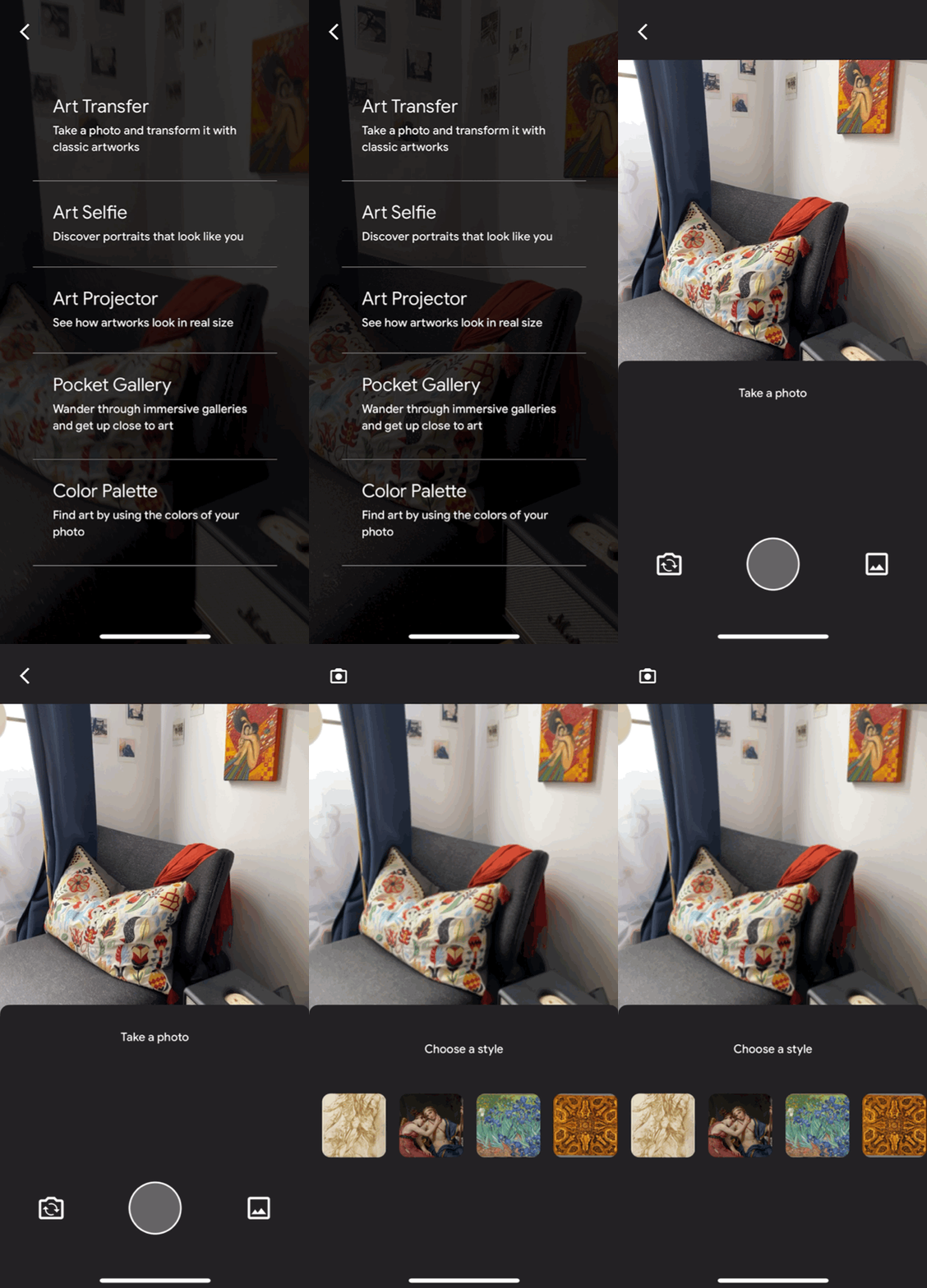
Fig. 3-1 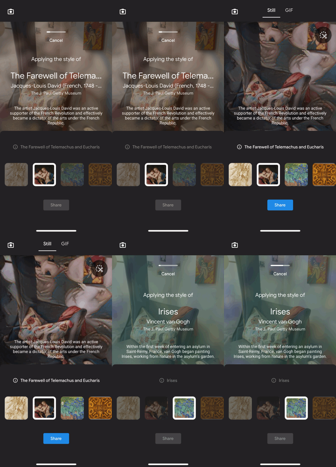
Fig. 3-2
Color Book
The Art Color Book creates an interactive playground for users to engage in a painting. After the loading page, users enter an editor to pick up a color from color themes regarding a chosen artwork from the gallery(Fig. 4-1 & Fig. 4-2). On the right side of the color palette, it shows half of the color to imply more color combo. Users can swipe the color palette to the left and scan more color options(Fig. 4-3).
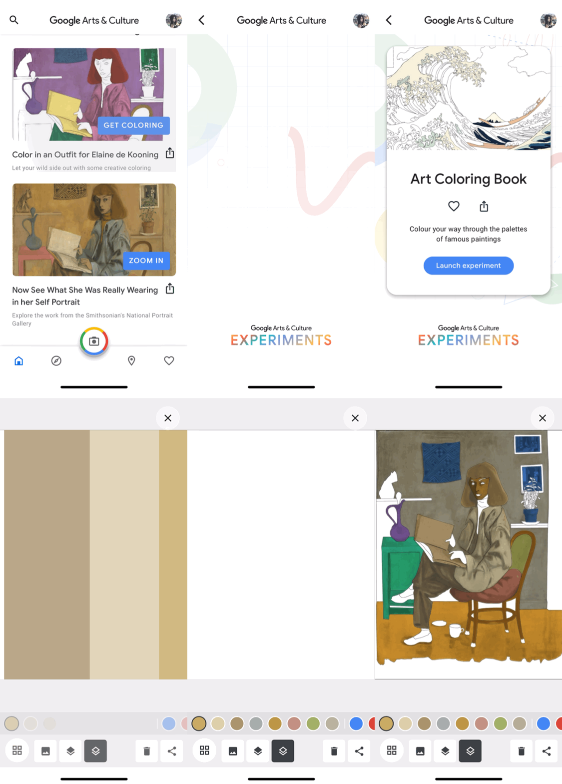
Fig. 4-1 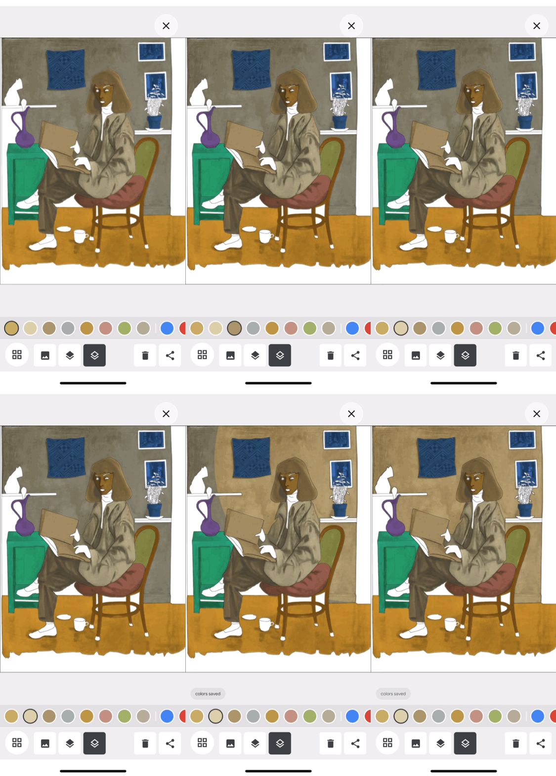
Fig. 4-2 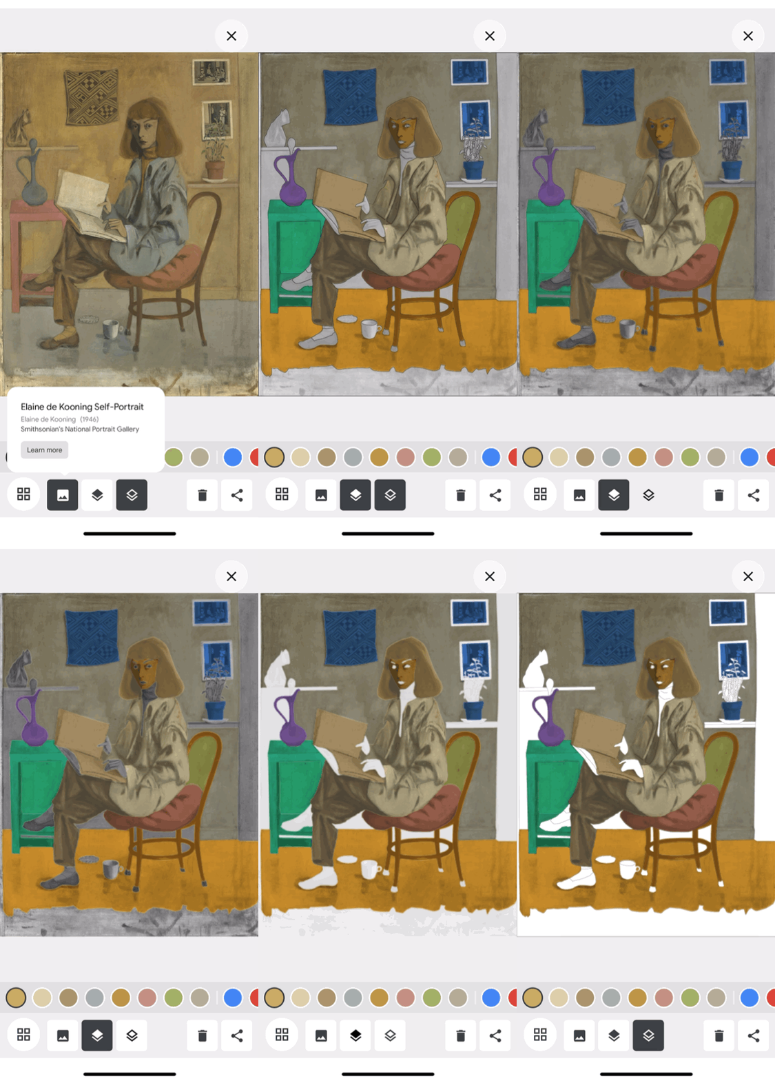
Fig. 4-3
Conclusion
The Google Arts & Culture App provides a seamless user experience for AR features. Even a first time user can follow the instructions step by step to manipulate the platform. Users engage the app with interactive features and learn the culture knowledge from the process. Also, the AR system needs a longer time to load the page. The app offers the animation to every scene that users have to wait for the result to come out. Overall, the app is a great example and standard for someone who needs to build a system regarding AR interfaces.