Description: Headspace is an app that guides users through a mediation process to help decrease stress, focus more, and sleep better. This app follows a reflective cognitive processing because it focuses on a specific need for the users and how it will benefit the user in the long run.
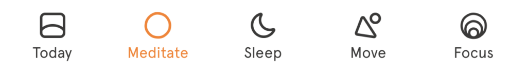
Navigation: Headspace did a great job creating a natural mapping for the navigation bar (Figure 1). The navigation bar located at the bottom of the screen divides the categories/focuses into clear signifiers — today, mediate, sleep, move, and focus. Unlike other apps, like Instagram, the navigation bar’s signifiers are only icons; Headspace avoided any confusion by labeling the icons with its categories. When a category is chosen, it is highlighted in orange; this indicates immediate feedback that the user’s request is completed and the user acknowledges which category they are currently viewing.
Captivating Headline: If a user’s goal is to start a meditation course, they’ll have to click on meditation (with a circle icon) on the navigation bar. Users are then directed to a page with a bright green graphic with the headline, “Transforming Anger”, in large fonts (Figure 2). I believe this can be a bit confusing for a first-time user because after selecting meditation they are immediately presented with an unrelated headline instead of reassuring the users that they’ve made it to the meditation page. Although the headline is a bit confusing, it is not a big enough issue for the users to give-up on the app. In my opinion, I would make the big headline apart of the big green illustration and then move it below the recent/featured courses. In this case, users can acknowledge that they’re in the right place and become aware of the advertised course. Below the featured headline is a strong, attention-grabbing, bright, blue play button with a padlock icon (this is another problem I noticed but I will bring it back up and discuss more in-depth about it under The Inconsistent Padlock and Selecting a course sections).
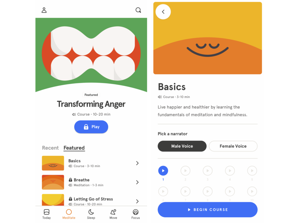
Recent v. Featured: Throughout the main meditation page, users are presented with multiple signifiers. For instance, users can navigate between their recent course history and featured courses. The selected section (either recent or featured) will be highlighted by an underline and become a darker shade of gray.

The Inconsistent Padlock: When users click on the featured courses, they’re presented with a list of different courses — basic, breathe, and letting go of stress. Courses that require a Headspace Plus subscription contains a gray padlock next to the course’s name, indicating a limitation of access for the course. This is a problem because the bright blue button, mentioned in the Captivating Headline paragraph, has no meaning for the users. So, are locked items supposed to be grayed out or represented by blue?
Headspace Plus and other activities: Users would need to scroll down for information about unlocking Headspace Plus subscription, other available meditation courses, and group mediation. This factor is not quite discoverable for the user since it’s below the fold and there’s no signifiers to indicate that there’s more information below.
Selecting a course: When users select a course presented by the recent or featured list, users are given another immediate feedback. The app sends the user onto another screen (Figure 3). This screen was a success because it shows an appropriate headline of the selected course (in this case Basics). It prepares the users by providing an estimated amount of time and a short description for the course. In addition, the users are able to choose between listening to a male narrator or female narrator. The selected option is then indicated by a consistent signifier — a dark, bold gray button. Right below the narrator option are voice recording icons; the one in bright blue is available and the grayed out ones are locked. This brings us back to the locked play button to the Transforming Anger play button which was blue…yet locked. This inconsistency in coloring can make it hard to understand the meaning of the buttons. I would make the bright blue button into gray buttons to solve this issue.
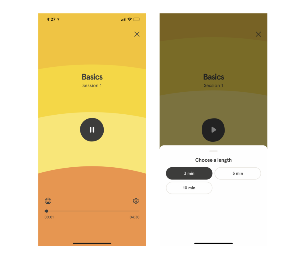
Playing a recording: When a user starts a course by playing a recording, they are presented with a bright screen with multiple shades of orange (Figure 5). The design is very simple; if the user wants to pause, they simply hit the middle button. If the user wants to skip further into the course they can navigate through the natural mapping of the video’s timeline and if they want to leave, they can click the x on the top right corner of the screen. Headspace takes advantage of user’s mental models, in which they gained from personal experiences through YouTube and other platforms, of controlling the audio. However, there was a hidden feature. If the user wants to change the length of the course, they would have to click the settings gadget (Figure 6). This feature is not successful because it is not discoverable by the user.
Conclusion: Headspace was a success! Headspace did an excellent job with providing signifiers throughout the app to help reassure the user’s actions. Although they had a few minor problems, they still did an amazing job guiding the users to their destinations/goals. The undiscoverable features and the blue Headspace Plus button become a physical constraint and limits the user to other features on the app. The blue button also allows the user to create slips because they’re so used to seeing blue as an available feature. Especially when a user does not intend on purchasing the subscription, it can become irritating when they continue to press the button by accident. My solution is to remove the button button if it’s locked – if a user is interested in the featured course, they’ll click on it even if it shows a grayed out button. When the user purchased the subscription, then users should be able to see all the gray buttons become blue. Or an even better option, remove the button and just display the featured courses as clickable ad modals.