WeChat, a super app developed by Tencent, eventually became China’s app for everything in the last decade. Not only can users chat with others through texts and videos, but they can also share posts, subscribe blogs, hail taxis, pay utilities, order food deliveries, make medical appointments, shop online, transfer payments, etc. Among all those features, I’d like to focus on one unique function of WeChat in this design critique — the Red Packet.
The concept of the red packet comes from the Chinese tradition of giving family and friends a red envelope “hongbao” containing money as a gift representing good wishes. This function enables users to give monetary gifts in the form of virtual cash to other contacts. Received money would be deposited into the user’s WeChat Pay account and sending out a red packet would withdraw money from that account. The red packet can be sent out in two contexts: the pairwise red packets, for which users send out the money in a private chat of two, and the group red packets, where the money is distributed in a group chat.
Receiving a Pairwise / Group Red Packet
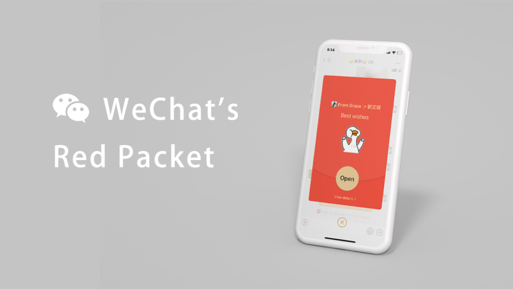
The signifier of opening the red packet is well-designed because the visibility of the text “Open” is very strong due to its contrasting color and clear instruction in text. The design of the digital red packet follows the principle of mapping since the visual form of the digital red packet is consistent with the Chinese traditional red envelope. After pressing “Open”, the page plays an animation of the coin rotating and then shows the amount of money the user received, which serve as good feedback of opening the red packet.
The process of receiving red packets involves three levels of processing for emotion. On the visceral level, the first reaction of the users may be curious, due to the lack of visibility of the amount of money in the red packet before opening it. On the behavioral level, one may feel happy to see a red packet posted due to procedural memory and the expectation of receiving money. On the reflective level, the user can decide if he/she wants to send a sticker back as a response after receiving the gift. Furthermore, while all other features are the same for receiving the red packet in the two contexts, there is a chance that the user cannot successfully snatch the group red packet if one does not act quickly enough. Such a setting would cause a visceral reaction of urgency. Moreover, showing the amount that everyone has snatched with one having a luckiest draw is also very likely to result in a reflective reaction of comparing.
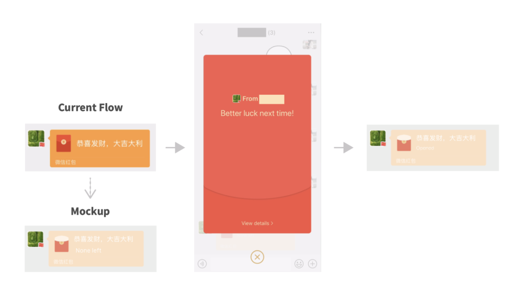
However, one deficiency of the receiving group red packet function is that the users are unable to know if the red packet was already empty before pressing the packet (as shown above), which can cause a behavioral reaction of frustration since one would expect to receive money from the red packet. It would also cost extra time opening the packet and even causes the users to miss the next one. The deficiency could be fixed by improving the visibility of the red packets’ availability status before the user pressing the red packet. For instance, the group red packet can contain a signifier saying: “2/5 packets are snatched” or “none left” as shown in mockup. This can save users’ time and may even strengthen their visceral feeling of urgency to advance users’ engagement.
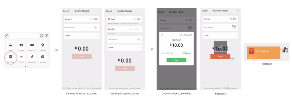
Sending Pairwise / Group Red Packets
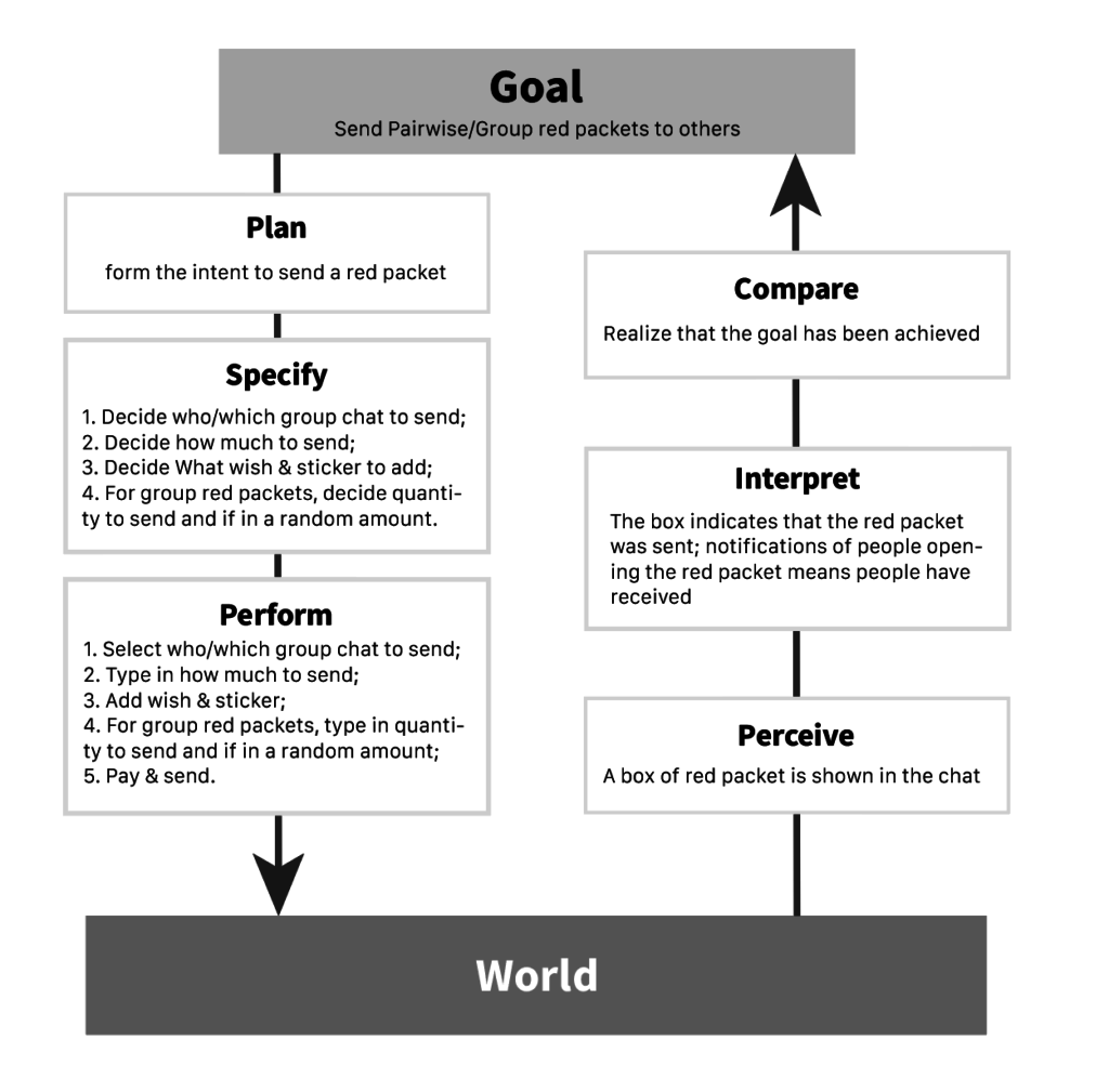
Based on the process of sending pairwise/group red packets above, we can develop seven stages of action for sending red packets in the two contexts.
The overall user journey is very smooth because there are clear instructions for each step, visible operation system, and visible outcome of the operation. The discoverability of the red packet icon is not very high. First-time users may not be able to find the feature immediately since one has to press the “+” icon and read through all functions to find it. Yet, moderate discoverability is acceptable in this case since the red packet function should not outweigh messaging as the main functionality of WeChat.
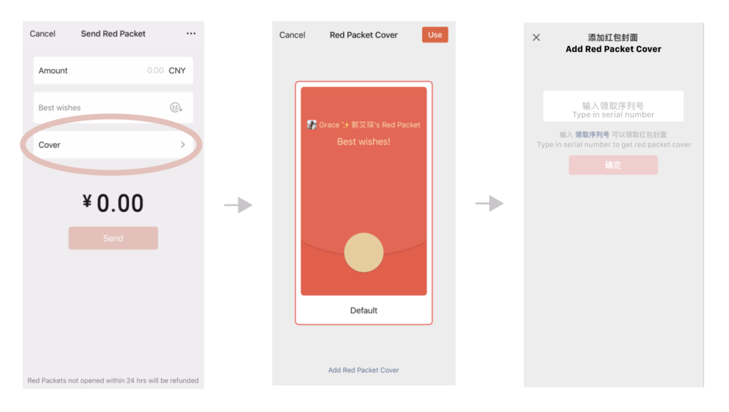
However, there is one outstanding deficiency in the process: the option to change the envelope cover. Though the interface gives the user the option to add a red packet cover, the next page asks users to type in a serial number which causes an immediate visceral reaction of confusion: what is the serial number, where can I find the number, and what covers can I choose. Here, an issue about the Gulf of Execution arises and the user makes a slip to come to this page while he/she does not have a serial number. To fix this issue, the page of adding red packet cover can offer a few pictures of covers to the users to choose directly; if there is no other cover to choose, WeChat should erase the signifier of “Cover” from the Send Red Packet page to eliminate slips and confusion.
Red Packet vs Money Transfer
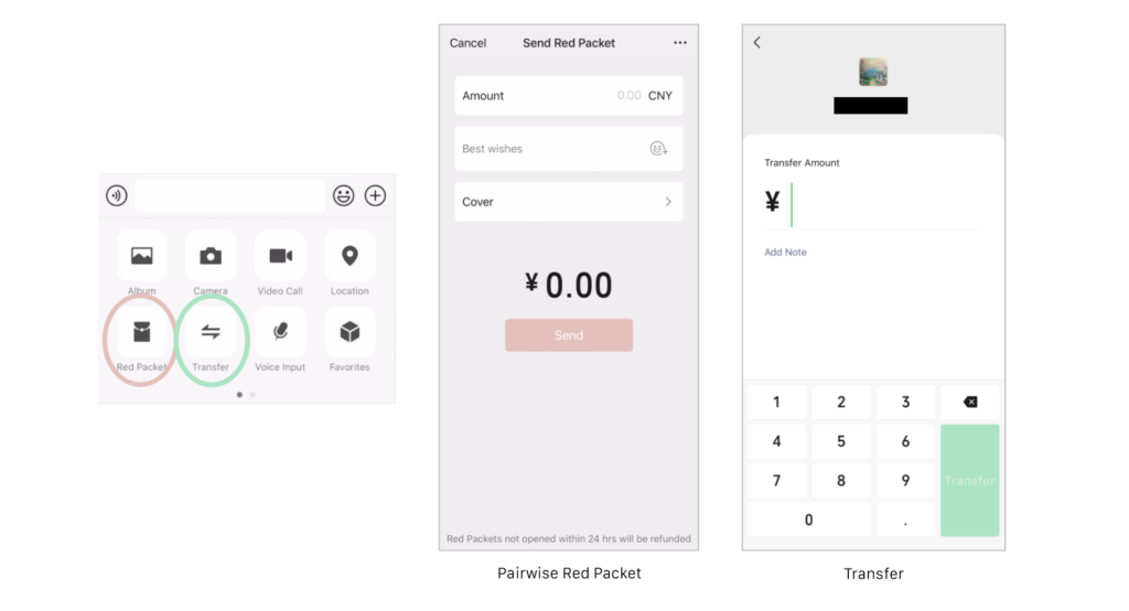
It may be confusing to have red packets and money transfer two functions at the same time in the beginning, but WeChat uses constraints to minimize such confusion. While the transfer function is only constrained to type in the amount and add a short note in a private chat of two, red packets can DIY stickers, assign the quantity of packets, and the money distribution, which highlights Red Packet’s entertaining purpose. Furthermore, while there is a monetary constraint of 200 CNY for sending red packets, there is no upper limit for transferring, which emphasizes Transfer’s affordance of formal money transactions. The visual design also differentiates the two — red packets use red and give multiple options, and Transfer uses green and a very clean and simple UI — so that users can have distinct visceral emotions. The use of constraints here guide actions and ease interpretation for the users.
Overall, the Red Packet function by WeChat offers a great conceptual model. Despite a few minor deficiencies, the effective usage of signifiers and feedback ensures discoverability and a smooth human-computer interaction process.
