StreetEasy is one of the most well-known services for New Yorkers looking to buy or rent apartments in and around New York City. By aggregating listings and providing myriad search criteria, StreetEasy allows potential buyers and renters to view pictures, videos, and descriptions of the home of their dreams. While there are desktop and mobile versions of the site, this critique will be focusing on the rental side of the mobile app.
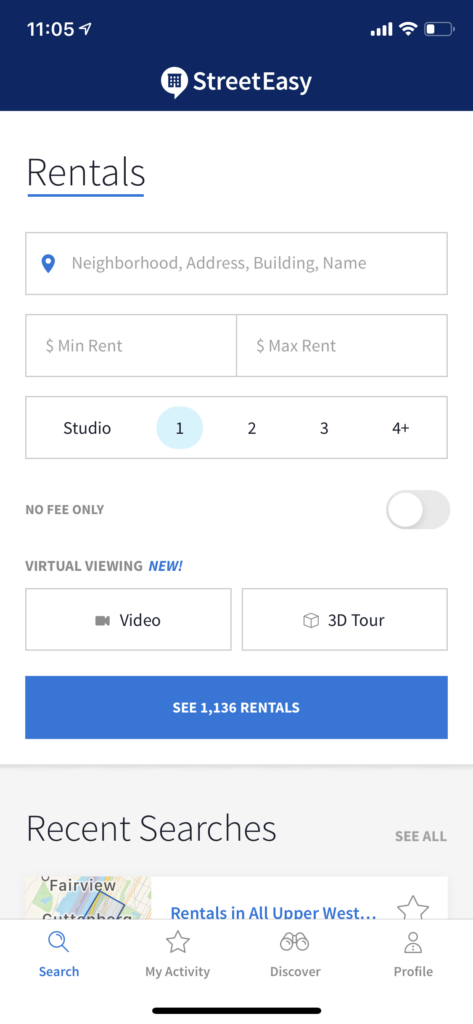
Upon opening the app, I land on a search page where I can define the neighborhood, minimum and maximum rent, and bedroom number preferences, as well as no-fee only and virtual viewing availability. As the user adds parameters to the search, the blue search bar updates with the number of relevant listings available.

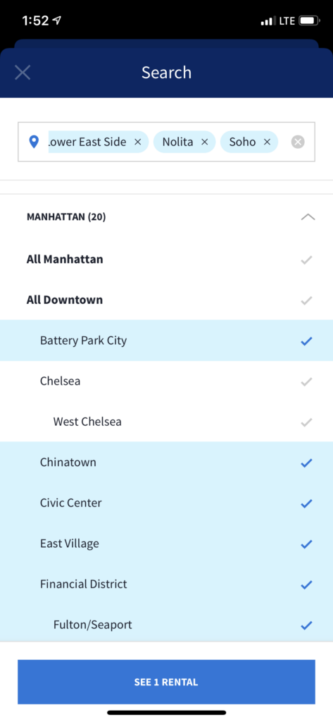
When using the neighborhood search feature, StreetEasy has many affordances that let the user specify where they are looking more precisely. It is first broken down by boroughs, then areas, then by each neighborhood with some subdivisions. However, the app leaves out a feature that the desktop version contains. It only lists out the different areas of the city, whereas the website has an interactive map of the city from which to select neighborhoods.
This is a great benefit to renters who are new to the city and do not know which areas are where yet. This leaves a new New Yorker in the Gulf of Execution, having to guess at areas and toggle between the map and the search function. Otherwise, the more familiar will have an easy time using this feature, due to its obvious feedback of color changes and a selected list when areas are added to the search.
As Don Norman writes, “complexity is good, it is confusion that is bad.” The range of listing amenities, tour options, and transportation choices a user can select are extremely important in narrowing down a search. StreetEasy has employed human-centered design by thinking of every common concern a potential renter would have. Where this fails, however, is when selecting laundry options. A user can select “in-unit” or “in-building” laundry filters. If I were to select both, I would assume I would see listings that have either one, but instead of working together as and/or, the algorithm attempts to show listings with both, which is unintended and unnecessary. Here we find another Gulf of Execution, forcing the user to select one option, scroll through the listings, and then select the other. If these choices worked together as an “and/or” function, it would save the user time and confusion.

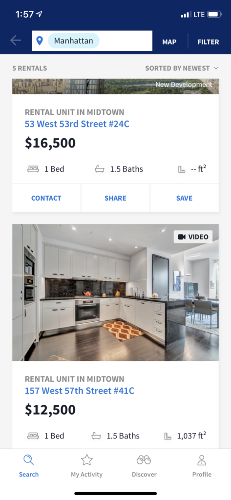
Once these aspects have been decided on, we can move to the available listings screen. A sorting feature lets users see apartments in order of newest, recently updated, least expensive, most expensive, largest, or smallest. These signifiers can be misleading, though. Does “newest” mean the newest listing on the app or the newest apartment? The same goes for “recently updated”; these terms would be much more clear in their meaning if they simply added “listing” to the end.

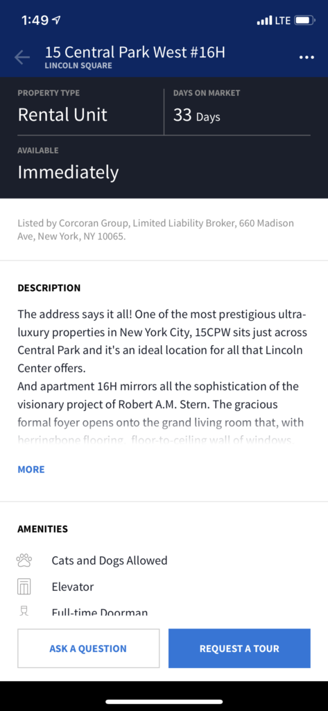
All in all, there are relatively few errors that can be made on the StreetEasy app. Most of the usage consists of scrolling through listings and pictures. Once a user decides they like a listing, there are two large buttons at the bottom of the screen with action buttons “ask a question” or “request a tour.” These buttons at the bottom of the screen take to the end of the conceptual model, from the starting point of the filters at the top of the screen. In this way, the user gradually moves down the screen during the process of finding apartments and finds the last step available on the app on a sticky bar at the bottom. This mapping of buttons is effective for natural spatial cues.
StreetEasy’s app is overall very user-friendly, allowing potential renters to navigate through the overwhelming apartment hunt process. Moving through the Seven Stages of Action, a user can easily answer each prompt and accomplish their goals. Still, these simple design improvements could improve the overall usability of the app and ease the burden especially for renters who are new to the city.