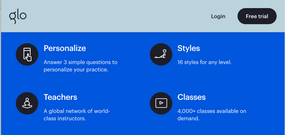
YogaGlo, or Glo, is an online subscription service offering yoga, meditation, and Pilates classes and programs that match a user’s “level and interests.” With over 4,000 classes available on their platform, YogaGlo supports user wayfinding to a desired course through establishing and following:
- Organization systems
- Labeling systems
- Navigation systems
- Searching systems
For the purpose of this critique, I will review the web browser version of Glo.
Organization System
To ensure that Glo’s classes are accessible to it’s a user, Glo’s organizational system categorizes content characteristics that are important to a user in their context of using the app or website.
Glo’s content is first categorized by type of content available:
- classes
- programs
- courses
- message boards
Next, by considering the user and their context, Glo further organizes its content by characteristics that are helpful or important to the user.
Content characteristics for classes and programs include:
- the teacher leading the class or program
- the type of class or style of yoga
- the length of the class
- the vibe or special intention of the class
- the difficulty levels
- the targeted area of the body
For the message boards, Glo categorizes by topics important to a YogaGlo user including platform FAQs in addition to health, diet, and yoga-centered subjects.
Labeling System
For metadata to be helpful to a user, its labeling systems must be carefully selected and consistently applied.
YogaGlo succeeds in the labeling system of its program and class metadata by selecting names that bring meaning to a user on the platform. “Teacher,” “style,” “duration,” “level,” “intensity,” “focus,” and “body part” all clearly indicate to a user what type of information is grouped beneath the heading label including the styles of workout, time commitment, or the ordinal ranking of class level and intensity.

The labeling system applied to classes is exhaustive and mutually exclusive, so each class or program and is tagged with one label from each category to support user seeking and cognition.
Navigation System
Labeling systems support navigation system by selecting label names that effectively represent information environments.
For Glo, the top navigational labels are carefully chosen to represent the site’s different types of content (classes, courses, message boards), and to support the different types of user way finding (know-it seeking, exploratory seeking, exhaustive research, and re-finding).

- “For You” communicates to the user a customized homepage to support exploratory seeking based on a user’s interests communicated via account preferences and user history.
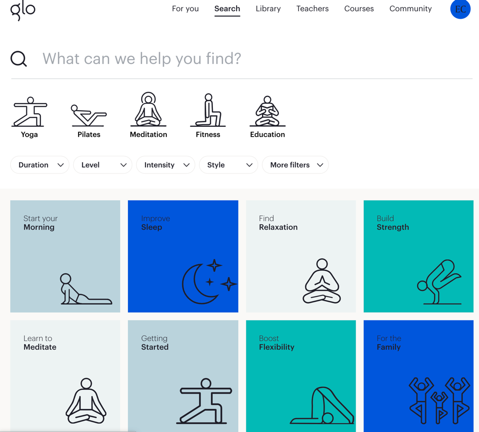
- “Search” connects to the user an information environment that will support know-it seeking.
- “Library” suggests collection of resources, signaling to a user an information environment in which a user will be able to re-find any saved classes.
- “Teachers” communicates to a user seeking to do exhaustive research, highlighting YogaGlo’s familiarity with a user’s practice that may center around a few favorite teachers.
- “Courses” is direct naming the label of the content type, suggesting to the user it is the exclusive area of the on which to seek exploratory and exhaustive information on the educational courses offered by YogaGlo.
- “Community” effectively conveys the user intention of the message board content.
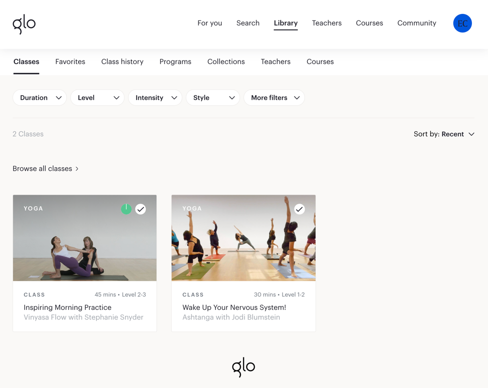
Although YogaGlo is successful in its consistent application labeling and cross-linking to support exploration on the site across by teacher and style, it’s navigation for re-finding is the least user-friendly due in part to its top navigation labeling as “Library.”

Within the “Library,” YogaGlo has grouped all ‘re-finding’ user-tasks, but under names that do not necessarily communicate how they got there or what they are.
For example, the difference between “Classes” and “Favorites” is not clear. “Class history” and “Programs” are prioritized ahead of “Collections,” which like “Classes” and “Favorites” is a category that a user created by saving classes together for the purpose of re-finding.
Also, by simply re-applying the labels “Teachers” and “Courses” under the “Library” top navigation, it is not necessarily clear to a new user that these are only the teachers they’ve elected to follow or courses they’ve already started unlike the top navigation labels.
Searching System
On the other hand, Glo has excelled utilizing the thoughtfully considered organization and labeling systems to support their search system.
Filters allow users to recall classes and programs that only fit the characteristics deemed important to the user by the user, whether duration, style, or level.
In addition, Glo supports user search by supplying additional categories for sorting its content based on user intentions for opening the app, whether it be to build strength, learn to meditate, or improve sleep. These recommended categories are incorporated on the personalized home page and search page to develop search systems around user motivations as an alternative to search by program or class characteristics.

Overall, Glo’s effective synthesis of its organization, labeling, navigation, and search systems support user exploration and continued engagement with their site encouraging both user’s to return for another class and deepen their practice.
