Strategy
Google drive is designed for people to manage their file like docs, slides, or tables online. It also a cloud cooperation platform for users to share and collaborate, by inviting others to view, edit, or leave comments on any of the files or folders. Google drive is accessible to all users over the world with internet connections. Google introduce itself as “Everything you need to get anything done, now in one place.”
Scope
One of the fundamental functions is that the users could access their files no matter where they are or whatever devices they are using. All the files are being stored in Google’s remote servers. So, the users could access it as long as they get the internet access. It also allows the user to grant the access for other use to access their file or even work together to edit the file.
Structure
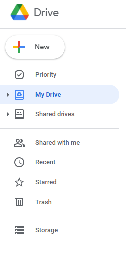
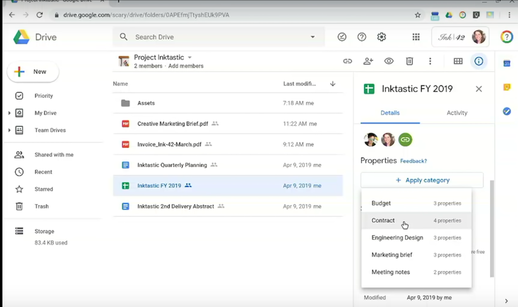
The structure of the files for the user could be clearly managed. You could access all the files you have the access. Or you could filter these files into categories like “Shared with me”, “Starred”, “Trash Can”. With this intuitive design of the structure of the file being stored, and since the platform only store the files and no other things like system files. The user could manage their file with ease. On the left side of the web, there is also a bar shows how much space you have used your drive. It also increased the ability of the user to manage their files.

Skeleton
The skeleton of this platform is really simple and due to this, it is really easy to work with. You could access this in Google’s Homepage after you have logged in with your google account. After you have hit the Google Drive button it will automatically direct to the page where you have all your files. So, if you kept your google account logged in, it would only take you one step from the Google’s home page to all the files in your google drive. By clicking the corresponding icon of your file, you would directly open the file and started editing mode by default.
Another features is the cooperative aspect. You could send the invitation link to other users of google drive to let them work together with you. This has saved the user a lot of time for synchronize the work process when working on the same project/document.

Surface
It has a logo on the top left side and all the functions on the left side. Besides, you could also access other product of google on the right side. For example, Calendars and Tasks. People may likely to use the google drive along with other products of google like calendars. This design has increase the efficiency to switch between different products. And also, the user could also move from the Calendar web to Google drive very smoothly with the same reason. It is a good design of the platform ecosystem.
Also, when you are in the cooperative editing mode, there will be multiple cursors with different colors. This is an intuitive design which help the users easily determine which participant is working on which part. And all the participant could leave their comments on the side.
Overview
In all aspects of the designing strategy, google drive is a successful product that achieved the goal for its user manage their files and work cooperatively with these files. The interface is neat and refreshing, all the function is intuitive. There would need to be an instruction to teach the users how to use it. Just by looking at the interface, the users would find their button they are looking for by their intuition. This is a fully developed product and there is very little things need to be modified.