ABOUT THE PROJECT
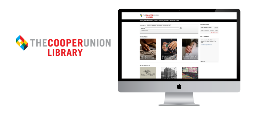
The Cooper Union Library has served The Cooper Union community for over 160 years. With the recent redesign of their library website, the purpose of this project is to learn how users interact with the website and provide recommendations to enhance the usability and user experience. By using UserZoom Go, an online, remote user testing tool, we were able to conduct user testings and assign tasks for our users to test the website’s functions and services.
My Role
- Create promotional flyer to recruit Cooper Union students
- Conduct (2) and note-take user testings
- Analyze results, identify key usability issues, and suggest recommendations
- Co-write, edit, and create mockups for the usability report and presentation
CLIENT
Lisa Norberg —
Acting Director of the Library
Our team
Jamie Chen
Jeffrey Delacruz
Verena Tanzil
Victor Chien
duration
October — December 2020
Tools
UserZoom GO
Google Slides
Google Meet
Google Docs
Miro
THE PROCESS

After meeting with our client, we were able to define our goals and establish a clear idea of how we should conduct our user testings and create our tasks. Our client wanted to know how users were interacting and reacting to the newly redesigned website, such as if users are able to find out how request books, search for a specific item, and easily navigate around the website. We were then able to design our tasks that will satisfy our client’s goals and effectively test the redesigned website. All members of the team had participated in most of the user testings. We were able to consolidate all of our notes after finishing conducting the user testings. And we scheduled many group meetings to discuss and identify key findings and recommendations.
TASKS
Before completing tasks, participants were asked to fill out a screener form.
Participants were then given the following 6 tasks.
Task #1
Submit a request form for a book called ‘Invisible Cities’ by Italo Calvino, Harcourt Brace Jovanovich, 1978.
Task #4
Save the book ‘Thinking architecture’ by Peter Zumthor for future reference.
Task #2
Find an academic journal about Zaha Hadid in “Perspecta Vol 37: Famous” on JSTOR and download the PDF.
Task #5
Find out how long the loan period is for undergraduates.
Task #3
Find a book called ‘Thinking architecture’ by Peter Zumthor and see its available location(s).
Task #6
Find out what day the library reopens after New Year and what time it closes.
PARTICIPANTS
We have selected eight participants to help with the study. Seven participants were full-time students, and one is a recent graduate from The Cooper Union. Six participants were from The Cooper Union, while the other two are graduate students from Binghamton University and Columbia University.
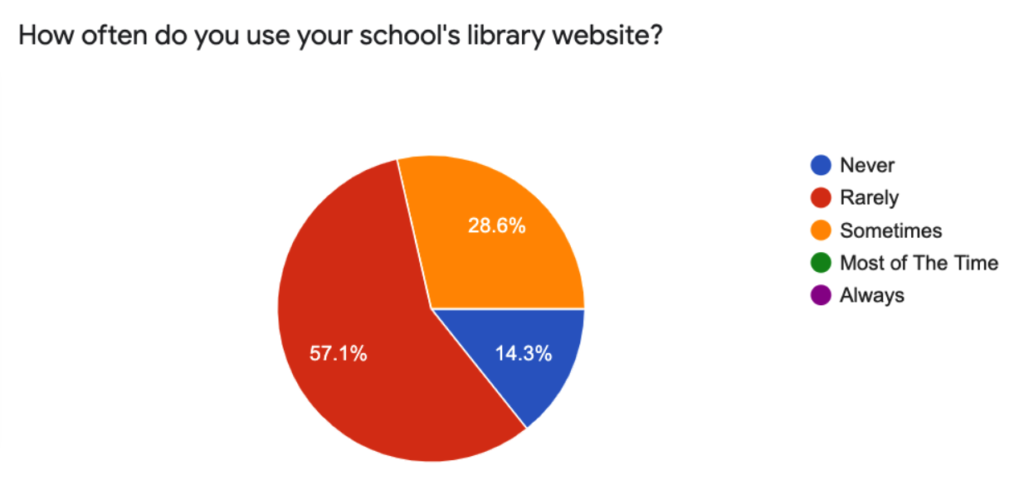
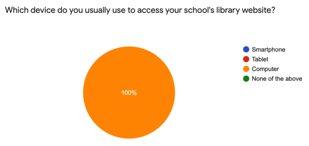
In our screener form results, all participants reported using their computers to access library websites, thus why we chose to conduct the user test on desktop. And most of our participants reports to only rarely use their school library website.
ANALYSIS
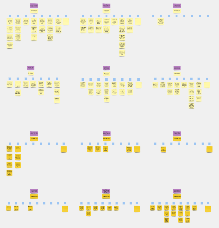
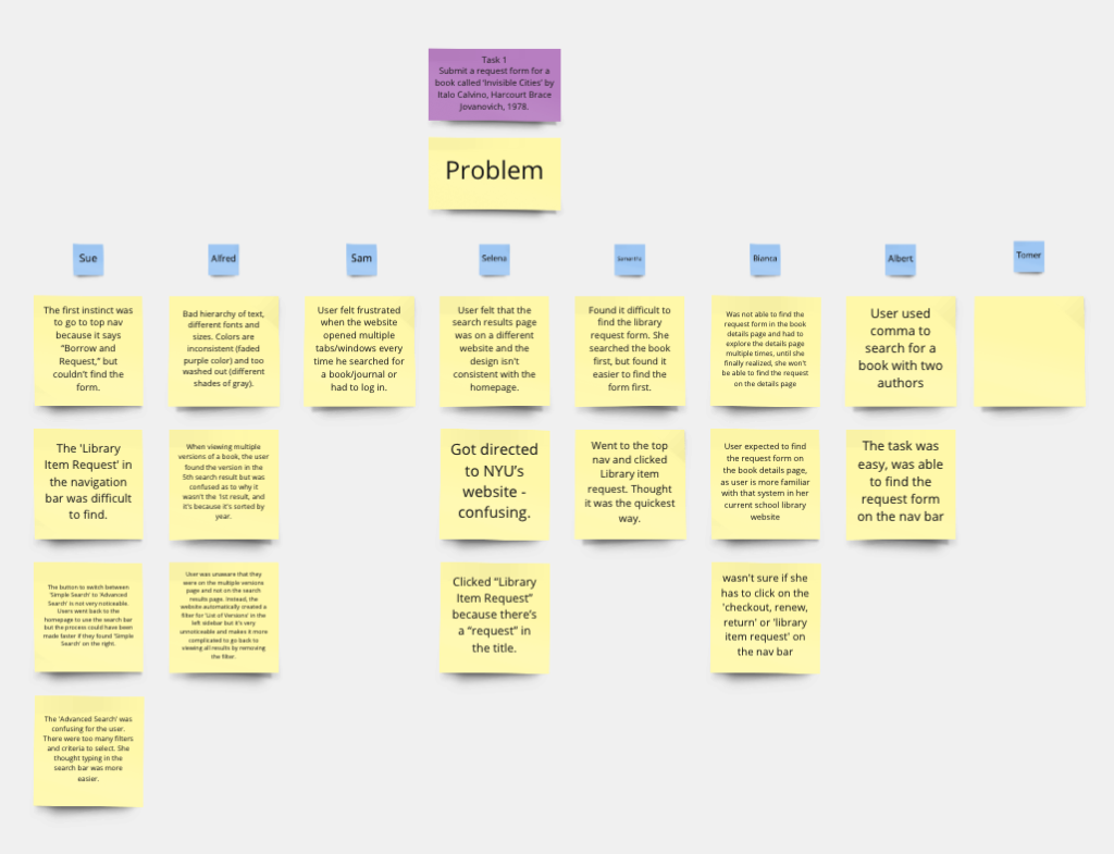
After conducting all of the user testings, our team organized and complied all participant responses and identified key findings into a Miro board. This greatly helped to compare each user testing and measure the difficulty of each task.
RESULTS
TASK DIFFICULTY AND RATING
OVERVIEW
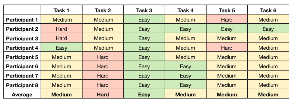
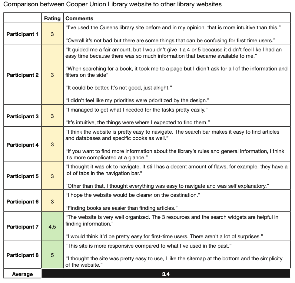
Many participants thought the library website was very simple and easy to use, but not as intuitive when completing tasks such as identifying critical information, and searching for specific books and journals.
Therefore, our team has identified three key findings and recommendations for this project.
FINDINGS & RECOMMENDATIONS
FINDING #1: LIMITED INFORMATION AND TEXT/COLOR HIERARCHY IN THE SEARCH WIDGET, HOMEPAGE, AND SPECIFIC PAGES.
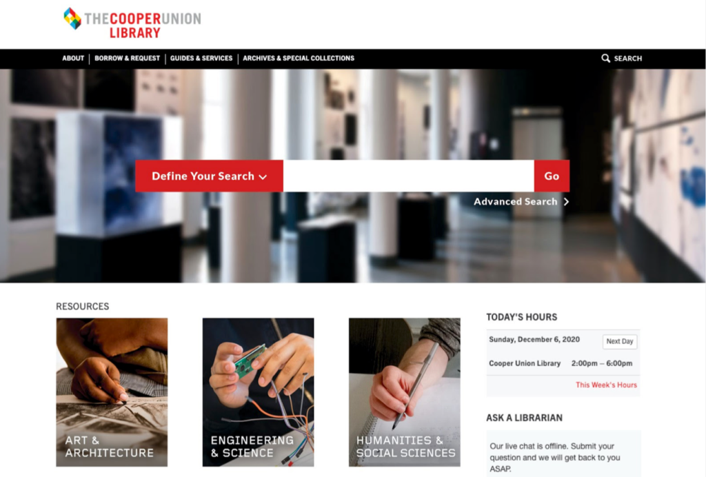
Problem: For the first three directed tasks, one user felt that they needed some description of each tab on the search widget because it was difficult to know which category would be the best to search for their specific item.

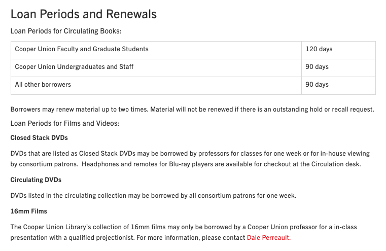
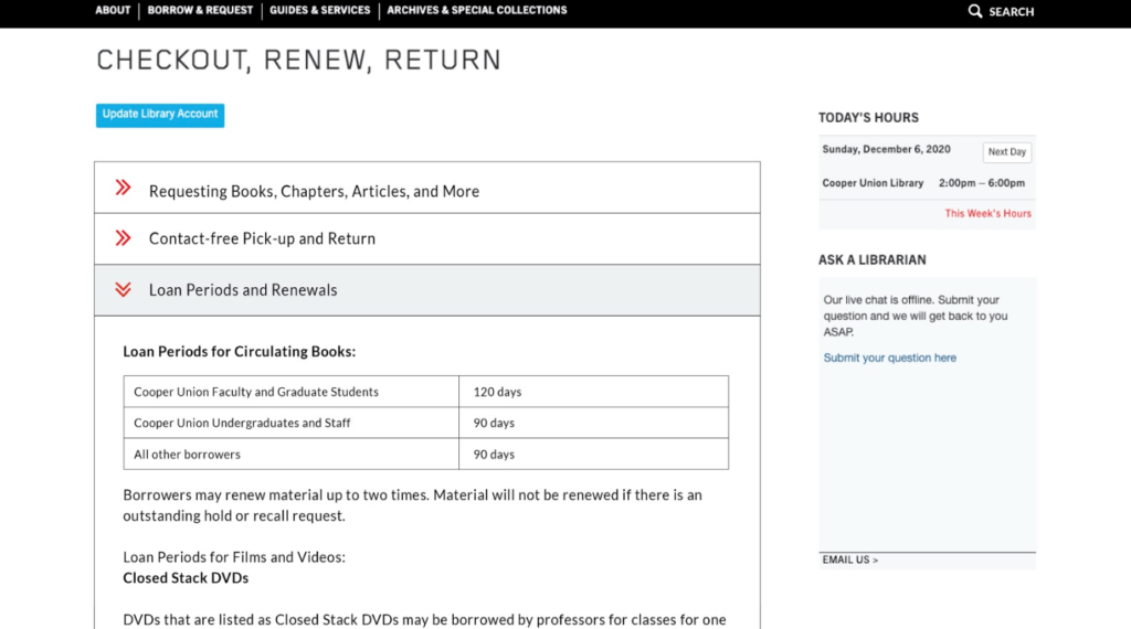
Problem: Many users had trouble locating the loan period information on the Checkout, Renew, Return page due to its limited text hierarchy. Many users had thought this page was very text heavy and had limited text hierarchy to help differentiate between sections and information.
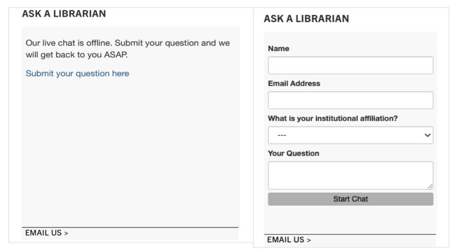
Problem: One user noticed that the ‘Ask a Librarian’ live chat was offline and was wondering what time it will be available again but couldn’t find the information on the widget or anywhere on the website.
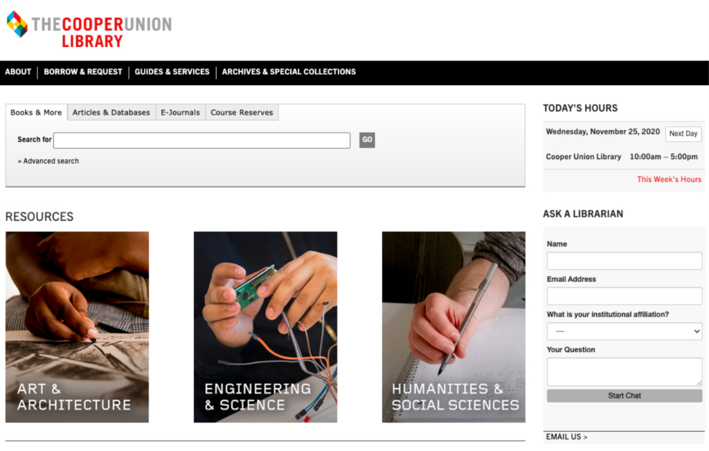
Problem: One of our users was partially colorblind, so the colors on the website were difficult to differentiate between sections, features, and information. For example, the user thought that the search widget was the most important feature on the homepage and should be the first thing that stands out, but their focus went directly to the resources section first.
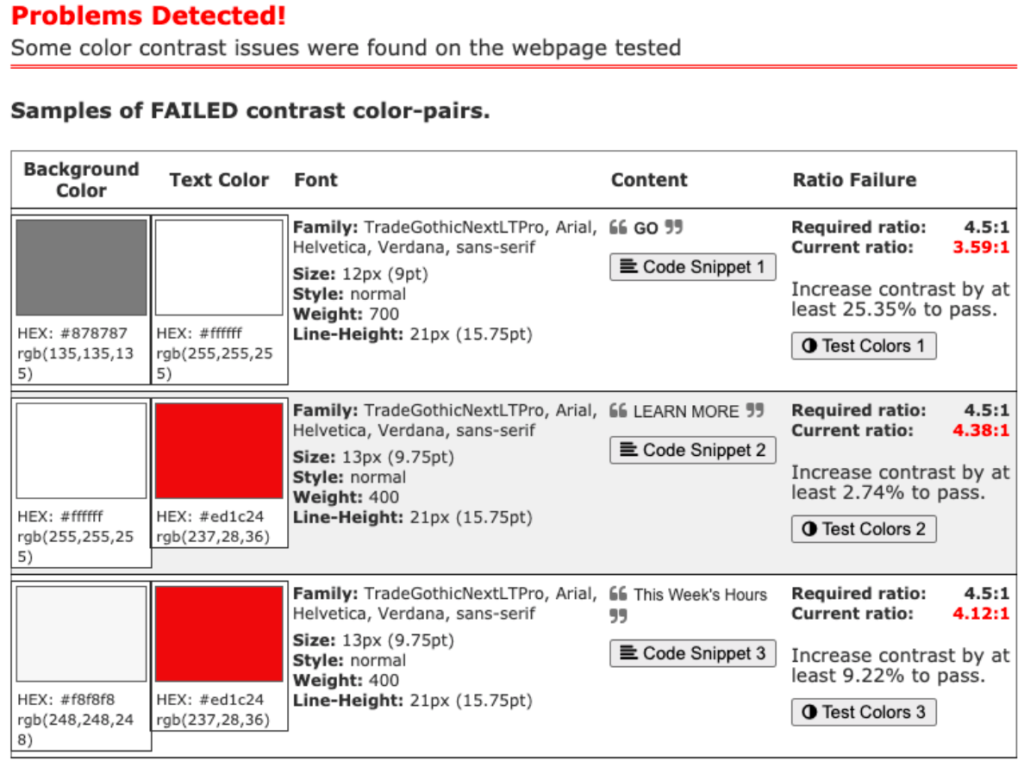
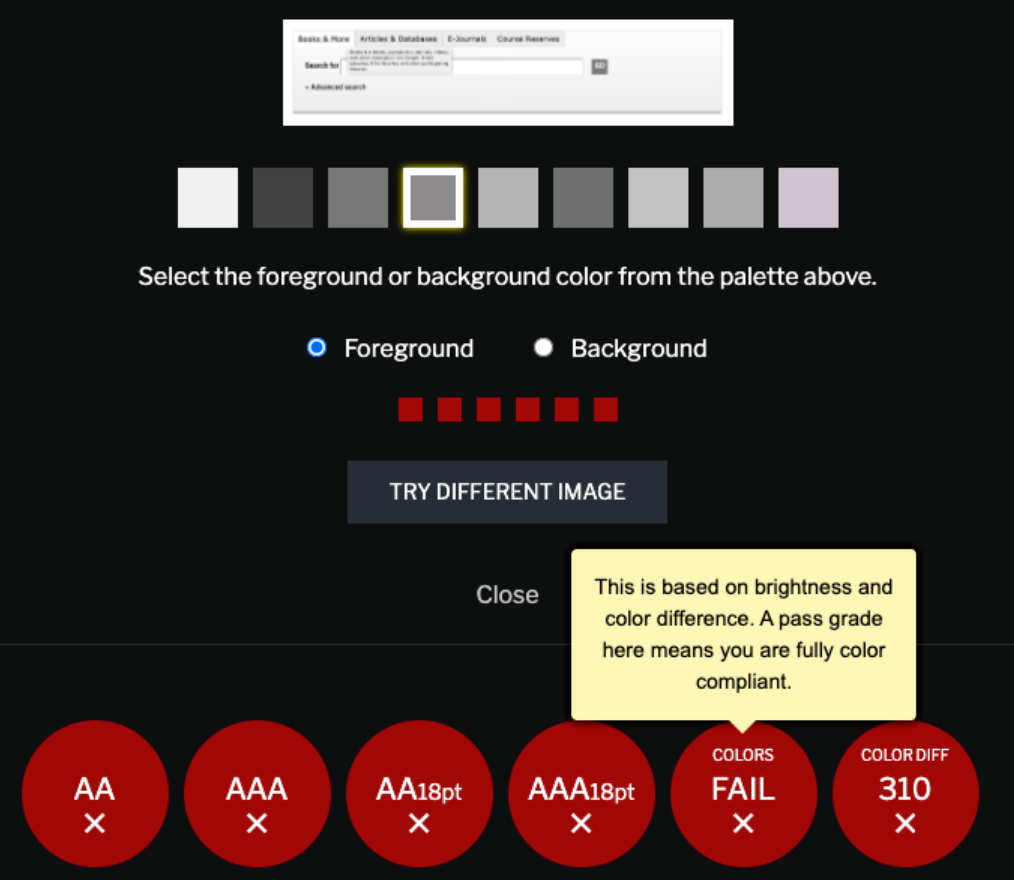
We tested the homepage with an online color contrast checker and it found some issues that did not pass the minimum contrast ratio such as the GO button, the color of the search widget, and any red text on the page.
RECOMMENDATION #1: IMPROVE TEXT AND COLOR HIERARCHY AND CONTENT
Recommendation: We suggest to redesign the search widget to better emphasize the widget and other features by implementing more brighter and contrasted colors. we added a photo from cooper union’s website to add more focus and color to the search widget.
This drop down option makes it easy for users to clearly view and determine which category they should search in.
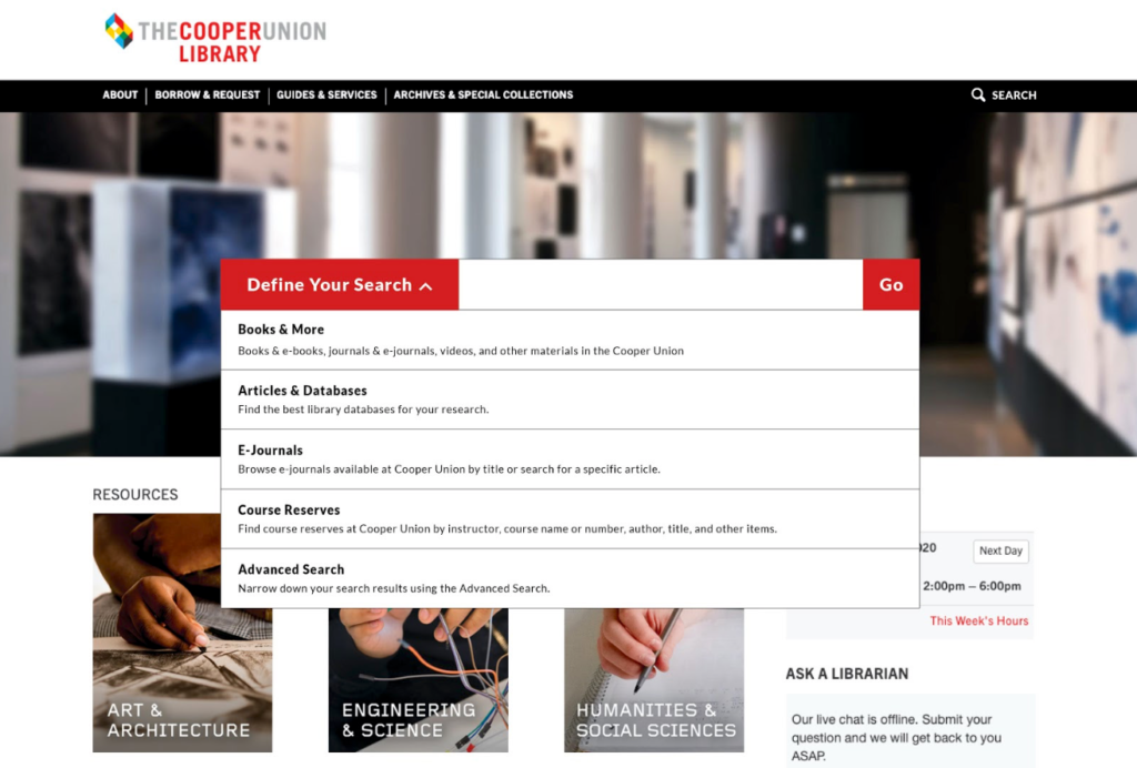
Recommendation: Include a search function that lets users search within the library website. So if users want to find the loan period information, they can easily use the search function and find the page right away.

Recommendation: For the checkout, renew, return page, our recommendation is to improve the text hierarchy to better organize information and content in a more efficient way.
We suggest to combine each section into its own box where users can expand and collapse and easily find the section that they want.
FINDING #2: UNCLEAR LABELS IN THE NAVIGATION BAR AND E-SHELF
Problem: Most participants had trouble submitting a request form for a book and was confused on which section in the navigation bar that would contain the information. Users had difficulty finding keywords that were related to their task and some users did not expect to find the loan period information under the Checkout, Renew, Return section.

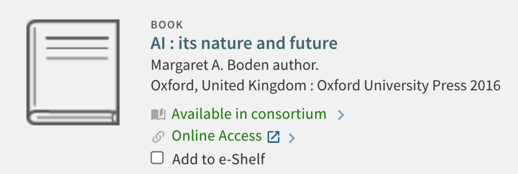
Problem: Some of our users also had some confusion as to what the purpose of the ‘Add to E-shelf’ function was. After informing them that it was to bookmark a book, they reported that this was a useful function but should replace the wording with familiar keywords such as ‘save’ or ‘bookmark.’
RECOMMENDATION #2: MAKE CHANGES TO LABELS ON THE HEADER
Recommendation: When quickly navigating through the site many participants overlooked the “Library Item Request” tab therefore we recommend moving this tab up in the subheader and removing the word Library in “Library Item Request” so that the visitor can quickly locate and identify the key word “Request”. The result will reduce the amount of scanning through the subheader.
Recommendation: To increase the visibility and eliminate the confusion of this feature, replacing the word add with “Save” or “Bookmark” will give the visitors a better understanding of the function and purpose of E-shelf.
FINDING #3: LIMITED FLEXIBILITY AND SHORTCUTS TO VIEW OPENING TIMES
Problem: Many of our users had some difficulty using the weekly calendar widget to find when the library is open on a specific day. As they were clicking the previous and next buttons, they thought it was very tedious to find a date that’s far into the future since the widget only displays by week. Also, the previous and next buttons kept moving back and forth after every click, taking more time than expected to find the information.


RECOMMENDATION #3: REDESIGN THE LIBRARY HOURS SECTION
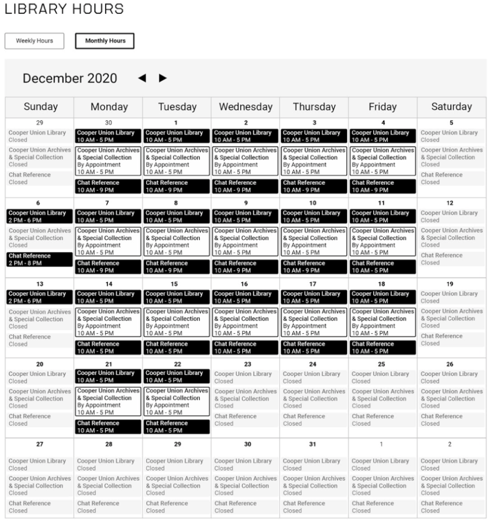
Recommendation: We suggest to add a new feature that enables users to view a monthly calendar and to include color coded information that will better organize and find information more efficiently.
CONCLUSION
After presenting to our client, we were able to discuss more in detail about our user testing and results. Our client had strongly agreed with most of our findings such as the color contrast issue on the homepage, limited text hierarchy of the Checkout, Renew, and Return page, missing information of the hours of operation of the live chat, and difficult use of the calendar widget. The usability study was successful in identifying key findings and recommendations to better improve the website’s usability and user experience. These results and recommendations have revealed a lot about the way people interact and navigate around the website, and we hope that these recommendations and user responses will be useful in improving the Cooper Union Library website.
