Project Overview
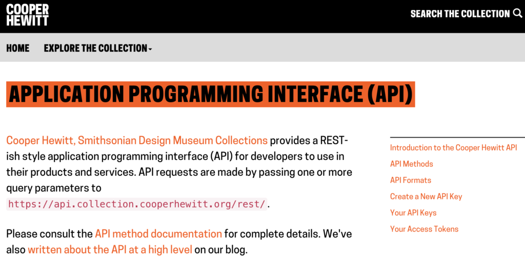
This usability study was conducted in collaboration with the Cooper Hewitt, Smithsonian Design museum to evaluate the current user experience of the Cooper Hewitt API. Our client at the Cooper Hewitt Museum wished to evaluate three stages of the user experience: API onboarding, API usage, and usage of response data. Our findings and recommendations focused on reducing user error and improving site navigation.
The Challenge
To encourage API consumption by improving the usability of the API onboarding and usage experience
The Goal
To identify significant usability findings and provide actionable recommendations to improve the API website
The Team
Four interdisciplinary Pratt Institute graduate students; my primary roles include study design, participant recruitment, data collection and analysis, reporting writing/editing, and client communication
Study Timeline

This eight week project began with a client meeting to determine goals and culminated in a presentation and report. Due to the timeline of the project, we limited our scope to refining the existing API website. We did not ask participants to integrate the API with external projects nor did we propose new features.
Recruitment Plan
Our team identified two user personas, Coding Cate and Software Sam, to guide recruitment. We limited participants to users with some programming experience, eliminating screener respondents who self-reported a 0 on a 0-5 scale rating their programming and API experience. We selected 8 participants from our screener respondents, with 50% identifying as novice users with non-professional programming experience and 50% identifying as experienced software engineers.

Study Design
In order to discern user patterns, we wanted to gather contextual data in addition to task data. For each user session, we conducted the following:
- Pre-test questionnaire: This questionnaire gathered data on the participant’s prior experience with APIs and API documentation expectations.
- Tasks: The tasks, presented below, gathered data on the participant’s ability to onboard and use the Cooper Hewitt API.
- Post-test questionnaire: This questionnaire gathered data on the participant’s overall impression of the website and ideated use cases.

Data Collection & Analysis
All user sessions were scheduled via Calendly and recorded via UserZoom GO. User sessions were synchronously completed with a moderator and accompanied by a supplemental note-taker. During the user sessions, participants were introduced to the “think aloud” method and instructed to voice their thought process while completing each task.
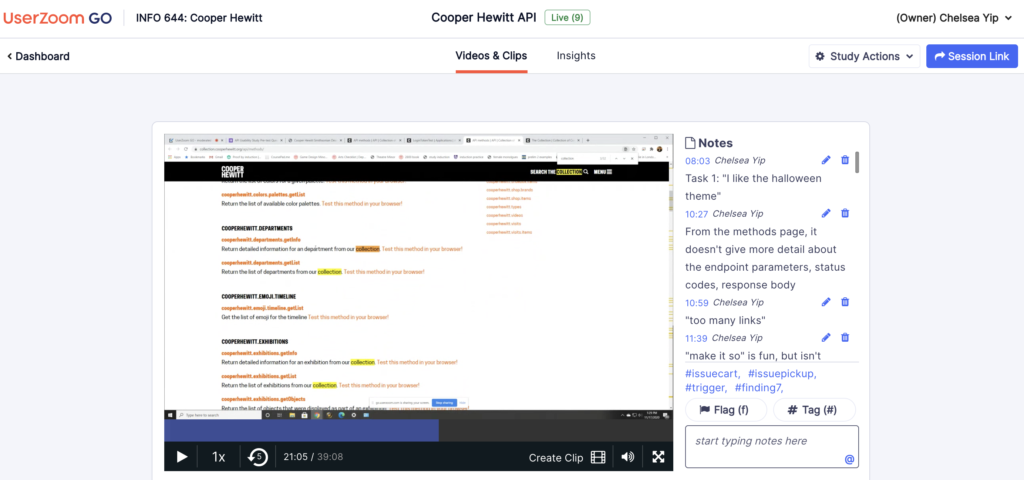
Following data collection, all usability findings were aggregated and prioritized. We grouped findings by location and similarity, and we evaluated findings using quantitative (number of occurrences) and qualitative (severity of misstep) methods.

Findings & Recommendations
Participants overall reported positive experiences with the Cooper Hewitt API and its documentation. On the post-test questionnaire, participants unanimously agreed that the website was easy to use (reported as a 4 or above on a 1-7 scale), and 75% of participants reported feeling confident using the interface. In particular, participants laughed and remarked that the playful language throughout the website was “super cute” or “really funny”, and they appreciated that the ability to test methods directly in the browser reduced the barrier to entry while they became acquainted with the website.
Our four highest priority findings and corresponding recommendations are presented below:
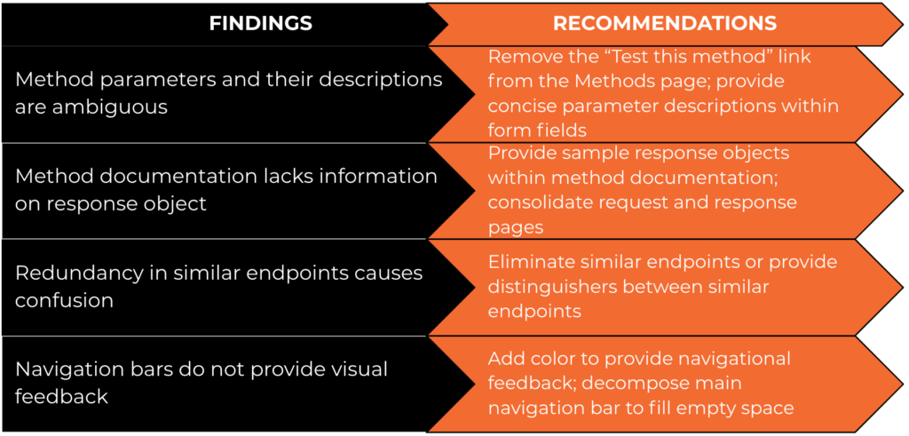
Full mock-ups of our recommended design changes are available in our report, but key observations and recommendations have also been collected below:
Early Presentation of the “Test this method in your browser” feature prevented users from Viewing method documentation
The “Test this method in your browser” feature offers a simple and convenient tool to interact with the API without external tools. While participants found the feature extremely helpful, early presentation of the feature on the methods page allowed users to navigate directly to the test feature without reading the method documentation, and this behavior was observed in 7 out of 8 participants.
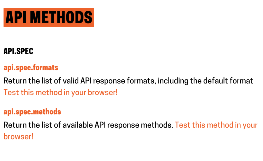
In order to encourage users to read the method documentation and gain context regarding the method parameters, we recommend introducing friction intentionally and removing the “Test this method in your browser” link from the methods page. Users will still be able to access the feature, but will be forced to read the method documentation prior to doing so.
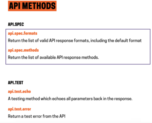
Method Documentation lacks information on response Status codes and object shape
While method documentation provides in-depth details of input parameters and even provides a sample request, the documentation does not provide details on the response object. During testing, 5 out of 8 users expressed surprise when they received the API response, with participants stating that they “didn’t know what the response would look like” or that there was “no expectation of what further objects would look like.”
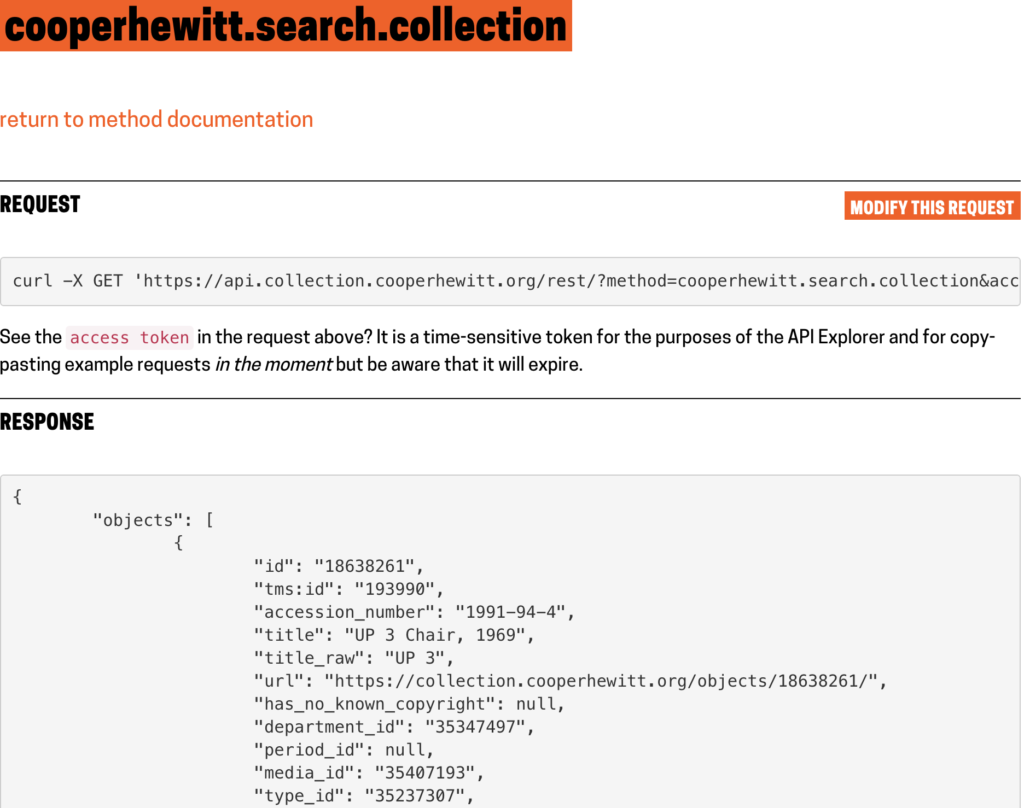
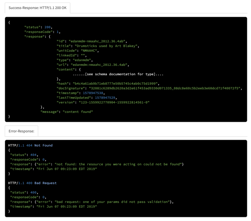
A competitive analysis of cultural heritage APIs such as the Smithsonian Institution’s public API or the Art Institute of Chicago API reveals the value of providing example response objects. By providing example status codes and response objects, users can build in error checks and fall backs within their applications.
Outcomes & Future Considerations
Our study of the Cooper Hewitt API determined that novice and experienced programmers alike believed that the API was straightforward and easy to use. Participants found the design visually appealing and enjoyed the personality added by playful diction throughout the website.
Upon presentation of our findings, we were encouraged by positive feedback from our clients. We hope that our findings may positively influence future iterations of the Cooper Hewitt API and hope that the API will continue to be accessible and enjoyable for all.
Due to the limitations of this study, we were unable to research additional user groups such as children or fully inexperienced programmers. Given additional resources, we hope that further iterations of this study might include these user groups and additional use cases such as external integration and data visualization.
Questions?

Team members at our final client presentation.

The full report for this study can be found here and the presentation here.
If you have any questions about this study or are seeking a consultant on a new study, please contact me at cyip@pratt.edu.
