Introduction
I was tasked to review a digital interface against Don Norman’s design principles in his book, The Design of Everyday Things. I reviewed an app called iRobot. The app is installed on my iPhone. iRobot is used to perform, monitor, and troubleshoot actions on the Roomba vacuum cleaner, a robot that vacuums your home on its own.
I reviewed the app in two manners: 1) without any specific goal, and 2) with the goal of cleaning my floors with the Roomba.
Interface Analysis: No specific goal
When first opening up the app, I can already see what affordances are available, with help from signifiers. For example: scheduling, adding a favorite, and starting a new job. There is an arrow pointing to the button “New Job” with a “+” icon which signifies that I can tap on the button to begin a job.
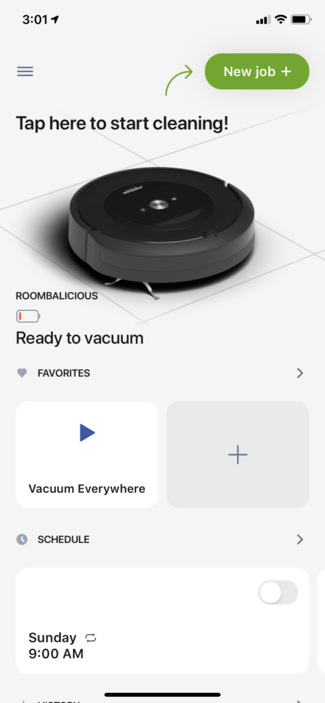
The reason I know I can tap on buttons is due to my mental model that buttons on applications can be clicked (on the desktop) or tapped (on mobile).
Though the “New Job” label here is a bit generic, given my experience of using the app previously I can understand that this implies starting a ‘vacuum session’ with the Roomba. This understanding can be explained by Norman’s idea of conceptual model, the understanding of how something works.
Additionally, the interface presents itself with an image of the Roomba, and a battery icon. The current battery icon signifies that the Roomba is at a low level, given its perceived red color and amount the battery is filled. However, it does not indicate the amount of time the machine will be able to perform its main purpose (vacuuming). This leads me to believe that there are no constraints – if I were to try to start a vacuum job – that would prevent the Roomba from starting a job without being able to fully accomplish its goal of properly cleaning my floors (measured by a period of time). This lack of understanding additionally can be interpreted as a poor conceptual model.
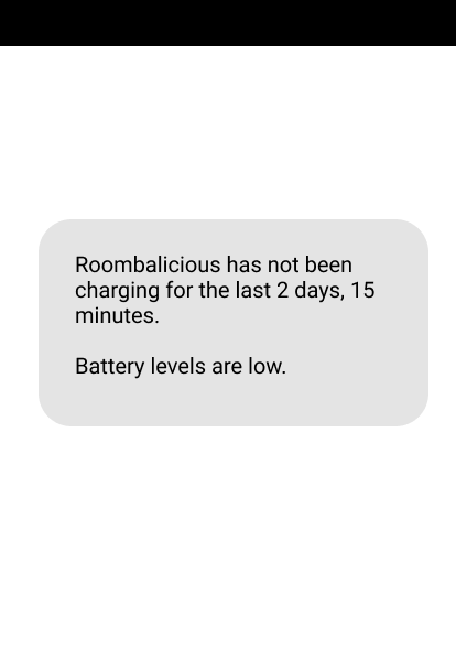
Similarly, on another note, I also did not get a push notification from the app about the low battery. Because I did not get a notification, I had no idea the robot itself wasn’t properly stationed at its base, and therefore not charging since its last use. Receiving a notification might help avoid the mistake of thinking I am able to run the Roomba for an indefinite period of time, when in fact I may not be able to.
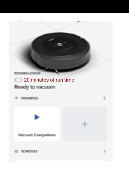
The battery issues leading to a poor conceptual model and possible mistakes could be improved by a) providing a time indicator of how long the Roomba can run for, given its current low battery level; and b) notifying me that the robot isn’t (or hasn’t) been charging since its last use.
Mockups provided below: providing clearer information
Mockup for a)
Mockup for b)
Starting a New Job Analysis: Goal to vacuum for an indefinite amount of time
Regardless of the above confusion, I still wanted to start a vacuum job for an indefinite amount of time. As I tap on the “New Job” button, I get immediate feedback:
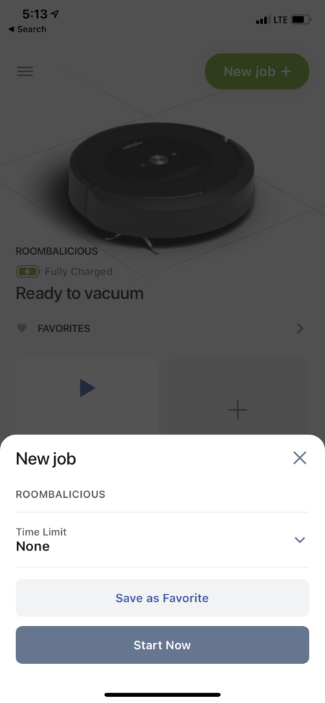
Once I tap on “Start Now” I receive feedback again, since I hear the physical Roomba make a sound, and see the app update to the label “Vacuuming” with a new affordance to “Pause” the robot. This is a good example of proper feedback because it gives me clear indicators that my actions were executed.
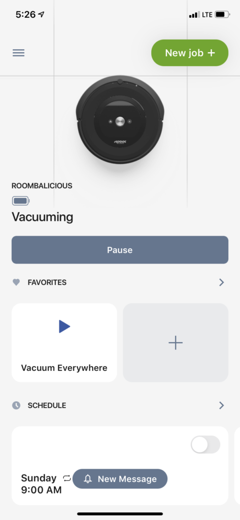
Moreover, for demonstration purposes, tapping “Pause” updates the screen – again, utilizing good feedback.
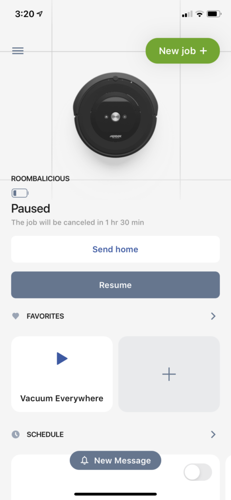
Nonetheless, it was still unclear how long I would be able to keep the Roomba on in order to accomplish my goal: cleaner floors. This example of having a poor conceptual model remains, since it still does not provide all information I need in order to gain full control and understanding of the how long the robot can vacuum for.
Conclusion
The app provides appropriate affordances to accomplish relevant tasks, they are discoverable through easy-to-interpret signifiers, and executing a task provides good feedback. However, there were two situations that felt confusing, leading to improper understanding, or conceptual model, and possible mistakes. The first example was the lack of understanding whether I would be able to accomplish my goal (vacuuming for an indefinite amount of time) given the low battery life. The second was the lack of awareness that the Roomba wasn’t charging since its last use. I provided mockups for these poor scenarios that would benefit from clearer information.