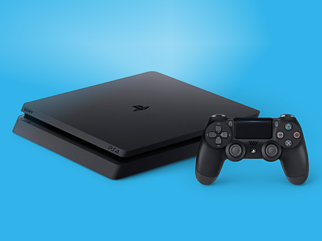
Launched in the United States on November 15, 2013, the Sony PlayStation 4 is one of the most successful gaming consoles ever produced. With support for internet-based media, multiple apps, USB peripherals and physical discs of various formats, the PS4 is a holistic entertainment system that affords users a wealth of digital interactions.
Even though Sony’s next-generation PlayStation 5 has already hit the market, their PS4, with well over 100 million units sold, is still widely popular around the world due to its implementation of many successful design attributes.
The Controller

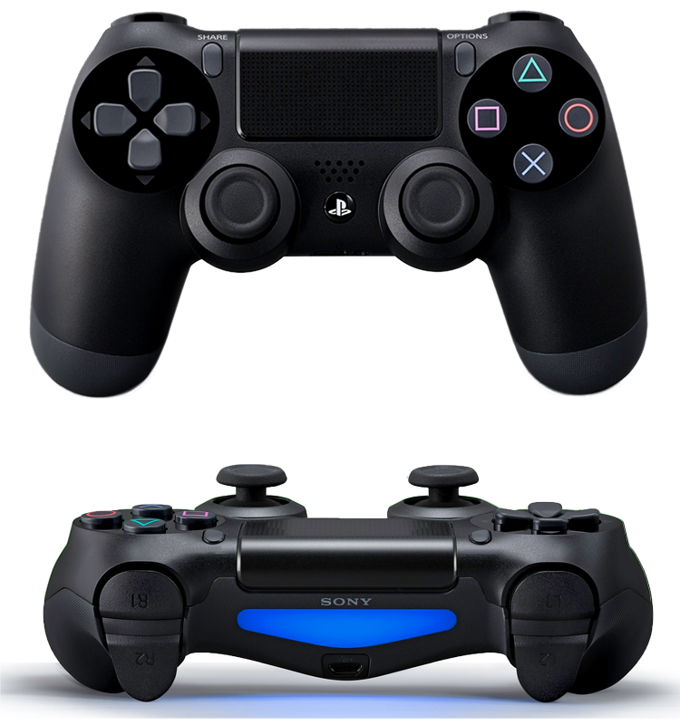
Often imitated but never quite duplicated by its competitors, the aesthetic and feel of Sony’s now iconic controller configuration has not changed much since the late 90’s. Over the decades, buttons and features have been added, cords have been removed, but the basic two-handled “body” is as familiar in the hand now as it was all those years ago.
On a visceral level, the DUALSHOCK simply feels good. The symmetry, ergonomics, lights, sounds, vibration and touch sensitivity combine to produce a near-organic interaction with every aspect of the broader UX system of the PS4. These attributes not only make the controller visually and tangibly appealing, but also afford the user literal hours of game-play without hand fatigue or discomfort. This capacity for prolonged engagement results in a deep behavioral connection where even the most nuanced of hand movements quickly become second nature, and the controller functions as a subconscious extension of the user, significantly strengthening the immersive flow of digital activities with relevant feedback.
All of this time spent vicariously adventuring or viewing streaming media is certainly enjoyable for the user in the moment, but one of the most powerful affordances of the PS4 console is the ability to store and share nearly any instance of an experience with others.
Sharing

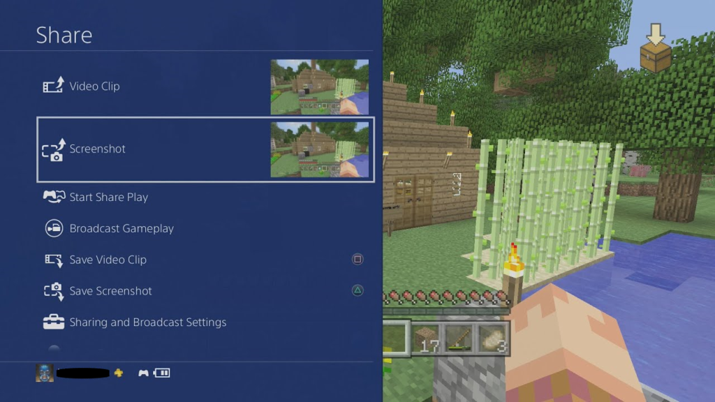
One of the most noteworthy additions to the PS4 was the introduction of the SHARE button on every controller. While hardly essential to mastering any of the games on the platform, the SHARE button afforded new possibilities for capturing screenshots and video, streaming live game-play broadcasts online, and even allowing users to give control of their game session to a friend on the PlayStation Network for up to an hour at a time. This robust set of functions enabled an entirely new level of personal reflective processing as gamers could now record and collaborate on experiences they found particularly noteworthy or challenging.
Design Issues
As impressive and popular as the PS4 may be, it is not without its faults. While there are a slew of powerful affordances for enjoying, recording and sharing various digital experiences, there are not always the best signifiers present for leading users to these utilities. The SHARE button, for example, is easily discoverable on the face of a controller, but the full depth of its functionality is not as obvious. A simple press of the button will pause whatever is happening on the console and present a menu for saving or broadcasting content, which is intuitive enough, but holding the button down will automatically capture and store a current screenshot.
This subtle variation is a feature that drastically reduces the amount of time and effort required from the user to complete a specific task, though it is often discovered through an action-based slip. An appropriate signifier, such as a pop-up reminder when capturing a screenshot the long way, could possibly improve the user experience.
