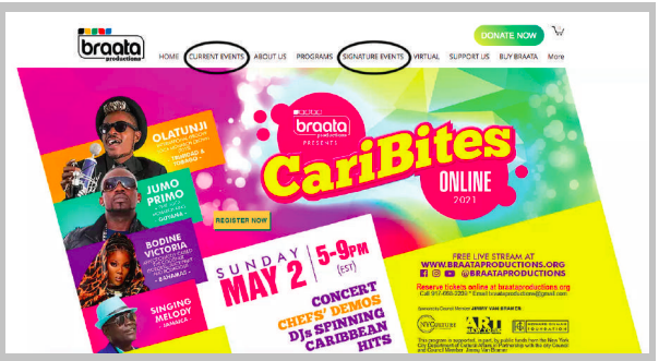
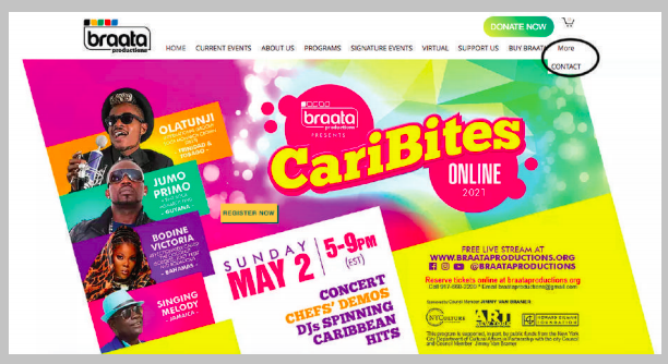
Braata Productions is an organization based in New York that seeks to cultivate a space for Caribbean artists and Culture through events, community outreach and educational programs. The organization has a strong core audience, Caribbean women over 30, and wishes to expand its reach to a wider array of individuals.
The purpose of the usability test was to ensure that Braata’s website was set up in a way that was conducive to its goals. The current pandemic has accentuated the need for online presence to stay connected and communicate. A strong website is therefore important for Braata, not only to stay active with its current audience, but also to reach new audiences while events unfold remotely. Through the usability test, we were able to locate which areas of the site were creating the biggest hurdles for users as well as make recommendations to avoid these issues and provide a more seamless experience for users.
The Process
- Team Meets Braata
- Testing Plan and Recruitment
- Remote moderated tests
- Data Collection
- Report and Presentation
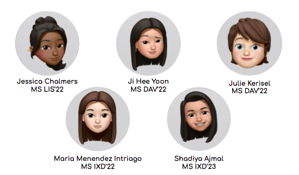
The Team
We met with Braata Production’s Executive Artistic Director, Andrew Clarke, to familiarize ourselves with the organization, its mission, and work. After the meeting, our team reconvened to determine our next steps and divide up tasks. Furthermore, we established concrete goals for the website.
The Goals

I was in charge of writing up the test’s tasks and therefore had to explore the site to determine which areas would be most important to test and to determine how the current version of the website, both on desktop and mobile, was functioning and aligning itself with the organization’s goals.
Methodology
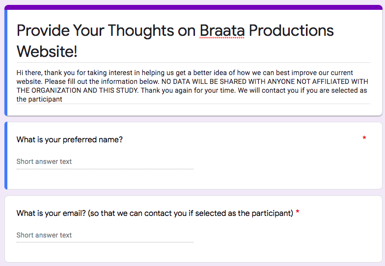
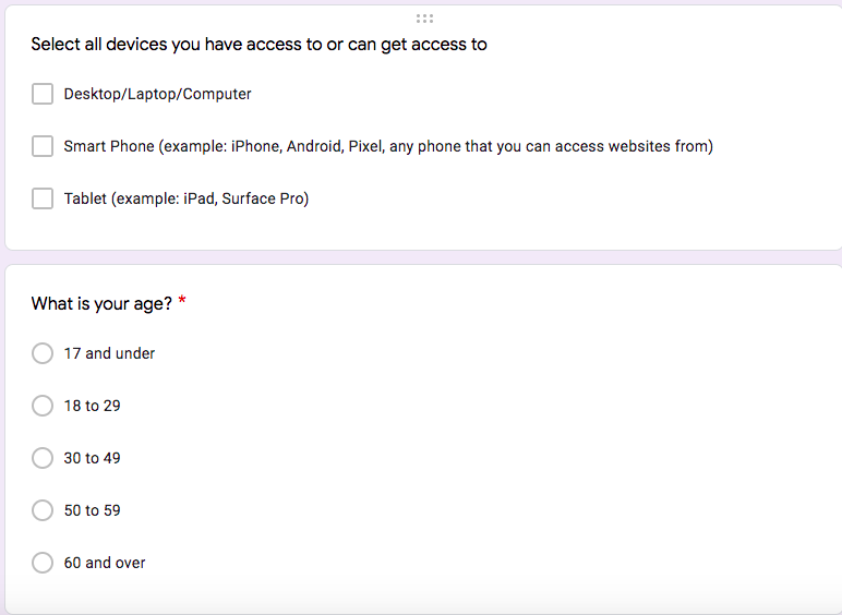
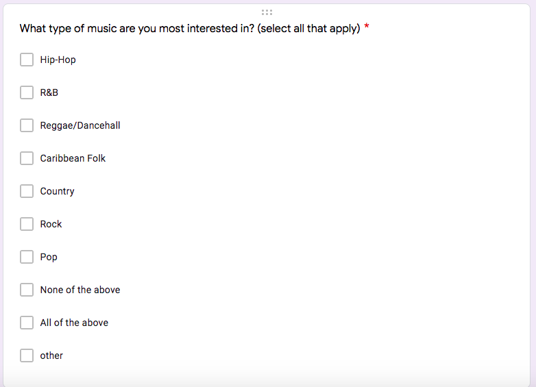
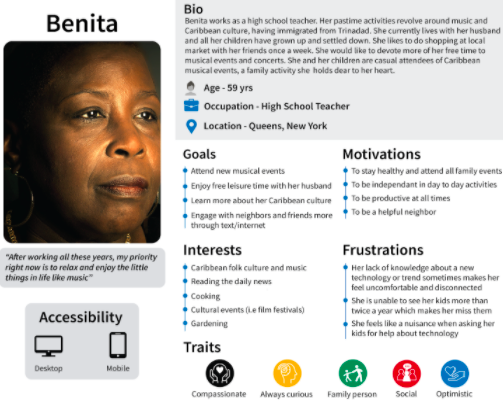
Once our testing plan was approved by Mr. Clarke, we started recruiting users and conducting tests. Users were mainly recruited by sending a questionnaire both to the Braata and Pratt listserv. We were looking to test two groups: women over 30 who were already familiar with Braata and Caribbean culture, and millennials/gen z who may have an interest in Caribbean music and art but who are were actively involved.
Once we got our responses to the survey, we each reached out to two individuals who fit our criteria. 5 users tested on the desktop version and five on the mobile version of the site. Furthermore, six of these participants were in the younger target audience and four were from the core audience.
The Test
The tests were conducted remotely on zoom, one on one. Evaluators asked some pre-task questions, to get a sense of users’ relationship and knowledge of Braata and some post-task questions to give them an opportunity to reflect on their experience.
The tasks of the test were the following:
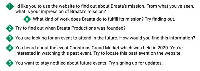
As users were trying to complete these tasks, they would share, out loud, their thinking process and what they were focusing their attention on. Furthermore, they shared their expectations and reactions to the version of the website they were engaging with.
Collecting Information
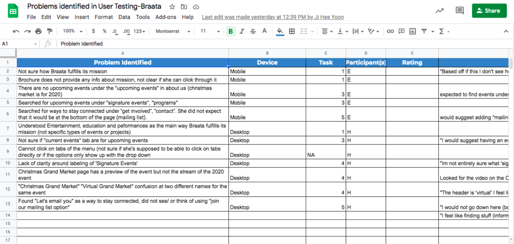
The tests were recorded, with the users’ consent, which gave us an opportunity to go back to our tests to observe more closely user behavior. We then collected the data (problems that came up, users’ observations and suggestions) and compiled them in a google spreadsheet.
Findings
When the data collection was over, the group discussed themes, and how we could regroup our findings into main categories. We established four main findings and recommendations.
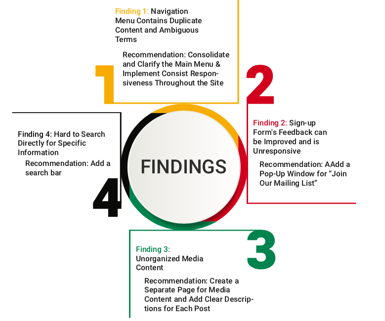
Once we had our four findings we once again divided the tasks. I was in charge of Recommendation 1 (as well as some of Finding 1), the conclusion and making mockups/screenshots for Finding/Recommendation 1.
Recommendations
- Consolidating and Clarifying the Main Menu
“I would go under ‘Current Events’ but I don’t know. Are those the events that are going to happen?”
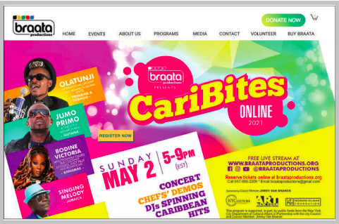
The main menu included several options that were either repetitive or ambiguous, which prevented users from finding important information on upcoming events. Indeed, they expressed that they were unsure as to which option they should select to find upcoming events and that some options like “Signature” were vague and therefore did not convey what sort of content it would redirect them to.
“I’m not entirely sure what ‘Signature’ means. I would think it means the highlight events, not all the past events that happened.”
Clearer labeling and consolidating options can therefore be helpful for users to find information more efficiently.
2. Implementing Stronger Feedback for Email Sign-Up on Mobile Version
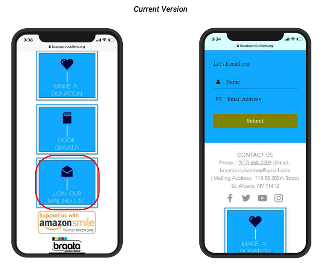
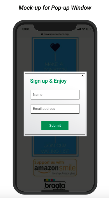
When users tried to click the “Join Our Mailing List” many had to click several times in order for the tool to work. We therefore suggested implementing a pop-up that would give users feedback that their actions were working.
3. Adding a Centralized Media Content Page
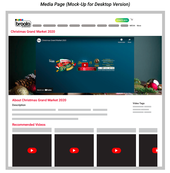
Almost all users had trouble finding videos of past events. Indeed, when looking for a video of last year’s Christmas Grand Market, one user said “this was difficult. I did not expect to go to virtual events… There are also videos on the ‘Signature Events’ page but no description.” Because the pandemic has moved everything to remote, virtual spaces, it is important that they be able to stay connected to Braata’s content. Having a centralized media page would allow users to enjoy Braata’s content safely and potentially encourage them to sign up for future events.
4. Adding a Search Bar
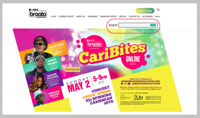
If users are looking for specific information, or are unsure as to where in the menu they should be looking to find that information, a search bar can be a powerful tool to ensure that users always have a way to find valuable and desirable content.
The report can be viewed here.
The presentation can be viewed here.
