Overview
GrowNYC is a nonprofit organization that aims to improve New York City’s quality of life through environmental programs including farmers markets, conservation, and community education. This project aimed to redesign the GrowNYC website into an intuitive and efficient site.
Platform
Mobile Web; Web
Team
Three Pratt Institute graduate students; my primary roles include research design, project management, and report writing/editing
Technology
Figma; InVision; UserTesting
Timeline

Discover
User Interviews & Proto-Persona
User interviews followed a semi-structured format and focused on understanding user behavior surrounding sustainable and eco-conscious lifestyle choices.
Findings
- Sustainable habits mays stem from personal ethics and values, but they are dependent on cost and convenience.
- Community support and social groups influence personal commitment to sustainable habits.
Proto-persona
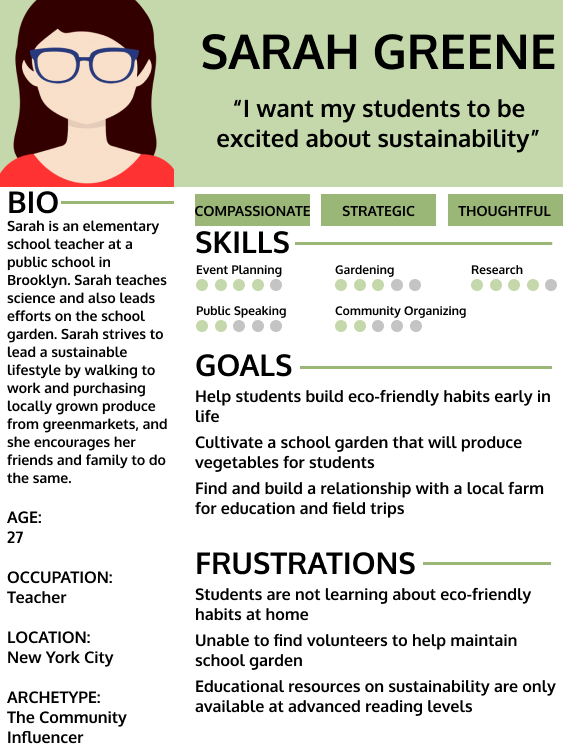
The Sarah Greene proto-persona was created to represent the combination of our interview findings.
Competitive Analysis
Our team conducted a competitive analysis to understand GrowNYC’s competitors in four spaces: greenmarkets, food boxes, conservation, and education. While GrowNYC operates as an umbrella organization for these spaces, we selected a best-in-class competitor for each space individually.
Competitors were evaluated against criteria including website usability, navigation, and user flow. GrowNYC recommendations were drawn from the competitors’ top strengths.
GrowNYC Recommendations
- Greenmarkets: Sort greenmarkets by borough
- Food Boxes: Allow customization of food boxes to substitute allergens with favorites
- Conservation: Improve greenmarket mapping tool to easily identify locations
- Education: Provide more examples of curriculum or offerings

Our full competitive analysis can be found here.
Define
Information Architecture
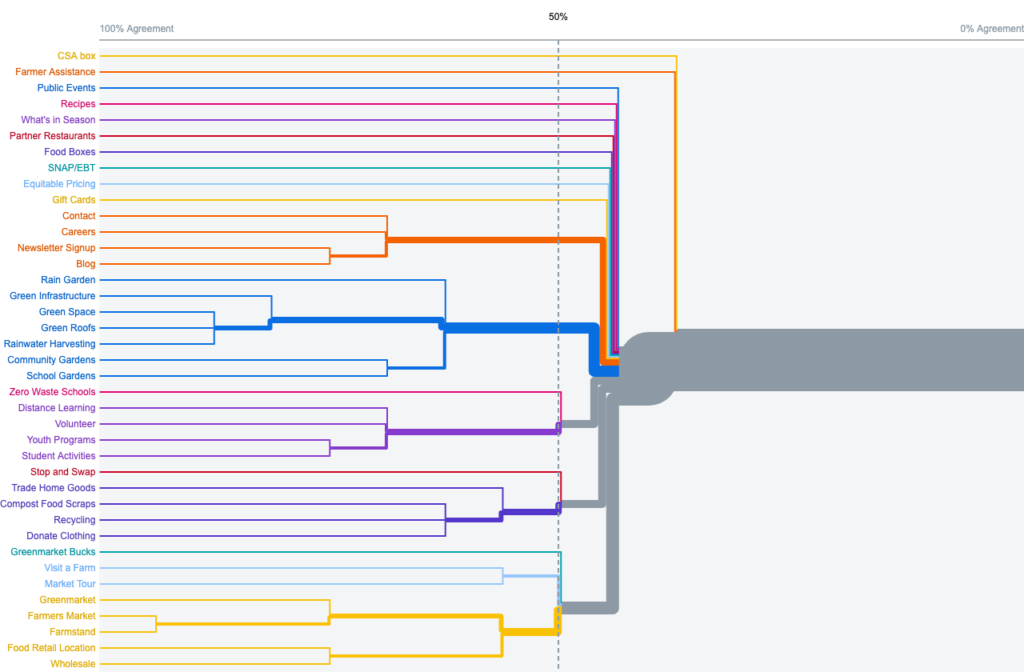
In order to determine a new information architecture for the GrowNYC website, our team conducted an open card sort exercise with 39 representative labels. The results from 14 cart sort participants guided the hierarchy and labelling of a new site map.
Our full card sort brief can be found here.
Low & Medium Fidelity Prototypes
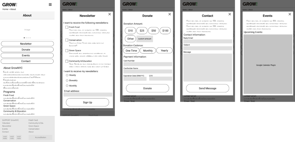
Using the insights gained from the card sort, our team began rapid prototyping. Each team member individually created a low-fidelity prototype to outline key user flows.

Following light testing to identify the strengths of each individual’s low-fidelity prototype, our team created a medium-fidelity prototype and standardized common components like navigation, menus, and headers.
Usability Testing
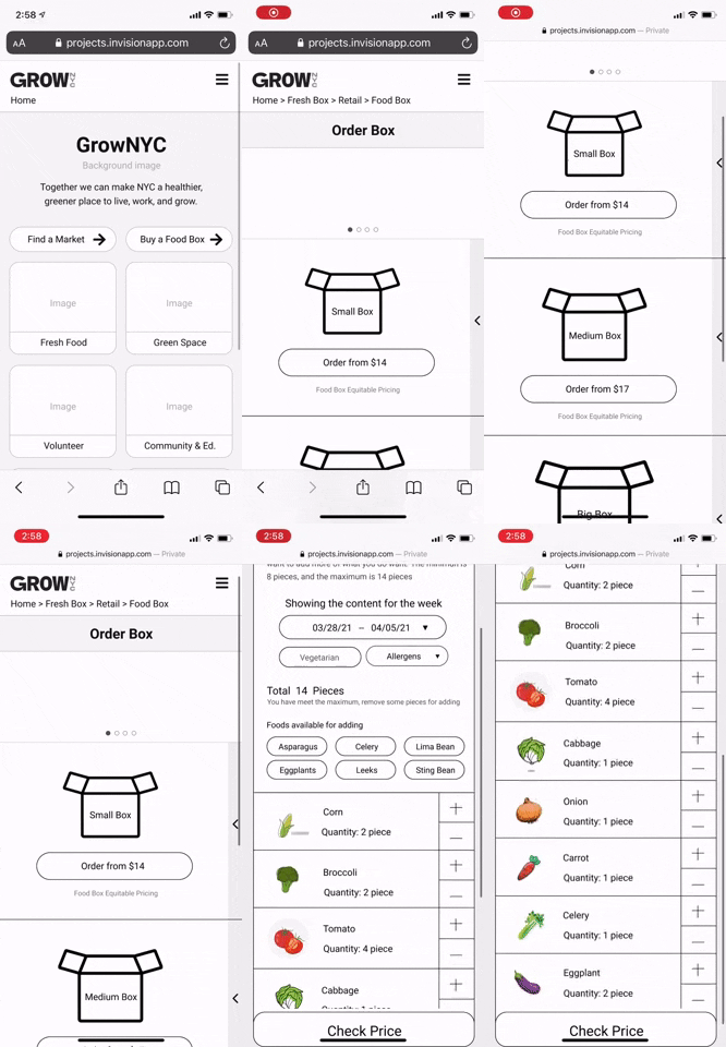
Our team conducted nine unmoderated usability tests via UserTesting to evaluate the usability of our medium-fidelity prototype. Our testing found successes in our top level menu headers and navigation, but revealed opportunities for improvement in the food box ordering flow and recipe search. Our team iterated upon our medium-fidelity prototype to incorporate our findings.
The complete results from our usability tests are collected here. Our updated prototype can be viewed in InVision here.
Design
Style Guide
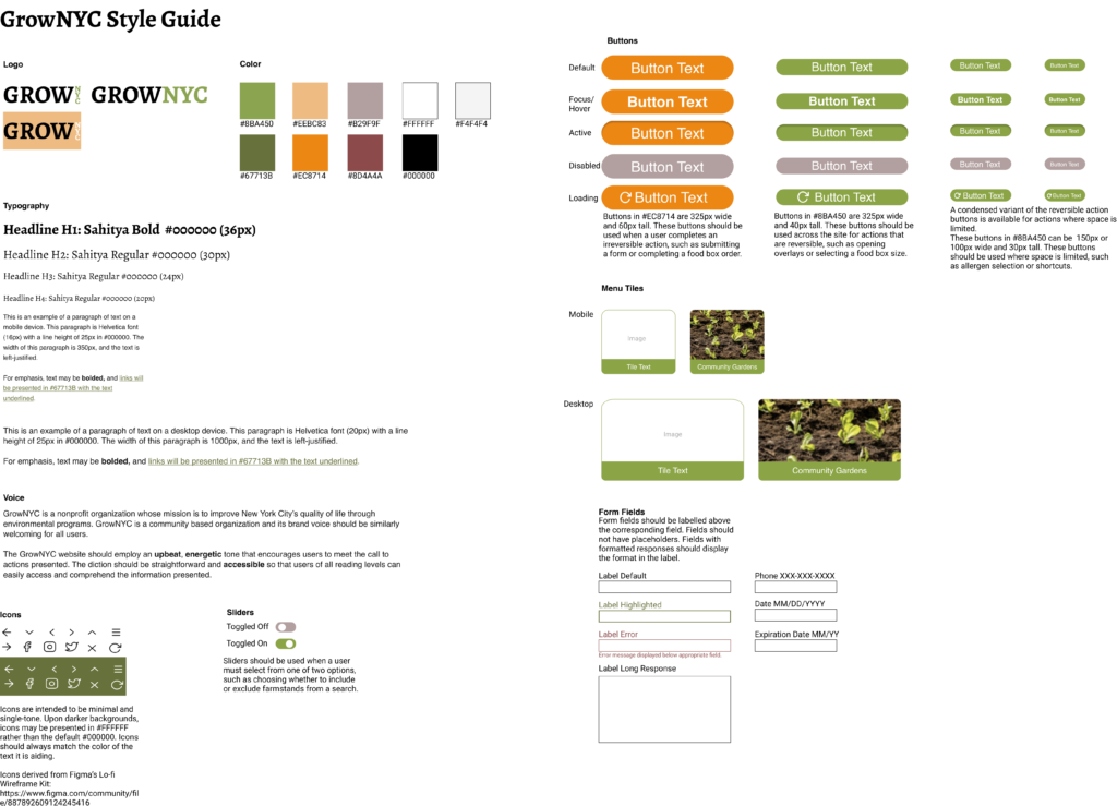
The GrowNYC style guide was designed to build upon GrowNYC’s community-focused, sustainable brand. Natural, earthy tones were chosen for common components, and brighter colors were chosen to highlight actions throughout the site.
High fidelity prototype
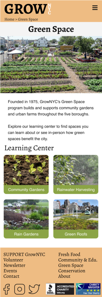
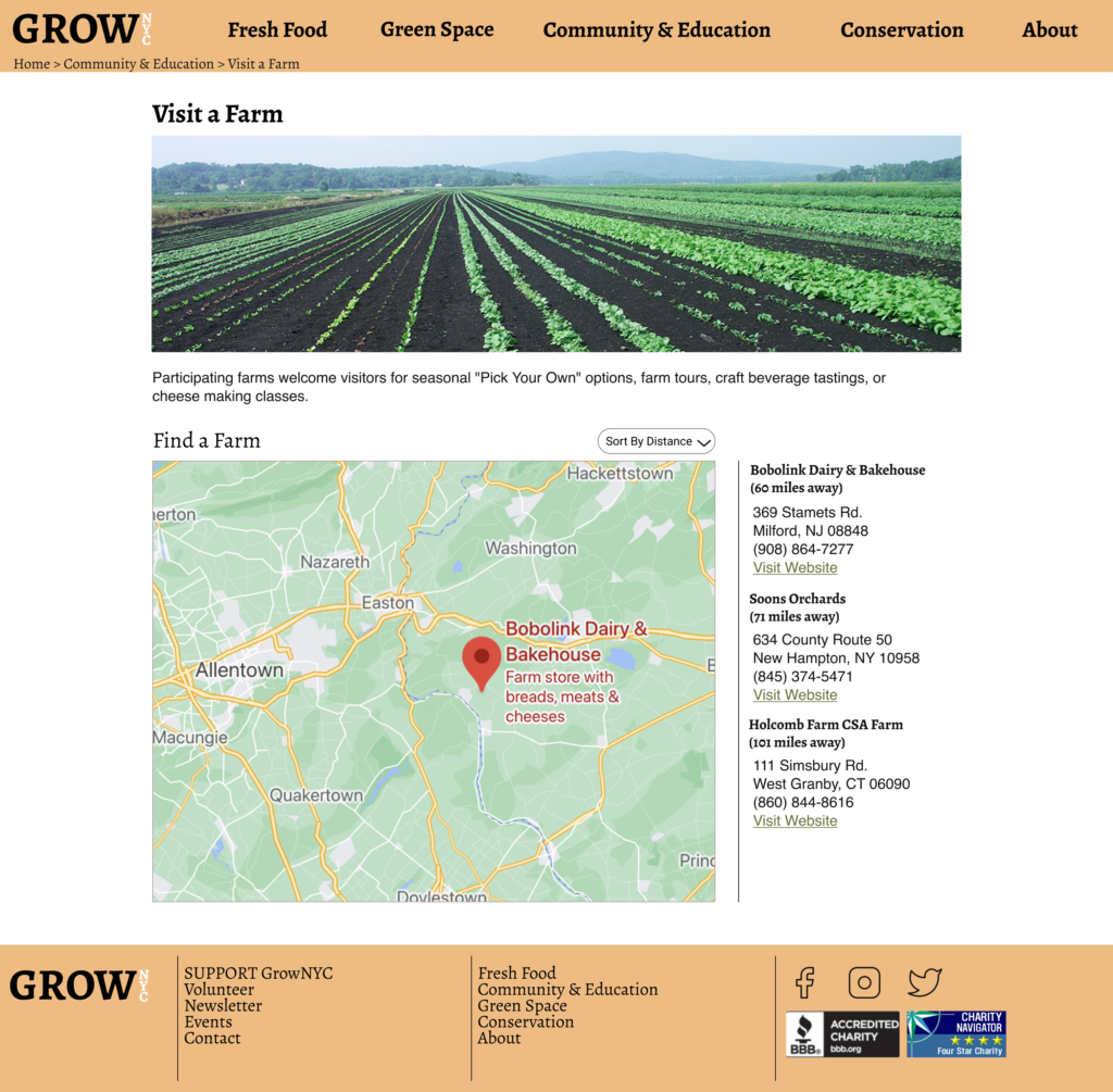
A high fidelity prototype was created by applying the style guide to our mobile and desktop prototypes. This redesign gives GrowNYC a fresh look with intuitive features.
Takeaways & Future Considerations
Working iteratively and conducting usability testing, formal or informal, for each prototype allowed our team to discover and solve a wider breadth of usability issues than a single round of testing may have revealed.
With more time, our team would have enjoyed the opportunity to work closer with stakeholders at GrowNYC and brainstorm further features to help drive New Yorkers towards sustainable well-being.
