Canvas has become a popular online resource over the past 10 years for schools and educators to help facilitate the learning experience. Students use Canvas to keep updated on courses, get and submit assignments, and keep track of grades while educators use it to post course material, assignments, and track grades of all students.
Log In Page
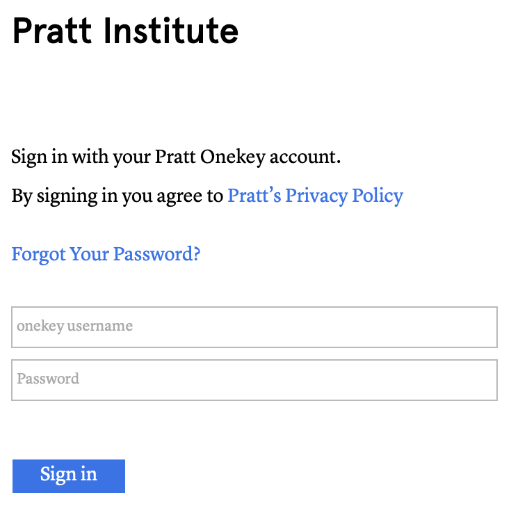
Figure 1
While the log in page can differ from institution to institution they all follow the same format as Figure 1. This page affords logging in and it signifies this to the user with the Sign in button in the bottom left. Furthermore this page gives good feedback when one tries to log in with either sending them to their dashboard upon successfully logging in or it gives them a notification in red text as shown in Figure 2 that they had a slip and that the log in has failed.
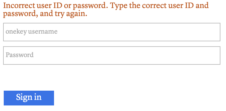
Figure 2
Navigation
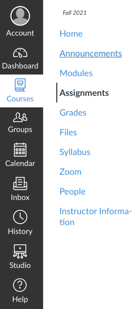
Figure 3
Canvas makes navigating simple while also having great discoverability and good understandability. It does this by having all tabs grouped together along the left hand side of the screen in dark gray while the rest of the screen is white. This also makes knowing which tab one is in easily discoverable as it is the only white box with blue text in that column and when one switches tabs the sidebar changes accordingly giving the user good feedback. Even within the individual tabs, if they have different pages, all of them are listed on the left hand side in blue text denoting that they are clickable links.
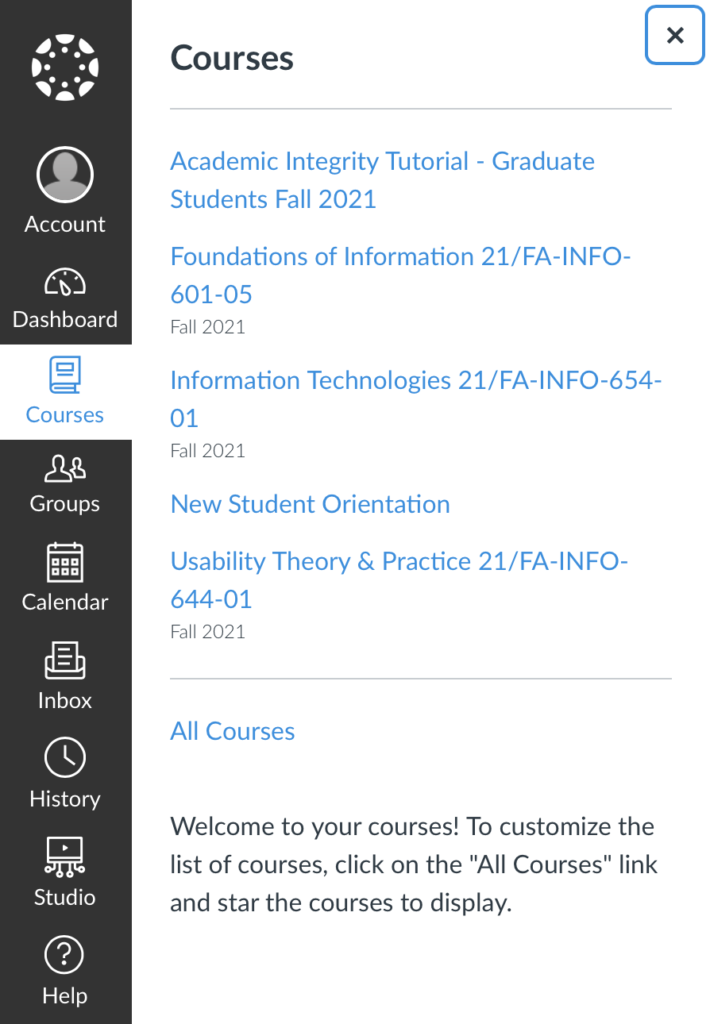
Figure 4
Now slight confusion may arise to a new user when selecting one of the main tabs as while most tabs will bring one directly to a new page, four of the tabs, Courses, Groups, History, and Help, all bring out sub tabs, as shown in Figure 4. The user must then click on one of the links within the sub tab to change the page. This can be addressed by adding a small arrow or triangle to those tabs to indicate which ones have sub tabs and which ones are direct links.
Assignment Submission
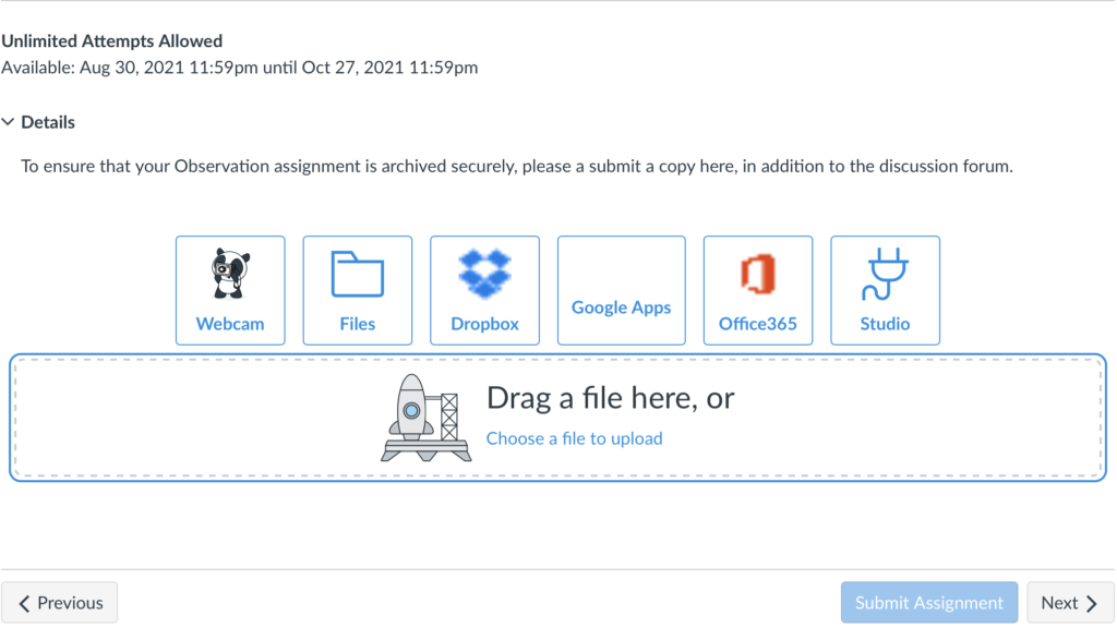
Figure 5
Submitting assignments is one of the primary affordances of this site. In order to facilitate this various constraints are build in and available to educators to reduce the chances of a slip occurring. The most obvious of these is that one can not hit the Submit Assignment button until a file has been uploaded, this is signified by the grayed out submit assignment button, as seen in Figure 5. Furthermore, Canvas offers educators the ability to set another constraint onto what type of submission is allowed. Unfortunately these constraints don’t eliminate all slips as canvas can not tell when one submits the wrong file.
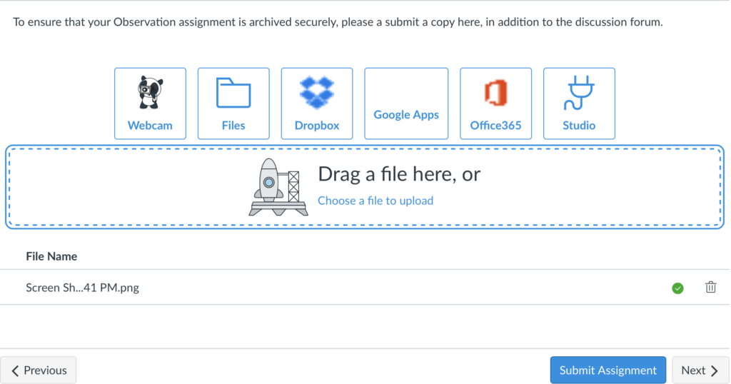
Figure 6
Once an assignment is uploaded the user gets feedback in the form of the Submit Assignment button turning blue signifying that the assignment if now able to be submitted, as shown in Figure 6. Finally, the site give one last piece of feedback when one hits the Submit Assignment button as the user is notified that the files have been submitted.
Conclusion
In summary, Canvas that has good discoverability and feedback while also having good constraints built in to prevent slip that all come together to aid in achieving the affordance of learning.