Discord is a communication service which allows users to chat, call, and share files and other media in one hub on the web or their desktop and mobile apps. Users can create or join existing servers, to which they can invite friends and open topic-specific chat threads as well as voice and/or video rooms to drop in as they please. Focusing on the principles and methods outlined in Don Norman’s The Design of Everyday Things, this critique aims to provide an analysis of what works and what could be improved.
Signing Up
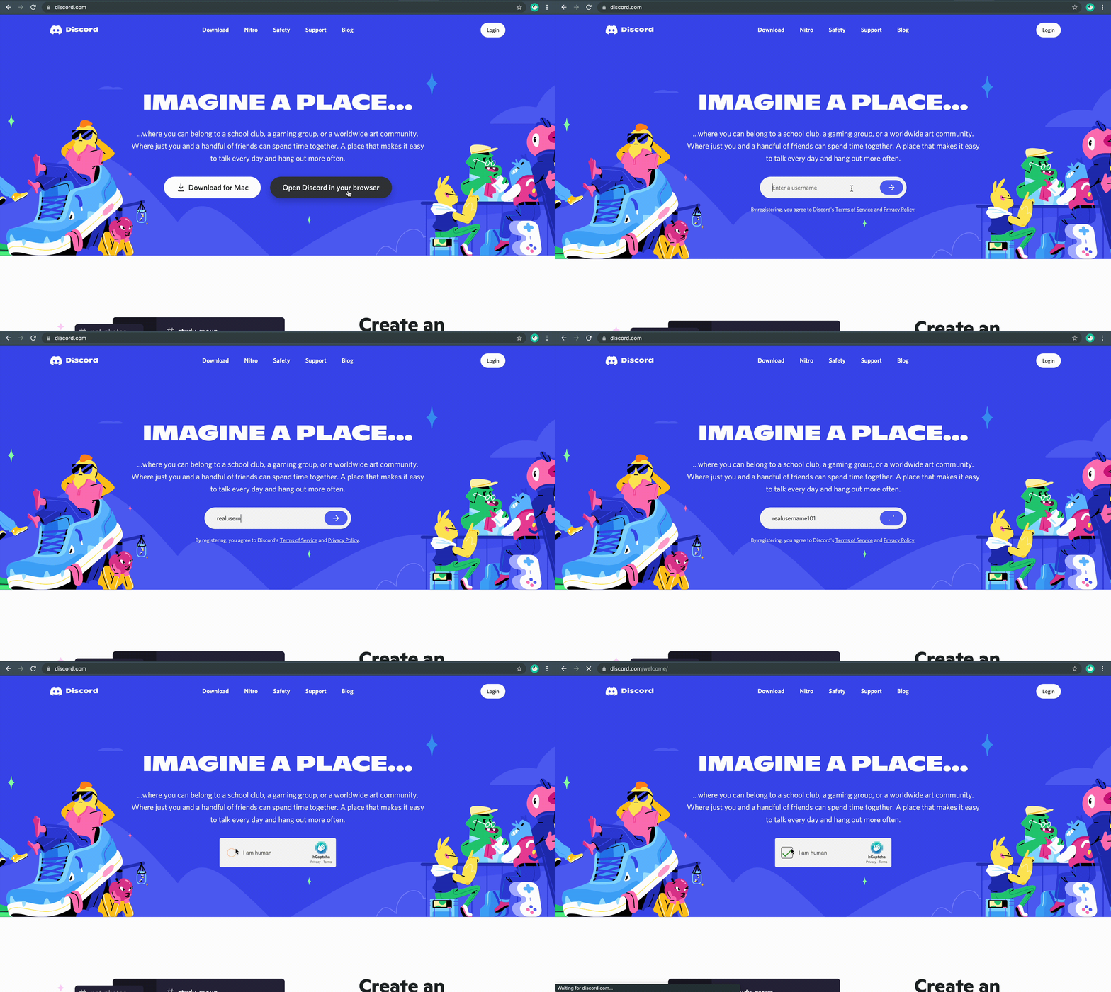
When a user arrives at the discord website, they have two options: download the app or open Discord in a browser. For some first-time users, this doesn’t offer much discoverability—it’s unclear whether they are entering a new or existing username in the field. This may cause a sizable gulf of execution because the only signifier confirming you are registering appears in small text underneath (fig. 1A). This may be better communicated by replacing the submission arrow button with a button that reads “Register.”
Creating Servers
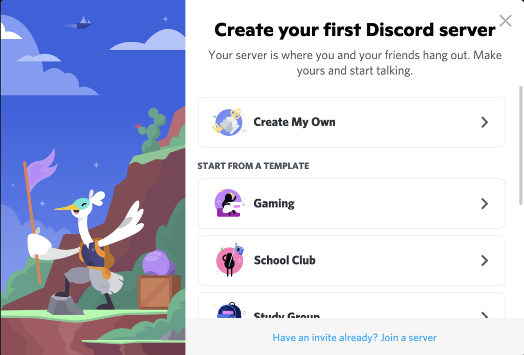
After submitting the form on the previous page, Discord welcomes users to its service and asks if they would like to create their first server, with a short description of what a server is. The window displayed provides the user with some affordances as well, offering a list of possible classifications for a server.
The user is then taken to the landing page shown in fig. 2A, providing feedback to confirm the server is now live. The UI provides signifiers for different affordances within servers by highlighting the areas to explore in orange and explaining their functions. By clicking on the highlighted areas, users learn about using text and voice channels, as well as how to send messages. When users enter chats or voice rooms, Discord plays a sound and shows tips (fig. 2B), providing more signifiers and feedback that reduce the gulf of evaluation. The page also offers a checklist for getting started and a menu bar on the left-hand side, laying a clear mapping for the intended ways to interact on Discord. The tutorials create a system image for users, providing consistency across servers.
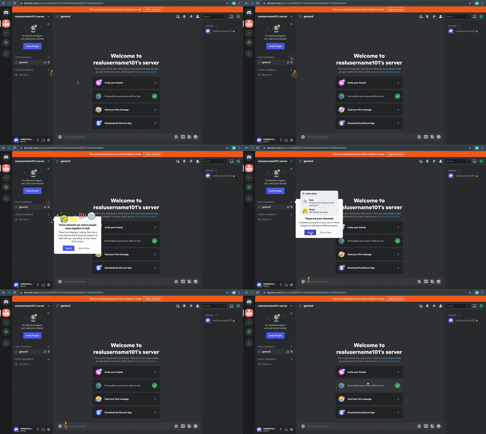
Fig. 2A 
Fig. 2B
One note about the landing page is users aren’t required to verify their account before using the app. There is a signifier at the top of the page serving as reminder to claim the account before it’s lost; however, without any constraints on the usability of the app, some users may deliberately violate the verification—a mistake resulting in the loss of their account. Discord could encourage users to finish setting up their account by affording only some key features of the app to balance learnability before users commit to verifying their account, as opposed to allowing unverified users to take full advantage of the service.
Further Features
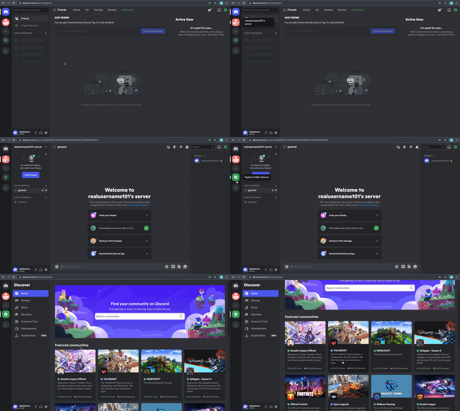
Users can experiment with personalization, searching for existing servers to join (fig. 3A), and streaming gameplay for audiences. On the home page, users keep track of their friends once they have been added with a menu displaying direct messages and active users online. When a user accepts or sends a friend request, it will appear in the notifications tab on the home page, again providing both a signifier and feedback for the intended task.
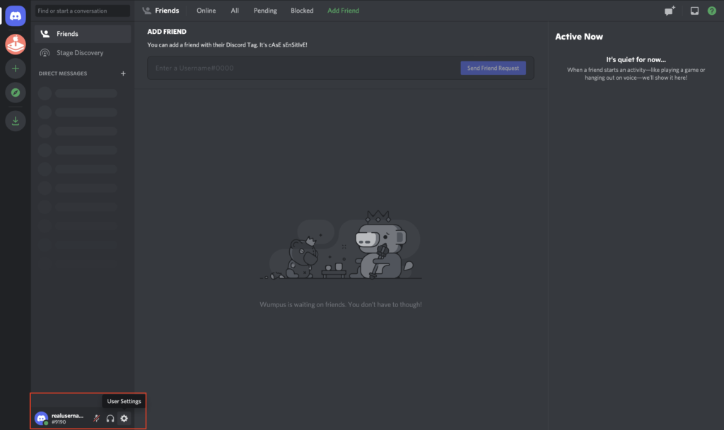
One criticism is that user settings aren’t discoverable; they only appear when clicking a small gear next to the username under the chat groups. Without prior knowledge, this may cause a large gulf of execution for users hoping to personalize their settings. A possible solution would be to relocate the settings gear to the upper right-hand corner of the home page, as this would be a natural mapping consistent with other social media platforms.
Conclusion
Discord’s conceptual model is ambitious, relying on a both of knowledge in the world as well as users’ knowledge in the head to offer an approachable user experience and a feature-heavy platform. Though the discoverability of extended features Discord affords isn’t always high, the main features are made clear through easy-to-understand tips and tutorials. Though learning to use the app in its full capacity may seem complex, Norman argues complexity is necessary and that “the most important principle for taming complexity is to provide a good conceptual model,” (Norman, 247) which I believe Discord does successfully.
References
- Norman, D. A. (2013). The Design of Everyday Things. MIT Press
- Discord Inc. (2021). Discord. Retrieved from https://discord.com
