At a Glance
Youtube is a video sharing and social media platform that has an app (on mobile devices) band is accessible through web browsers. It consists of three types of users: (1) Users who upload videos onto the platform for others to watch (2) Users who watch videos uploaded by other users (3) a blend of both users types 1 and 2. Youtube was founded in 2005 and bought by Google in 2006.
Initial Website
When accessing Youtube via the website Youtube.com users are able to navigate most of the features on the site with no sign-in requirement. At first glance, users can quickly discover what they can do with the site by looking at the page for a short time. The site has plenty of signifiers like the shapes around the specific topics (Bossa Nova, Instrumental, Background Music, etc) at the top of the page. As well as colors to distinguish between important information like the blue box around “Sign In” or the red words around “Live Note”. It is important to note that words like “10M view” or “2.5 Watching” signify that users can watch these videos.
Users are able to make sense of how to use the platform with the knowledge they already have from other Google platforms. There is a search bar at the top of the page, similar to that one on the main Google website with predictive typing to reduce the amount of memory recall a user has to do. The navigation bar is consistent among Google products.
Menu Options
There is a small menu on the left-hand of the site with six options. The site has affordances like the hamburger menu so users are aware that this menu expands. Once clicked, the five options that were initially there and a list of more options to choose from appear. However, some of the options are exclusive to users with Youtube accounts, so the website provides users with a signifier of a constraint that will prevent the use of certain features of the platform (commenting, liking, subscribing). Users are encouraged to sign in but are able to use the site even without doing so. The “Sign In” button is blue, appearing twice and maintaining consistency throughout the page. The button stands out from the rest on the page signifying an interaction will occur that may be different from the rest on the site.
Sign In

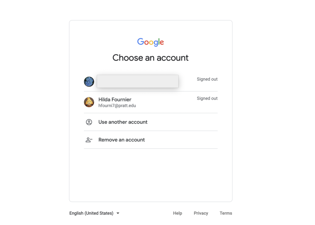
Once clicking to sign in users with Gmail accounts are able to select the account they would like to use for their Youtube login. Youtube shows users the account Name, Email, and display image for users to quickly recognize their accounts. They are also able to use a different account if they do not see one they are familiar with.
Changes After Login
Once signed in, the Youtube page changes slightly. You are now recommended videos that fit your profile more closely, the “Sign In” button on the top right is replaced with the account image along with a bell (for notifications) the bell has a red number informing users that there are unread notifications. The left-hand menu for the page changes as well. Users can see accounts they have subscribed to, view their own videos, their library and much more. The site uses good mapping techniques allowing users to naturally look down the list of items on the menu. At the bottom of certain sections of the menu, there is an arrow indicating there are more options. For example, users can see more accounts that they are subscribed to or more menu options. The affordances (the arrows pointing down) tell users that clicking on this option may list more items below while the words next to the arrow signal that the action is exactly that.
Conclusion
Using Norman’s principles of design one can see that Youtube follows each principle and makes use of each option and space on their page using a balance of knowledge users may have of previous Google products, but also providing them with the knowledge they will need if they have not interacted with Google products before.
