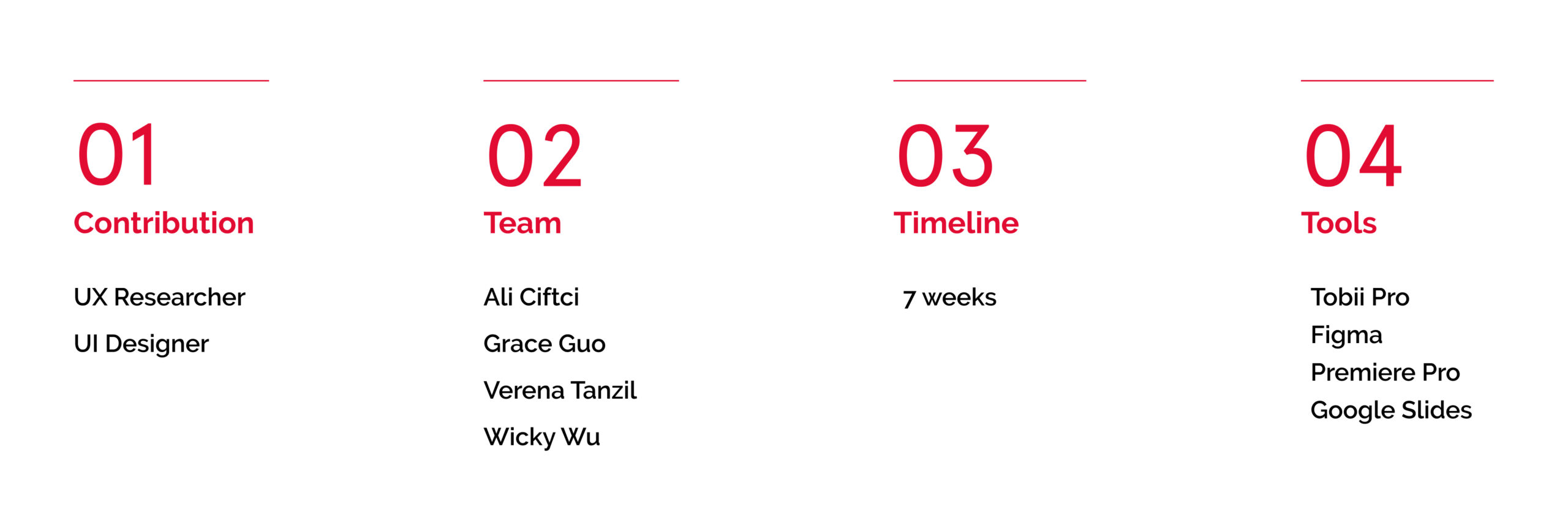
Overview
The Metropolitan Museum of Art is one of the largest and most prestigious art museums in the world. Its collection has more than two million works of art from all around the world, spanning five thousand years of world civilization from prehistory to the present.
The Met partnered with Pratt Institute to understand more about the Met’s website using eye-tracking technology.
Study Objective
We evaluated the effectiveness, efficiency, and satisfaction of user experience in Exhibitions, Events, and Primers aiming to have a better understanding of the following research questions :
- On exhibitions and primers, how do visitors consume and interact with textual and visual content?
- How do people locate events that are specifically tailored to their requirements?
- How do people engage with primers’ immersive multimedia content?
Process
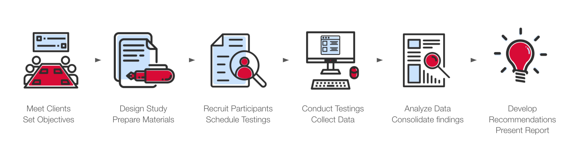
Participants, tools, Tasks, and sus (system usability scale) score
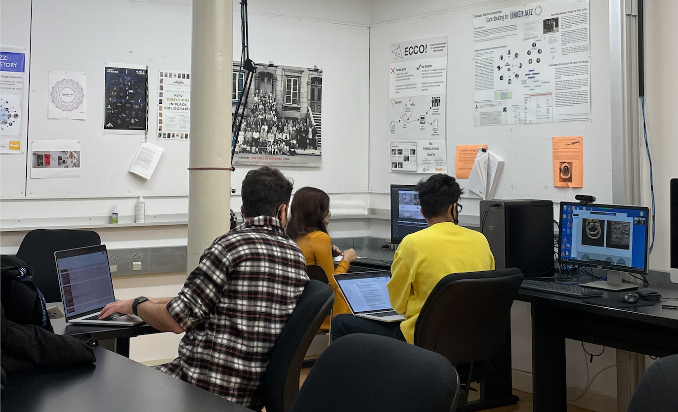
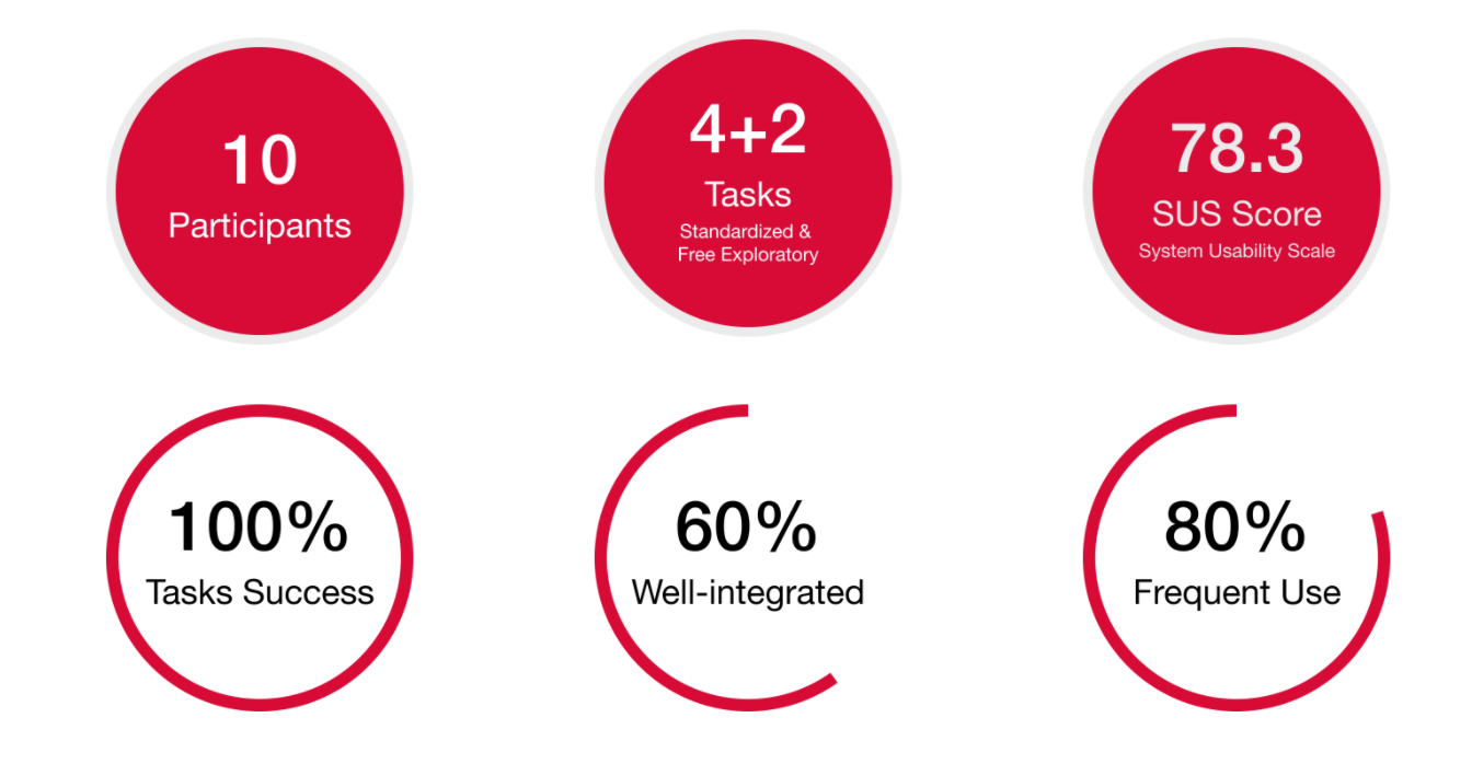
We have a total of 10 participants from students and staff who have been to the MET and have experience going on museum websites. We asked the participants to go through 4 standardized tasks and 2 free exploratory tasks in order to capture more qualitative data.
We used an eye tracker tool called Tobii Pro to capture and collect data for this study, which accurately records and tracks users’ eye movement. We were able to observe and understand where and how users look using this technique. Prior to testing with actual users, it’s essential to do a pilot test on all of the tasks to ensure everything works properly. The preliminary pilot test helped refine the test, methodologies, and tasks. The pilot tests help us understand the limitations of the software as well as understand ways in which we could make the participant feel a lot more comfortable in the testing environment so that it’s more natural.
Once the tasks were completed, users have presented with a SUS: system usability scale questionnaire (test on a scale of 1 (easy) to 5 (difficult)), And the result is 78.3, which is a very good score when above 80.3 means excellent. So in the case of usability, there is still room to improve. Finally, we asked our participants to walk us through their processes as we made them watch their own eye-tracking videos.
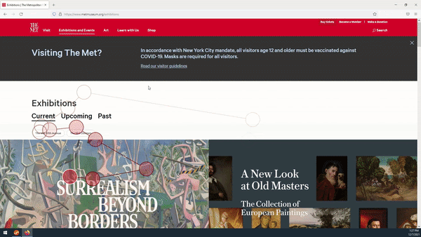
Exhibitions page:
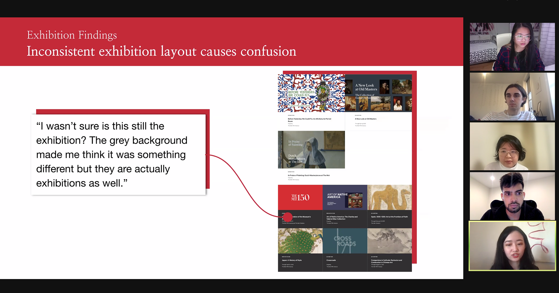
What worked well: First, we received a lot of positive feedback regarding navigation and cover images. All participants thought finding out what’s currently on either through the homepage or navigation bar was easy. We also noticed that users’ eyesight generally follows the order of image first, then title, and details at last. Users’ eyes gaze at the big texts on the images last the longest. That makes cover images especially crucial to the Met’s page. Therefore, The Met did a great job as all participants provided positive feedback about the cover images.
– Participant
“I wasn’t sure is this still the
exhibition? The grey
background made me think it
was something different but
they are actually exhibitions as
well.”
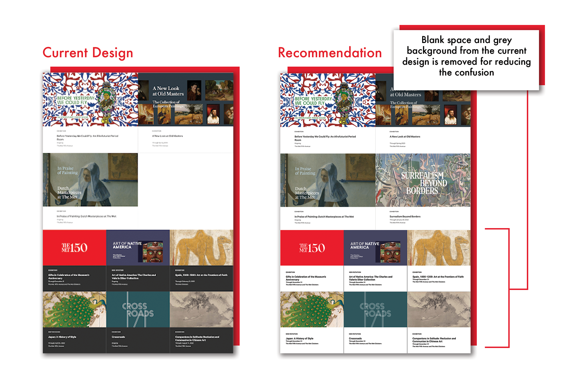
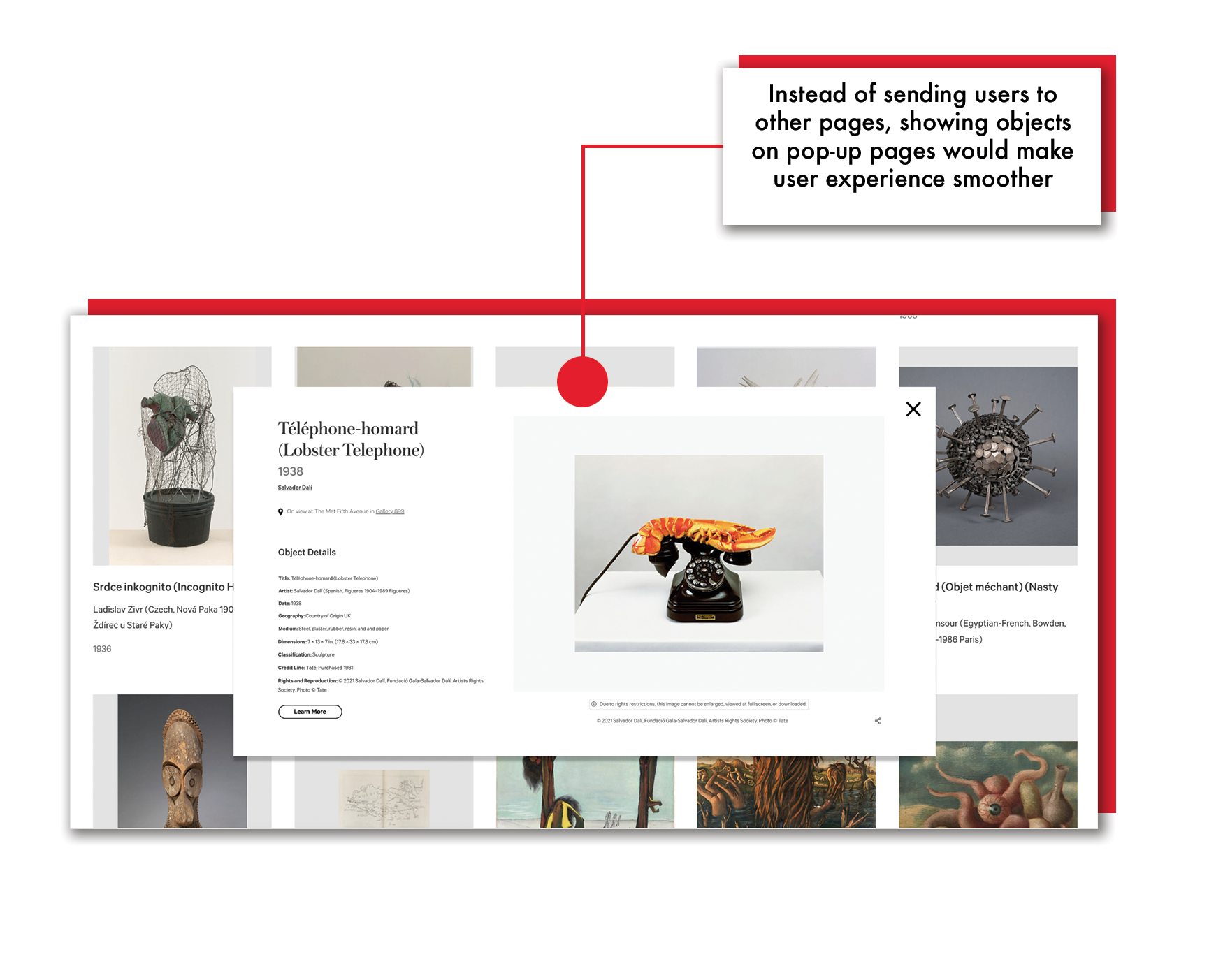
Recommendation: Because varied background colors for exhibitions caused visitors to become confused, we decided that eliminating them would improve the user flow. Users can also simply return to and continue viewing the items owing to pop-up object pages.
Events page:
There is a need for increased transparency and flexibility:
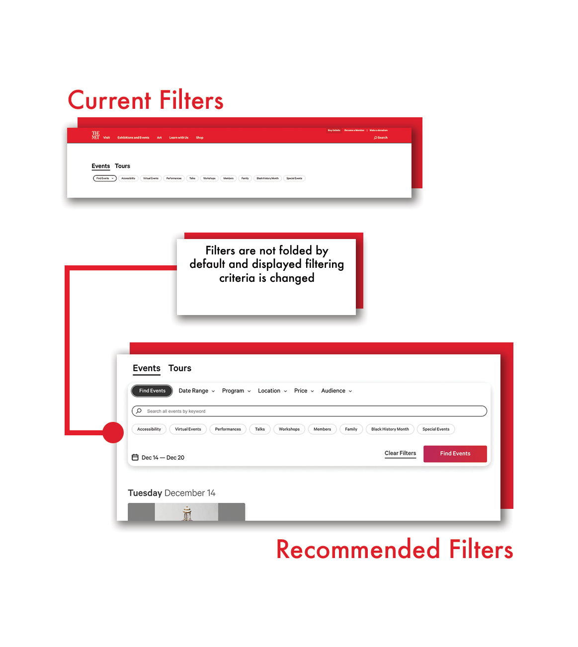
- Users do not frequently pay attention to the “filters” aspect of the events, according to eye-tracking data, and prefer manual navigation.
- Despite the fact that the content requiring attendees to know where and when the event will take place was already in place, they were unaware of it, they found it hard to consume information on the event card.
Recommendation: Filters
If our participants weren’t being asked to use the filter for something specific, 90% of them didn’t see it. Instead of using the filter tool, most participants chose to click on the “Next Week” or “Preview Week” buttons to find upcoming or past events. Hence, we recommend an unfolded filter section which the user could notice without extra clicks.
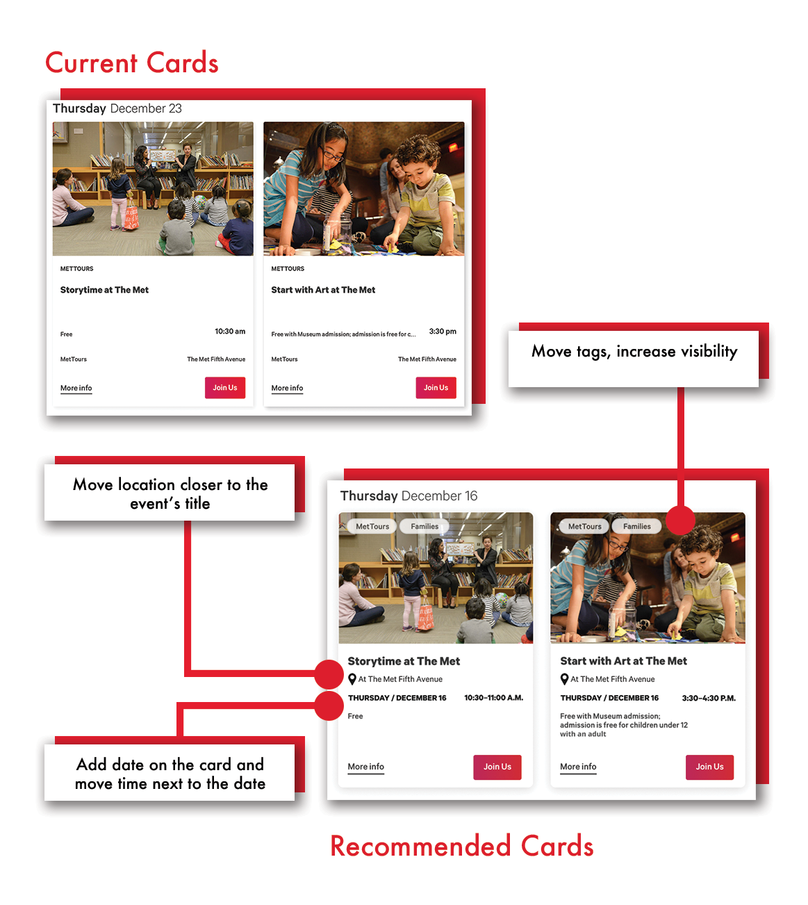
Recommendation: Event card
To improve content exposure, we recommend reorganizing the information on the card. Add the date on the card, the time next to it, and the icon location to indicate where the event will take place.
Primers page:
What worked well: The Primer page’s interactivity and content arrangement were praised by 80% of participants. Primers, according to the participants, are a fun method to communicate stories. Participants found the primers page a very engaging way of looking at content on a museum website and said they haven’t seen that before.
However, all our participants had a hard time understanding what exactly did the term “Primer” meant? Even after reading the definition, the participants couldn’t settle on what it meant. “Primers” is not intuitive and adds to the user’s cognitive load. We recommend either justifying the name primer by clarifying what it means to the users, or changing it to something else entirely.
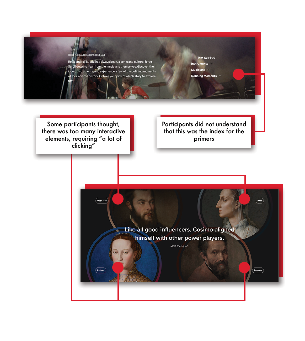
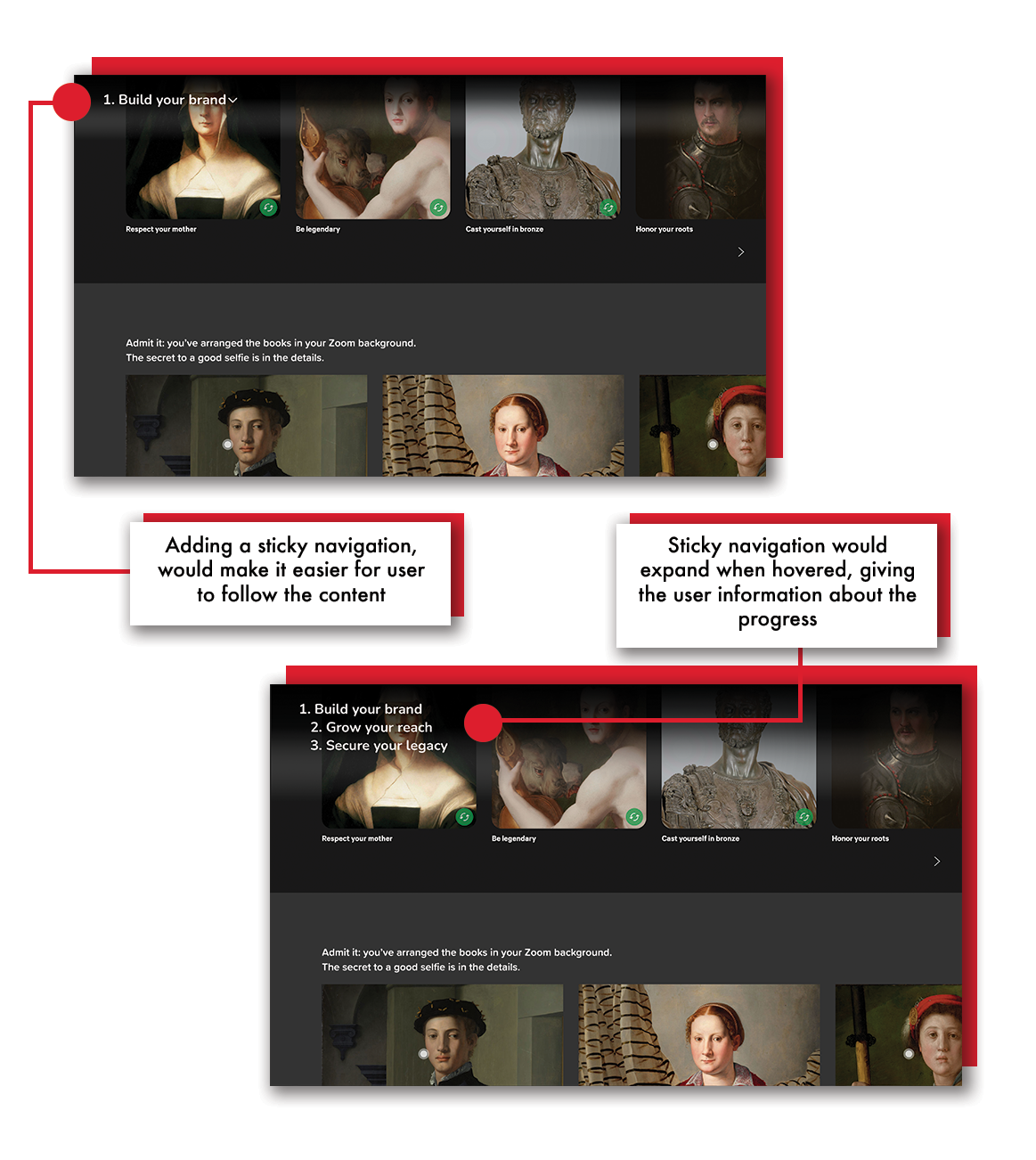
50% of participants also reported that they were having a hard time following the content or finding the desired image. Sometimes they ended up being outside of the primer page but still thought they were on the same page. The sheer number of interactive features could be daunting at times.
Some participants complained that there were too many interactive features, which required “a lot of clicking.”
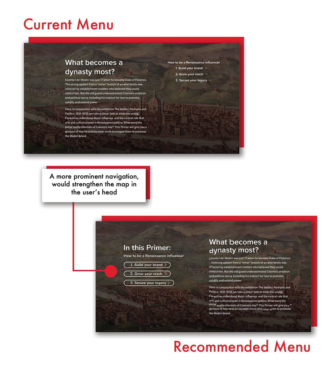
Reccomendation: Increase the prominence of the sub-navigation
Participants, as previously said, were quite fond of interactive components. However, as participants browsed through the content, it would occasionally overwhelm them. Hence, making the sub-navigation or index more prominent in the primers is one approach to assist readers to understand where they are and browse through information more easily.
Conclusion
We presented our findings and recommendations to the digital experiences department of The MET and our client found the entire presentation and findings very compelling. The client specifically mentioned the “event” page finding – they wouldn’t have known about the “filter” not being accessible easily.
We recruited participants from Pratt Institute for this eye-tracking study, even with this limitation we were able to come up with recommendations that satisfied our clients and met our users’ needs.
Overall, I am proud to have worked with The Met and also learn more about Tobii, which lead us to gain real insights into human behavior.