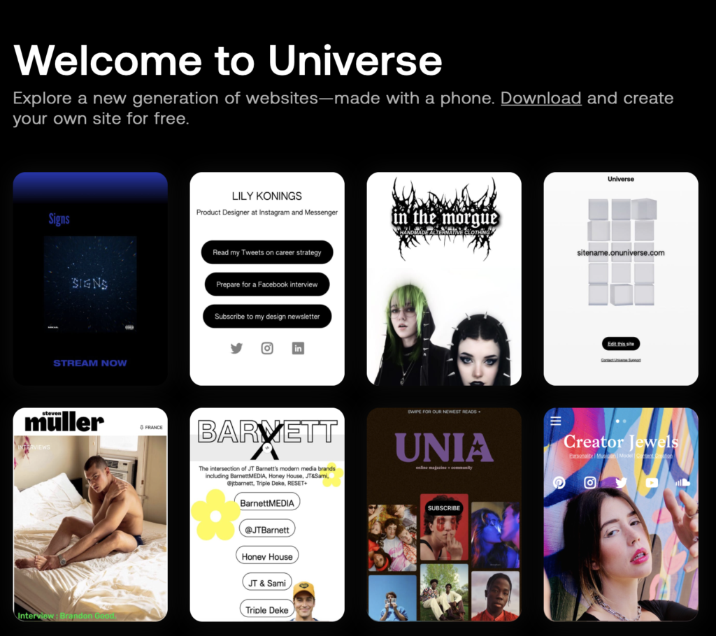
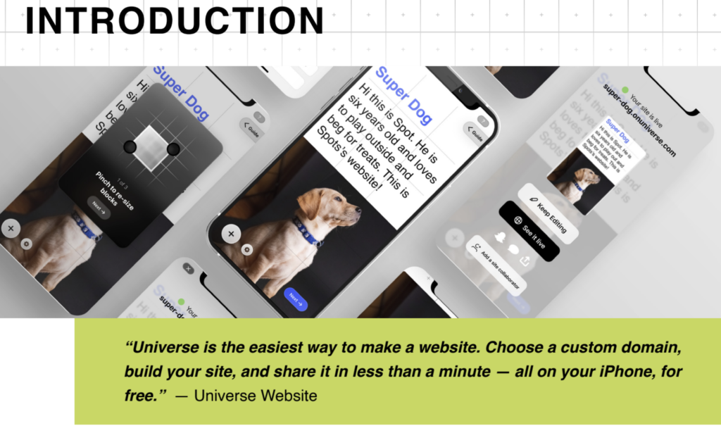
Universe is an IOS application that empowers users with the ability to create and publish their own websites in minutes. It is a dynamic platform with the main goal to give its users the ability to easily and quickly do what competitor platforms, like Squarespace, Wix, and WordPress, do- but this time on a mobile device!
I tackled this User Testing Project by doing individual research on the client and preparing questions for our initial meeting. During our meeting, I asked the client-specific questions I believed would be beneficial for us to know prior to recruiting participants and creating tasks for our Moderated User Tests (MUTs). One of the most important questions that formulated the test and study moving forward was the target audience our client was interested in. Universe wanted the target user to be someone who considered themselves creative, between the ages of 18-30 years old, and had no knowledge of Universe. They were curious about how people within this demographic would interact with the platform on their first-time use and what were and areas of opportunity would drive new users away from the app.
When recruiting participants I suggested a few questions that could be asked to individuals to ensure they fit our target audience. At the end of the recruiting process, we had secured eight individuals, all of who had no knowledge or experience with Universe but did have experience with other website building platforms. The group decided the Moderated User Tests would take an exploratory style, this meant allowing participants to speak out loud about what they experienced as they experienced, and not give any exact end goal. Because I worked as editor of the script, I encouraged the group to include example follow-up questions in the script that moderators could ask participants when they have shared an insight we wanted them to expand upon. I ensured I was present for four User Tests, two of which I moderated and two I would sit in as a notetaker.
By the end of the User Tests, we individually tasked ourselves with entering notes, key insights, and important quotes that participants shared during the session. This was an important part of the project because here I collected themes that came up more than once and quote I found were examples of areas participants experienced frustration or excitement. Once we had finished all our MUTs, I rewatched everyone’s recording to share feedback and prepare for the next steps in the project. I held an alignment meeting where I took the role of project manager, and we went over key responsibilities and all the upcoming tasks that were left. I also provided feedback to each of our team members on the MUTs I watched and made suggestions for future user tests they may be working on. From this meeting, we decided on set deadlines to have individual contributions to our insights Matrix, who was working on the design and mock-ups, the writing of the report, and lastly, the presentation.
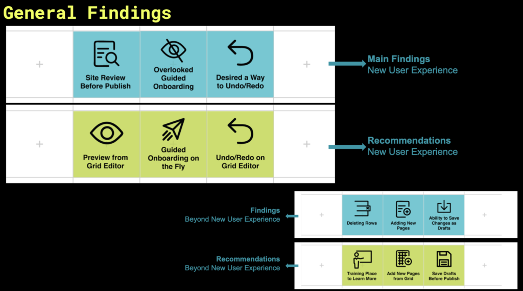
When analyzing all the findings in total, we gathered that (1) 7 out of 8 of our total participants spoke of having trouble looking for a preview option prior to publishing their website, (2) 6 out of 8 participants skipped our guided onboarding, and lastly, (3) 4/8 participants searched for a way to undo an action. These became our three key findings and recommendations for Universe! Throughout the users’ tests participants shared many questions about specific features they came across, or areas of confusion, but even with some areas of friction, all our participants were curious about the Universe and thought it was the easiest platform they had come across to build a website!
While two of my teammates worked on drawing the mock-ups for our recommendations, I wrote parts of our report and made grammatical edits to our entire report. I also began to develop our presentation for the final class and client meeting by outlining the information and inputting details to questions. I used our matrix to find the qualitative data of how many users touched on a specific theme and inserted these metrics into our presentation to create a clearer picture for all the viewers. Lastly, I went through each video recording of all our MUTs and pulled sections I thought would be worth sharing with the client so we could include video clips in our presentation. Once our mock-ups were completed and handed in by the designers, I read through our report one final time and redlined any areas that needed further clarification, contained grammatical errors, or could be cut.
Once we presented our final work, I was one of two presenters and I have to say it was exciting to be able to deliver the final product. Our client seemed genuinely excited by all the information we gathered and expressed taking our findings into consideration. During the meeting with our client, I shared some next steps that would be helpful for the Universe design team to consider, including conducting an A/B testing method with different designs and having task-based user tests. Within these tests participants can focus on the features we highlighted in our findings. This suggestion was later added to the report because the client found it extremely useful!
Overall, I gained a handful of skills from this project. I was able to project manage parts of the project and delegate tasks, give feedback, where I felt, was needed, and help encourage communication between teammates. I learned how to navigate tricky conversations with teammates and speak up for myself or others when needed. I learned I would like to become more comfortable using Figma or platforms that are similar. Lastly, I learned I truly enjoy conducting user tests and working with participants because I gained so much insight from just one or two sessions and I wanted to do more. I cannot wait to take on the world as a UX Researcher one day.


