Client Brief
Community Board 3 is a resident board located in downtown Manhattan which has an important advisory role in land use and zoning matters, City budget, municipal service delivery, and many other matters. There were two objectives for redesigning the website. One is restructuring CB3 Website and the other is designing a feature of the landmark on the CB3 Website.
Challenge
We defined two separate challenges based on the client brief our team provided, and the landmark committee meeting brief.
Community Board 3
- Restructure CB3 website information architecture
- Reorganize the CB3 website navigation
- Make CB3 Website more accessible
Landmark Preservation Committee
- Preserve local landmarks by educating residents
- Maintain and preserve historical landmarks in the CB3 district by designating historic landmark status for buildings
Design Process
To meet the client needs and solve the problems with human-centric approach, we followed following steps
- Generating User Insights
- Developing Features
- Structuring content
Initial Problem Statement
Based on the design challenges from the client brief, we set the initial problem statement that would guide us throughout the project.
Community Board 3
How can we make navigating the CB 3 website a more seamless and accessible experience for CB 3 residents?
Landmark Tools
How can we increase CB 3 residents’ awareness of landmarks in order to increase the preservation of local landmarks?
User Research
To view the problems from both the client’s and users’ views, we conducted user research. Our research objectives are as follows.
CB3 Website
- Impression
- Navigation
- Usage
Landmark Tools
- Attitude toward local landmarks
- User behavior
- Decision making process
- User pain points
Our team conducted research that aligned with our research objectives. To figure out CB3 Impression, Navigation, Usage, and residents’ landmark visiting decision-making process, pain points, the attitude we interviewed 6 residents who live downtown in Manhattan. To discover user behavior and attitude toward the local landmark, we conducted a contextual inquiry. Our team utilized an affinity diagram to integrate qualitative data we collected from the research
Key Insights
[CB3 Website] Users are overwhelmed by the website’s heavy text
All of the interviewees mentioned that they won’t revisit the website because of its overwhelmed amount of text.
[CB3 Website] Users don’t find any useful information on the Website
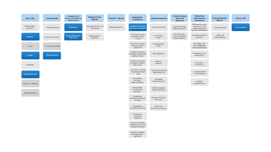
When the users skim through the website, they said that they wouldn’t use the website because they don’t have any useful information for them. However, as our team analyzed the structure and contents of the website, we figured out that there are resources for residents but it is hard to find since they are mixed with contents for committee members.
[Landmark Tools] Two key user groups are found
As we conduct in-depth interviews and contextual inquiry, we could find two distinct user groups. One is user groups who already have in-depth knowledge about local landmarks. When we conducted the contextual inquiry one guy approached and explained the history and usage of landmarks. The other group is a user group who are interested in landmarks but unaware of the landmarks. We mostly figured from in-depth interviews. We figured out that the residents are interested in the landmark by its appearance but they don’t take further action.
[Landmark Tools] Residents are interested in learning more about the local landmarks
Our interviewee explained that they are wondering about the history and usage of the landmarks, but they haven’t tried to learn more about it because the moment when they want to learn more about the landmarks passes when they pass by the landmarks on the street.
[Landmark Tools] Encounter the landmark is when spark the local residents’ interest in the local landmark
We also found that the moment users get interested in local landmarks is when they encounter the landmarks. When the residents encounter the landmark they take a photo or record a video but they don’t take further actions such as learning more about the landmarks.
Refined Problem Statements
From the research insights, we could redefine the problem statement regarding landmark tools and CB3 website redesigning.
[Landmark] Initial Problem Statement
How can we increase CB 3 residents’ awareness of landmarks in order to increase the preservation of local landmarks?
[Landmark] Redefined problem Statement
How might we provide information about landmarks at the right time in order to make CB 3 residents more interested in local landmarks?
[CB 3 Website] Initial Problem Statement
How can we improve the CB 3 website’s navigation in order to make it a more seamless and accessible experience for CB 3 residents?
[CB 3 Website] Redefined problem Statement
How might we restructure the information architecture of the CB 3 website such that it is more resident-friendly?
Target User Archetypes
We also defined two target user archetypes we found from the research. Since the client wanted to let more residents be interested in the local landmarks, we focused on target archetypes who discover landmarks by chance but are unaware if it is a landmark.

User Journey Map
Our team also analyzed current problems on the landmark visit journey of the residents with a user journey map to uncover the opportunity area where CB3 can interrupt. Aligning with the client desire (want to let more people be interested in the local landmarks) and user insights (Encounter is when the residents try to learn more about the landmarks)

Design Principles
We also set out the design principles so that we can focus on the users and client desires while designing the landmark tools and CB3 Website

Feature Generation & Prioritization
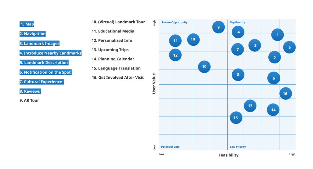
We generated ideas for the landmark tools based on the user insights we found, then prioritized the features with two criteria: User Value and Feasibility.

Concept Validation
Since landmark tools are the new concept feature that is added to the CB3 Website, we quickly build a low fidelity prototype and tested the concept with users. We could set out the future direction of the feature based on the findings from the test.

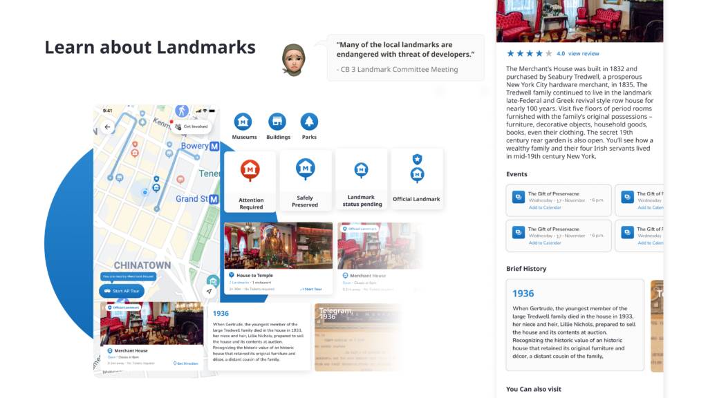
Prototype


Restructuring Website
[CB 3 Website] Initial Problem Statement
How can we improve the CB 3 website’s navigation in order to make it a more seamless and accessible experience for CB 3 residents?
[CB 3 Website] Redefined problem Statement
How might we restructure the information architecture of the CB 3 website such that it is more resident-friendly?
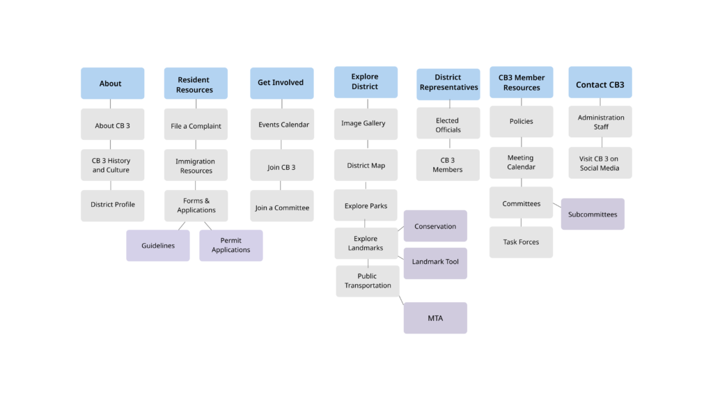
Card Sorting Analysis
We took four steps for conducting the card sorting method.
- Prioritized contents for residents and picked top 28 contents
- Conducted card sorting with 7 users using Optimal Workshop
- Standardized the data to categorize cards as an average
- Made final executive decisions when categorizing content in certain use cases
Site map
Final Design


