ZocDoc is a popular New York-based online platform that makes it easy for people to schedule appointments with their doctors. Users can choose their insurance plan, schedule an appointment with a doctor in their network, and if they wish, leave a rating for the doctor’s services after they have attended the appointment.
On initiating a search:
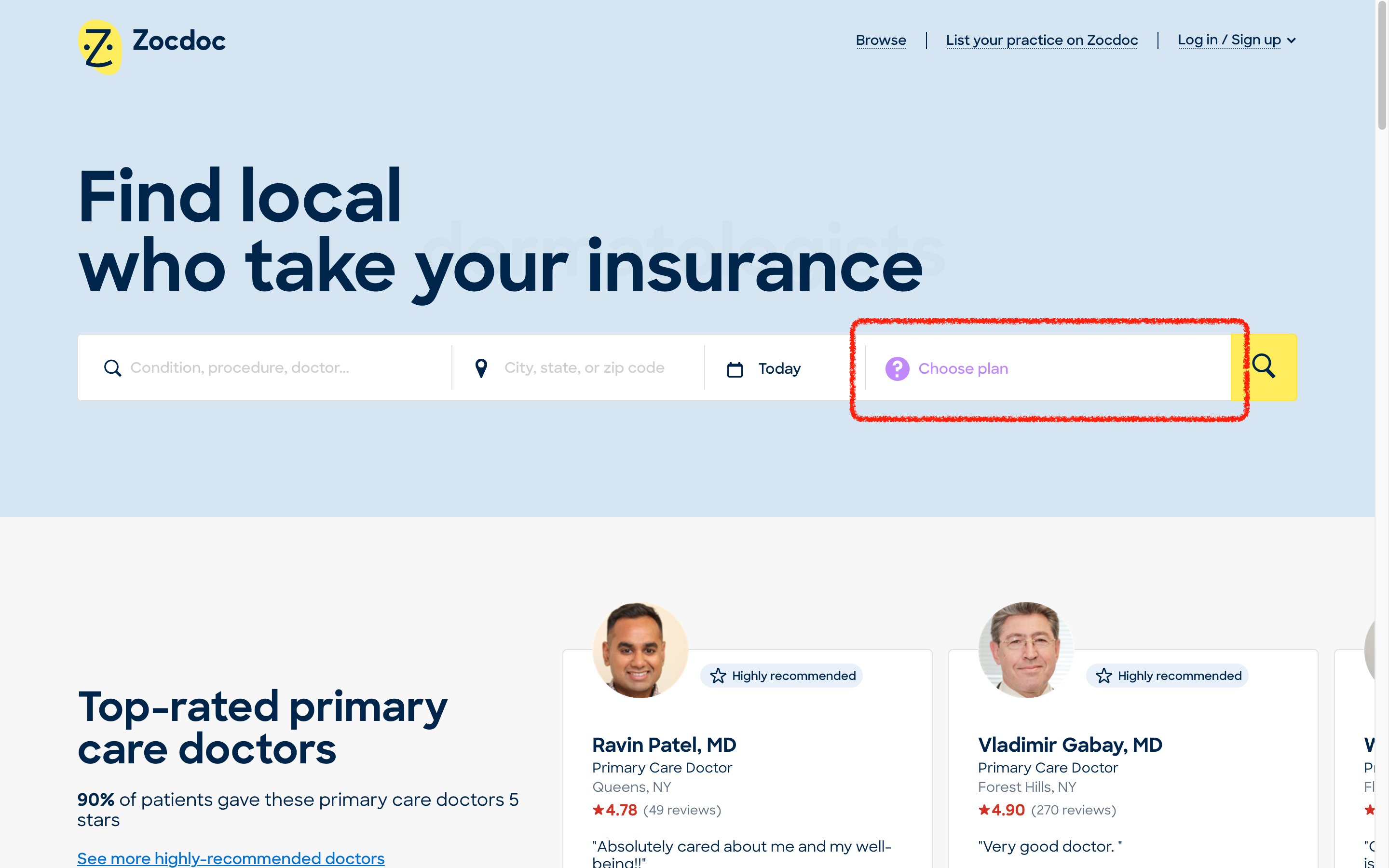
It’s very easy to search for a doctor on ZocDoc. The search bar is highly discoverable, it’s the first thing a user sees upon visiting the website. It has four white input fields that affords user input and a bright yellow button that signifies to the user to click it in order to start the searching process. The color contrast between the fields helps users to map the action with the result: white blanks are for entering user information, consistent with users’ internal knowledge of such search bars; and the only non-white button would be the search button. (see Figure 1)
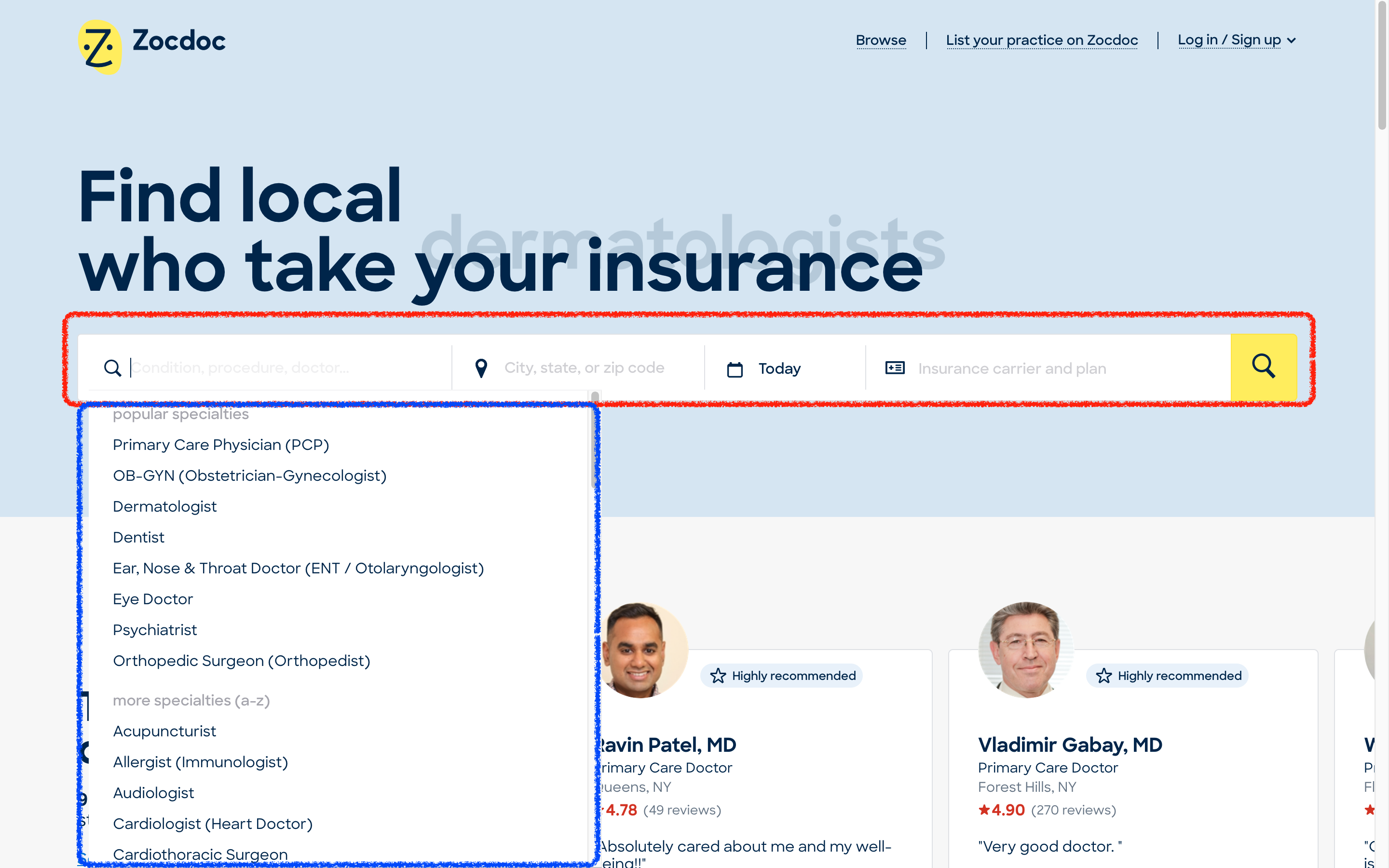
Upon clicking on the first field, a drop-down list appears, with the most popular specialties displayed on the top and a more comprehensive list below it ordered alphabetically. This feature serves to avoid the usability issue of having to go through each item in the list. As we can see, there are a variety of ways to enter information (typing, selecting, browsing), but all of which are constrained to one field, which makes the interface clean and reduces potential confusion brought on by too many options. (see Figure 1) A potential downside to this field is that since the default text is long, parts of it could be hidden if the browser window is not set to full-screen. For example, if the “doctor” part of the first field is hidden, the user may not know that they can search by doctor’s name. My suggestion is to display the default text in full upon clicking the field.
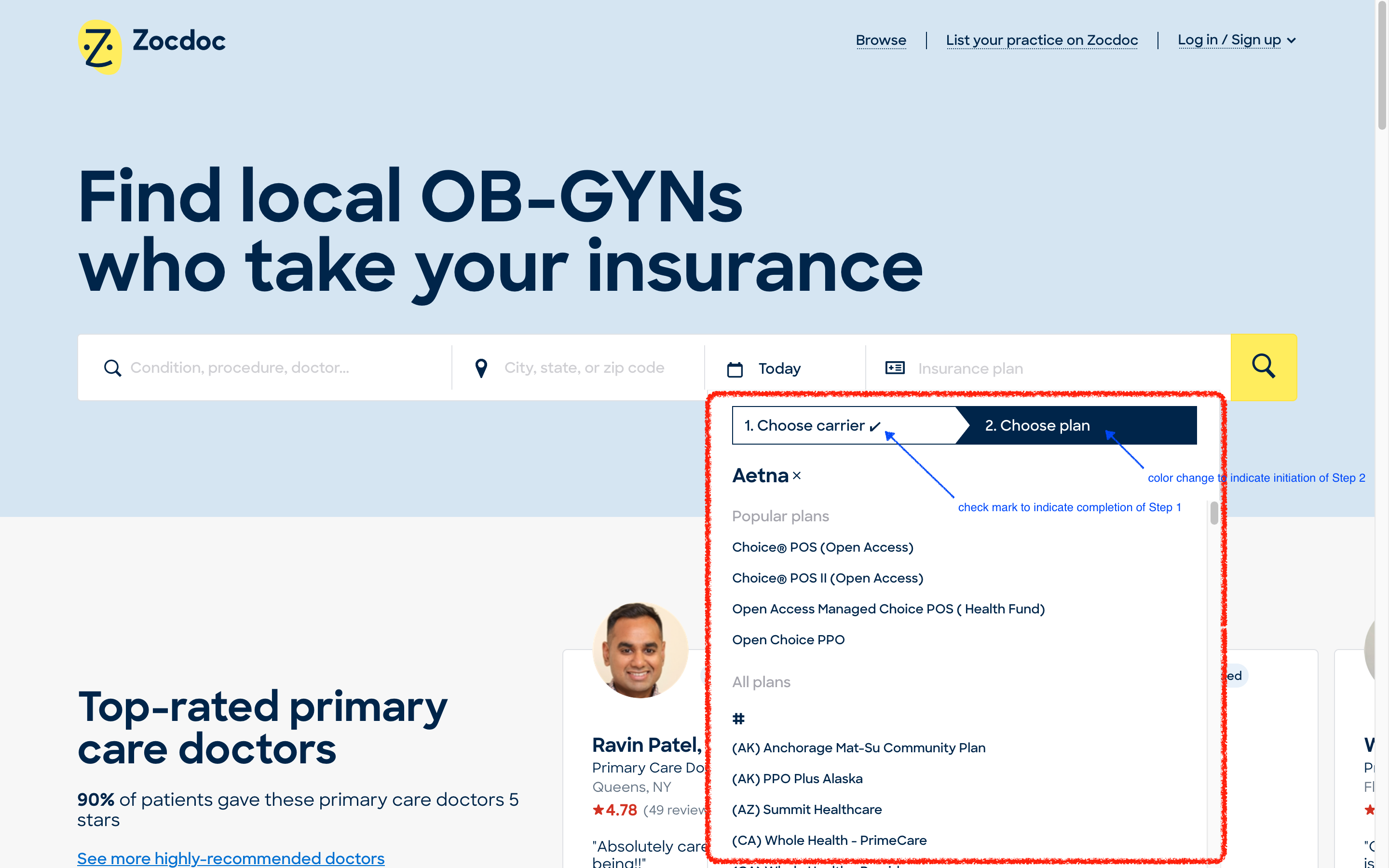
The last field that affords selection of an insurance plan presents some excellent usability design choices. Upon clicking, the user is presented with a 2-step selection process: first by carrier, and then by the specific plan. Alternative actions (paying without insurance or choose insurance later) are displayed at the top for good discoverability. After selecting a carrier (or the lack of one) successfully, feedback is given by color changes in the column names and a little check-mark besides the “Choose carrier” option, indicating the successful completion of one task. (See Figure 2) If the user exits from this selection process without selecting anything, a purple “? Choose plan” shows up instead on the field, giving a soft warning to the user that nothing has been selected. (See Figure 3) This is good feedback in case of a “slip”, more specifically a “loss-of-activation error”, when users forget what they are doing halfway through and accidentally abandon the task.
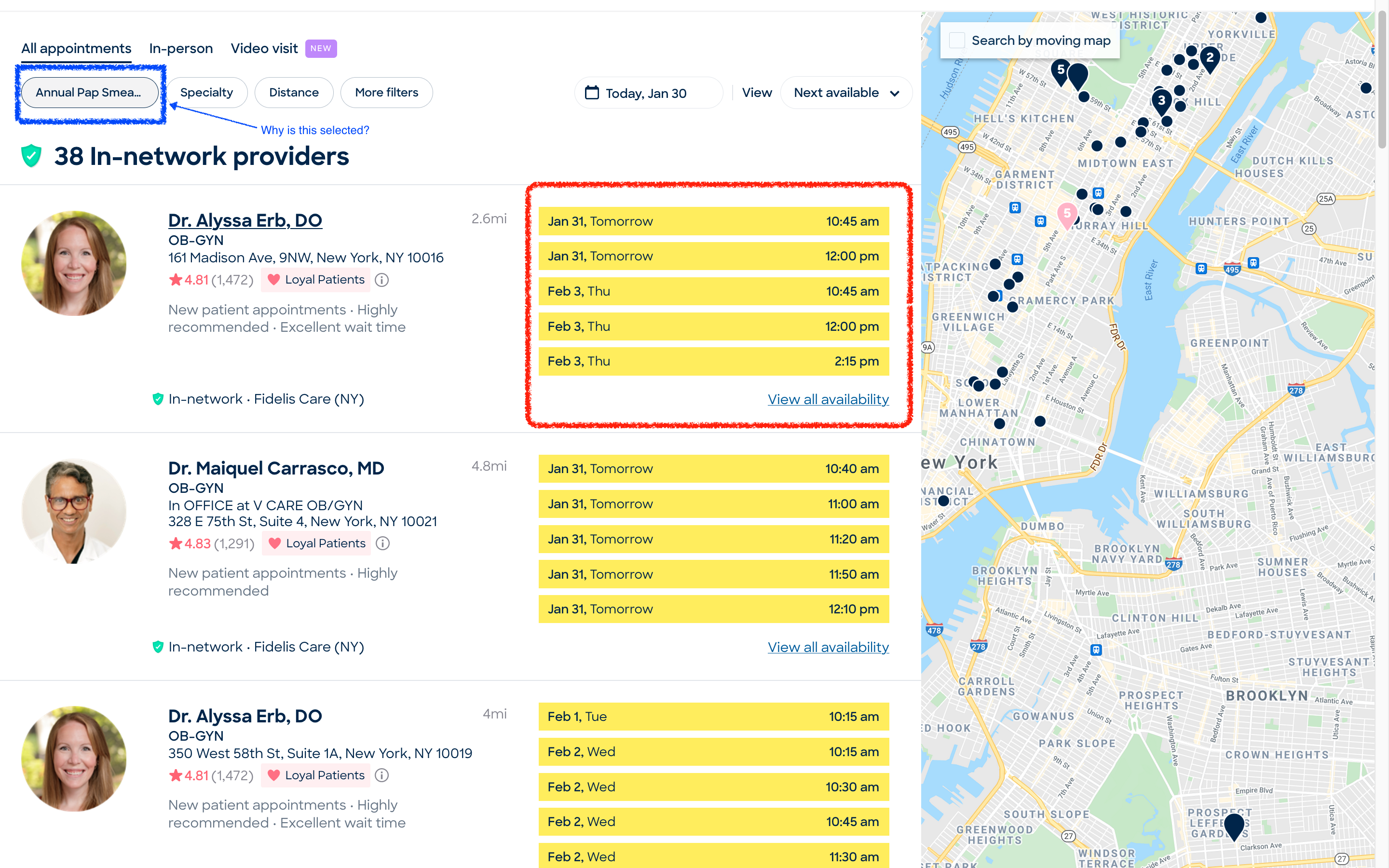
On selecting a time (see Figure 4):
On the search results page, time slots are highlighted with bright yellow, which means that they have high discoverability and naturally guides the users to click on them. This is similar to the “search” button on the previous page and establishes the correct action sequence mapping: the bright yellow buttons are meant to be clicked to go to the next page, whereas the rest of the information on the page is meant for filtering, selecting and browsing.
However, when I was trying out the website using the “OB-GYN” as a search criteria, the “Annual Pap Smear” filter is selected by default. This could pass unnoticed by many users since its font is small and the color difference minute. In case the user is actually not going in for a pap smear, I believe it’s better to leave common filters like this de-selected so that the user doesn’t necessarily book the appointment for the wrong reason.
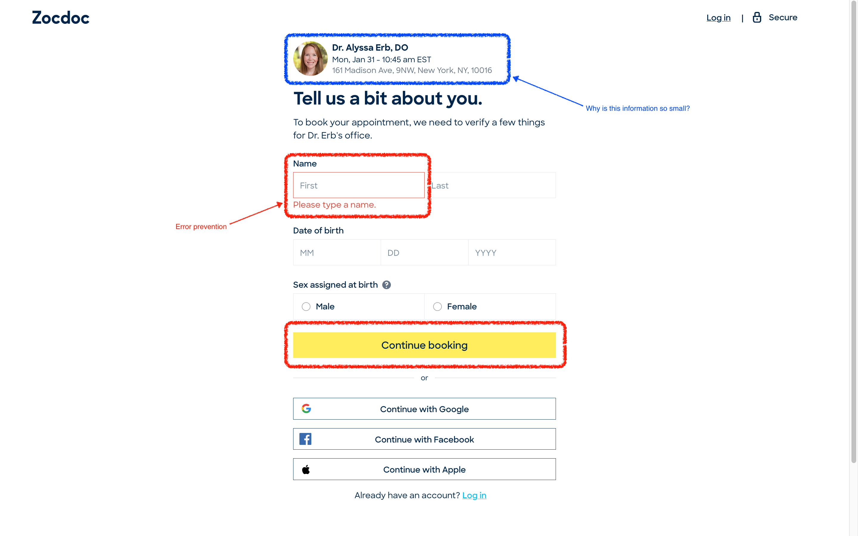
On booking the appointment (see Figure 5):
Upon successfully selecting a time slot, ZocDoc takes the user to the final pages. This page continues to use bright yellow buttons as a signifier for the next page, as well as other common warning notices. Clicking on the input field but not writing anything will leave a warning in red, a forcing function implemented so that users cannot go to the next page without resolving the error.
Compared to the discoverable login information, information about appointment details are not very discoverable. They are of a smaller font, and only display the time, address, and doctor’s name for the appointment. Reason for appointment should be included here, especially taking into account the unnoticeable default filters in the last step. Besides, it would also be good practice to increase the font size of this block and include a bold header like “Appointment Details” on top of this information to further encourage the users to double-check their appointment details before moving on.