Kindle is essentially an online e-reader by Amazon that grants users digital access to Amazon’s library of over a million books. The Kindle app facilitates users to access, buy, download and read e-books, magazines, and other digital media on their personal devices.
Homescreen
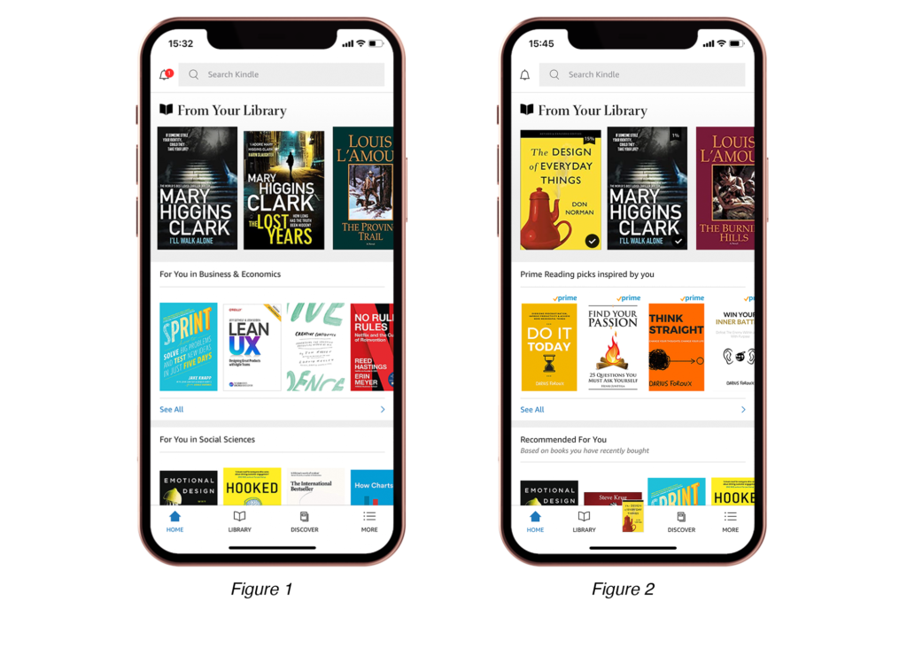
The app home screen uses various signifiers to facilitate users to seamlessly access books in their library, search and purchase new books. As shown in Figure 1, the natural mapping of the books on the screen affords horizontal scrolling to access more content in each category. However, the books themselves do not signify any action and users might have to rely on the knowledge in their head to discover the possibility of tapping on the books to read them.
Recommendation: A subtle drop shadow could be added to each book to signify the action of tapping to read the book. Alternatively, a “Read Book” label or the title of the respective book visually represented as a hyper link under the image of the book could be added to signify tapping.
navigation bar
The users can also explore and access content using the navigation bar located at the bottom of the screen. Each navigation item is represented by an icon and reinforced with a supporting label making them good signifiers that support the users visceral processing and thus facilitate effortless understanding and discoverability. The navigation bar also provides appropriate feedback when a certain icon is selected to indicate the users position on the app as shown in the figure 1 and 2.
Once a user downloads and accesses a book in their library, the home screen adapts to reflect a circular icon with a tick mark on the recently accessed book (refer Figure 2). This feedback matches the conceptual model of a successful download and thus helps bridge the Gulf of Evaluation. Additionally, an icon of the most recently read book gets added to the navigation bar (see Figure 2) affording users to promptly access and continue reading from where they left off. This feature is also helpful in case of an action slip where users accidentally close the book and want to go back to reading it without having to search for it.
The Reading Experience
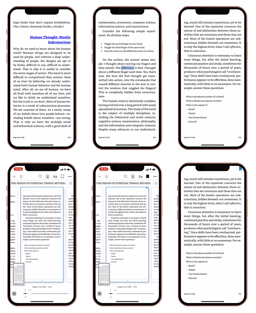
Primarily meant to make digital reading convenient, the app leverages skeuomorphic design to facilitate the experience of reading a physical book. Considering that users access the app on their smartphones, the idea that swiping from right to left affords navigating to the next page aligns with their mental models. The resulting interaction of navigating to the next page replicates the action of turning pages in a physical book and the subsequent feedback is visually satisfying for the users (Refer figure 3).
Tapping on the screen displays a wide range of functions signified using relevant icons that align with the users mental models from having interacted with various note-making apps on smartphones. Users can bookmark pages allowing them to return to it at a later time. This features allows users to enjoy the reading process by essentially reducing the cognitive load on the users short term memory.
personalisation and accessibility
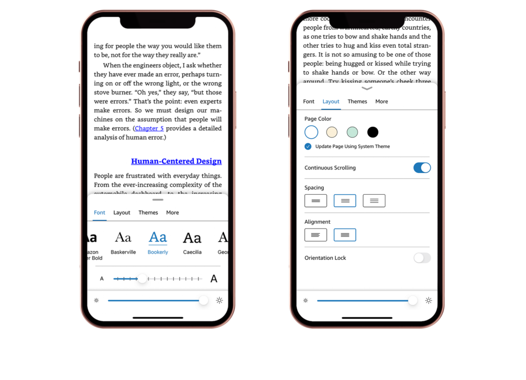
Considering users have varied visual and motor abilities, the app lets users customise page layout and improve the apps accessibility (Refer Figure 4). The app allows users to place physical constraints in the way they navigate from page to page by allowing them to enable the “continuous scrolling” or “lock the orientation” features. The toggle icon signifies the affordance of turning the feature on or off and the change in colour provides instant feedback that the action has been performed. Overall this particular interaction effectively bridges the gulf of execution and gulf of evaluation.
searching and highlighting information
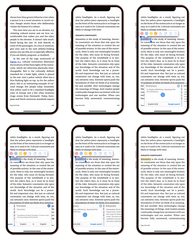
Leveraging users knowledge in the head from online chat platforms, a long press allows users to select a word to highlight, copy, export or search (figure 5). Furthermore, the app provides users with declarative knowledge about a specific word, and also makes it accessible for users to better understand certain contexts by providing an option to translate the word to other languages. While these tasks would have caused tremendous disruption when reading a physical book, the addition of these functions on the app allows users to gather more information without interrupting the users conscious attention.
Conclusion
Overall Kindle has an intuitive and accessible interface designed to facilitate a seamless reading experience. Majority of the interactions and signifiers on the app align with the users conceptual model ensuring effective usability. However, the app must be conscious to avoid the phenomena of creeping featurism as adding multiple features might overwhelm the users and affect the usability of the app.


