The Dunkin’ Donuts mobile app allows customers to locate their nearest physical store location, place online orders ahead of time, and receive points and loyalty rewards, among other things. Essentially, it exists to provide additional convenience and incentives for those who are customers of Dunkin’ Donuts.
Login Flow for an Existing Account (Good Design)
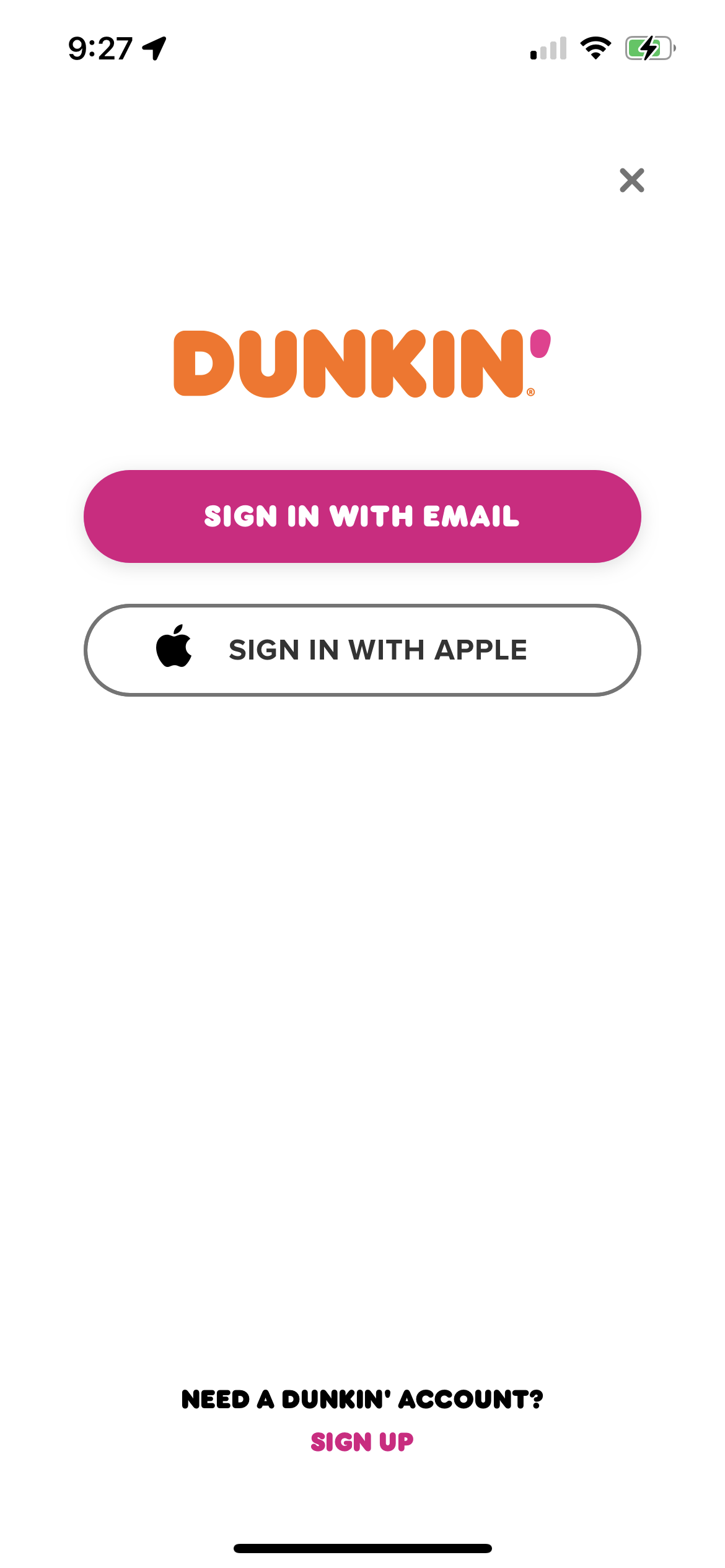
In the first step, users are prompted to ‘Sign In With Email’ or ‘Sign In With Apple’. These two buttons occupy the central region of the screen, orienting users to the primary two signifiers that are the buttons, demonstrating to users that they can tap either of the buttons to move forward to the next stage of the sign in process. Additionally, there is not much users can do on this page besides click one of the two buttons, exit out of the page (upper right) or click the ‘Sign Up’ button at the bottom of the page, indicating a proper use of constraints. While it could have been designed to do so, this page doesn’t provide users with additional distracting opportunities, such as being able to browse the menu, as this could potentially distract users from the problem at hand, which is to sign into their account.
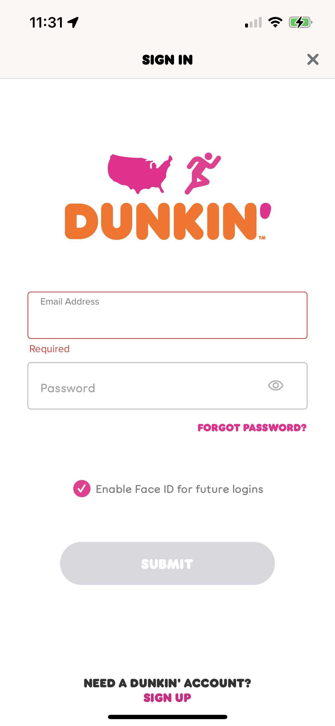
Next, users are prompted to fill in their email address and enter their password. They also have the option to see their password as indicated by an icon that looks like an eye. Pressing this icon provides great feedback, as the icon changes to allow users to see if they are in a setting in which their password will be visible or not (slash through the eye for a hidden password). Additionally, this follows a predictable conceptual model of a typical sign in process, as it has been seen in many login flows that clicking a sign in button will bring the user to the next step in which they must enter their email and corresponding password. Lastly, users also have the option to login using FaceID, which follows the idea of designing for error, as it is highly likely that people will forget their passwords, in which case, this is a great time saving alternative to helping users still achieve their goal of logging in.
Navigation (Good Design+Opportunities for Improvement)
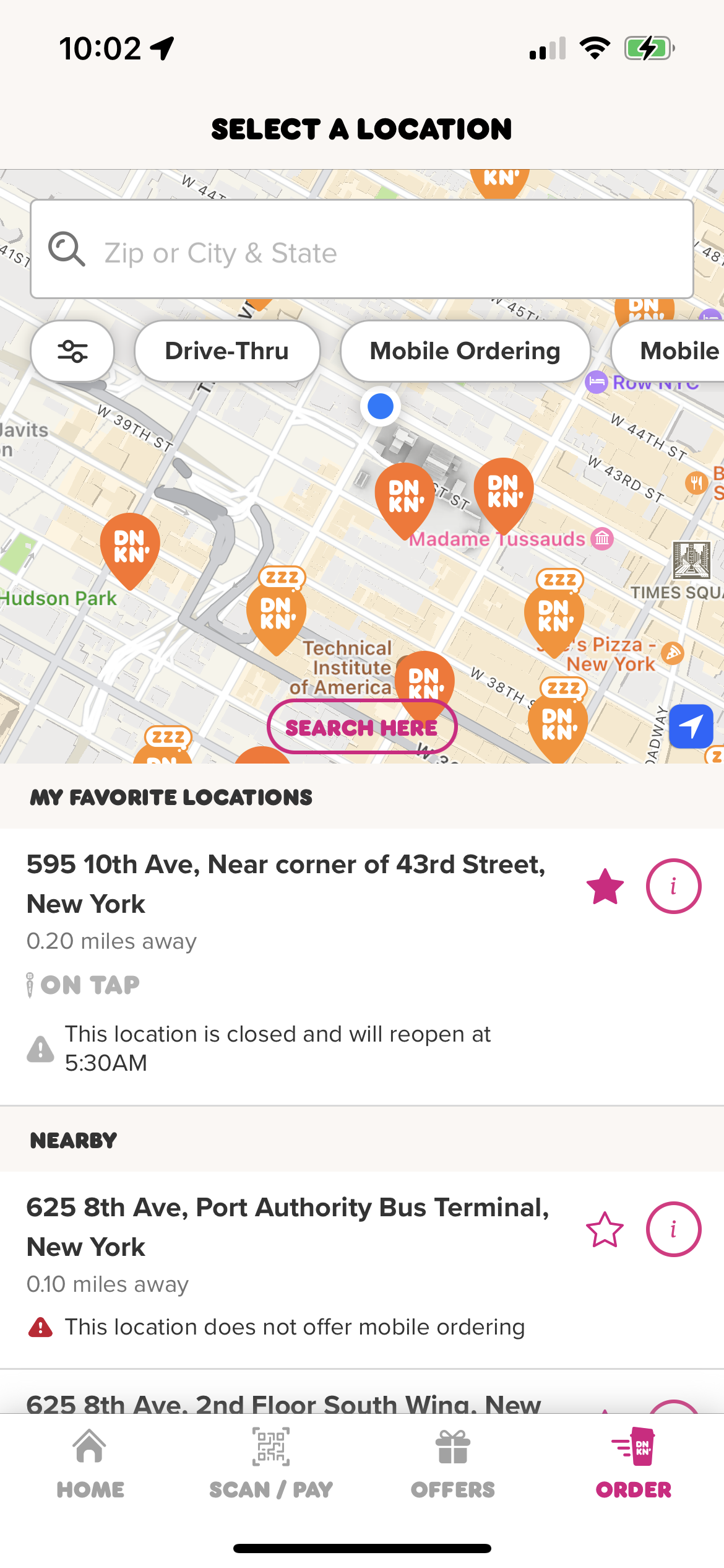
Store Location Navigation:
In order to help a user find stores near them, they are provided with a digital map, in which, upon enabling location services, a user can see where they currently are (indicated by the blue circle) in relation to the nearest Dunkin’ locations (indicated by the orange Dunkin’ icon). This makes use of natural mapping to help orient users to nearby store locations, but there could be improvement to further increase clarity for users.
Opportunity for Improvement:
All of the Dunkin’ icons look the same. Because users generally are looking to find the nearest physical store with respect to their current location, it would be helpful to change the color of the icon for the nearest Dunkin location to something unique/easily identifiable. Doing so could prevent a knowledge-based mistake, in the likely event that a user misjudges distance and accidentally picks a store location that is further than the closest store.

App Navigation Bar:
Like many app navigation bars, the ‘home’ icon is on the left hand side, making use of a popular conceptual model that aligns with many apps currently on the market and the fact that a majority of the target users are accustomed to reading from left to right. Additionally, based on what page a user is on, the icon will change to a bright color, providing great feedback to users as to where they are within the app.
Rewards (Good Design)
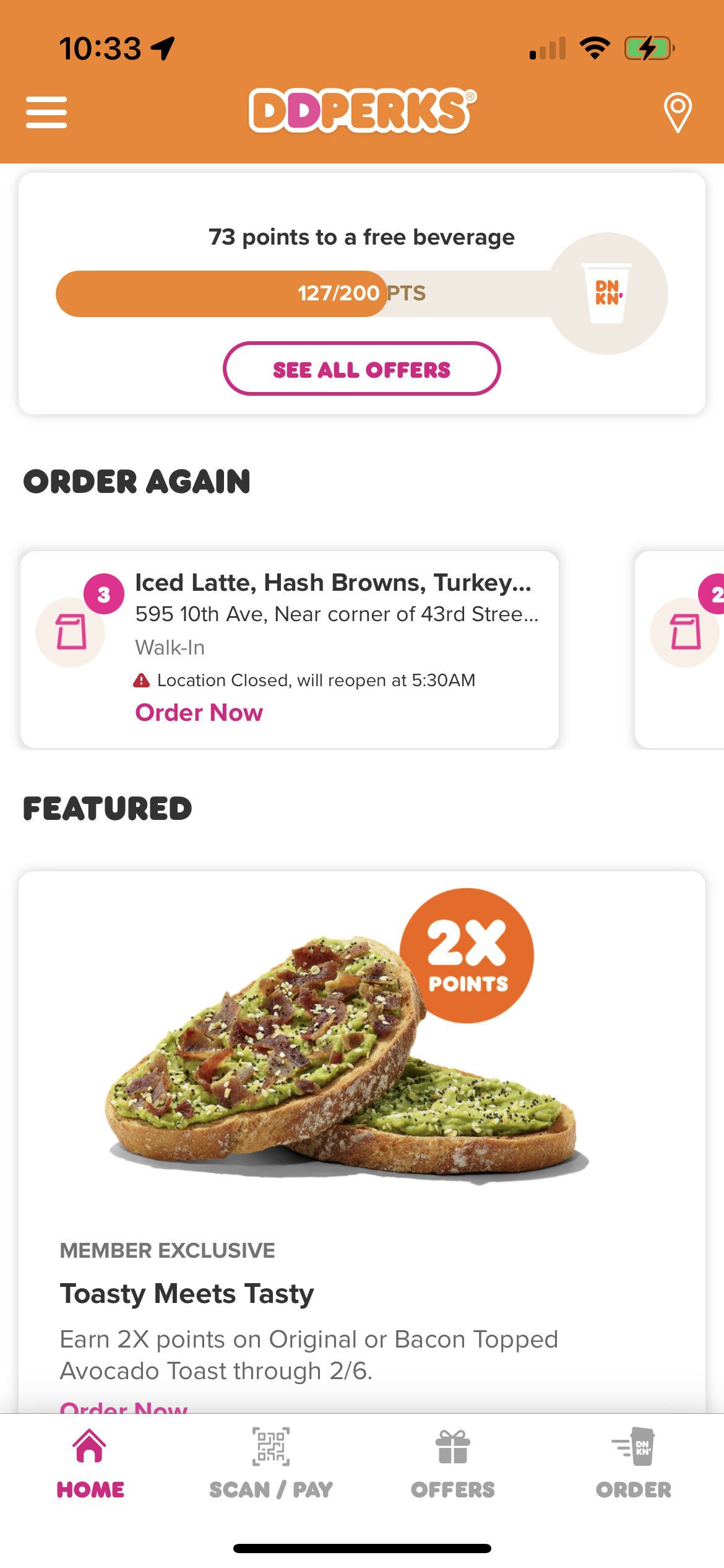
In order to maintain user loyalty, the Dunkin’ app incorporates a rewards program. Once a user logs in, they are brought to the homepage, in which the rewards section is right at the top. Immediately, this appeals to user goal-driven behavior, encouraging them to purchase Dunkin’ products to get closer to the 200 point reward. Additionally, the visualization of how close a user is to a reward and the immediate points users receive for an order appeal to the behavioral aspect of processing, enforcing positive feedback loops for being an active Dunkin’ customer.
Conclusion
Overall, the app is a great example of practical and enjoyable human-centered design that allows for users to find store locations, place orders and be rewarded for loyalty. From the bright and uplifting color palette that appeals to visceral processing to an intuitive user experience that leverages good design concepts such as natural signals (ex. a plus icon to add additional bags of sugar to a coffee drink), the Dunkin’ Donuts app is a success.