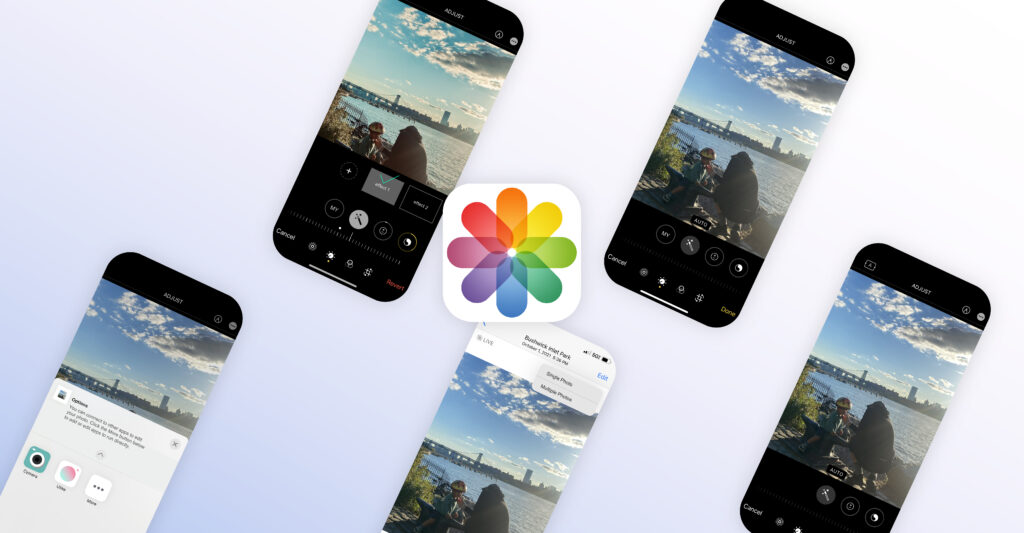
Millions of Apple users have Photos on their iPhones as a digital memory box. It gives users quick and easy access to all users’ photos and videos, and there are so many intriguing and fun opportunities that users can do in the edit screen. However, I found some problems from the user perspective based on Don Norman’s book, The Design of Everyday Things.
THE PROBLEM
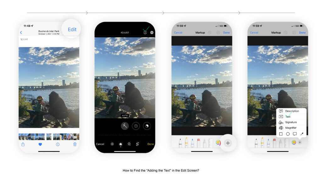
Adding the Texts 🤔
It’s quite too complicated to lookup functions to add a text box on the photo. Users might find the pencil icon; However, it’s still challenging to find which button offers the editing texts – Lack of Signifier & Discoverability.
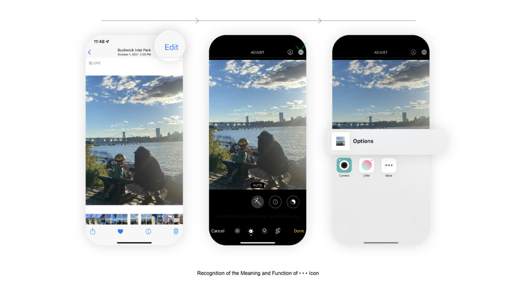
Recognition of the Meaning and Function of • • • Icon 🤔
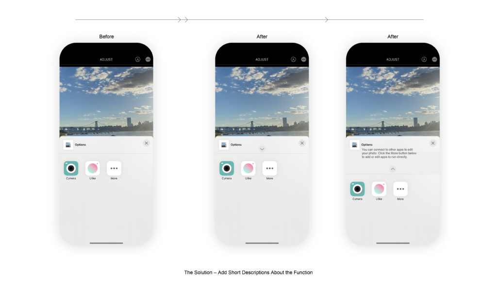
In the editing photo screen, it’s hard to figure out what the three-dots icon (• • • icon) is the primary function for. This function was originally made for offering extra functions for editing the photo connecting to other apps. However, only the “options” is written at the top of the bar, so it’s really hard to what extra functions do they offer – Lack of affordance & feedback.
Limitations in Edit Photo Functionality 🤔
It’s easy to find the “edit” button, so it’s a good example of affordance. Still, there’s a lack of functionalities. These are daily complaints that I had when I edit photos.
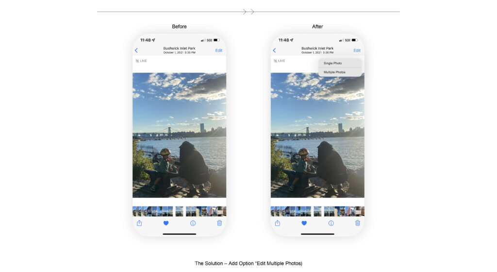
- Can’t Edit Multiple Photos at the Same Time
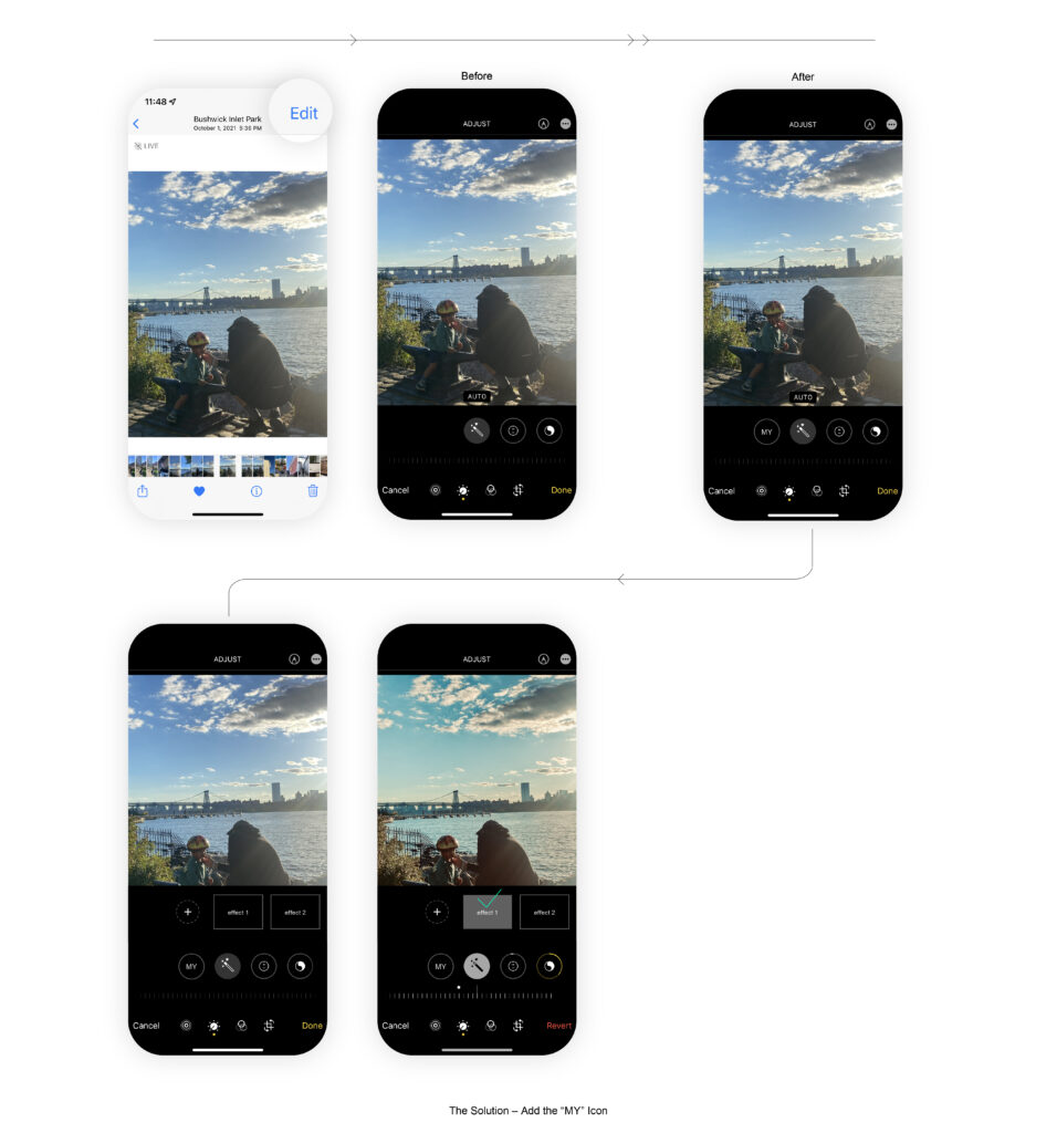
- Can’t Remember the Adjusted Style Effects
HMW CHALLENGE
- HMW write the texts with appropriate discoverability?
- HMW understand the right action with the right feedback?
- HMW utilize the desired function in multiple ways?
THE SOLUTION
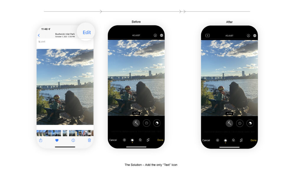
Add the ONLY “Text” Icon at the Top of the Navigation Bar in the Edit Screen 💡
Users can note directly by simply clicking the text icons at the top of the edit screen navigation bar. Through this possible solution, users can save time to find the text button.
Offer an Additional Short Description Along with the Word “Options” 💡
Instead of using only the word “Options,” adding the description about the function helps users understand.
Add The Option to Edit Multiple Photos 💡
Add the “Edit with Multiple Photos” option at the top “edit” button. Users either edit a single photo or multiple photos. If users select the edit multiple photos, they can view and edit every selected photo simultaneously. Also, while users edit multiple photos, they can remove or add other photos using + (add) button at the top left.
Save the Effect Style 💡
Add the “MY” icon at the bottom navigation bar that users can view and edit their saved photo edit effects. Users can save the chosen effects such as exposure, Brilliance, highlights, and other effects in their “MY” collection. Through the process, users can adjust the same effect in other photos.
CONCLUSION
Overall, the function of editing photos is easy to use, and it offers diverse opportunities that users can do. However, those many options sometimes lead to a lack of signifier, discoverability, affordance, and feedback. For those reasons, users needed clear direction or information. Therefore, I expect users can have convenient and joyful editing experiences with less confusion.
