Explore History

Urban Archive is an iOS-free app that shows history throughout a map. The app offers archival photos, historical information, cultural institutions and connects the user with their websites. It is designed to be accessible at any time, whether walking through the city or not. Its mission is to accompany the walker during his journey and show history through the buildings.
- First actions

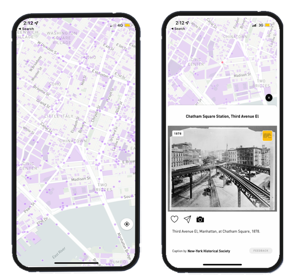
The first impression when the map appears is to tap on one of the purple points. The purple color indicates (the color makes the user think of an action) “tap” as first. The discoverability in this step is intuitive, it is not explicit in terms of design, but it can be said that it is good since, as it does not have extra information, the color is what commands to start using the app. Once the user taps one of the points, the mapping principle appears. The tap leads to a new page with information. Thus, we can say that the mapping is good. However, since the map does not have a legend, the user does not know what each shape means. This can generate confusion, and the UX becomes complex as the user tries to discover the proper action to get the information.
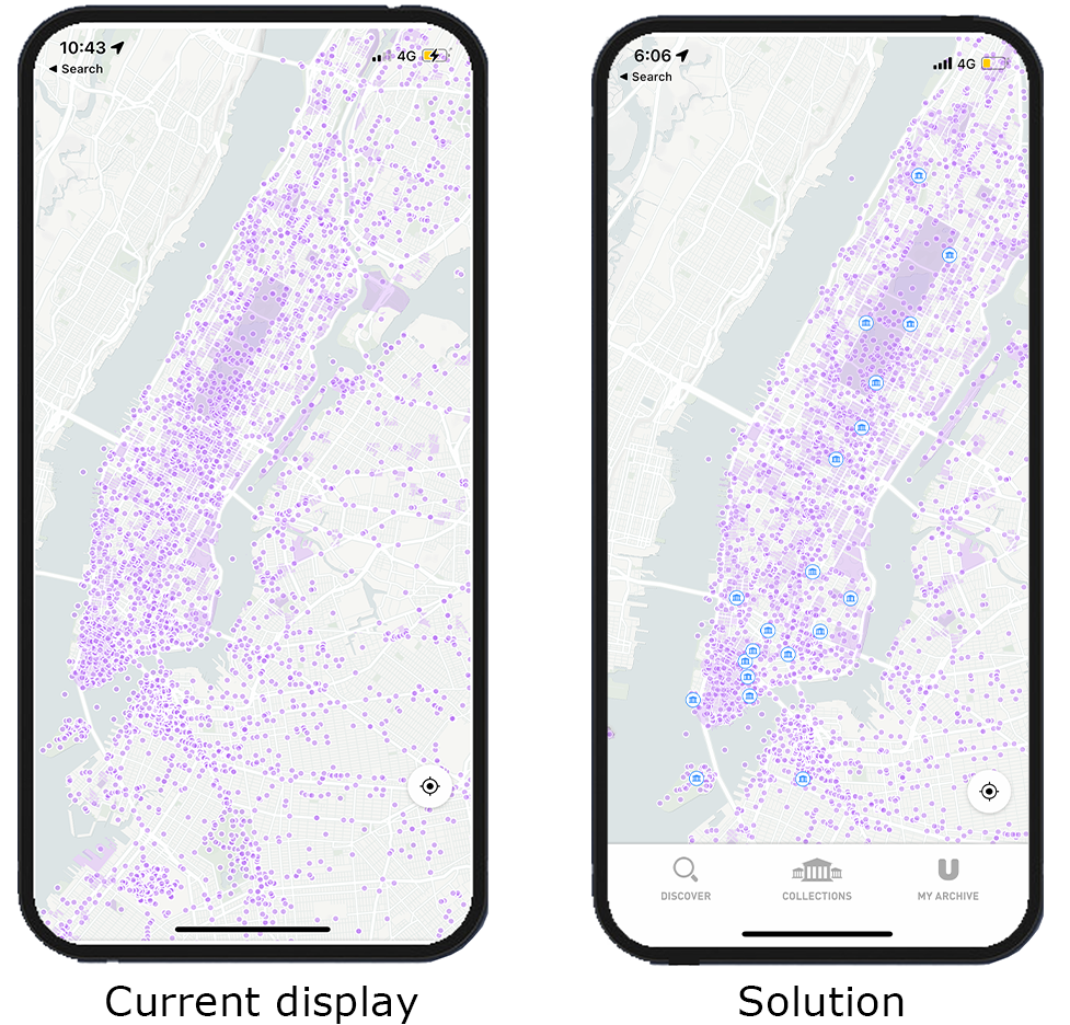
The solution could be to have a legend showing what each shape is or different colors for each type/use of the building. For example, a different color to cultural institutions or historic sites buildings. The UX would improve if the user had extra information. This would also help the user’s interest in tapping on the map.
2. Main menu

The steps to find the main menu to start using the app are confusing and unclear. To find it, the user has to play with the tap repeatedly until this menu appears at the bottom of the screen. Then, the user has to investigate by tapping for it to appear. After zooming in and tapping on “explore this area,” this menu appears. Simultaneously, the menu appears by tapping somewhere on the screen. The user has to navigate various functions to finally make the menu appear. In this crucial feature, the discoverability and mapping go bad.
On the other hand, the discoverability to achieve the configuration of the user’s interests is poor and inconsistent. Also, the feedback and visibility could improve. For example, the menu icon for setting user interest is not visible. Without feedback, the user does not know if the “taps” will choose the city to start navigating the map. By not having a visible icon or menu bar, this action is not part of the user’s knowledge in the head, making it difficult to find it every time entering the app. Finally, not having any icon on the main screen generates user frustration. Therefore, the design on the first impression is negative.
The solution is to add the banner: “Discover,” “Collections,” and “My Archive,” and a general menu visible to guide the user to correct action. The design has to have a signal to improve the UX: show a visual element for a logic constraint, and simplify the use of the app without guessing the steps to get this menu to appear.
3. Collections feature

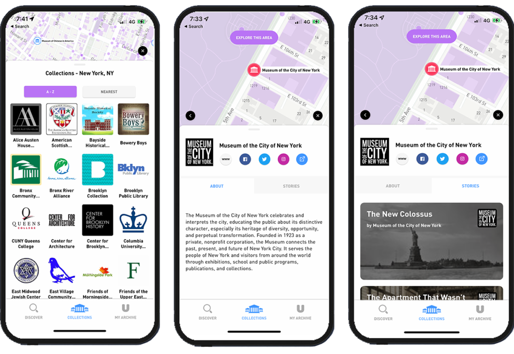
The “Collections” feature is findable once the menu at the bottom is activated. The signifiers in this section make it easy to take action, such as the lines’ design that leads to swipe to see more. In this feature, diverse institutions appear; by clicking on one, the details appear, showing it on the map at the top of the screen. In addition, some institutions have a feature called “Stories” within this, the user can see stories related to the selected institution/historical building. Then, by swiping, the app connects the story with the city and generates a tour. The mapping and feedback work fine since visuals respond to actions like tap or swipe.
In each “story,” the signifiers are precise, allowing the user to go deeper with the information by clicking. Also, the “Like” and “Share” icons are visible. This section of the app has a friendly and smooth UX. Despite being a section with several features, it is easy for the user to interpret the information since the design displays relevant information.
