The iOS weather application has become ingrained in many iPhone users morning routines and daily lives. The weather app provides users with information about the temperature, air quality, forecast, wind speed, etc of a specific location. With a just a few taps a user can quickly digest the weather related information they are seeking due to carefully thought-out design choices.
Detailed View
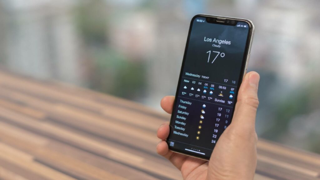
By default, a user who clicks on the weather app will first be shown the detailed weather for their current location. The use of icons at the bottom of the screen indicates that additional actions and screens can be accessed (Figure 1).
The map icon in the bottom left corner affords that weather information can be seen in a map view. The icon in the bottom right corner is a signifier that indicates an alternate list view is available. The sequence of dots at the bottom of the screen provides a mapping between the location currently shown and the rest of the locations available. As the user scrolls horizontally left and right, the corresponding dot is illuminated in the sequence allowing the user to understand the position of the displayed location within the full list. This representation of the sequence of dots also provides constraints on how far the user can scroll in each direction. Once the end of the list has been reached, the last dot in the sequence will be illuminated indicating that the user cannot scroll any further.
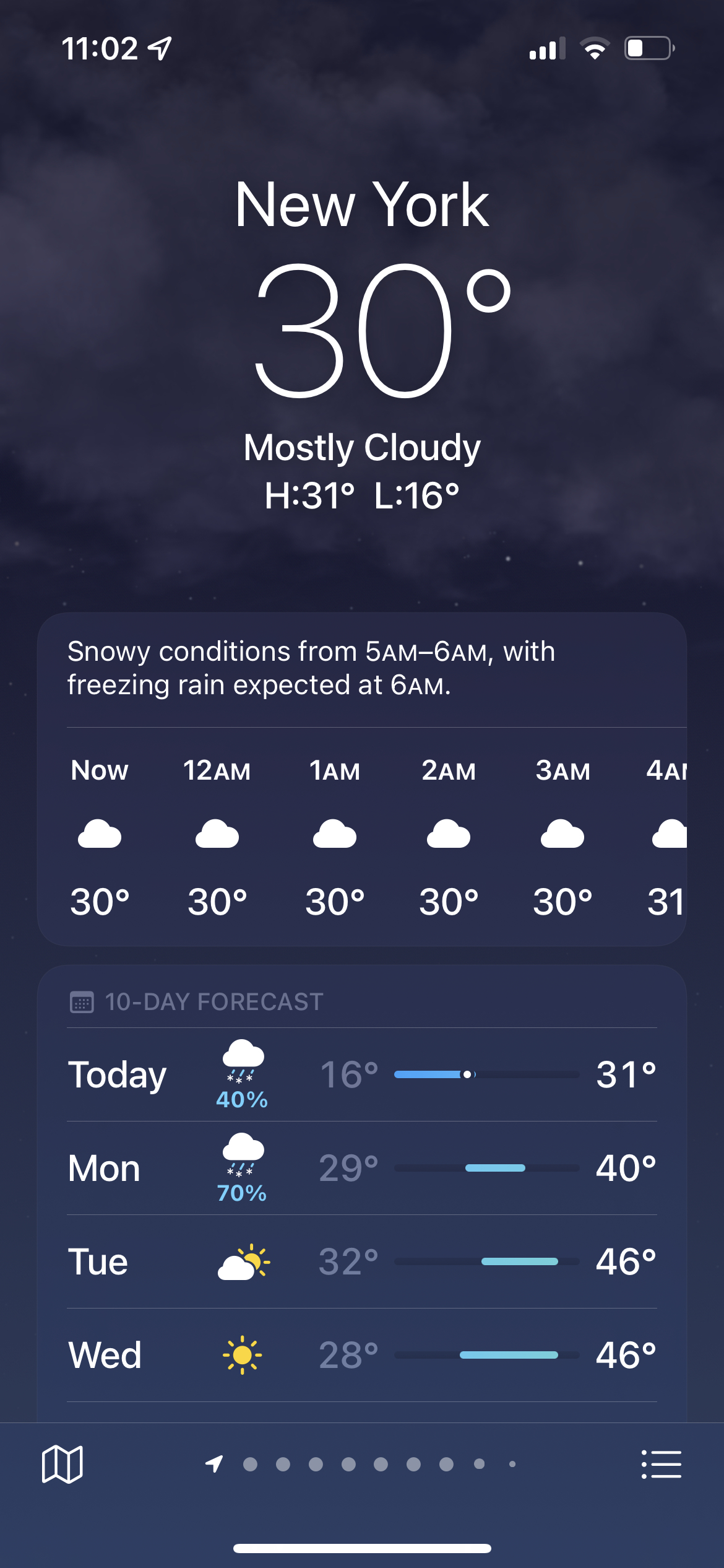
Icons continue to be used in a clever way to represent additional weather information. For every hour in the hourly forecast and every day in the 10 day forecast, there is an icon displayed to represent the forecast for that period of time (Figure 2). These various icons effectively represent information about the forecast and allow the user to digest a large amount of information without getting overwhelmed. Since the same icons are used consistently around the app, a user can depend on these icons to portray an accurate depiction of the weather without looking at any numbers.
MAP VIEW
Figure 3: Toggling between temperature, precipitation, and air quality information on the map view
The map view, shown in Figure 3, provides a map representation of temperature, precipitation, and air quality information. Presenting this information on a map follows a user’s conceptual model for location based information. When toggling between the different views, there is a loading bar that scrolls across the top of the screen to indicate that the information is being loaded. This feedback makes it obvious that the user’s action was registered and that there will be a response.
List View
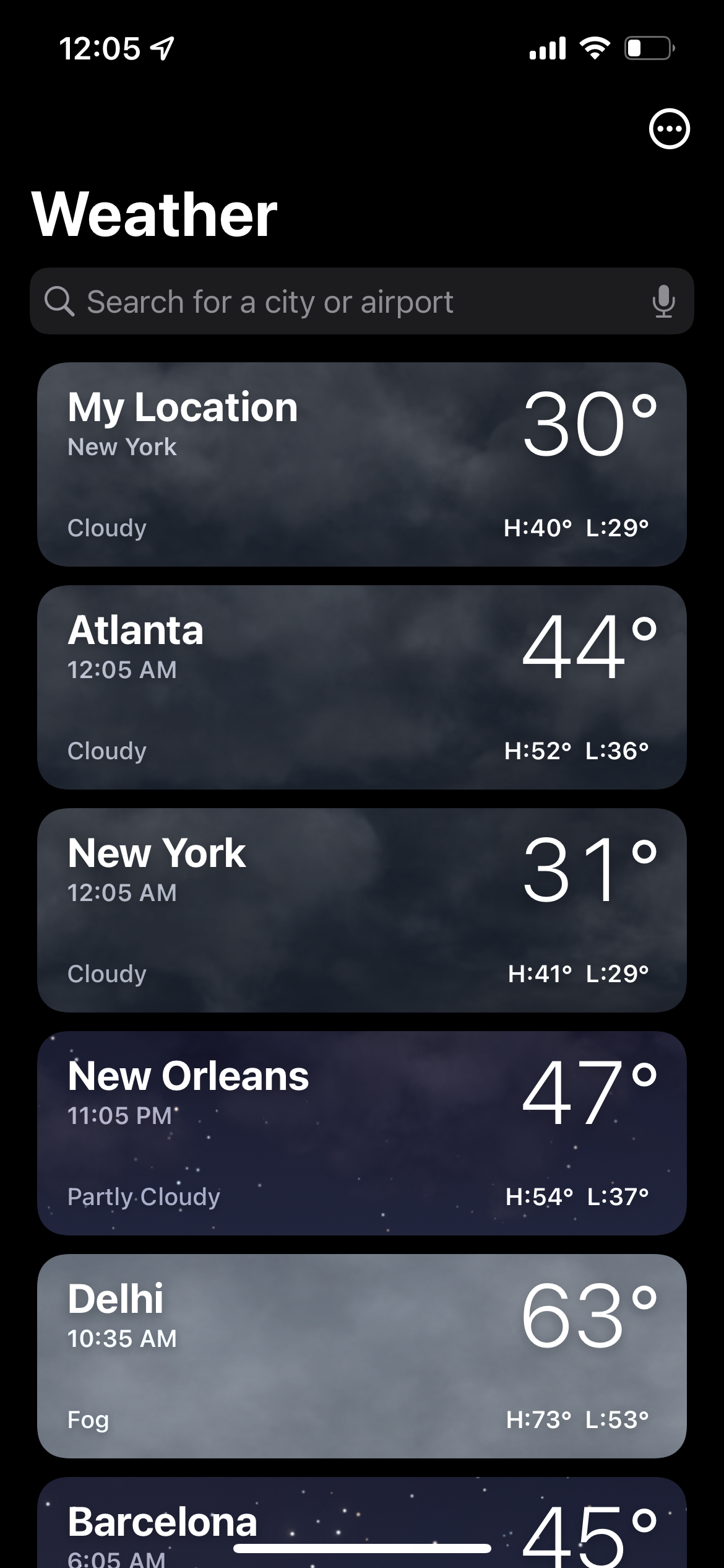
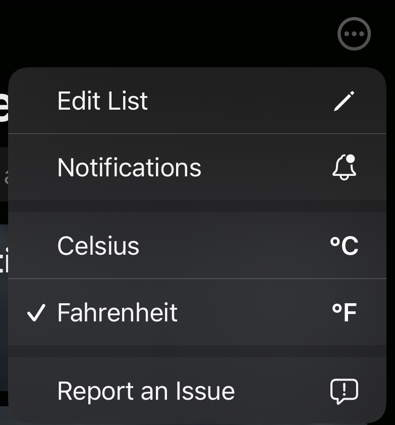
Alternative to the detailed view, a list view is also available to get a quick overview of the weather in multiple locations that have previously been saved (Figure 4). The icon on the top right corner is another instance of a signifier to indicate additional menu options when clicked. One of the options in this menu is the ability to switch the unit of temperature between Celsius and Fahrenheit (Figure 5).
Mode Based Errors
Toggling between the two units can be considered different modes. An issue that arises with having two modes within the app is the increased likelihood of a user making a mode based error. Since the unit of temperature is never displayed anywhere on the main screen, it is not obvious which mode is currently invoked. This means a user could easily interpret the temperatures as Celsius when they are in fact in Fahrenheit, or vice versa. In order to prevent this from happening, it would be useful to include the unit with the current temperature of a location. Since the current temperature is the largest number displayed on both the detailed and list views, it would make sense to include the unit of temperature here to explicitly establish the mode (Figure 1 & 4).
Add a NEW Location
Since the list view is a dynamic list of locations, locations can be added or deleted by the user. If a user wants to add a new location to their list, it is not obvious how to take this action which causes them to get stuck in the gulf of execution. There is no button or plus icon displayed anywhere on the screen – not even in the menu of the additional actions (Figure 5). In order to add a location, a user is expected to first search for that location, select it from the search results, and only then will they be presented with an “Add” button to save the location. To minimize confusion and bridge the gap between the gulf of execution and the gulf of evaluation for adding a location, I suggest the addition of a plus icon on the list view which would take the user straight through the steps of adding another location.
Conclusion
Overall the iOS weather app is effective in providing users with a plethora of information in a digestible and easy to understand way. However, there is room for a few improvements to the design in order to make the application easier to use and prevent mistakes from occurring.