Project Summary

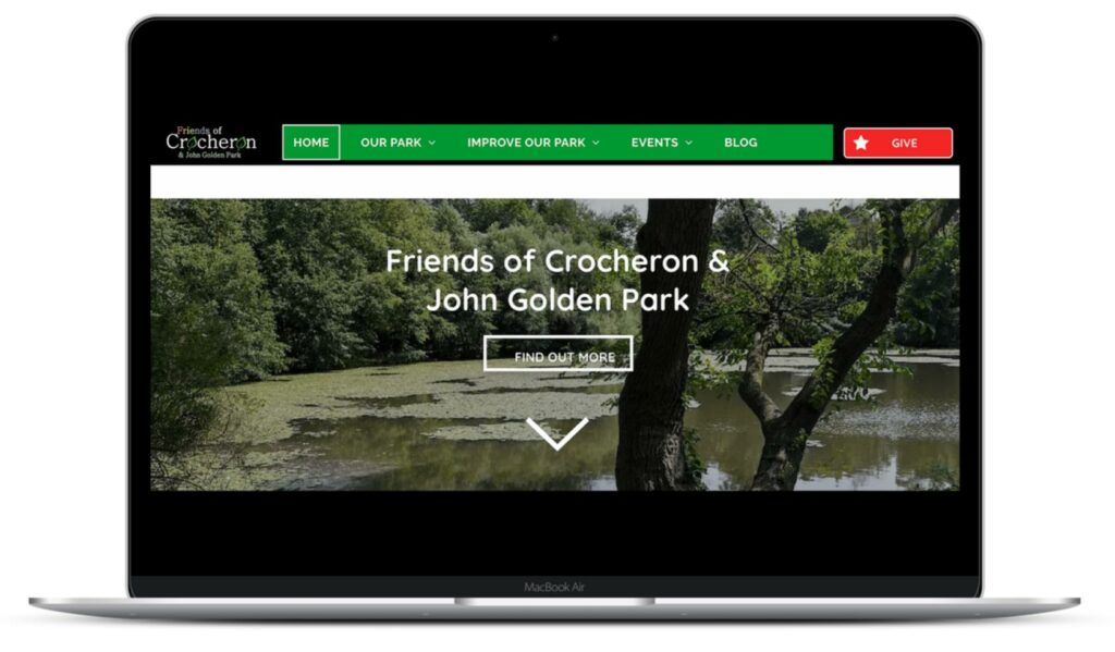
The Friends of Crocheron & John Golden Park is a non-profit organization whose mission is to provide stewardship over Crocheron & John Golden Park in Bayside, Queens. The organization coordinates volunteer events, recreational activities, park conservation, and educational opportunities to engage the community that uses the park.

Our clients were interested in understanding how users were using the park's website and if it was effectively meeting their needs.
The Team

My contributions included
- Defining a screening questionnaire and outlining tasks
- Conducting three moderated user interviews
- Analyzing the data and findings
- Creating mockups for both the history and blog sections of the website
- Presenting our findings to the client
- Writing the final report
Study Objectives
Based on the conversation with the client, the team focused on the following 4 areas of the website in our study
- History Section
- Volunteer Registration
- Donations
- Blog
Our goal was to understand if these sections of the website were successfully meeting user’s needs and supporting the community built around this park.
The Process
Breakdown of Participants
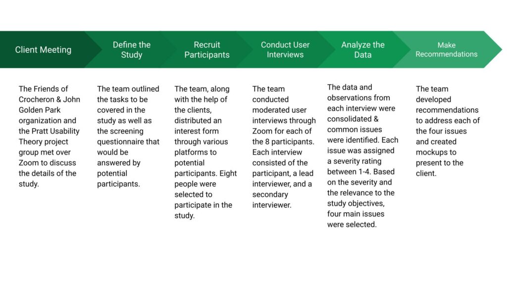
When recruiting participants, we used platforms such as the Crocheron Park’s monthly newsletter email, a Queens specific reddit group, and the Pratt School of Information discord server. We received interest from 10 people and ultimately ended up choosing 8 of those people to participate in the study. A variety of people with varying levels of familiarity with the website and the park were recruited. A further breakdown of the participants can be seen below.
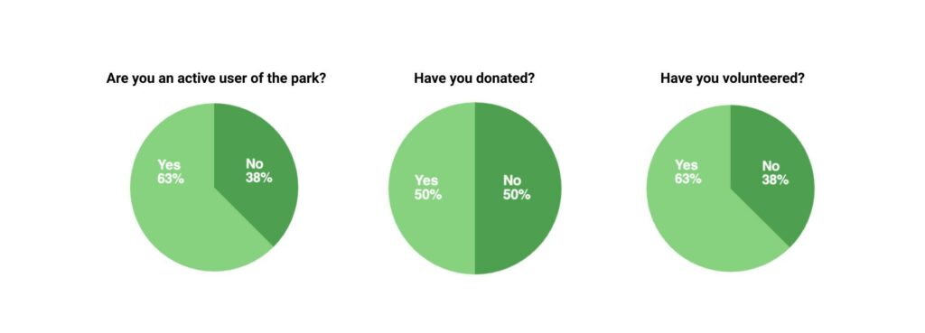
We were fortunate to have the opportunity to interview participants that were frequent visitors of the park. Many had volunteered at park events in the past and felt connected to the community around the park.
Defining the Tasks
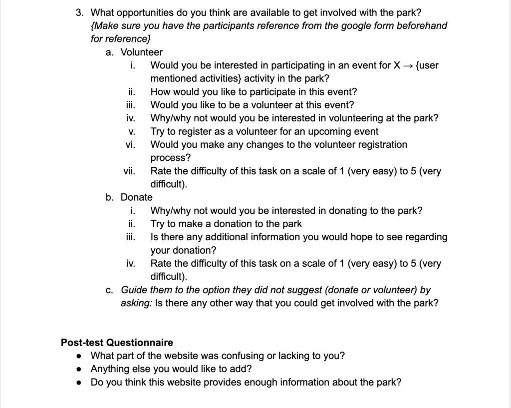
The team carefully outlined four overall tasks for the participants to complete in the moderated user test. Each task centered around understanding users’ feelings towards each section of the website mentioned in the study objectives. Each participant was asked questions about what information they expected to find in the various sections of the website and whether or not the site met these expectations. They were also asked to perform tasks such as signing up for a volunteer event or making a donation. These tasks were followed up with asking the participants to rate the difficulty of completing the task.

Examples of tasks
Conducting the Study
Each interview was conducted over Zoom and was recorded in order for the team to refer to when analyzing the data. Each participant was asked to share their screen as they went through each of the tasks. Eight moderated user interviews were conducted over the course of two weeks.
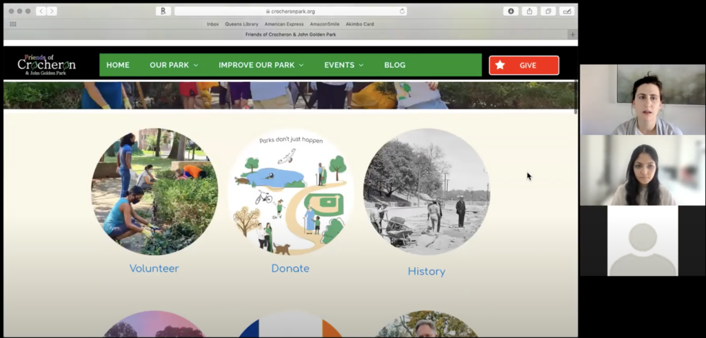
Conducting moderated user interviews provided the team with a lot of insight into how real users actually use the site. It was interesting to hear people’s thought process when completing various tasks. This method of user testing requires a lot of flexibility since much of the conversation is guided by the participant. Even though we had outlined a script, many of the interviews consisted of portions that strayed away from the script.
Analyzing the Data
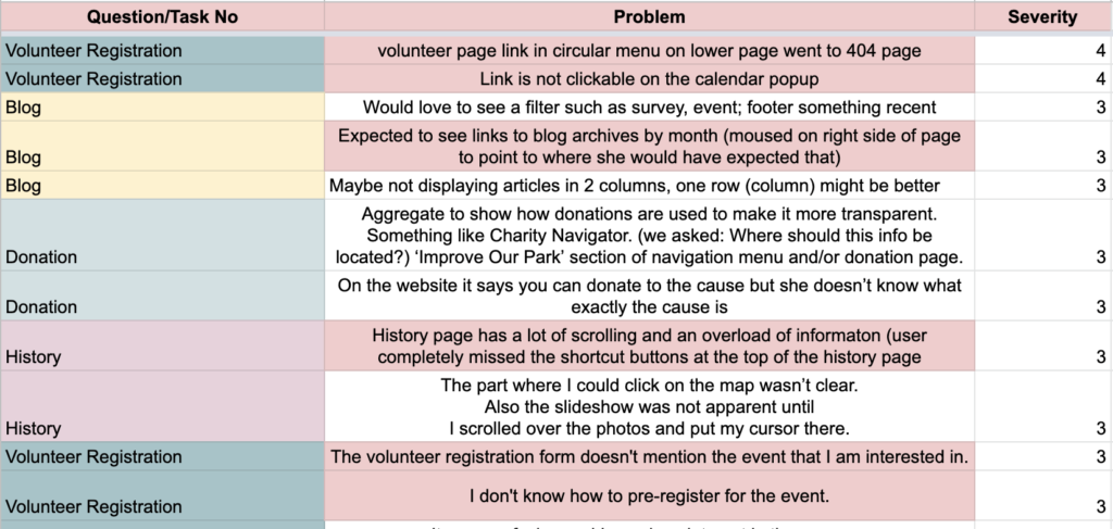
Each finding from the user interviews were consolidated on a master spreadsheet and organized by task. The team collectively assigned a severity rating to all issues that were uncovered based on a scale from 1 (minor issue) to 4 (major issue).
The Results
Volunteer Registration
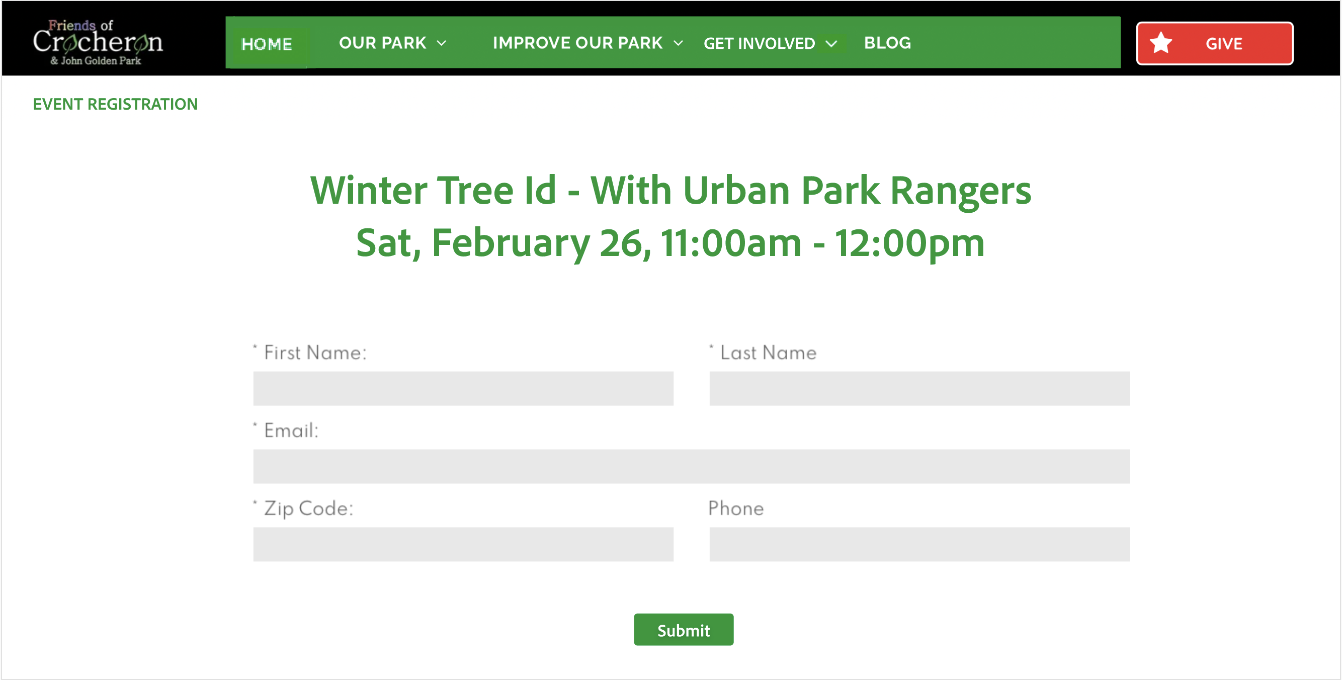
We noticed that there were many links around the site related to registering, however one link navigated to an event calendar, one link navigated to a volunteer interest form, and one link navigated to a general volunteer information page. This caused a lot of confusion in users and needed to be streamlined.
“It was confusing and I may lose interest in the process. It should tell me how to pre-register. It gave me two ways so that’s good but one way doesn’t work. Also what does pre-register mean and what does register mean”
– Usability Study Participant
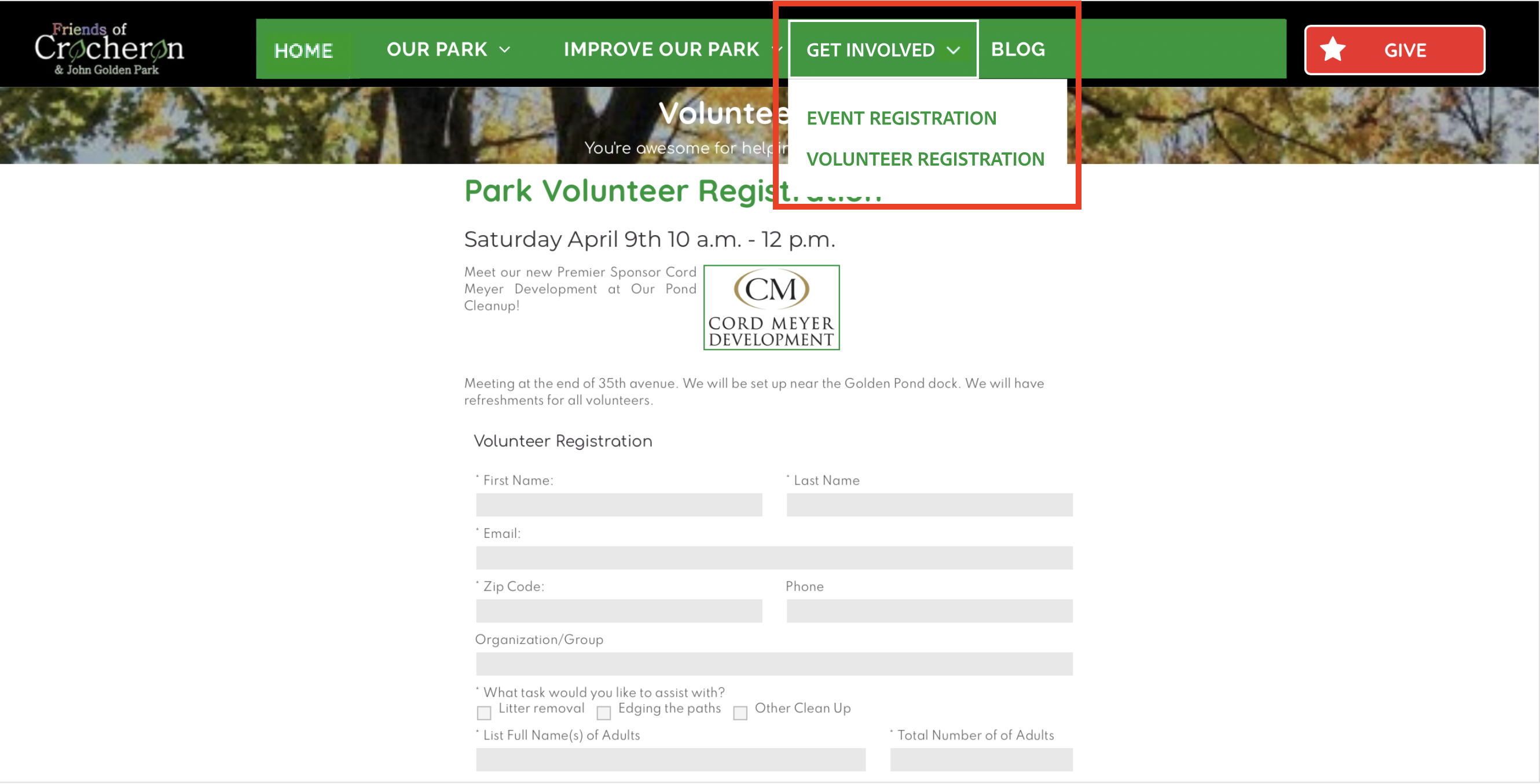
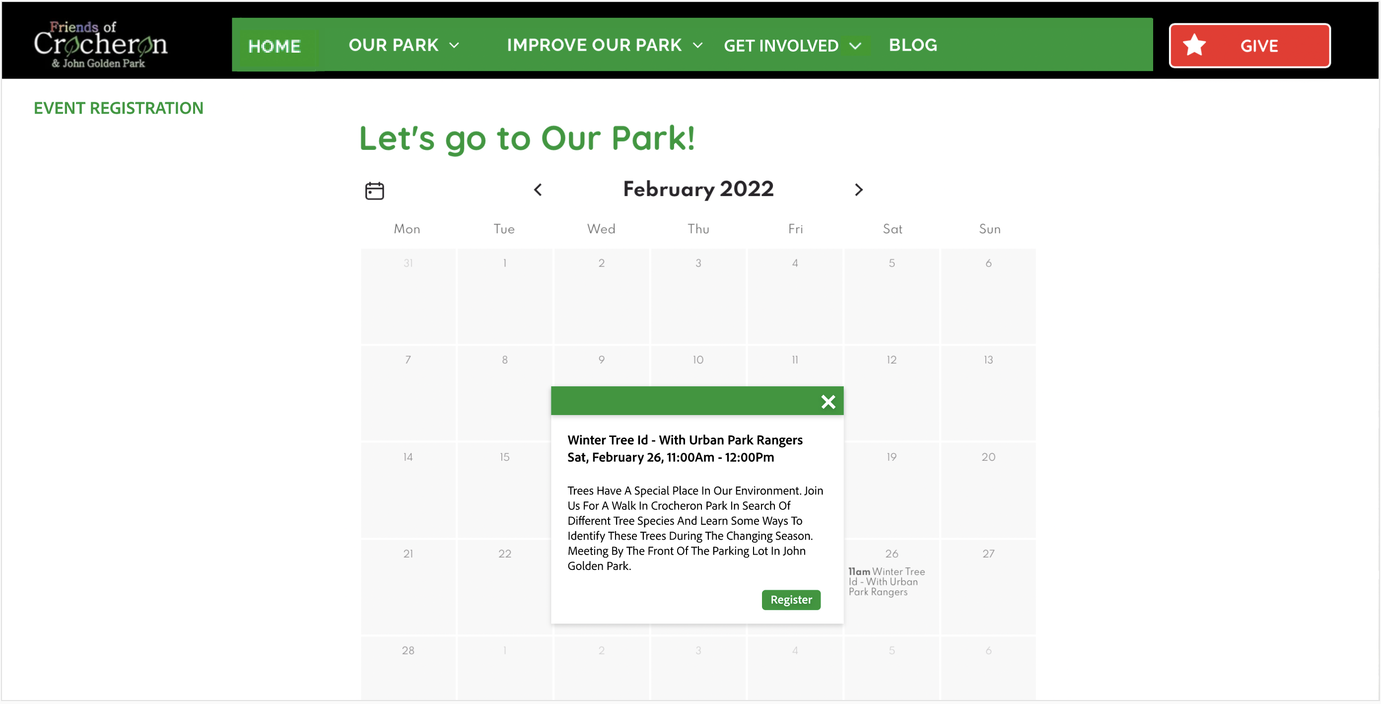
The team developed the mockups below based on the following recommendations:
- Clearly label registration related links with either “Event Registration” or “Volunteer Registration“.
- Only allow users to access the registration form after first selecting an event from the event calendar. This reduces confusion about which event they are registering for.
- Clearly label the registration form with the event information in the header.
Donations
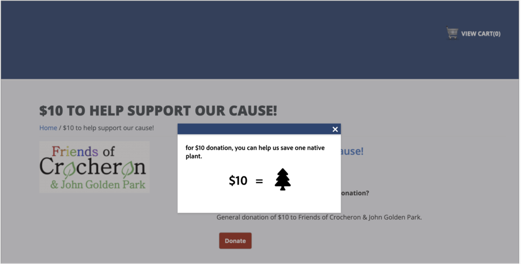
Users expressed hesitation when asked if they would be inclined to donate to the park since there was no tangible information about how the donation would be used.
Our recommendation is to include specific details about how donated money will be used on the donations checkout page. The mockup represents this recommendation.

History
Users were very interested in the information provided on the history page, however they were overwhelmed by its lack of structure. Our recommendation is to
- Include clickable sections on the history home page that indicate the different categories of information that users can find in this section of the website.
- Include a dedicated section for a timeline since many users expressed interest in seeing how the park has changed over time.
Blog
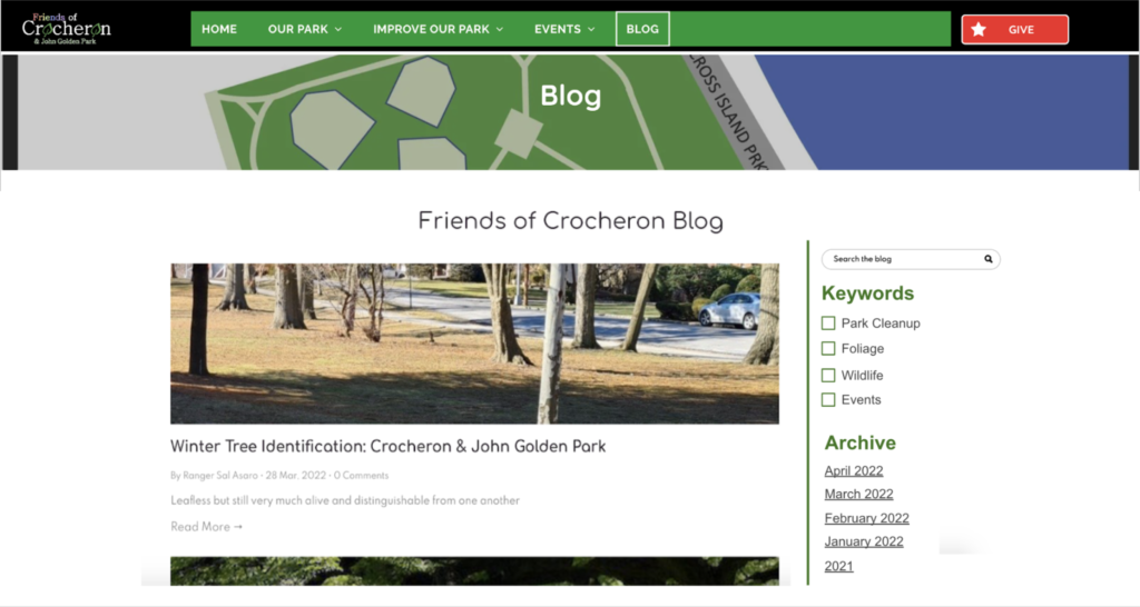
Users were finding it hard to search and discover blog posts that would be of interest to them. We recommend,
- Ordering the posts by recency in one column to adhere to the conventional blog structure.
- Include a keyword filter on the right section of the page so users can quickly get a sense of the categories of information presented in the blog. They can also easily search and discover posts by keywords
- Include an archive section to allow users to quickly navigate to posts from a certain time. This is especially useful when searching for posts about past park events.
Conclusion
“FOR THE USE AND ENJOYMENT BY THE YOUNG PEOPLE OF THE COMMUNITY OF ALL RACES AND CREEDS IN A MANNER SIMILAR TO THAT WHICH I MADE THIS PROPERTY AVAILABLE FOR RECREATION AND COMMUNITY ACTS DURING MY LIFETIME.”
JOHN GOLDEN (1875-1955)
Parks are a vital part of a community and have the ability to bring together people of all different backgrounds, ages, races, etc. Not only do they provide people with a way to connect with nature, but also encourage people to care about their community. The Crocheron and John Golden park specifically has a rich history attached to it that makes the park even more unique. Because of the historical importance of this park, the park’s website plays an important role in building a strong sense of community and preserving the history of the park.
The common thread amongst the areas of the improvement that we identified was that the content on the website must be presented in a clear and easy to understand manner. We learned that most of the participants were interested in reading all of the content on the website, however were confused or overwhelmed at times due to how it was presented. Implementing the recommendations provided above will drastically improve the user experience of the website and encourage users to visit the site to connect with the park and their community.
What’s Next?
The clients were extremely receptive to hearing about our findings and recommendations at the conclusion of the study. Information about how real users use their website is very valuable to them. In fact, we noticed that many of our recommendations had been implemented only a few days after our final client presentation!
We will be passing over all of our deliverables to the client so they are able to continue on with implementing changes to the site. With more time and resources it would be beneficial to get feedback on these changes from the original participants of our study!
