Introduction
AllTrails is a fitness and travel app for outdoor activities like hiking, biking and climbing. It provides users with trail guides to find their most suitable trails, navigate along the way and keep tracking their routes. This critique will focus on one of its key functions, trail navigation.
1. Start Navigation
There are two ways to start the navigation.
Via Menu
One way is through the bottom navigation bar. The middle “Navigate” button shows its discoverability and tappable affordance. Text “Navigate” and an icon are used as signifiers (Fig 1).
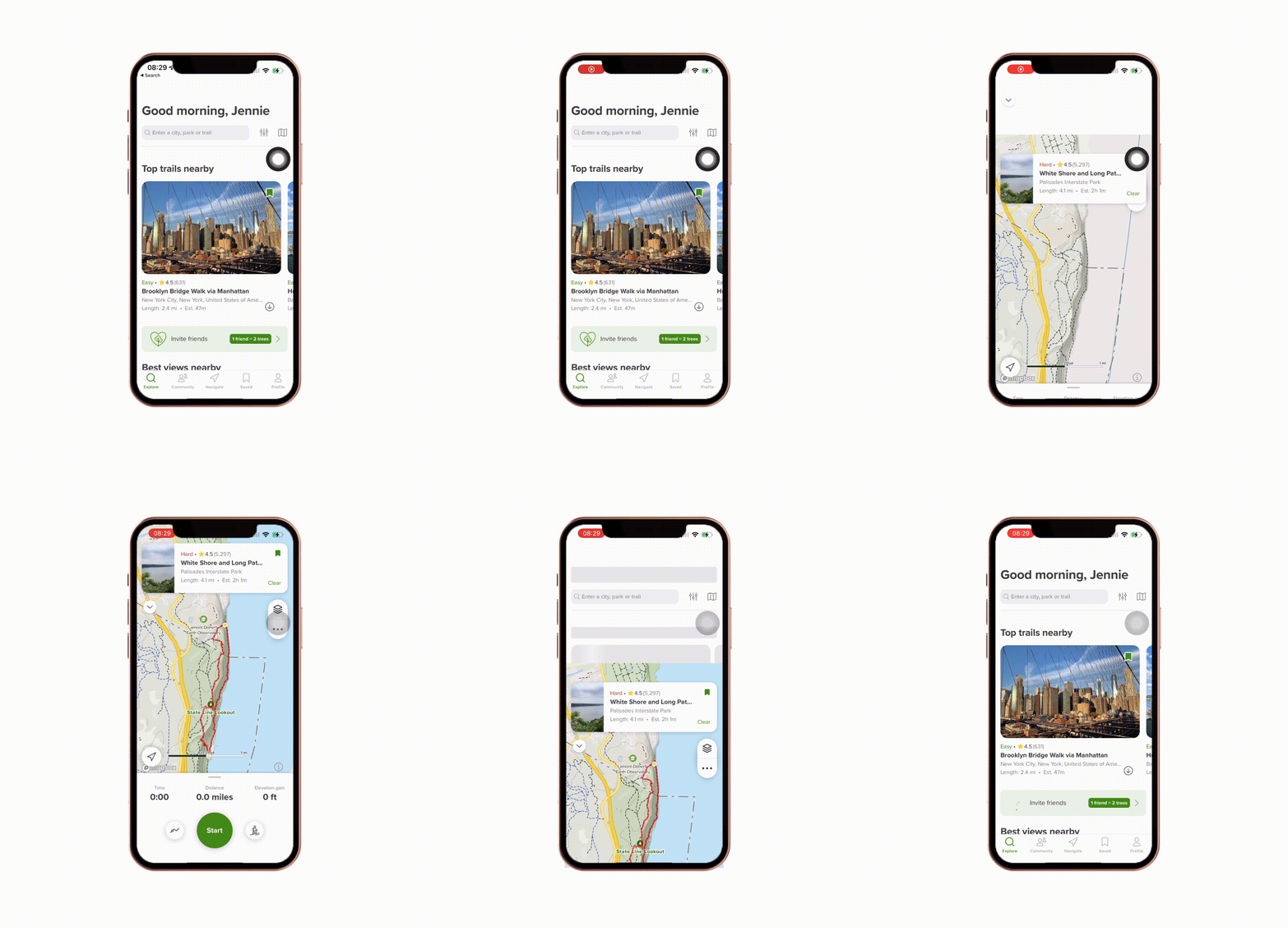
However, this button may lead users to form a slightly inaccurate mental model. Because of its consistent style with other menu buttons, users may expect that tapping it directs to another static page than a new function. Although this does not interfere with the navigation starting action, it can still be improved to help construct a better matching conceptual model. Here the button is redesigned into a distinctive style from others (Fig 2).

Via Trail Detail Page
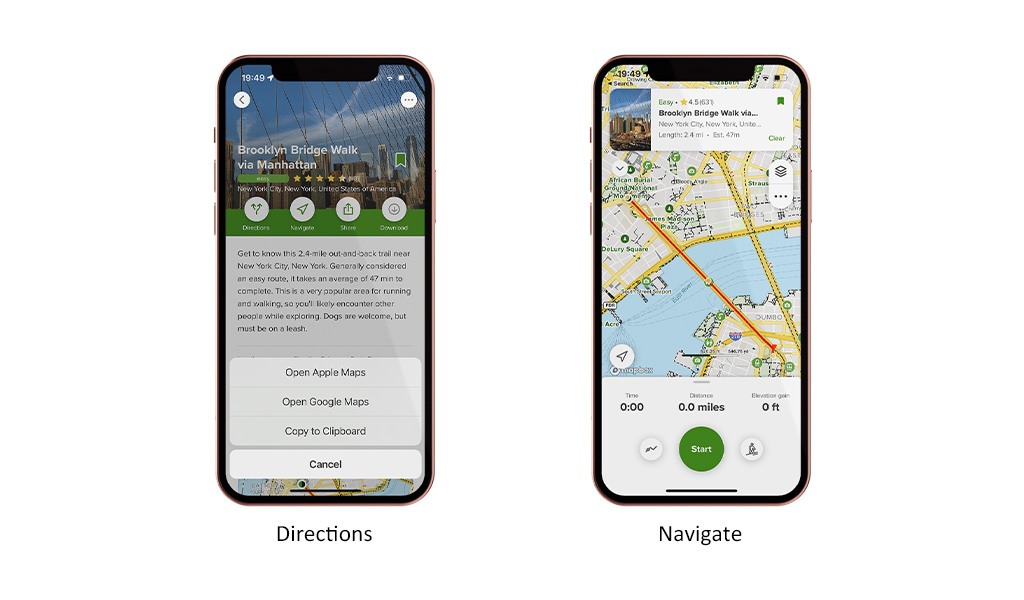
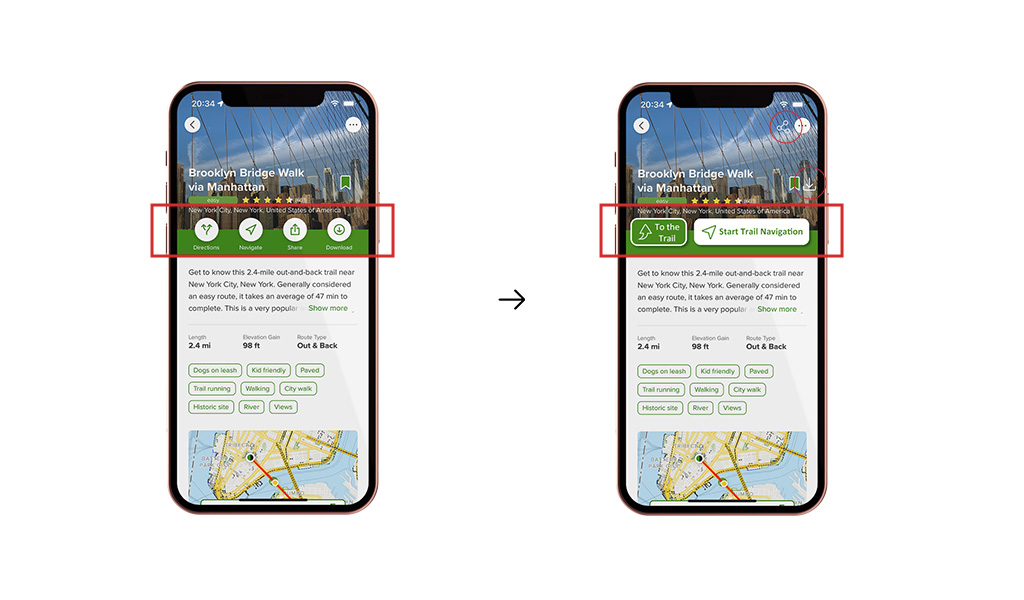
The other way to start the navigation is through the trail detail page. The “Navigate” button here is also easily discoverable with icon and text signifiers. The trail navigator pops up from the bottom as immediate feedback after tapping the button. But here a problem occurs in signifiers. “Directions” directs users to the trail, and “Navigate” starts the trail navigation (Fig 3). These two words and icons seem to work as semantic constraints to differentiate each other, while possibly arousing confusion for their similar meanings. Users may erroneously tap the “Directions” button to start trail navigation, which is a description-similarity slip between Goal and Plan in the Gulf of Execution.
One solution is to rearrange the buttons and refine their signifiers into more distinguishable ones (Fig 4). These specific descriptions help users differentiate controls between two buttons and prevent potential misleading.
2. Finish Navigation
Finishing navigation requires two sequential operations.
Step 1: Hold the “Pause” Button
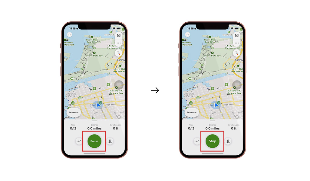
The first step is to hold the Pause button until the Finish page pops up (Fig 5). The button is highly discoverable with the “Pause” text signifier. The circular progress bar naturally maps the button-holding result as the filling progress ring. Immediate vibration as feedback indicates the completion of the pausing action.

The design here is questionable regarding the conceptual model for finishing navigation. No elements suggest the finishing but only pausing. Users may have difficulty forming a proper conceptual model to finish navigation. They may make knowledge-based mistakes, like tapping a wrong button to finish navigation, because of the lack of knowledge in the world.
On the other hand, this holding-to-pause design performs well in error blocking for the finishing action. Navigation and route recordings are important for outdoor enthusiasts. This step is an interlock before the final finish step. In the interlock, the auto-clearing in progress ring suggests possible undo when users release holding. They together minimise the possibility of navigation ending mistakes and eventually losing way or missing records.
A solution without impeding its error prevention is to change “Pause” to “Stop” (Fig 6). This expression, covering both pausing and finishing meanings, supplements knowledge in the world to develop the conceptual model for finishing navigation.
Step 2: Tap the “Finish” button
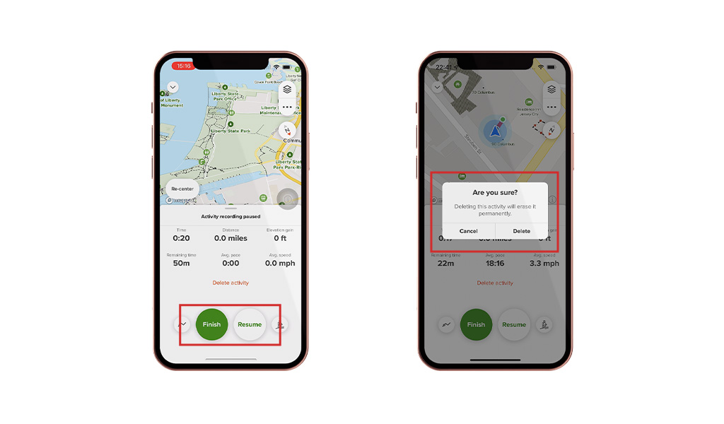
The second step is to tap the “Finish” button. The “Finish” button has high discoverability. Instant and short vibration feedback appears after tapping it to effectively indicate the navigation completion. One design advantage here is the use of lockouts in error prevention (Fig 7). A popup appears when tapping the “Delete activity” as feedforward information and error confirmation. Besides, the “Resume” button also provides an undo option, allowing users to return to the navigation. These two features protect users who do not intend to stop navigating from accidentally ending navigation.
Conclusion
Overall, AllTrails is a well-functioning app for outdoor activity lovers in trail navigating and recording, while there is still room for design improvements to reduce confusion and prevent errors.
