ClassUp is a scheduling application that helps students to organize their courses, manage activities, and communicate with classmates. ClassUp assists students in creating and designing a clear schedule with more freedom, making it a powerful tool for students to have personalized and aesthetic class schedules.
Adding new schedule
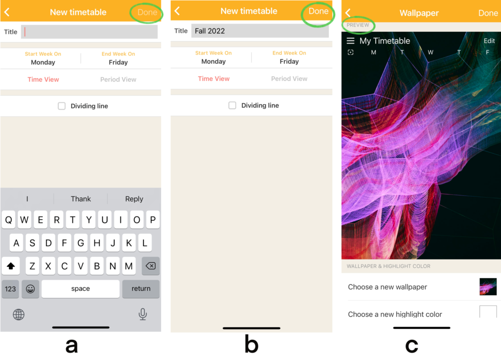
Once logged in, the user is asked to create a new schedule by naming the title (Figure 1a). The empty gray box affords the name of the timetable with its signifier “Title” next to it. Then, the user needs to decide when the week starts and ends. The natural mapping here also groups the controls and items being controlled together for better operations. After a series of executions, the gray and untapable “Done” button at the top-right corner becomes white, which signifies the completion of the timetable (Figure 1b). The process makes sure users make no action-based slips or memory-based slips. Finally, the user gets immediate positive feedback from the app through interface change. The new interface exhibits a preview, providing the user with a clear system image that matches the expectation of a schedule (Figure 1c)
Exploring the schedule
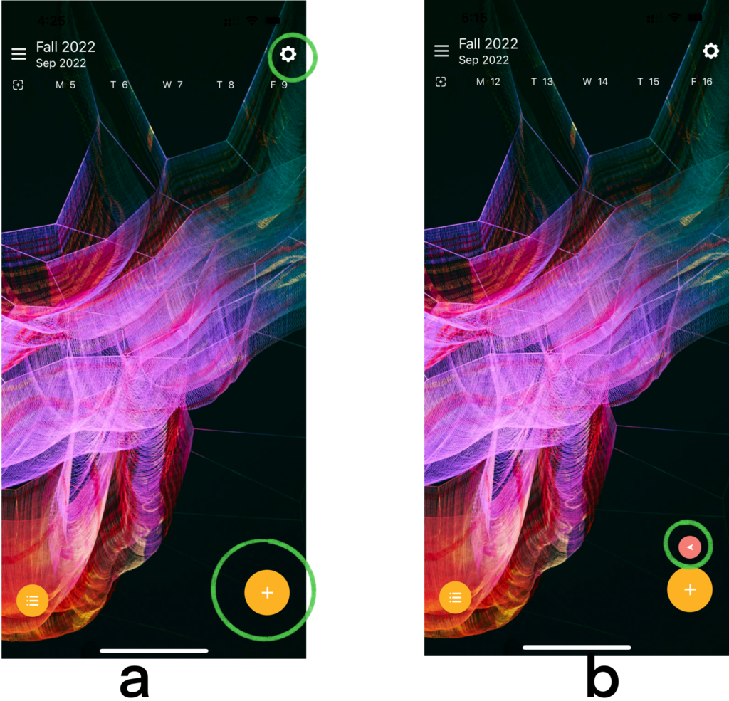
After the “Done” button is tapped, the page changes to a blank timetable with buttons at each corner of the screen (Figure 2a). The orange button on the downright corner affords to add new classes with a signifier plus sign (“+”) on it, increasing the discoverability. The plus sign provides semantic constraint to the adding function; therefore, the user is informed that the deleting function may be somewhere else on this interface. The gear sign button on the top right corner affords setting changes. The signifier gear symbol requires the user to use the knowledge in the head, as no word indicates the function. A gear icon is commonly used in digital products to symbolize settings. By recalling past experiences, the user can quickly figure out that tapping this icon can change the setting of the schedule.
Natural mapping enables the user to explore the schedule freely. Swiping left and right, the user can see future and past classes, correspondingly, which enhances understandability. Also, an arrow signifies the user is not in the current week, and affords the function to go back to the current week immediately by tapping it (Figure 2b).
Adding new classes
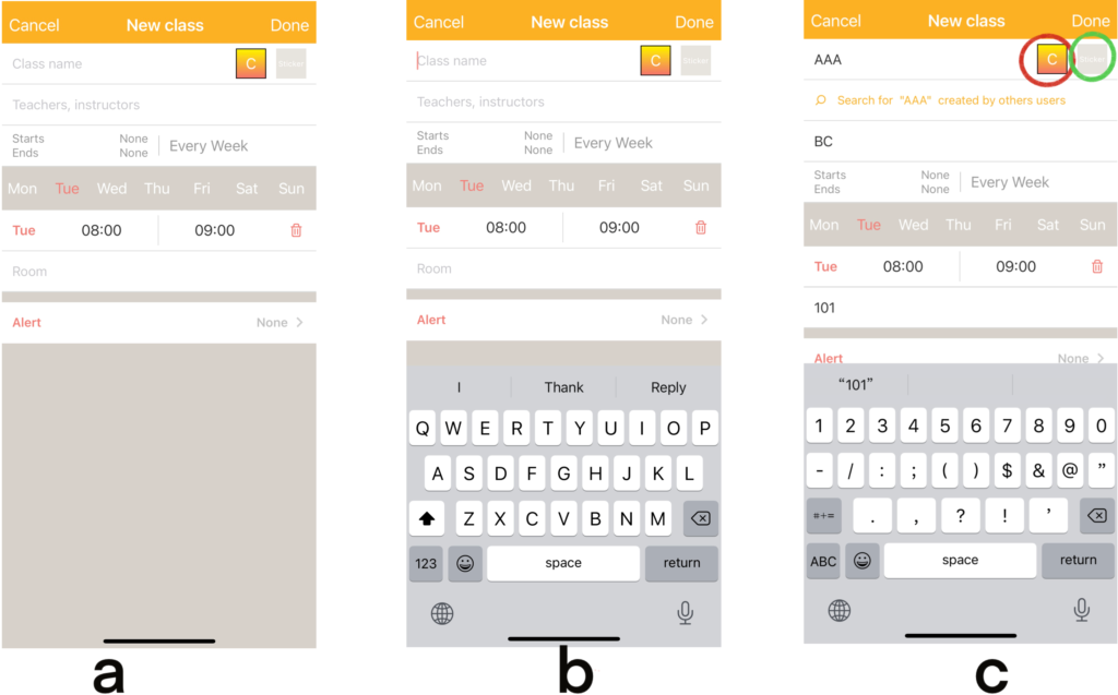
To add a new class to the schedule, tap the “+”, and a new page gives the user quick feedback to ensure their correct execution (Figure 3a). Empty blanks have gray words in them to signify the affordances. When the user taps the blank, the keyboard automatically appears to signify the action needed (typing information here) (Figure 3b). However, the button to change the color of the class slot needs more understandability. The letter “C” on the square is not enough to signify the user because when employing knowledge in the head, “C” stands for many words (Figure 3c). Consequently, it is hard for the user to associate “C” with “color” and execute its function. To improve, the signifier can be more specific, like the signifier “Sticker” next to it, the letter “C” can change to “Color” to increase understandability.
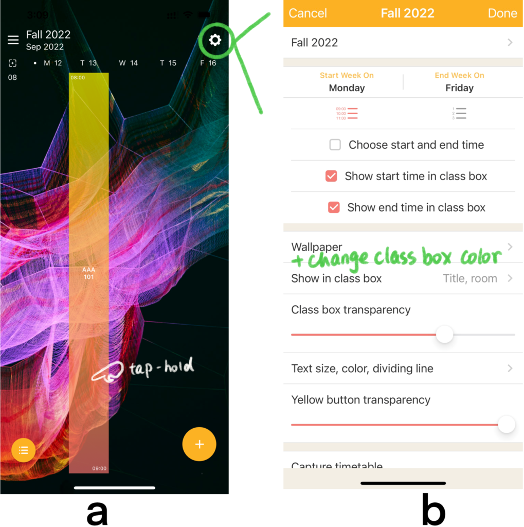
Once the class slot is added (Figure 4a), to edit the box’s color, the user needs to tap-hold the box until the app gives the user feedback, which lacks discoverability. Due to no tutorial in the app for the first-time user and no signifier to indicate the correct action, users are unlikely to try tap hold, which is also the only correct gesture to evoke the change color function. Failure to tap-hold could make the user feel frustrated and angry at a visceral level, leading to learned helplessness. The user may give up this app because it cannot provide the user with a personalized and aesthetic schedule. To fix this problem, developers can add a simple tutorial or guide users to make the desired schedule, enhancing the conceptual model. Another solution is to add a tab under the wallpaper within the setting menu (Figure 4b). By using knowledge in the head, the user is more likely to find the edit color function under the settings that usually control most alterations.
Conclusion
ClassUp is a wonderful app for students to design their personal schedules and organize their activities. Still, the discoverability of the color edition needs improvement to provide users with better experiences.
