Kindle app is a software that lets you download and purchase ebooks from Amazon Kindle Books, to read on most devices, such as Windows, Mac, iOS, and Android. It is extremely convenient for avid readers that wish to have unlimited books all stored in one device in which they can carry it around anywhere and read anytime. However, can ebooks on Kindle app replace traditional books? These are the pros and cons of Kindle app and how it should be fixed to come as close as the traditional books.
Let’s start with the pros:
Mapping
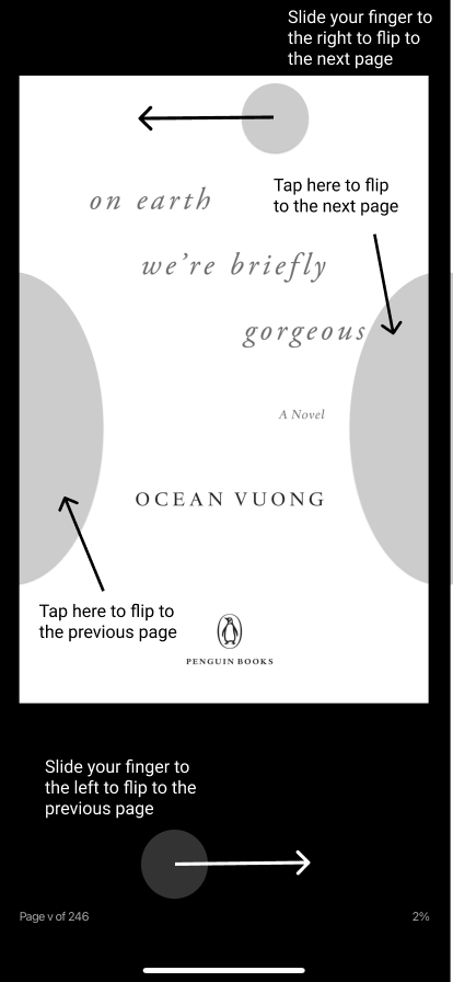
Kindle app has a good mapping in which it replicates the action of flipping pages of physical books. The user can swipe towards the direction they wish to flip the page. Also, to make flipping pages easier, the user can tap on the right section of the screen to flip to the next page and tap on the left section to flip to the previous page.
Signifiers
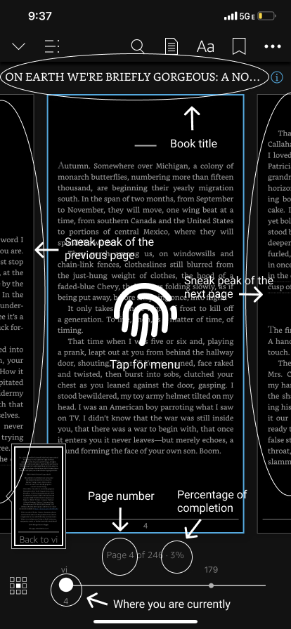
The app also has good signifiers which allow the user to know which page they are on, showing how much they have completed reading the book by percentage, and how much time it will take for them to complete reading the book. Also, there is a bar at the bottom at the screen which shows the where in the book they are at currently. The title of the book will show after a tap at the middle of the screen. The user can also get a sneak peak on the previous page and the next page.
Feedback
This app also did well on feedback. When the user turns to the next page, the page number increases along with the percentage of completion while the time of completion decreases. As a reader, I find this satisfying to see when reading a book as I can track my progress and it makes me want to keep reading.
Even though this app did some good jobs on designing and mimicking the physical books, there are some design concepts that could be fixed, to create a better experience for its users.
the usability cons:
Visibility
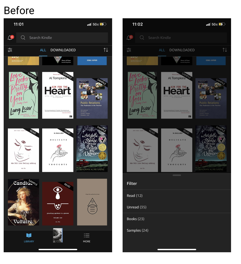
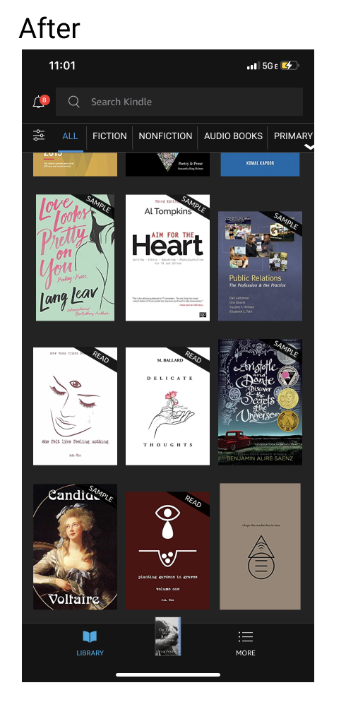
The visibility of this app could be improved. I find it hard to look up books in the library as there is not enough categorized filter. Also, the full version of the book and samples are in the same category. The app should categorize books and allow users to narrow down the search. For example, it should be categorized based on title, genre, the cover’s primary color (as some users don’t remember the name of the book), date added, completed, and samples.
Constraints
This app has few constraints. It would be more convenient for users if the app has zooming in and out feature, to create a better experience for font size changing. The Kindle app has font size changing feature; however, a user has to leave the page, go to the setting and change the size. There are sets of sizes a user can pick from but they can’t do it manually. Sometimes, it is not only the fonts we are looking at — the images in the books are what users would want to get a clearer look at; therefore, the zooming feature will benefit them. I do believe that the traditional books has its own pros; however, adding features that does not exist in the physical books will make ebooks more appealing to avid readers.
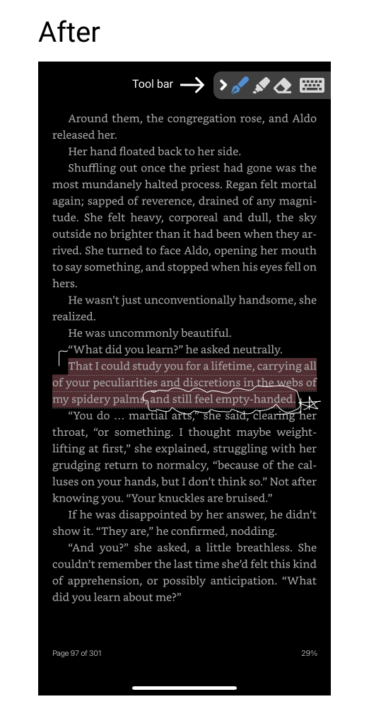
Another constraint this app has is not being able to mark the book beyond highlighting words and sentences. There should be a free-handed marking feature, such as circling, underlining, and also adding texts that are visible on the page.
In conclusion, Kindle app for iOS is a good alternative for readers that like to carry tons of books in one device. Buying books has never been this effortless — buy any book within a few taps. It is now possible to have tons of books ready at hand. Even though it won’t be able to give the same experience as reading physical books, there could be useful features that are missing in traditional books, in which will appeal to the newer generation of readers.
