Notion is a project management and note-taking software platform designed to help members of companies or organisations coordinate deadlines, objectives, and assignments for greater efficiency and productivity.
Critiquing design is always a process of identification, analysis and evaluation. Before having the insights, wells-structured in The Design of Everyday Things, these processes afforded questions and judgements but a clearer lens in the form of concepts and principles by Don Norman help precisely connect and recognise the quirks of design in a more understandable manner.
To demonstrate some of these above mentioned concepts and principles, the example of Notion : The desktop app. Having used it for over two years now, I was able to put my logical sense to test. Below are some explorations.
Basic blocks shortcuts (Signifier ‘/’)
(REF FIG 1)
The slash being used across interfaces, as it is on Notion could reflect as an inconvenience in a digital workspace environment as it is incorporated in the written language and is used in multiple different contexts such as to signify ‘or’ or to start a prose. Therefore, the distraction could be a hindrance in the workflow and causes a Gulf of Evaluation in the sense that it deviates from the goal of typing content.
An easy solution would be to use a shortcut key such as the ‘fn’ key which is equally easily accessible but doesn’t affect the practice of normal text.

Arrows on top of the work area
(REF FIG 2)
Following the mental model of a direction system, the arrows on the top left (beside the page header) are the signifiers that carry the affordance of direction. According to the mapping, it should take the user to the previous page when clicking on (<) and the next page when clicking on (>). This is where there is a mismatch in the associated expectation and the feedback as the ‘left pointing arrow (<)’ takes you to the first page instead of the previous one. This also creates a difficulty in the behavioural processing. This could simply be changed by following the natural mapping and meeting the associated expectation.

(FIG 2)
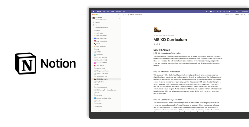
Pages
(REF FIG 3)
Essentially the pages are discoverable on the left menu column and is also aided by customisable icons + page titles to play as the signifiers. The response to clicking on them also gives a noticeable and satisfactory feedback.
The workspace organises itself mainly on the basis of these pages. On evaluating this system relatively, the page system digresses from a general understanding of a categorisation with folders and a sub-categorisation in terms of files and documents further which comes from a cultural constraint of having an understanding of digital data being sorted by folders, files and documents. The new documents, in Notion, being pages within pages, disrupts a of hierarchy. This stems from a legacy issue but could be solved by introducing folders and pages within, and to maintain the essence of the general branding being followed, can be kept open and simple.
This also feels unorganised in a sense that it gets perceived as an open book/diary rather than a well sorted organisation of a workspace as it also doesn’t show an inventory of the pages, so there is no ‘one-glance’ look at all the work encdoded.

Page layout
(REF FIG 4)
In making it effortless and uncomplicated the workspace has a width-wise text alignment which is not flexible to be converted into columns or rows for the optimisation of the wasted area. In writing long-body text, it doesn’t come across as an issue but while making lists the work area is wasted. This gives the user a feeling of an incomplete usage and leaves them slightly dis-satisfied.
Following the open and wide concept of the Notion workspace, a more flexible feature of sticky notes or a side-bar for notes could also be added, to help the user map their ideas alongside the workspace leveraging a cultural constraint and adding to the recall to the natural workspace with bulletins.

Conclusion
Overall, the desktop app helps organise the workspace at a preliminary level by providing a clean and easy interface for simple tasks in one place and also has a consistency across the different points of branding such as the emojis and an uncluttered space creating relatability and convenience but could fill in the few gulfs of evaluation by simplifying and reiterating natural mental models.