This Apple system application serves as a platform for users to access Podcasts, born digital audio programs streamed or downloaded from the internet. This article examines some of the in-built app’s (Version 1.1.0)features, specifically the exploration options, from a usability perspective.
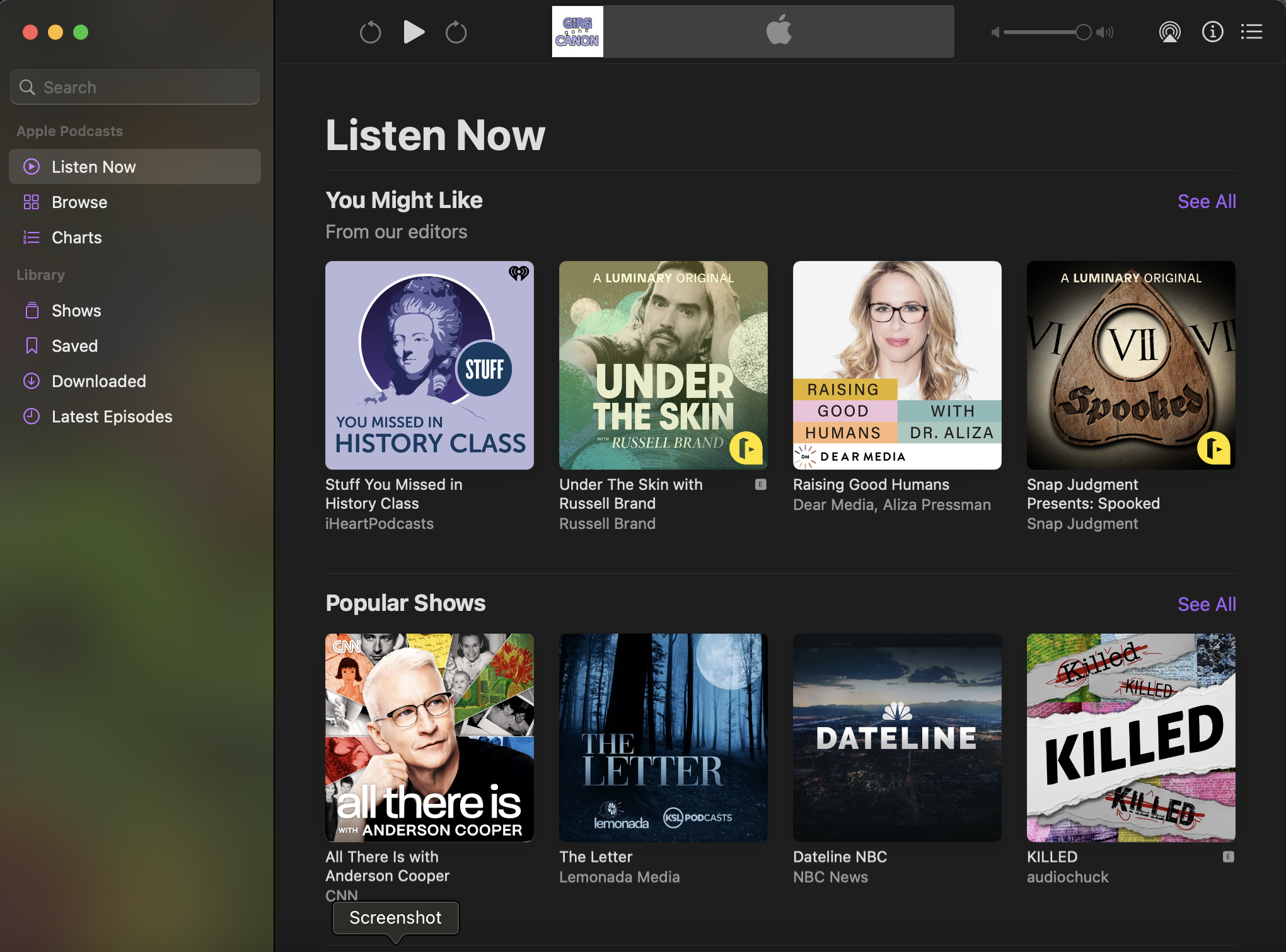
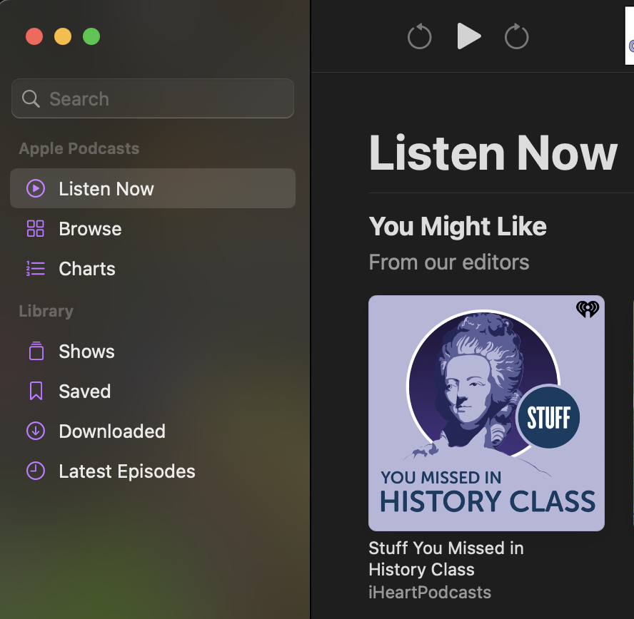
Listen Now
This landing page serves to introduce users to the application and present them with it’s main function: presenting them with Podcasts to listen to.
The Header bar, which remains on all pages clearly signified with easily interpreted buttons which, when hovered over, provide subtle feedback by highlight themselves. These are naturally mapped in a easily understandable back, play/pause, forward order. When listening to a podcast, the roll forward and back symbols gain numbers to indicate how far they skip in either direction. The volume control, information circle, and list buttons on this top row are similarly designed with their symbols. The exception is the symbol for available devices to broadcast through, which if a user does not have prior knowledge of might lead them to mistake the “browse” option in the side bar as the correct choice. This affordance issue could be remedied better signifiers, such as a button showing multiple simplified devices or just the text “available (or current) device”.
The page itself is well laid out, with clear headers and each option distinctly visible and discoverable. All sections of a given show’s image and text provide feedback when hovered over, such as a play button and underlining text. Each section has a “See All” option consistently in the top right in a purple that sets it apart from the default text, though unlike the show text only provides feedback when clicked, in navigating the user to a new, clearly titled page consistent with the section.
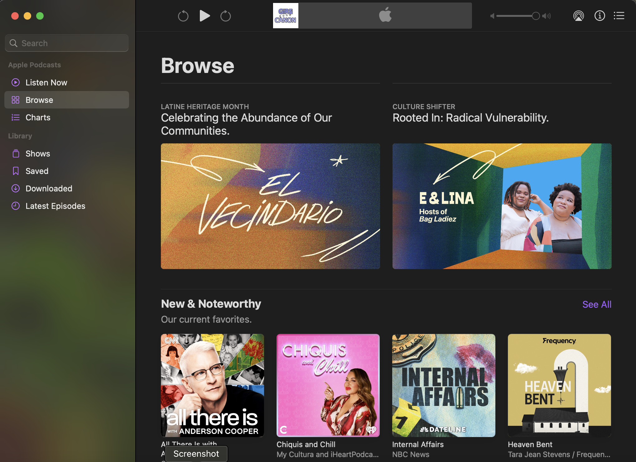
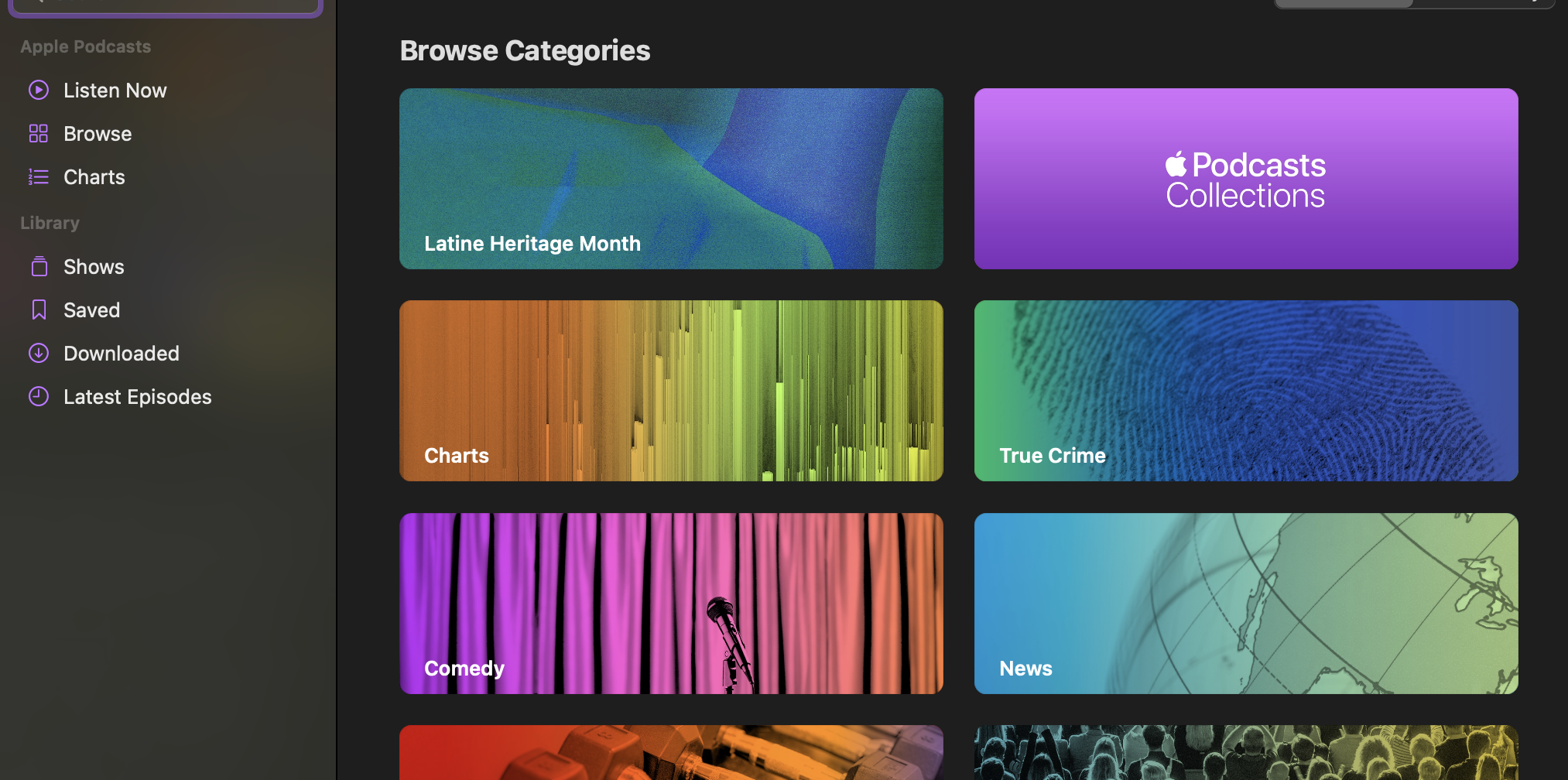
Browse
This page, so visibly similar to the Listen now page, could result in users believing they’d made an error were it not for the heading and page indicator on the sidebar. The visibility of options to actually browse through is not more than what was on the previous page and if it does occur to a user to scroll down, the options they are presented with are inconsistent in their specificity and layout, leading to a the app stumbling in the gulf of evaluation. Additionally, navigation through these categories is constrained on this page to just scrolling down, where a list or sidebar of options would be expected. Although not viscerally unpleasant, the reflective response to attempting to browse this way is likely to be negative and directed towards the app. Possible solutions to these issues are, oddly enough, already implemented on the Top Charts and Search pages.
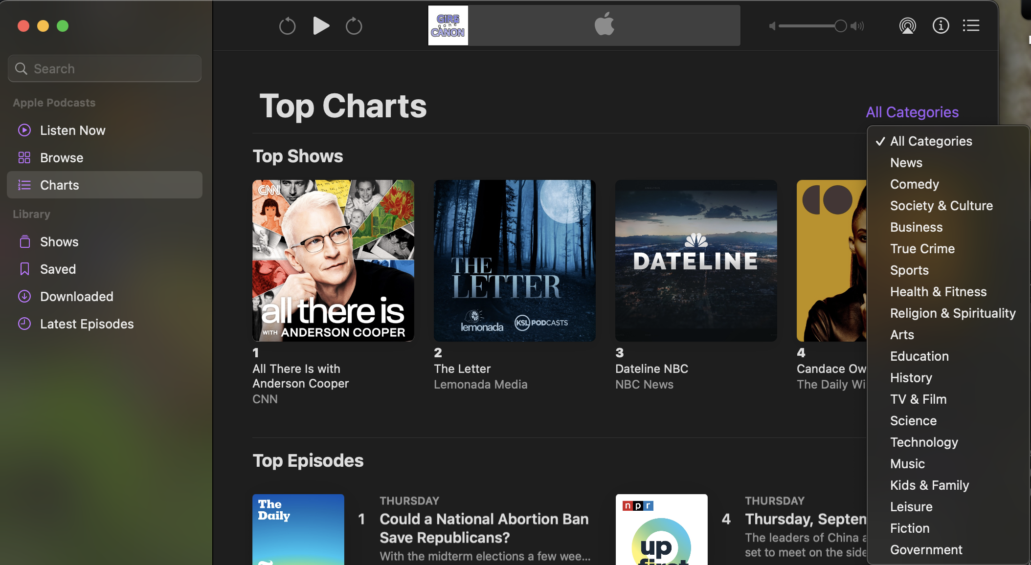
Charts
Here we see a clear sections, though the mapping for the numbering between the Top Shows and Top Episodes switches between a horizontal row and two vertical columns, an odd inconsistency which clashes with the majority of the app. For a user wishing to browse, we have button located alongside the page header for all categories which responds with a dropdown menu of the available categories, listed in what I have to assume is order of popularity. Unlike the other pages in the app, the visible indicator for these category pages replaces the “all categories” button while the Charts header remains.
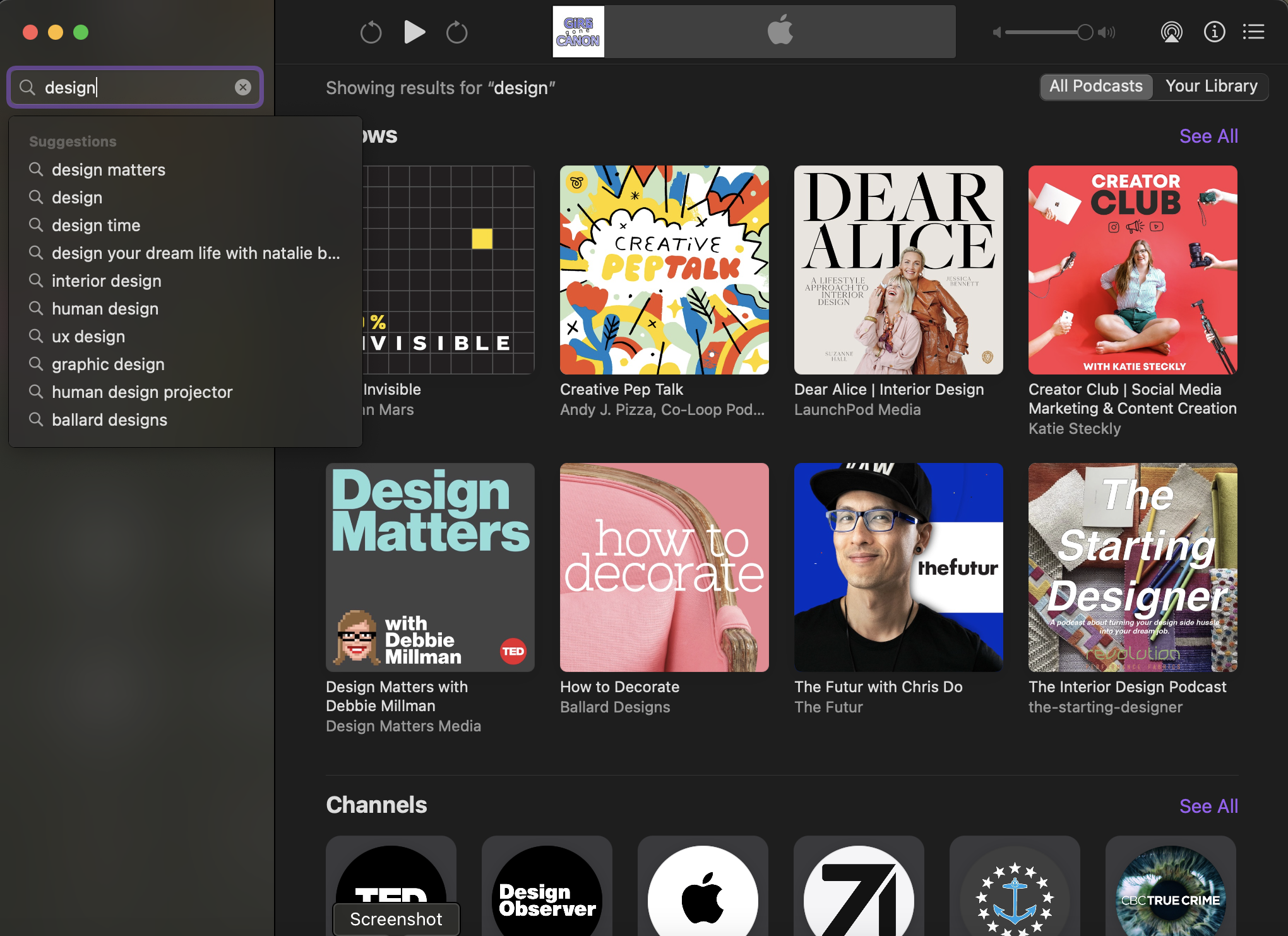
Search
When clicking on the search bar, there is immediate feedback before any typing occurs in a new page with a “browse categories header and easily visible large buttons with designs for those categories. This seems like it would be a more natural arrangement for the Browse window. Typing gives immediate feedback in the form of suggestions, though one has to intuit that the enter key must be hit to begin the search, and a “go” or “search” button alongside it would be an easy affordance to resolve this. The results page uses the consistent layout of shows, channels and episode sections, with the “see all” button at the top right of each.