
The homepage has a simple black and white layout with pictures from the listed areas. The neighborhoods are categorized by profiles, sectors, or location on the top right side of the page. When you hover on the menu, you can see the color change from a faded grey to blue underlined which acts as a perfect signifier that can take you to the next page.
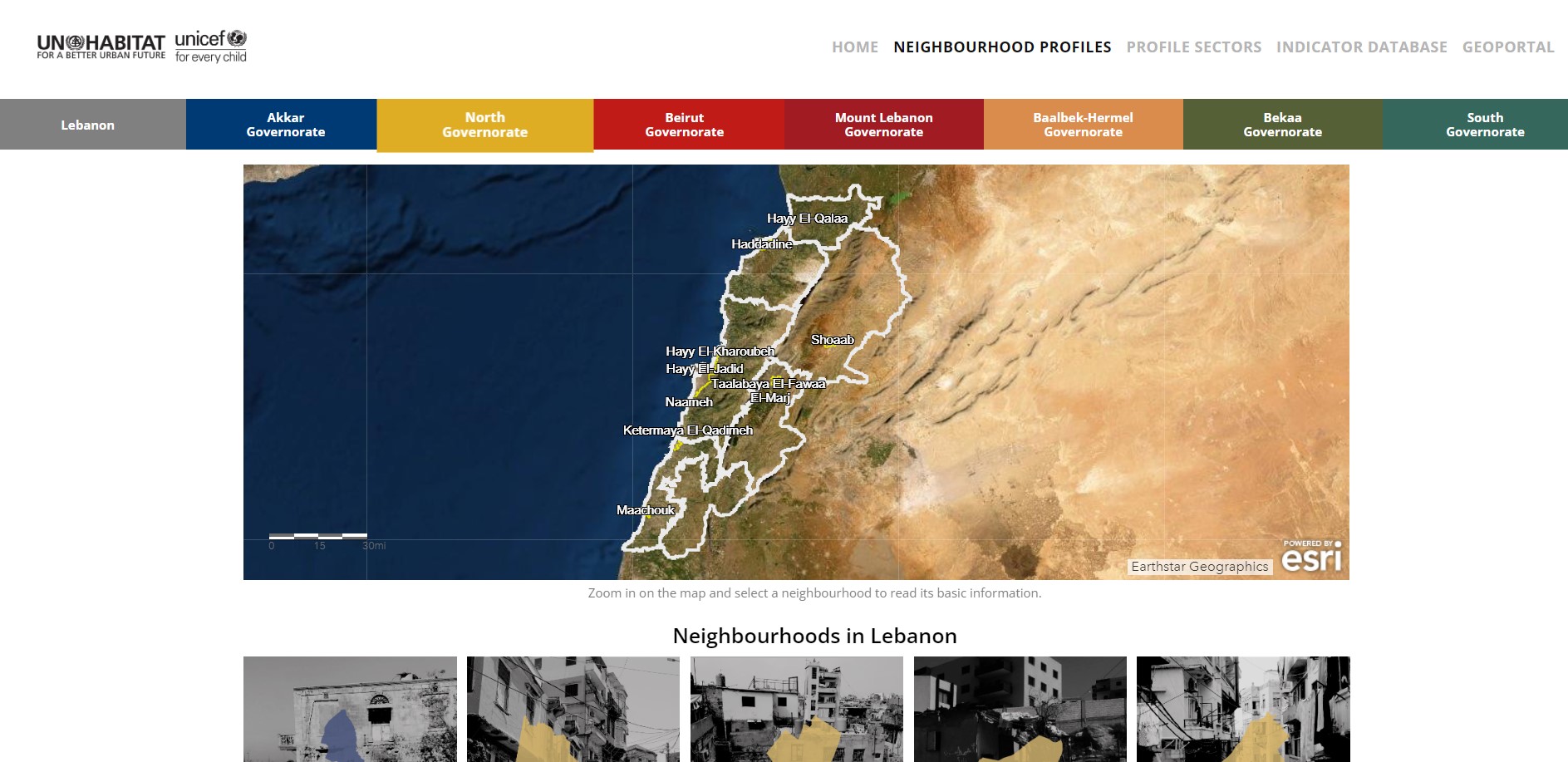
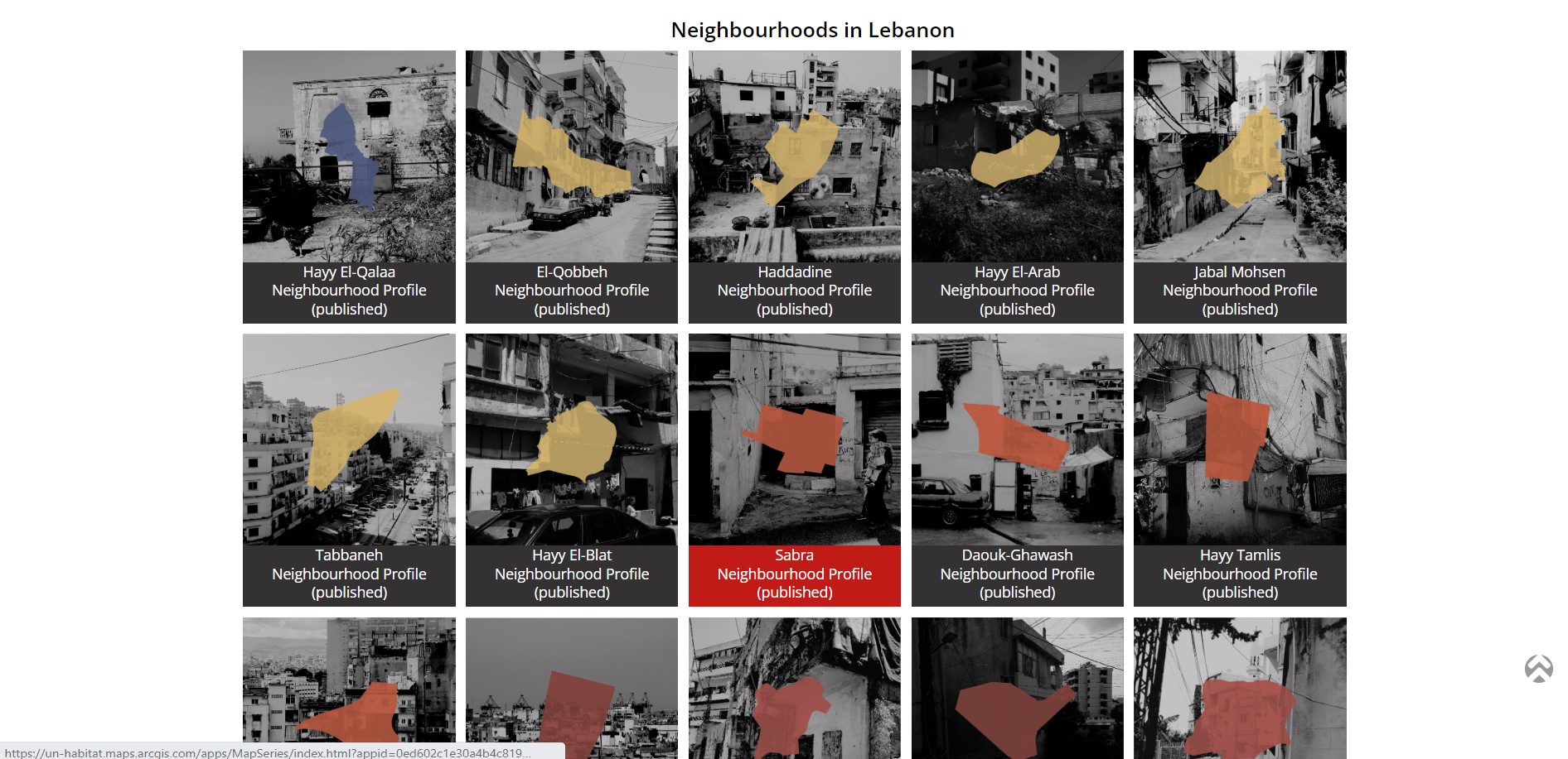
Once you click on Neighborhood Profiles, the governorates where each neighborhood falls under are displayed very clearly on the top and color-coded to avoid any confusion. This tactic is also a great signifier to help the user distinguish between the different areas each neighborhood is listed under. When the user hovers on a governorate, the tab enlarges and the text changes from white to black acting as feedback, however the abundance of colors makes the feedback not as noticeable to the user. If you scroll down, the page also lists the neighborhoods by governorate and maintains the same color-coding as the top menu bar, which allows the user to look for their specific neighborhood using a different method and the color of a specific neighborhood changes from black to red acting as another feedback to the user.
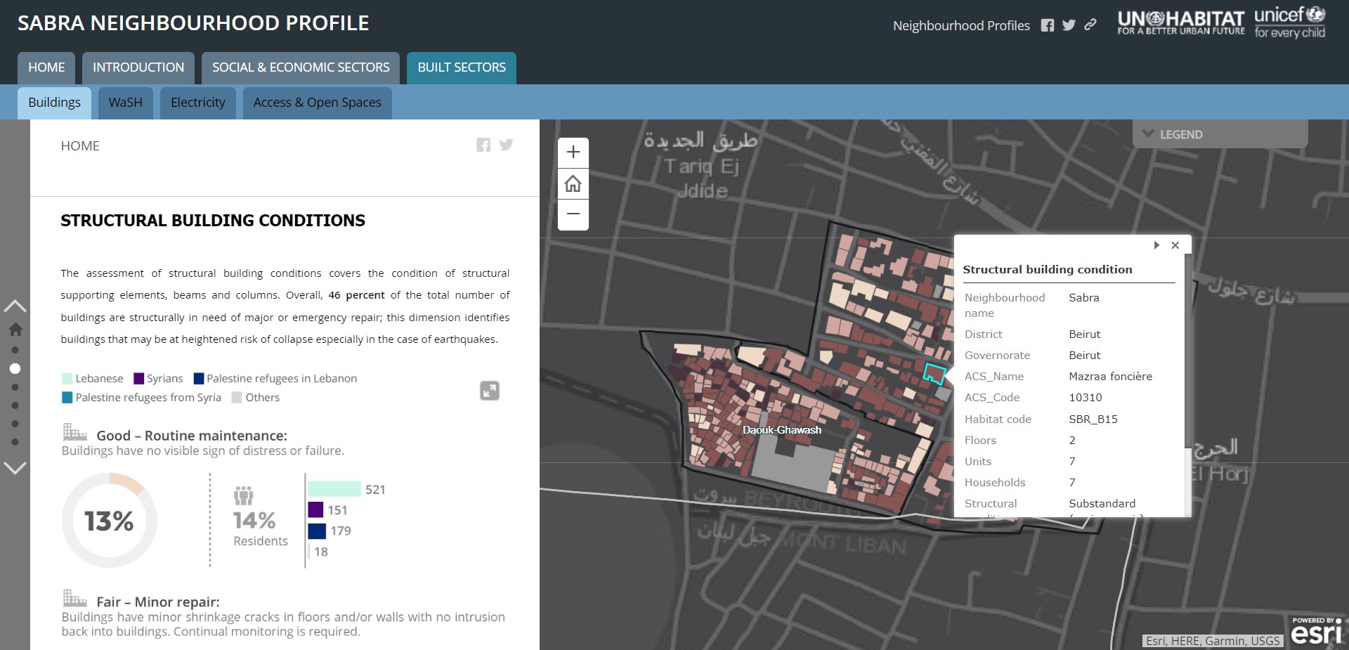
Once you have reached a neighborhood profile, the page turns into an enlarged map of the neighborhood with several tabs indicating different topics and subtopics of information collected for that neighborhood including an Introduction, Social and Economic Sectors, and the Built Sector. When you open one topic, the subtopics show up on a menu bar, which is smaller, and the texts are listed in black. This allows the user to differentiate between the main topics and their subtopics. In terms of mapping principle, the information is shown in both a map and a list. The information is shown in a scrollable list on the left with a geospatial map on the right and the information automatically changes on the geospatial map as you scroll down the list. This side-by-side interface allows the user to read the information in an infographic and text layout while being able to visualize the data on a map. There is a legend on the right of the map to explain the color-coding however, there is no clear signifier when you hover on a color on the map for the user to understand that they can also click on each color on the map and view specific information for that building/area.
Overall, the Neighborhoods Profile Portal is a clean interface and the user can smoothly navigate the site from the homepage to viewing a specific neighborhood with minimal disruptions. Minor disruptions, such as the abundance of different colors and legend in the geospatial map can be solved with by giving the user more clear feedbacks so he/she can know to press on certain areas and obtain more information on the neighborhood.