Introduction
Pinterest is an image and social platform, with a bevy of features for an inspiring discovery. Users can share and discover visual assets, including images, Gifs, videos, pinboards, and shopping in various topics. This design critique is based on “the Design of Everyday Things: Revised and Expanded Edition” by Don Norman.
1. Initial Signup
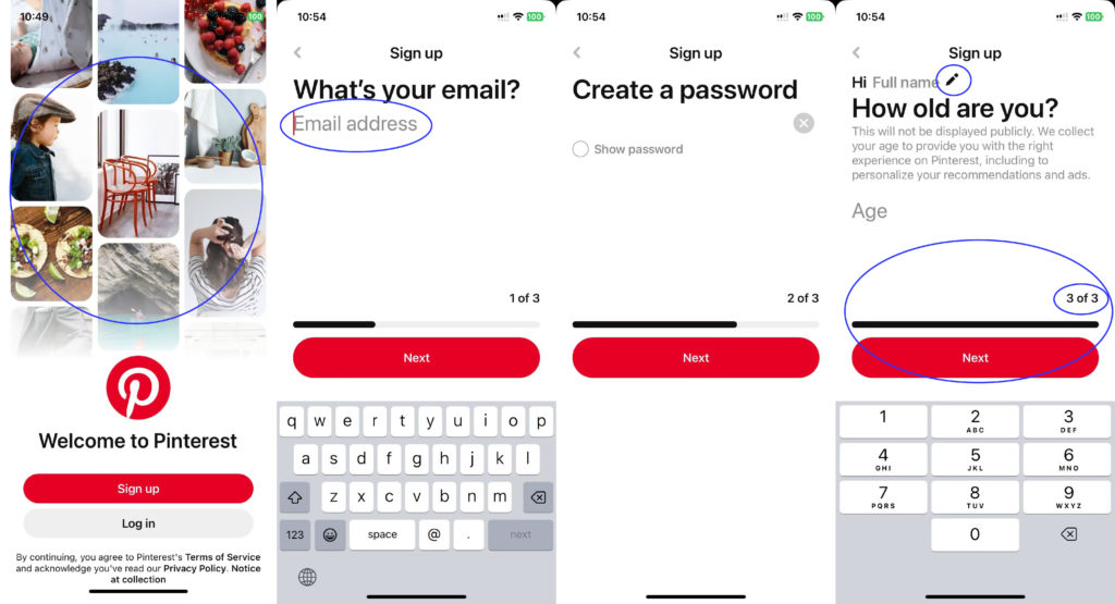
The signup and login page follows the concept of knowledge in the world, which enables an easy understanding of actions. For the new users, the masonry layouts on the first page provides initial attractiveness as a visceral design. The following signup flow is also understandable and clear, which has good mapping and feedback with an ongoing progress bar at the bottom showing which step users are in. Meanwhile, a small icon of pencil and grey text play the role of signifiers, contributing to signal available actions and how the actions should be done. Overall, the signup page is well-designed and user-friendly.
2. Homepage
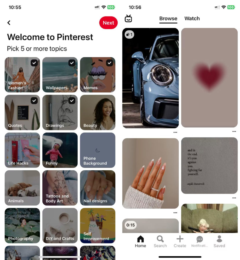
Users are required to pick 5 or more topics to enter the homepage of Pinterest. There are several icons at the bottom as signifiers, providing users with perceivable indicators showing available actions and their meaning. On the homepage, users can scroll down to see the pins posted. Scrolling here works as a physical constraint, limiting how and where the users see the content. However, during the process, after choosing 5 topics or more, users cannot go back to the topic selecting page and cannot choose topics again. Despite having certain knowledge in the world, users with experience will know the relationship between the chosen topics and images on board, there may still cause confusion about topics and inconvenience about initialization.
Solution
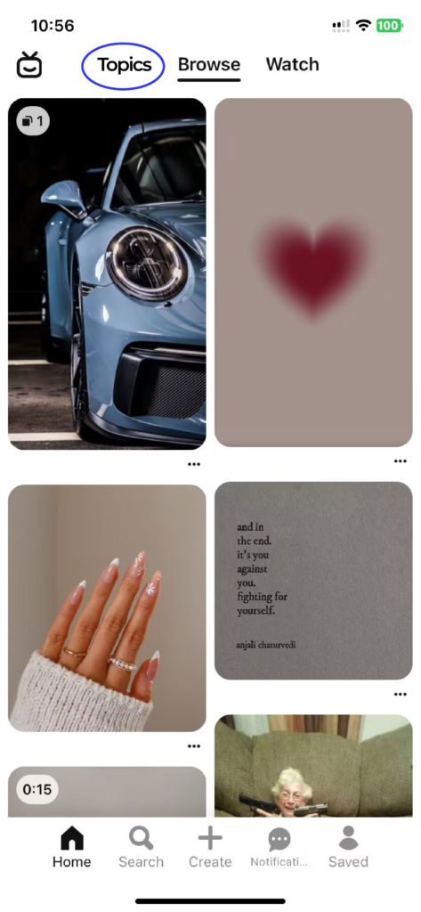
On the homepage, a “Topics” button is added on the navigation bar at the top, where topics can be selected again, and then the homepage images can be initialized based on new topics. Therefore, the conceptual model and mapping is optimized. Users will be provided with clearer gulf of execution and gulf of evaluation and also a better overall consistency between topics and images.
3. Video Post
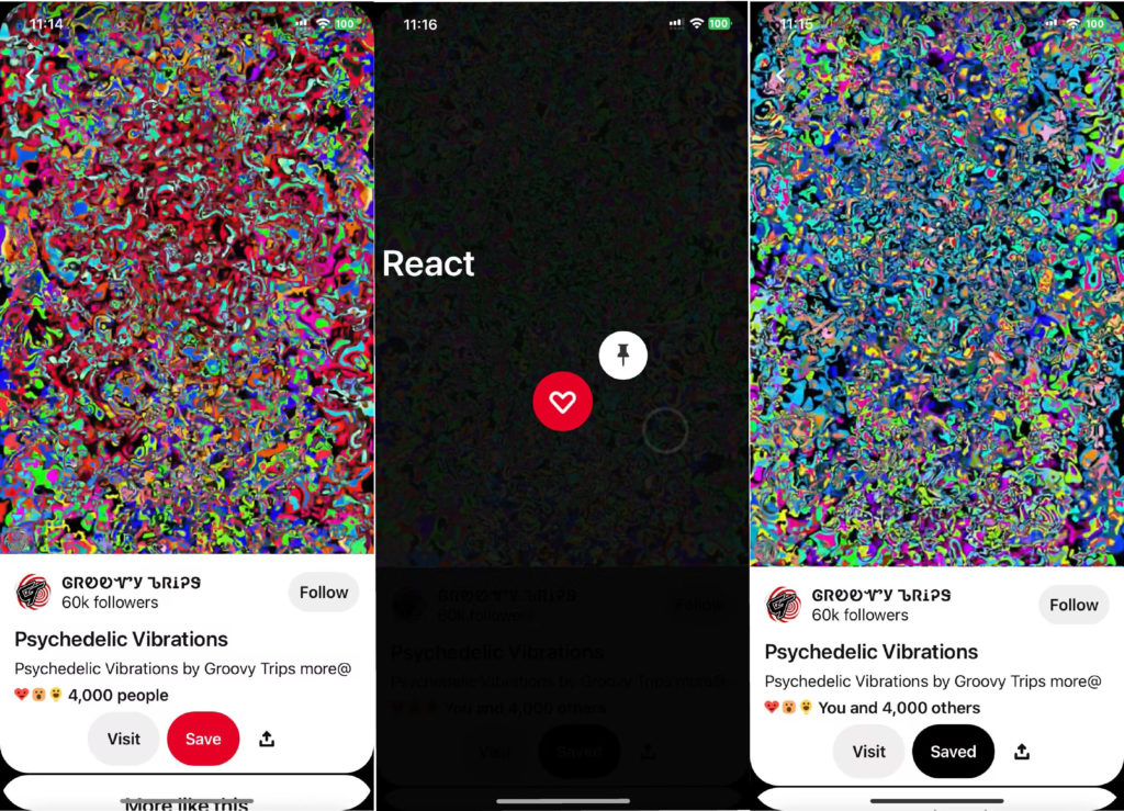
A video post affords visiting, saving, sharing, liking, and following the author. Among them, most functions are obvious to discover and easy to understand with perceivable signifiers. But like function is not easily achievable. A poor signifier under the description presents that “heart by 4,000 people” suggests that there may include a like function. With previous knowledge and experience of other similar platforms, users may be able to realize that they are supposed to tap and hold the video, hover over the heart icon, and then select one of the reactions that appear. But for new users without previous knowledge, it is easily to get learned helplessness when they keep failing to find out the function. Furthermore, after reacting to the video, the feedback is subtle since the only difference that can be observed before and after reaction is that the text “4,000 people” changes to “you and 4,000 people”.
Solution
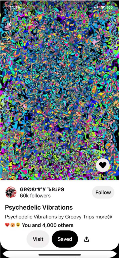
Instead of the present complicated like function, the heart icon could be put at the right bottom corner of the video. And after clicking the heart, color could be changed as a signal to show that the “like” process is completed. Therefore, avoiding big changes, this small change on the position of the “like” function simplifies user’s operation, keeps the consistency, and, meanwhile, enhances affordance, signifier, and feedback.
Conclusion
In conclusion, Pinterest is a creative platform with a minimal but clean and organized design, which gets a high popularity among youth and artists all over the world. Although it has clear mapping and easy understandability, there’s still a scope for improvement in better conceptual model and reflective level by making several simple changes to the interface.
