Google Maps is one of Google’s star mobile products, raising the bar for mobile map and GPS apps. Google Maps mobile features fast loading and reliable directions. Google Maps to and from directions are available for driving by car, public transportation, biking, and walking.
Home Page
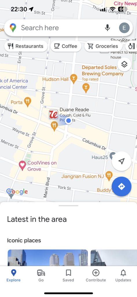
Home page reinforces the discoverability because it contains various types of information, including the search bar on the top, the filter below that and the bottom navigation bar. The Filter buttons by using Conceptual Model, so that use can be a manner of grouping objects with respect to the types of actions they carry through. The Signifiers are the search bar and the two direction icons. The lower direction can lead users to the trip guide page directly as the shortcuts enhance the flexibility and efficiency of use.
Moreover, Google Maps offers constraints to prevent mistakes. The most utilized functions, such as “Search location,” “Current Location,” “Navigation direction,” and “Discover locations,” are on the home page, whereas other elements are isolated with a navigation bar to limit user actions and prevent information slips.
Whether the user clicks the search bar or direction icon, users need to enter the destination to complete the trip guide. When the user clicks on any location on the map, they will receive feedback and the screen will show the detailed information.Additionally, considering affordances, different pin icons indicate different functions of the address, and these icons can be freely clicked by the user as a way to discover different places. Simultaneously, as a member of Google products, google maps keep the consistency of the interface, including the font, icon,lists, buttons, and basic layout; so that users can learn the actions in a short time,like what components are signifiers and affordances.
Navigation
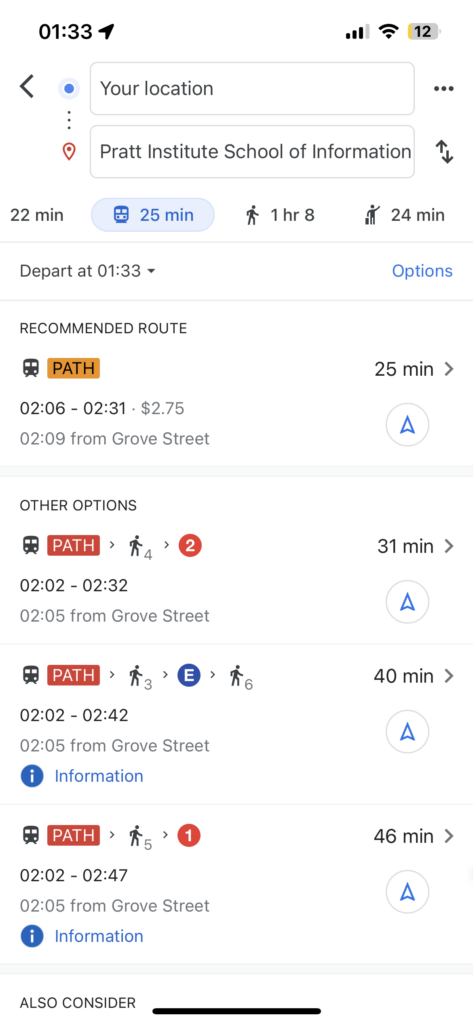
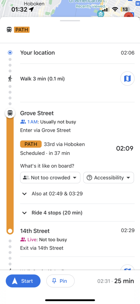
When the user confirms the destination, the app will provide different ways to get there. Referring to the affordances,in the public transportation part, the system will provide different route options, and after the user confirms the best route, navigation will begin.
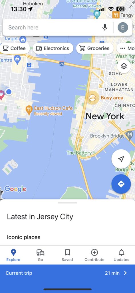
Users will not lose their guide information when they reopen the Google Map, the sidebar will indicate the current trip information, click that, and can jump back to the navigate interface.
Turning to User control and freedom, In the navigation page, it provides the return button, when users perform actions by mistake, it provides an “emergency exit” to leave the unwanted action without having to go through an extended process.
In the public transportation part, there are some icons showing the subway information, including crowdedness, accessibility, temperature and security. Also users will receive guiding notification food each stop of the trip.
“Go” Page
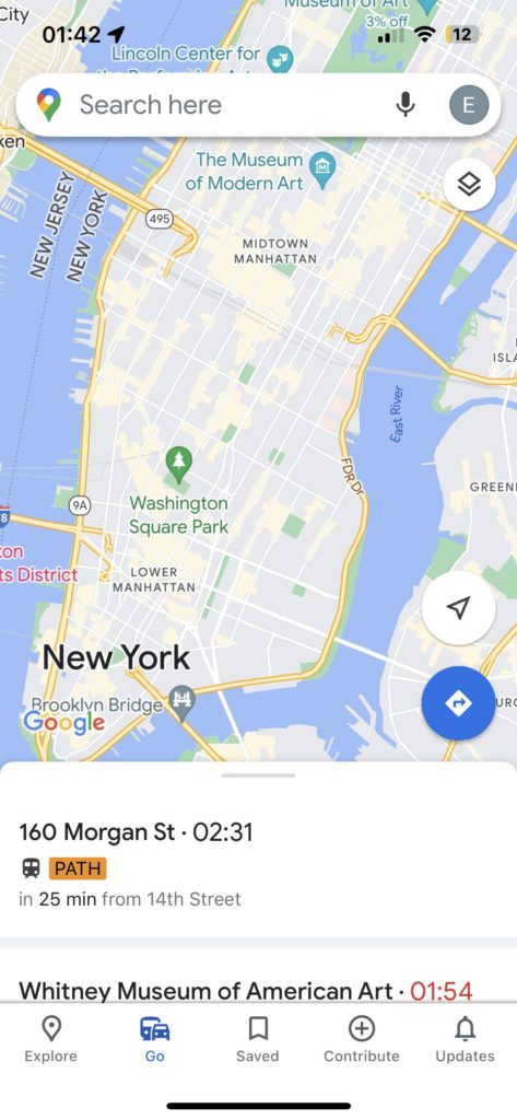
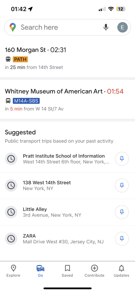
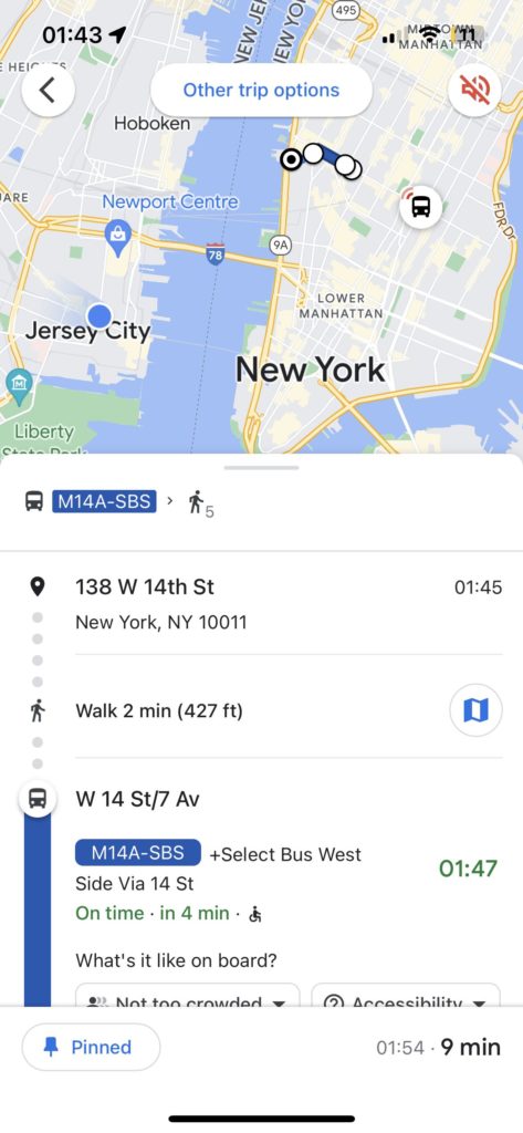
This page is pretty similar with the home page, it remains the same search bar and layout, the bottom slide box replaced by suggestd destination according to the past activity and transportation information to the pinned location.
When people need to navigate to a frequently visited location such as a school or a company, clicking on this page can reduce a lot of steps and immediately see real-time traffic information. Also, this page supports users to pin multiple locations, which reduces the time of repeated searches for the same address.
Cons:
Initially, users aren’t familiar with the function. If they pin the location by mistake, they will receive the transportation information all the time, without knowing how to cancel it. It’s an issue of discoverability and mistake prevention.
A trip’s departure location is limited to the location at the time it is pinned, and it cannot be adjusted based on current location. This constraints the flexibility of the user.
Solutions:
Make the pin button more noticeable, so that users can click it and instantly see feedback. The user can return to the previous level of the screen as an indication of the real-time feedback that will result from the cancellation.
Conclusion
Google Maps, as one of the most popular map apps, provides various services, interaction, and feedback that give users a good experience with mapping, discoverability, constraints, a conceptual model, and affordances. But in practice, this app still has room for improvement in terms of discoverability , mistake prevention and flexibility.
