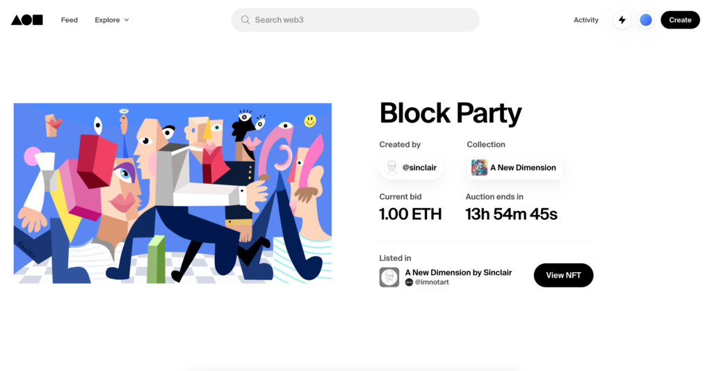
Foundation is a responsive app that works as an ecosystem of trade, sale, and curation of NFTs (non-fungible tokens). It can be connected with digital wallets to use the cryptocurrency Ethereum as payment for art-digital pieces. It also serves as a platform for artists to curate their art pieces including featured drops, worlds, and trending pieces. This website works as a bid system that allows artists to auction their pieces and become popular and have more visibility.
- Getting started on Foundation: Discoverability
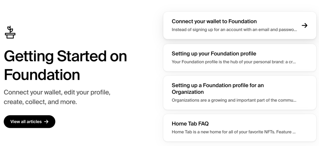
This onboarding explains each step quickly about their features including how to connect a digital wallet, individual or organizational profile, collections, and FAQs. Hovering on each of the tabs will display a signifier arrow pointing forward, indicating to the user that clicking on it will open one of the sections. The purpose of setting up your account with Foundation is to connect your digital wallet to place a bid and therefore by NFTs.
- Good mapping and consistency of color palette across the landing page
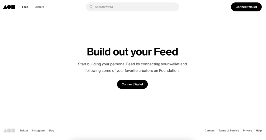
Their monochromatic palette applied to its background, buttons, and sans serif typography helps to balance the vibrant thumbnails (images) of featured drops, worlds, and collections. These images resemble easily, a separation on each section which also helps create a good mapping. It’s following the three levels of processing of Don Norman by connecting the user with a compelling, effective, and pleasant aesthetic with the clear purpose of selling the NFTs.
- Minting:
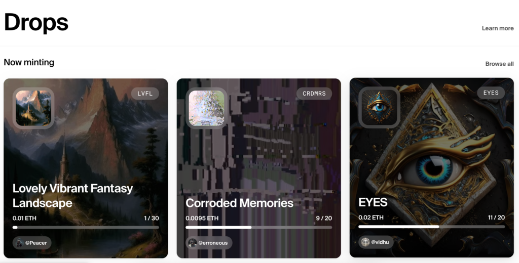
Their conceptual model of the feature “Minting” under the drops section, was not clear, when clicking on learn more it would open another page with very extensive steps on how to “request early access” but did not explain methodologically how to create one access to the “upcoming” pieces by creating an account and therefore accessing to NFTs, Collections, Drops, and Worlds
Recommendation: Implement a tooltip by hovering on the wording “learn more” or an accordion (expandable and collapsable) that would have a brief explanation of what is the meaning of “drops” or “minting”
- Trending Items
The trending section is pretty findable because of the clean data grid that allows users to switch between chips as signifiers: Collections, creators, collectors and periods of time (1 day, 3 days, 7 days and all time). However, the infinite vertical scroll of a total of 100 items can be a bit longer to see all at once and difficult to digest. As a recommendation to enhance the mappings, I would include within a header a bracket of numbers that allows the user to select the number of results to display (e.g 1-20 items).

- Cultural Constraints can change over time:
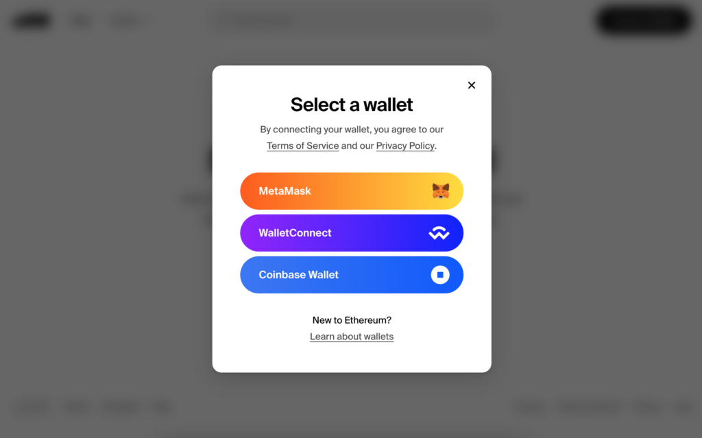
This platform implements Ethereum (ETH) as cryptocurrency to sell and buy NFTs (non-fungible-token) which challenges the “real and tangible” currencies in our society. Since Ethereum is a digital currency this could lead to some “misbelief” in the platform. However, they promote its credibility by connecting with well-known digital wallet apps such as Coinbase, Wallet Connect, and Meta Mask.
- Conclusion:
After connecting my coinbase account to the website, I was able to understand more about how to source different NFTs and their collections. Before creating an account it was very difficult to understand the onboarding flow and some of the lingo on the website. I liked the aesthetics but I think they could do a better job of onboarding new users by following the seven States of Action.
