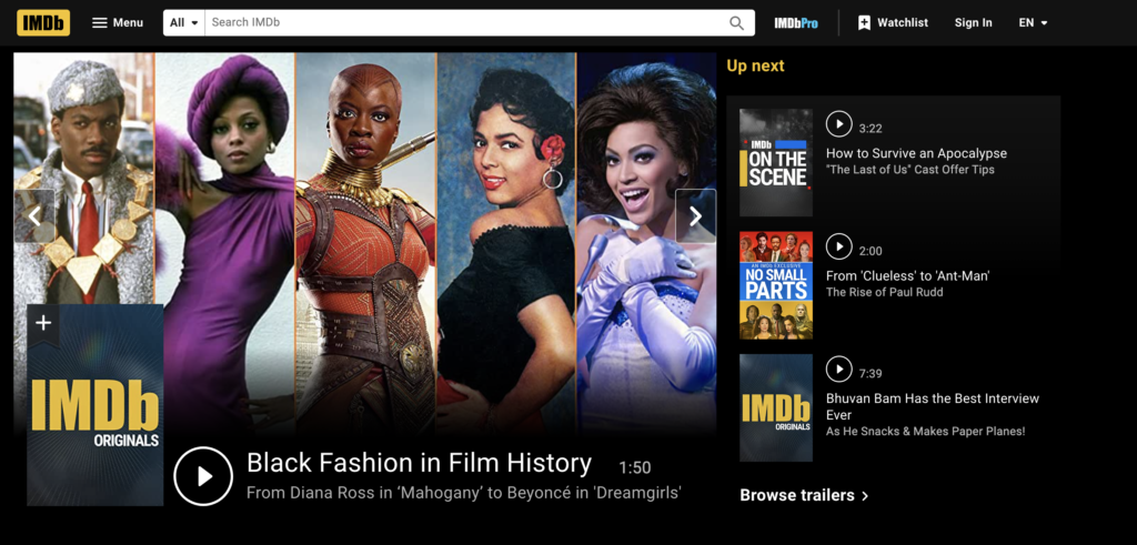
In order to successfully analyze the IMDb (Internet Movie Database) website, I began by identifying why a user would come on to it, and what they would be expecting to see. I turned to Don Norman’s “Seven Stages of Action”, to briefly analyze a user journey through the site, beginning by forming a goal: to explore and analyze the site, and setting an intention: to find movie critiques.
Welcome to the IMBd Website
Upon first looking at the site quickly realized there was so much initially offered that the user was easily confused, with reviews, film, television, “streaming” services, interviews, and the like all listed in the same way. The front page throws the content at you without clear headers over the sections. With it’s unique layout, there is no “knowledge of” or “knowledge how” to the site, leaving me staring at the front page in confusion and intimidation. In fact, the page hit multiple points on Norman’s “how to do things wrong” list, by making section headers invisible, being arbitrary with the content, and inconsistent on what was listed where.
The Menu
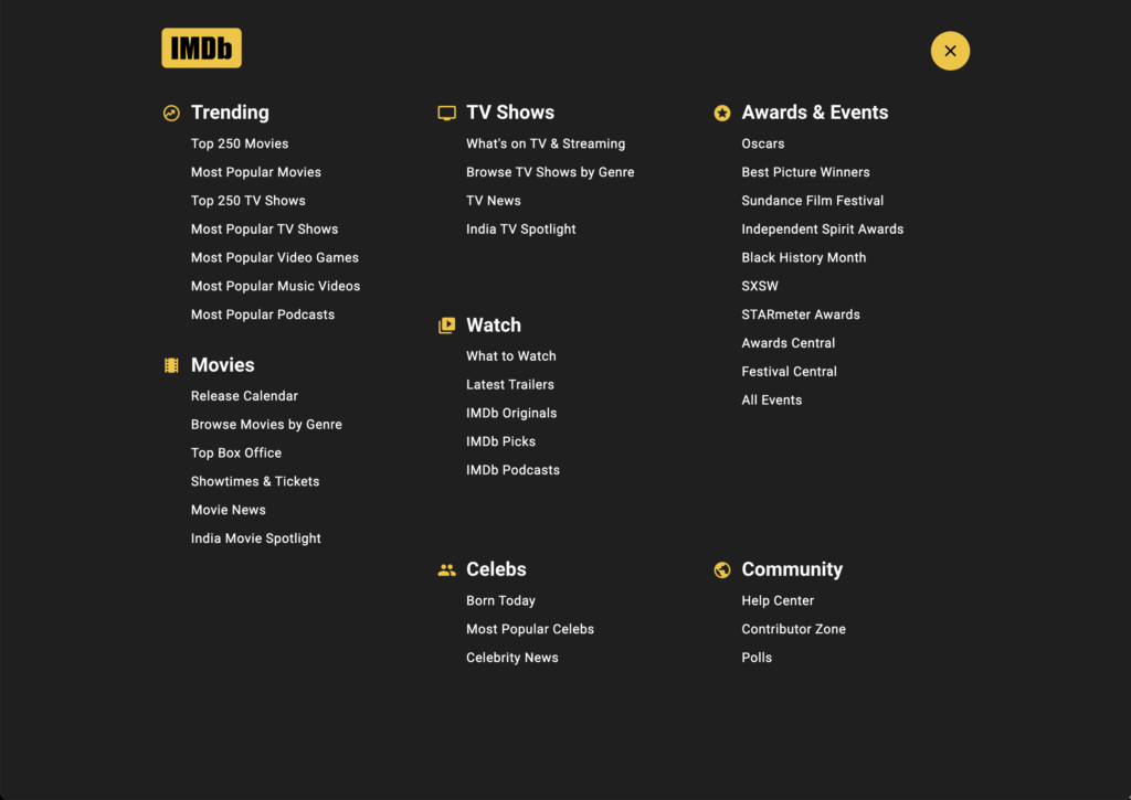
Once I clicked on the menu I could breathe easy again. I could finally “perceive the state of the world” that I was in. In contrast to the rest of the site, the menu was consistently designed and broken out into clearly defined sections. I was still unclear of where exactly to go for movie critiques, but as a user I could understand what the website offered, including a section on “Awards and Events” that I would never have guessed would be included. But with such a disconnect between the structure or mapping of the site and the content itself, it raised real challenges for me to be able to evaluate the current state of the system.
Movie News
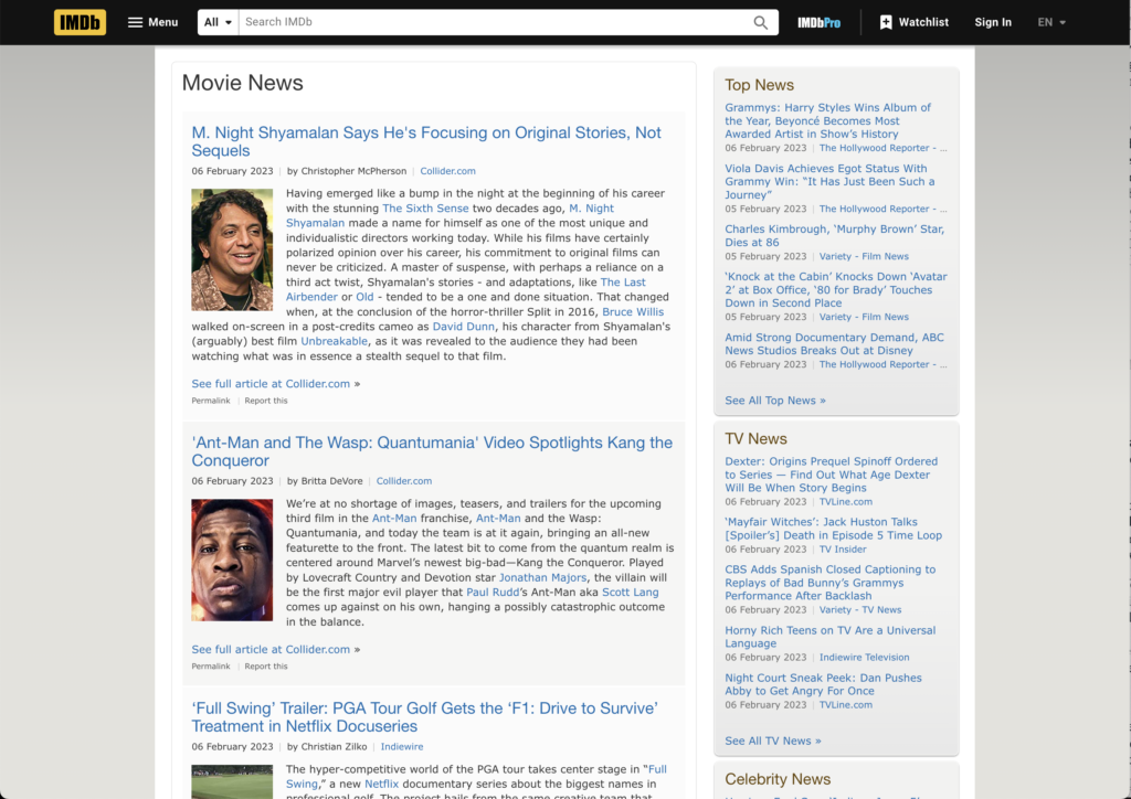
Continuing my search for movie critiques, I clicked on “Movie News”, a link in the menu. It took me to a part of the site inconsistent with the rest of the site’s basic design. A quick glance at the page led me to understand it was supposed to be more of a “News” section, akin to a newspaper or blog. Unfortunately while the sections were broken out appropriately, the overall design did not support seeing multiple pieces of news at once, and was poorly created to support a news system overall. As a user I couldn’t imagine actually checking this regularly, but I did look for a “sign-up” to a newsletter, to stay up to date. There was not one.
Interior Movie Pages
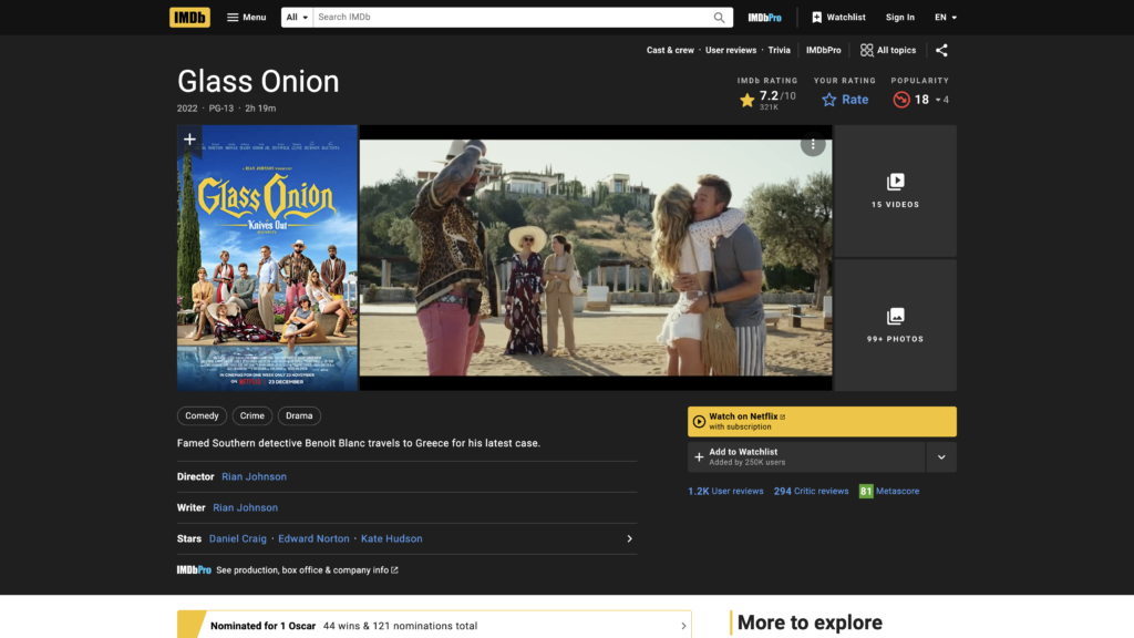
I returned to the main page and once again looked for the best way to find movie critiques on the site. At this point the site had veered into “deliberately making things difficult”, by hiding critical components, and using unnatural mapping throughout the site for various actions. Scanning the site again, I looked through the many titles and videos listed on the front page. I finally clicked on “Glass Onion” as an example. Moving into the interior movie page, the trailer plays almost immediately, which was useful and informative. The second informative piece would have been the “description” listed underneath this section, but it was so nondescript it told you almost nothing about the film, and was easily overlooked. I was once again disappointed at the lack of thought that went into this segment of the website.
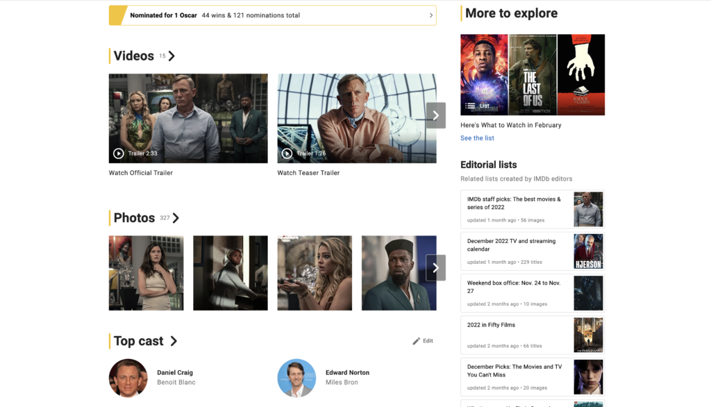
Regarding the rest of the interior movie page, segments on the page had varying sizes of titles, some with no header at all, some with numbers next to the headers and other seemingly random additions. The titles and sections were random and out of touch with my need as a user. This was a clear violation of one of Norman’s key intuits on design “users don’t want each new design to use a different method… users need standardization”. This website once again served as a clear example of poor standardization and clean work on their movie interior pages. I would prefer less information and options, in clean & concise formats.
Conclusion
Overall regarding Norman’s design concepts, the IMDb website continues to miss the mark. The mapping of the site was simply not well done. The design registered more closely in Norman’s explanation of how to deliberately make thing difficult, and “how to do things wrong”, than on any positive spectrum of analysis. I’m sorry to say this site begs for a good redesign, however I’d be happy to lend some advice to the developer.
