The MYmta app is MTA’s official all-in-one app for subways, buses, LIRR, and Metro-North trains. It says the App is “designed for our customers based upon feedback directly from our customers,” and that it “provides a personalized experience across all transit services for daily commuters and tourists.” The app includes functions like trip planning, planned and unplanned service change information, finding nearby stations & stops, as well as real time arrivals plus live tracking when you are on the trip. However, with a 2.3 star rating and ranking #138 for travel apps on Apple’s app store, I decided to really explore what this App is good and bad at using Don Norman’s book The Design of Everyday Things.
Trips! How do I get to places?
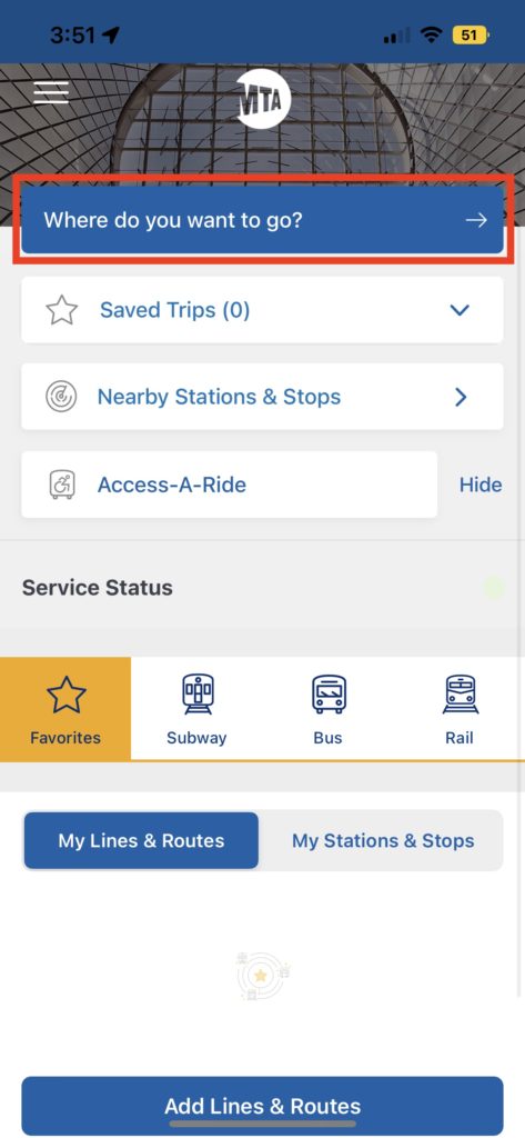
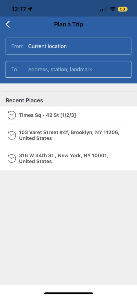
The App has a rather unconventional tab for the basic “search” function – instead of a search bar with a magnifying glass or prompts to “search”, it uses the phrase “Where do you want to go?”. This tab is definitely discoverable since it’s at the top of the page, but because it might not match people’s mental models when it comes to conventional ways of searching for a destination in an App, it messes with people’s knowledge in the head. Even though the written signifier means to tell people this is where to search for a route, they might still miss it or get confused. However, if you get over this gulf of execution, the feedback is actually worth it since it leads us to a more familiar looking page for trip planning, with the ability to allow people to choose their starting point and destination.
Potential solution
One way is to replace the arrow at the right side of the bar with a magnifying glass icon, since the arrow is not a common signifier for searching. Another way to use a more direct signifier, such as “Plan a trip here.” This would provide more information to people so that the gulf of execution is smaller, and it’s easier for them to interpret and match perceived conventions of traveling Apps.
Save and Favorites! Making things easier or harder?
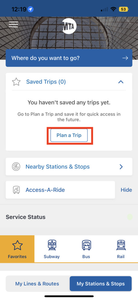
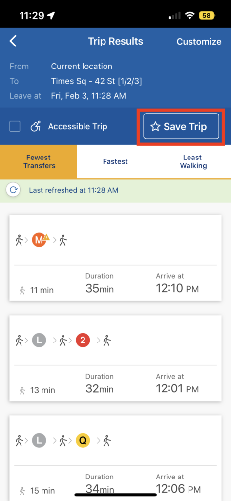
There are 3 features in the app that allow you to customize your trips, lines and routes, as well as stations and stops. These affordances help people organize the repetitive trips, routes, and lines that they use, turn regular conscious thoughts of “how do I get from my home to work” or “when does this L train station near my home leave” into something that’s more behavioral, so that how to achieve a goal is already specified, saving people planning time before performing a goal. However, there are still a few problems. For example, to add a saved trip, written instructions indicate that one needs to go plan a trip first and then save it for future quick access. When clicking on plan a trip, it leads to the same page where people plan a trip in the first place. This might lead to confusion, as it adds complexity to the goal of saving a trip – people might not need to travel anywhere but still want to save a trip, and the extra step of planning a trip forces people to process their action on a reflective level, making them consciously thinking how to get to somewhere instead of just an end-to-end hypothetical route. This may lead to negative emotions like stress and anxiety, thus the App becomes less enjoyable.
Another issue is with the Favorite tab under service status. The faded logo in the center of My Lines & Routes and My Stations & Stops are different sizes, and the latter also contains written feedback that indicates this is where your favorite stations and stops will appear. This inconsistency in design is very confusing. Also, 2 other functions: finding out planned service changes as well as elevator and escalator status will only appear under My Stations & Stops, and there are no signifiers for these 2 affordances on the front page unless you click on My Stations & Stops, which makes them undiscoverable.
Potential solution
For the first issue with saved trips, one suggestion is to add this tab inside the master plan a trip function. This way, people would build a more logical conceptual model of how all trips and saved trips are related (you can only save a trip if you plan it first), thus creating a more positive experience. For the second issue, first to match the map of the 2 saved tabs so that they are identical, and singled out the planned service changes as well as elevator and escalator status under a new category. This way, people can have proper signifiers for accessing these helpful features.
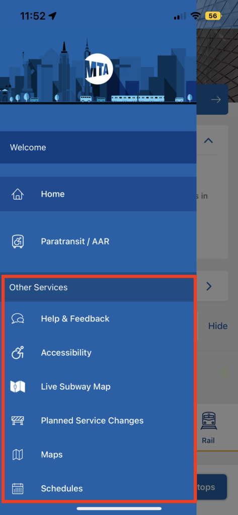
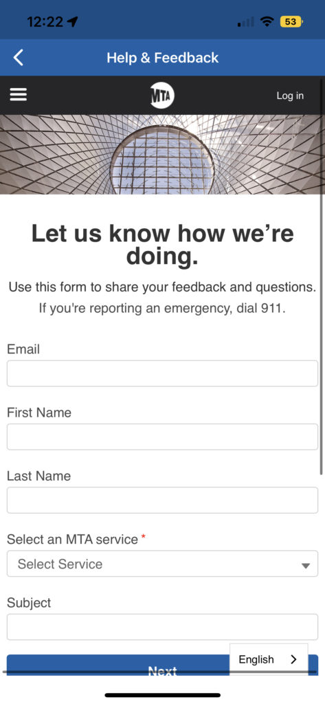
Hamburger menu! But why website in an App?
If one opens the hamburger menu, it gives you the map of the App in a more traditional layout. The first issue is that there is a signifier for the word “Welcome”, but it doesn’t do anything if you click on it, which is very misleading and could lead to a gulf of evaluation: it looks clickable and I clicked on it, but why nothing happened? However, this is not even the biggest problem. For all the tabs under Other Services, they have the same consistent design for the logos as the Home and Paratransit / AAR tab, however, when you click on it, it leads you directly to the MTA website section of the content. As the book says, “Complexity is good; it is confusion that is bad.” People’s perception of a standard App is that everything on it is designed for the App, everything is on the App, but all the tabs under Other Services are breaking this tradition since it is leading people to a website. I do think the team behind the App thought about this weird thing so even though you are on the website, you are still inside the App you can still afford to go back to the hamburger menu relatively easily. However, this is just strange.
Potential solution
One way is to just tell people all these things are on the web, giving people interlocks such as “This tab leads to a webpage inside the App” then allow people to choose Yes or No. A harder way is obviously to develop these functions for the App so no websites need to get involved. Another way to think about this is to identify a few of these items that people use often and incorporate them into the App.

